Planning and operation of contents of Kia Design Magazine, which unravels the philosophy of the Kia Global Design Center, "Opposites United," through the stories of creators
- case studies
Q. I'd like to briefly introduce this project and ask what kind of work Double D was in charge of.
«Kia Design Magazine » is a global online magazine launched in 2021 by the Kia Global Design Center. Starting from Kia's unique design philosophy, "Opposites United, OU," it has a colorful journey of thoughts linked to it. In 2021, the « Kia Design Magazine » planned to deliver the Kia design philosophy OU with the media characteristics of the web, and in 2022, the « Kia Design Magazine » renewed the content and design to make it easy for the public as well as internal members to access and intuitively understand Kia's design philosophy. In particular, it is designed to increase reader concentration by actively utilizing video content and to more intuitively access content by placing multiple UX devices from various angles.
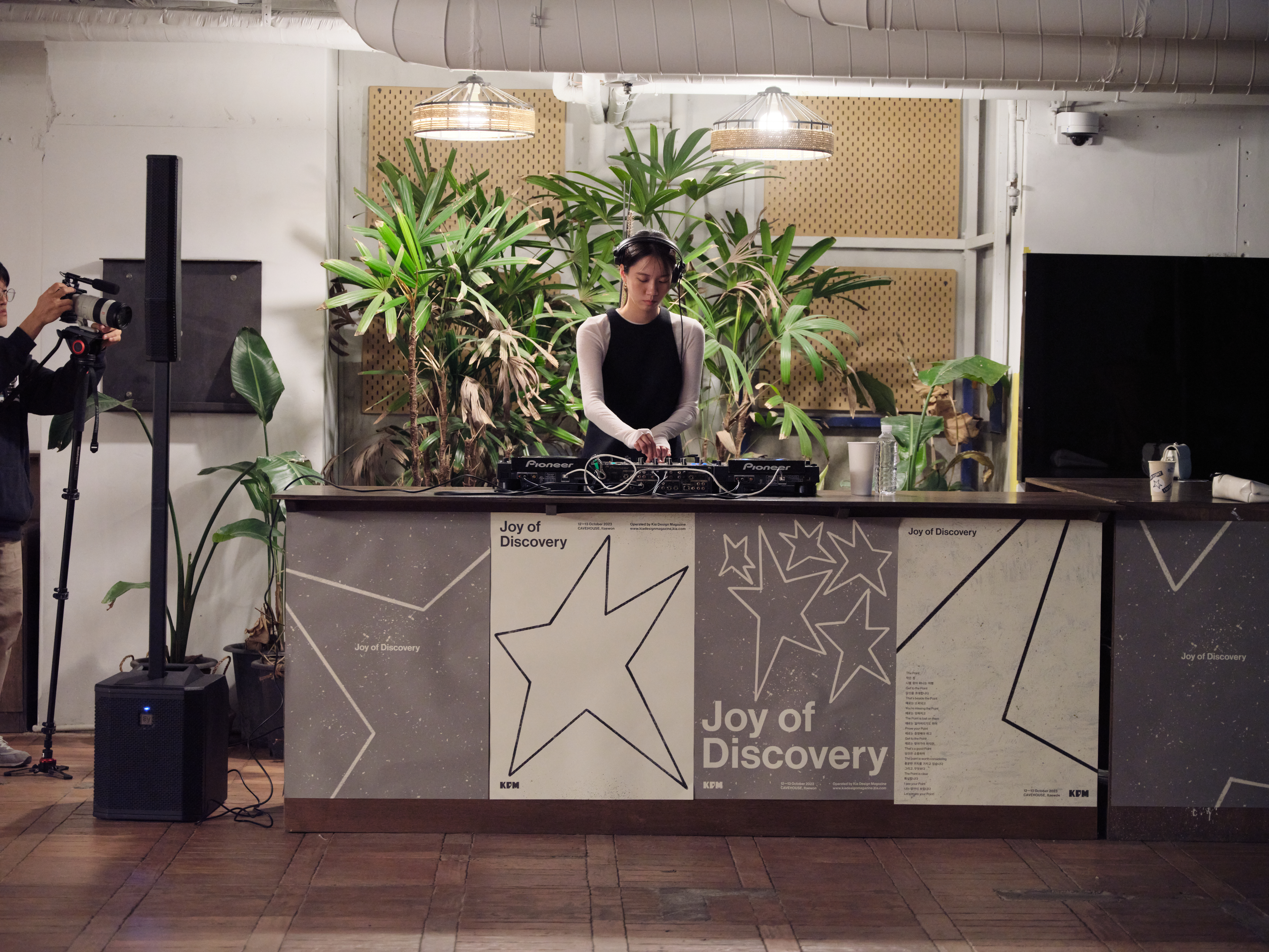
In addition to content operation, in 2023, we wanted to become a medium to represent the Kia Global Design Center by planning a workshop called "Joy of Discovery" with our partners to inspire the daily lives of the Kia Design Center. The "Kia Design Magazine Yearbook" is planned and published once a year in print format, which is distributed primarily to a small number of officials for archival purposes.
Q. How did you participate in the project?
In 2019, Double D participated in the Kia CI Renewal Project. One of Kia's partners who selected us at the time was Karim Habib, the head of the Kia Global Design Center. Later, as the project progressed, I mainly worked with the brand strategy team, but during several official presentations together, they gave me a good evaluation of DoubleD, so I asked for a proposal to the place that planned Kia Design Magazine, and through the official proposal, I was selected as an agency that plans, designs, and operates Kia Design Magazine's contents annually.
"Karim Habib, head of the Kia Design Center, designed Kia Design Magazine to convey the philosophy of the Kia Design Center through various contents internally and externally."
Q. How did you plan the contents of Kia Design Magazine?
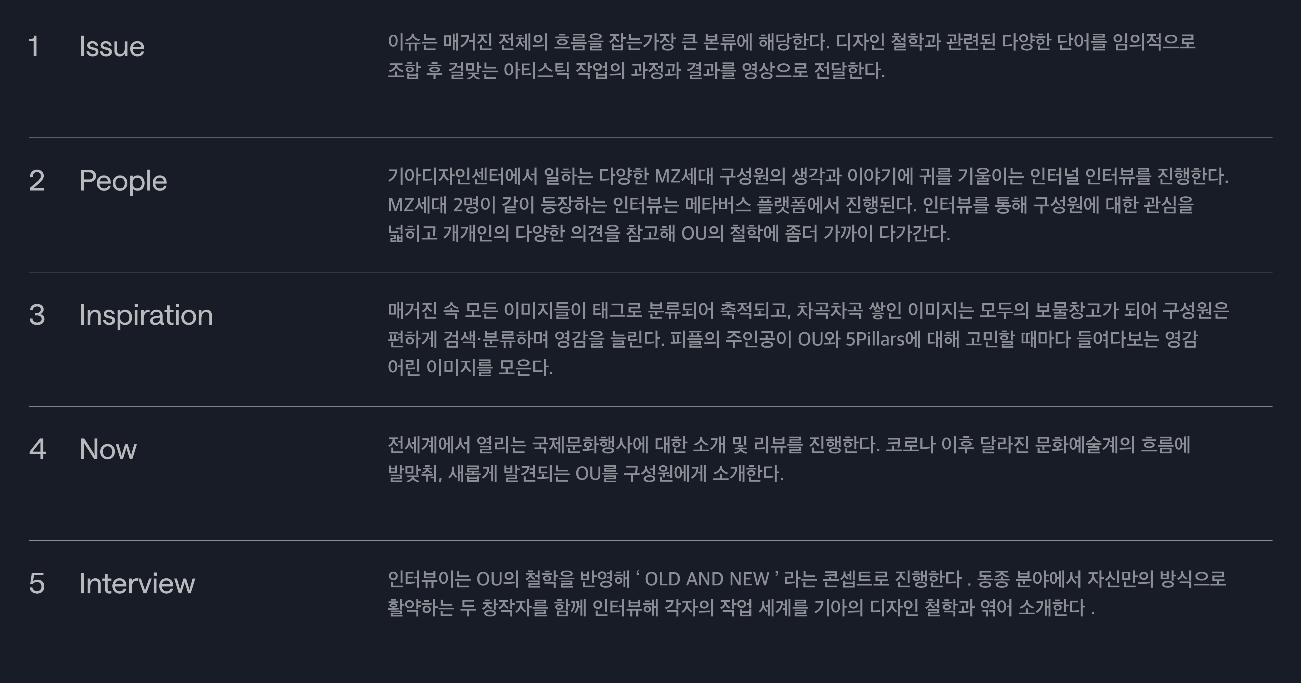
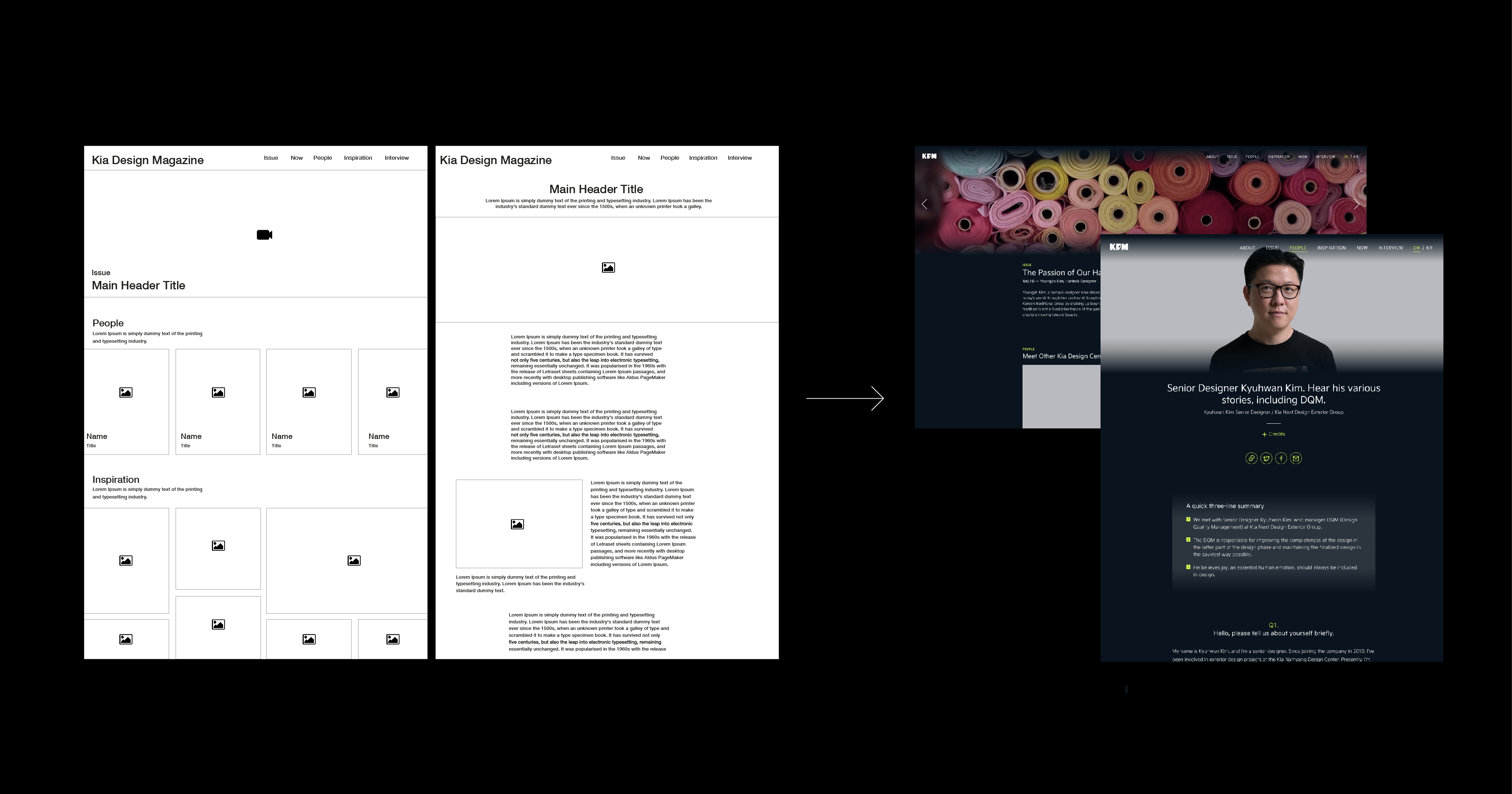
Kia Design Magazine is a web magazine in the form of a quarterly magazine. The philosophical message of "Opposites United" that Kia Design Magazine wants to convey, and furthermore, we have organized content to help readers project their perspectives to get inspiration. It covers in-depth content about creators and creative scenes working in Korea and globally. As of 2023, it consists of Issues, People, Now, and Interviews 1, and operates quarterly. In 2021, it consisted of issues, focus, themes, stories, and interviews. The current issue is video recording the story and work of the creator who summarized the selling theme. People seek interviews where they listen to the sincere voices of members inside Kia. Now introduces cultural and artistic events held around the world in the form of reviews by art and design experts. Interviews deliver two creators of OU's philosophy in video and text.
Q. How did you develop the logo and color of Kia Design Magazine?
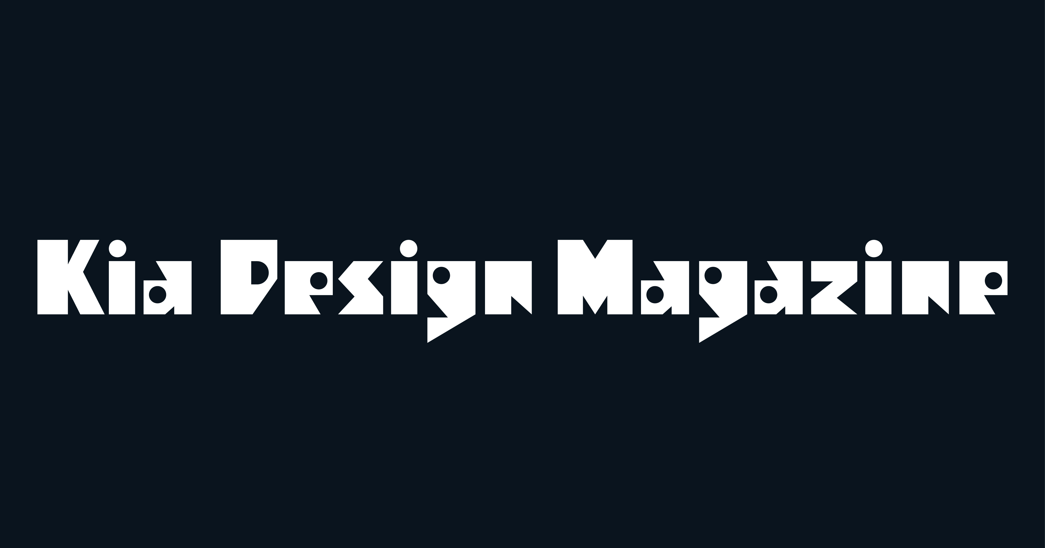
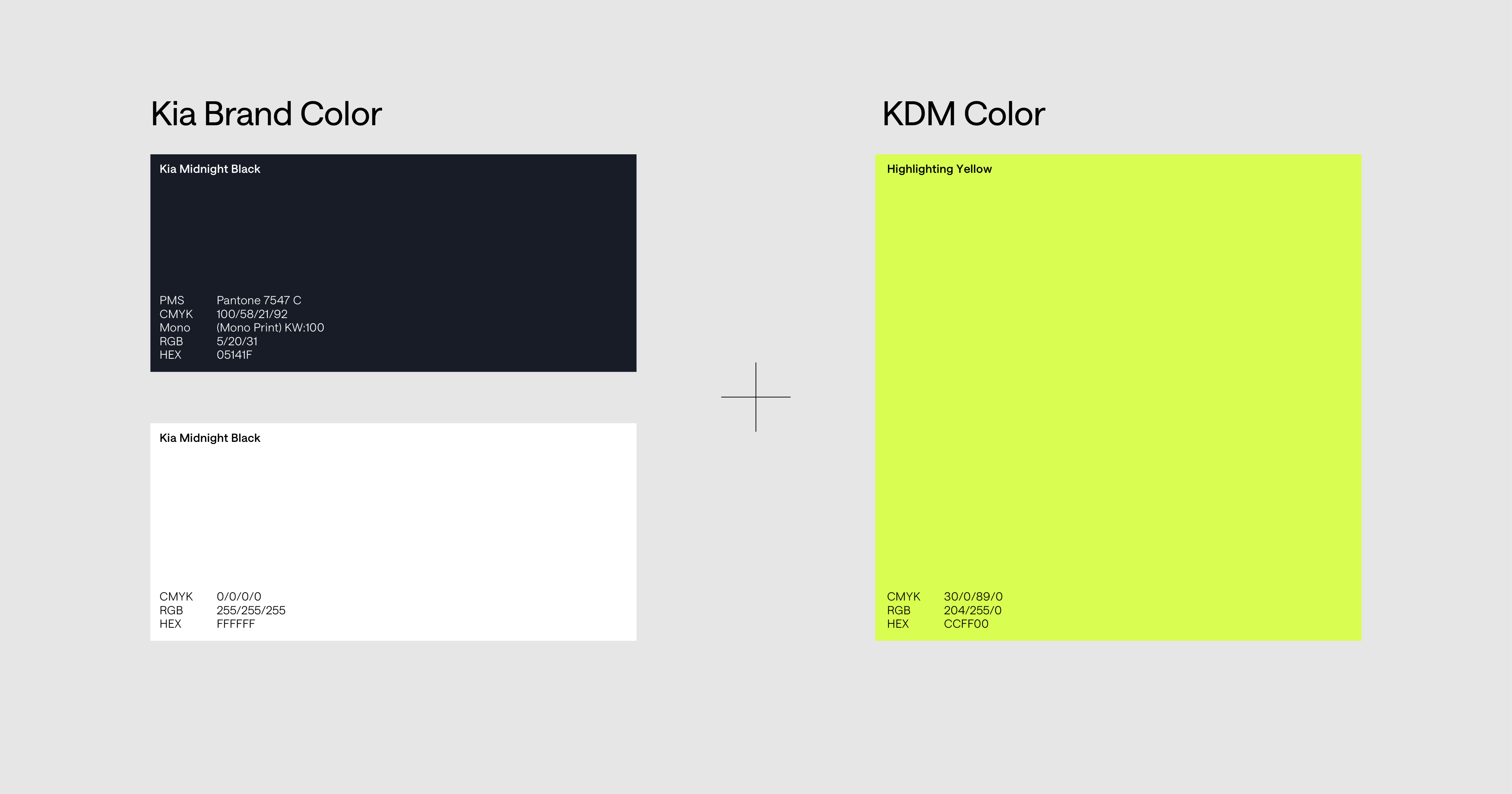
We have established design keywords and messages to differentiate ourselves from Kia brands and emphasize design philosophy rather than brands. We have developed a formative language that contains OU and contains the value of Kia Design Magazine, which is Korean and creative inspiration. The logo type of Kia Design Magazine is designed to convey unique personality by making the characteristics of the geometric form strong and based on a font suitable for the title. It contains a design philosophy that binds different formative languages at once by using a unique typeface with a strong geometric shape with a combination of square and circle. In the case of color, we used color based on the existing Kia color palette by taking advantage of the characteristics of web magazines, but we additionally used Highlighting Yellow to establish the identity of Kia Design Magazine. This was supplemented by utilizing the high-lighting yellow, which is a bright spot for use in web environments with the point color, Livedred, and the main color, Midnight Black.
Q. What was Kia Design magazine's first form and what form has it developed now? I wonder why.
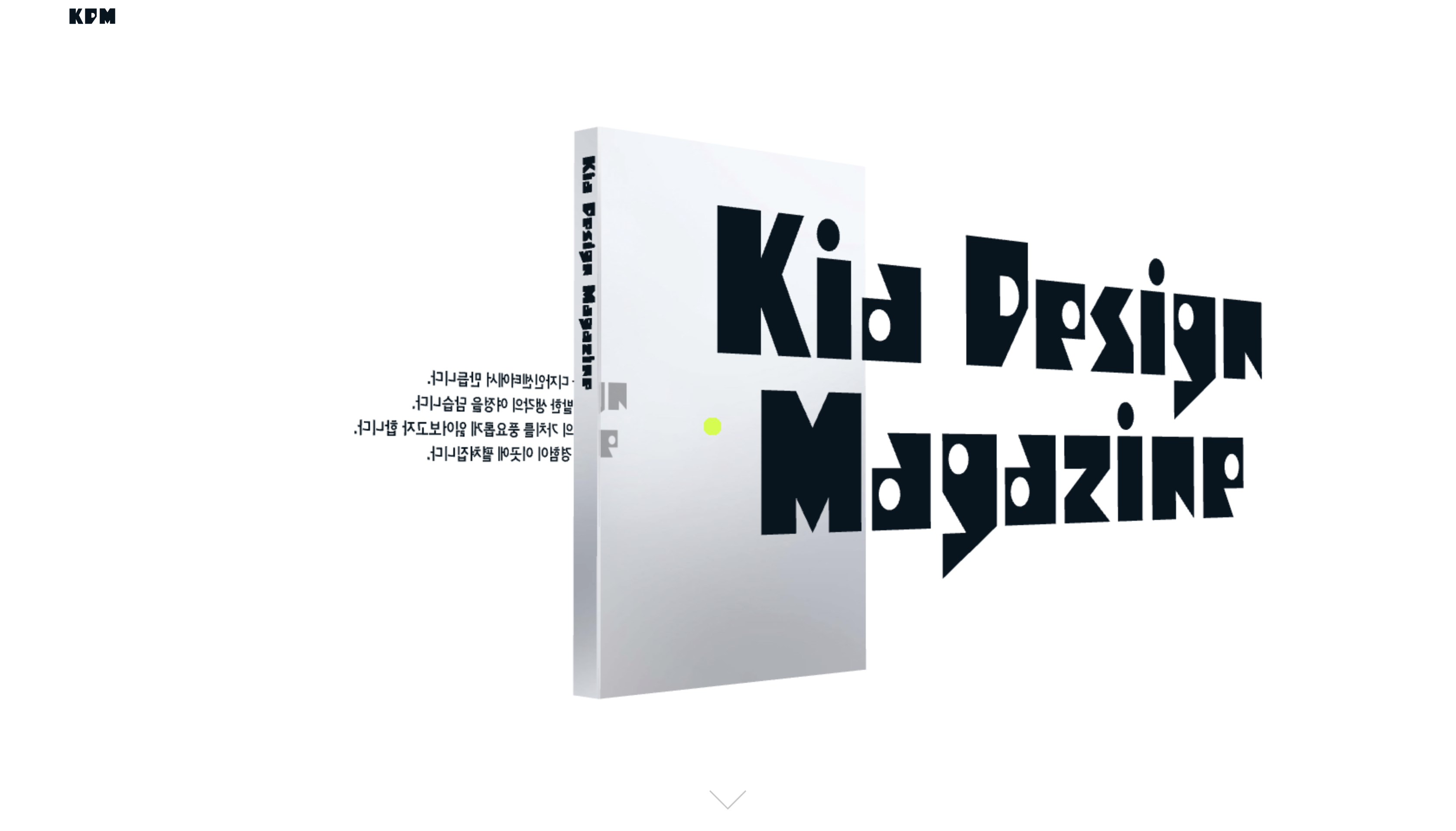
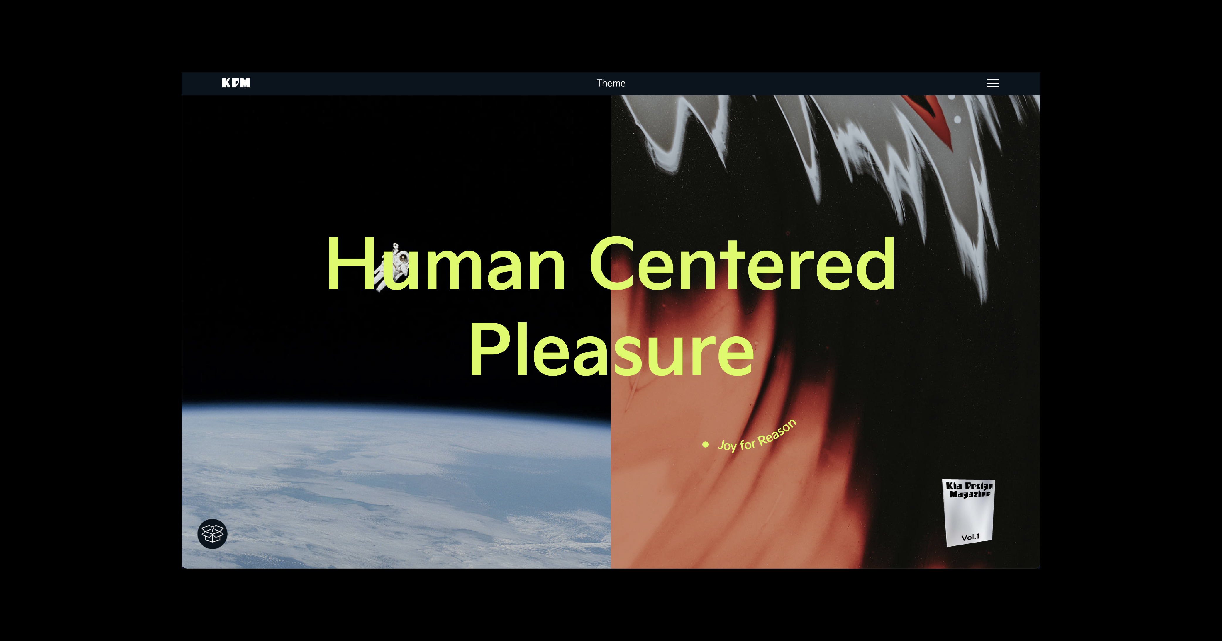
Kia Design Magazine of 2021 aimed for an unusual form of experimental website design. Even now, I can see the unusual 3D book circulating 360 degrees. Key Visual emphasizes the expansion of various viewpoints using three-dimensional synesthetic elements, and with the concept that readers are inspired by projecting their perspectives, we have created a main page that can be viewed in 360 ºs by moving 3D book graphics and introductions to magazines. The web layout also used a two-division method rather than a traditional method. We planned a web layout to deliver content that unraveled Kia's design philosophy. We used a two-tier grid with separated text and images and used a narrow margin. What I especially emphasized was the "Theme" part. I should have planned an interaction design that changes every time, but it was not easy to work with creativity and production together. The theme part, which contains participatory content that allows readers to experience Kia's design philosophy in person, is designed in the case of Volume 1, where images including keywords are arranged in a two-tier grid, and the left and right ends are separated and can be clicked individually, and when clicked, it randomly moves to the next keyword + image. It was because I thought that this random combination meeting made me feel better about OU, the philosophy of hunger.
"Kia Design Magazine designed content and design to reveal Kia's unique creative side."
In the case of the first package, the mold was selected and utilized among off-the-shelf products without digging new ones. We tried to capture the brand identity and clean beauty by revealing the color of the product in a transparent bottle. We also tried to clarify the value of Torriden against separable emission labeling and animal testing in the package. For the second package, the paper texture feels natural and allows customers to touch Torriden sensibly through effects such as mold pressure.
Q. What was the most memorable moment while working on the project?
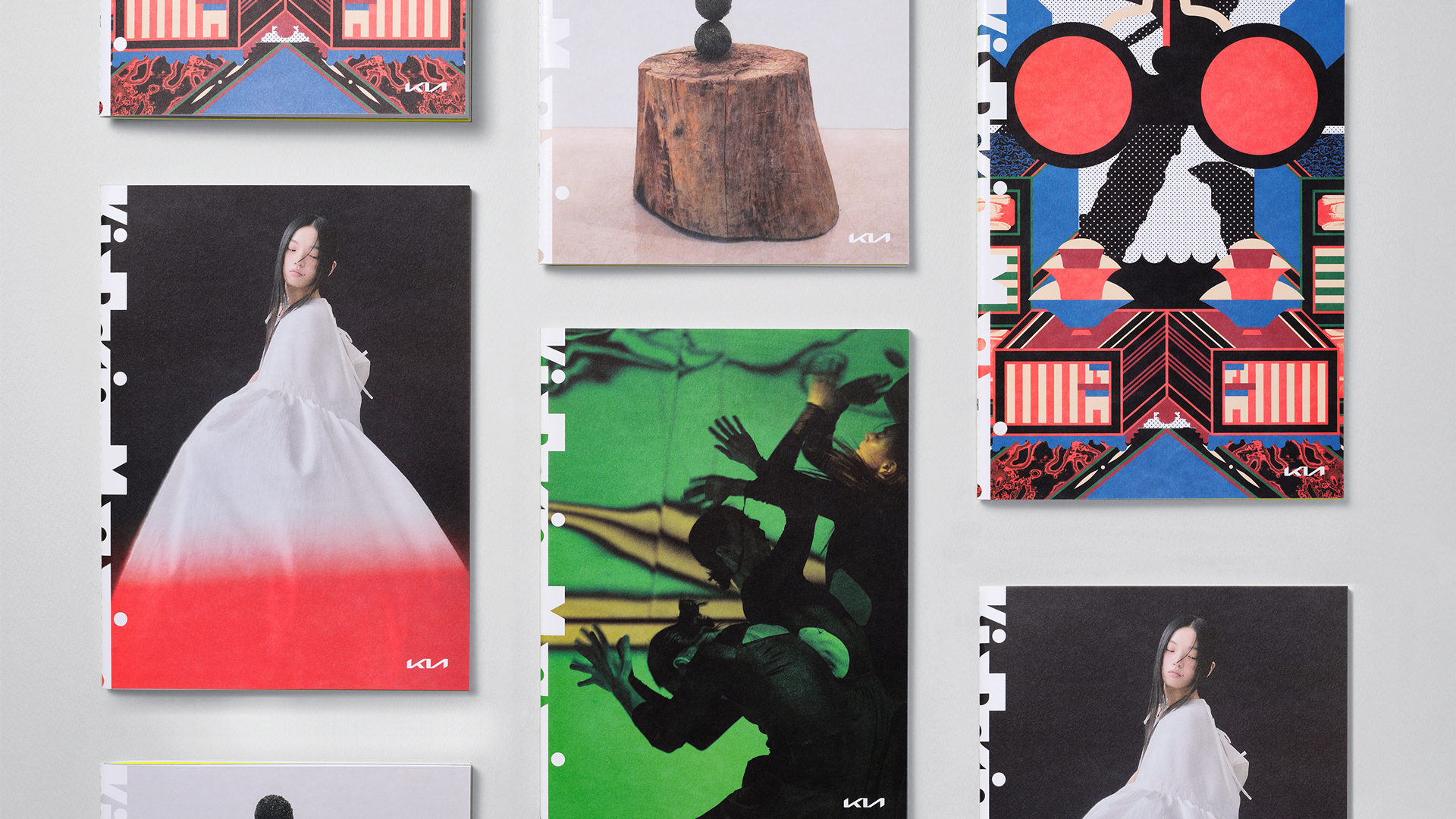
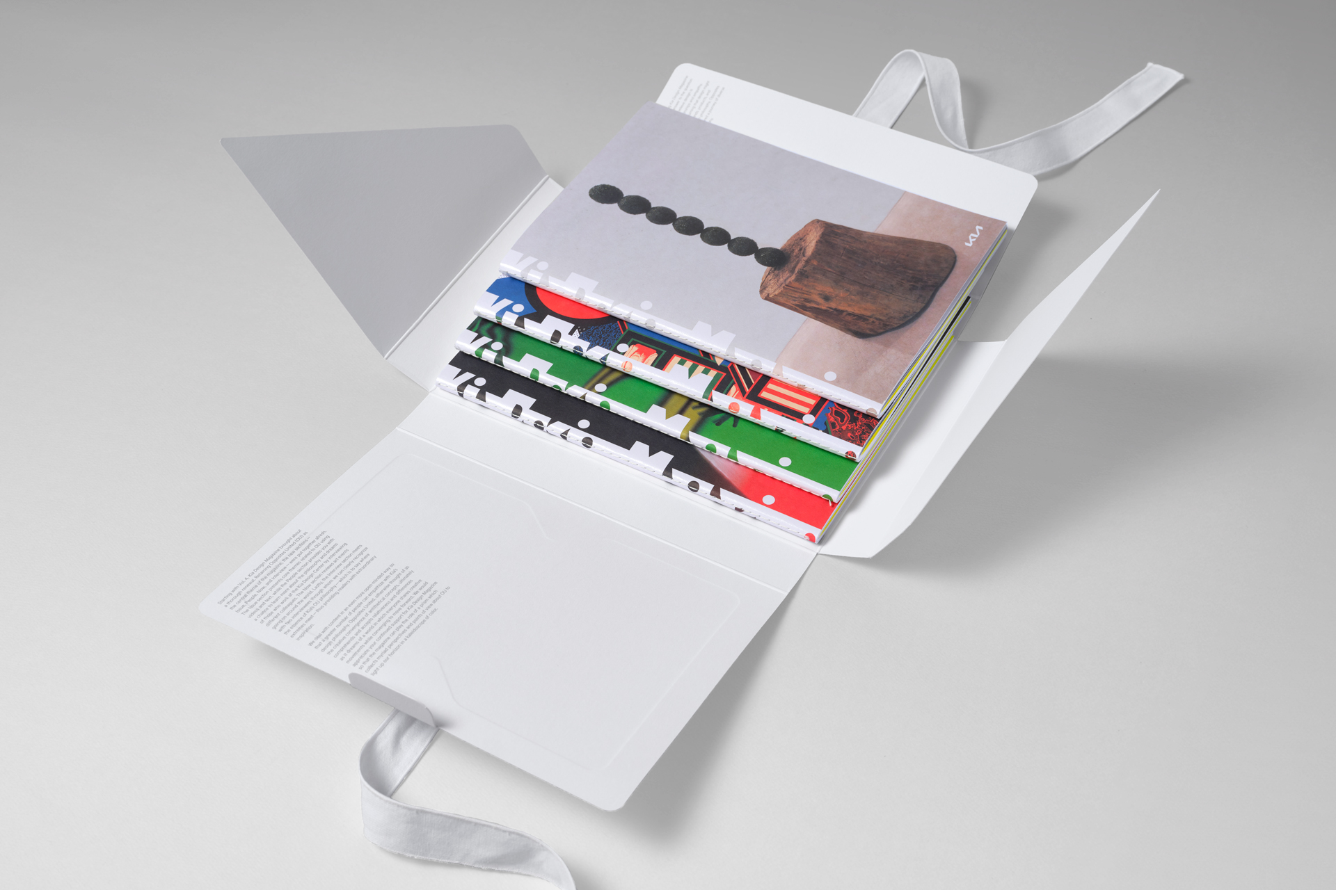
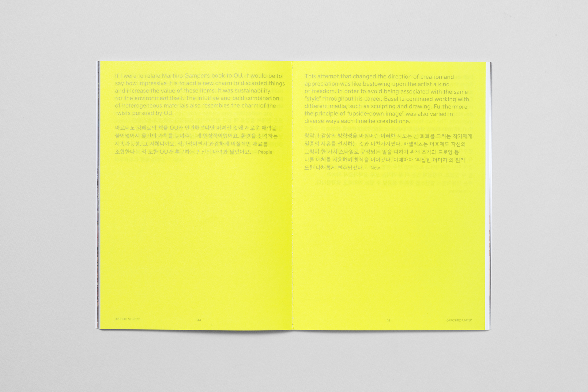
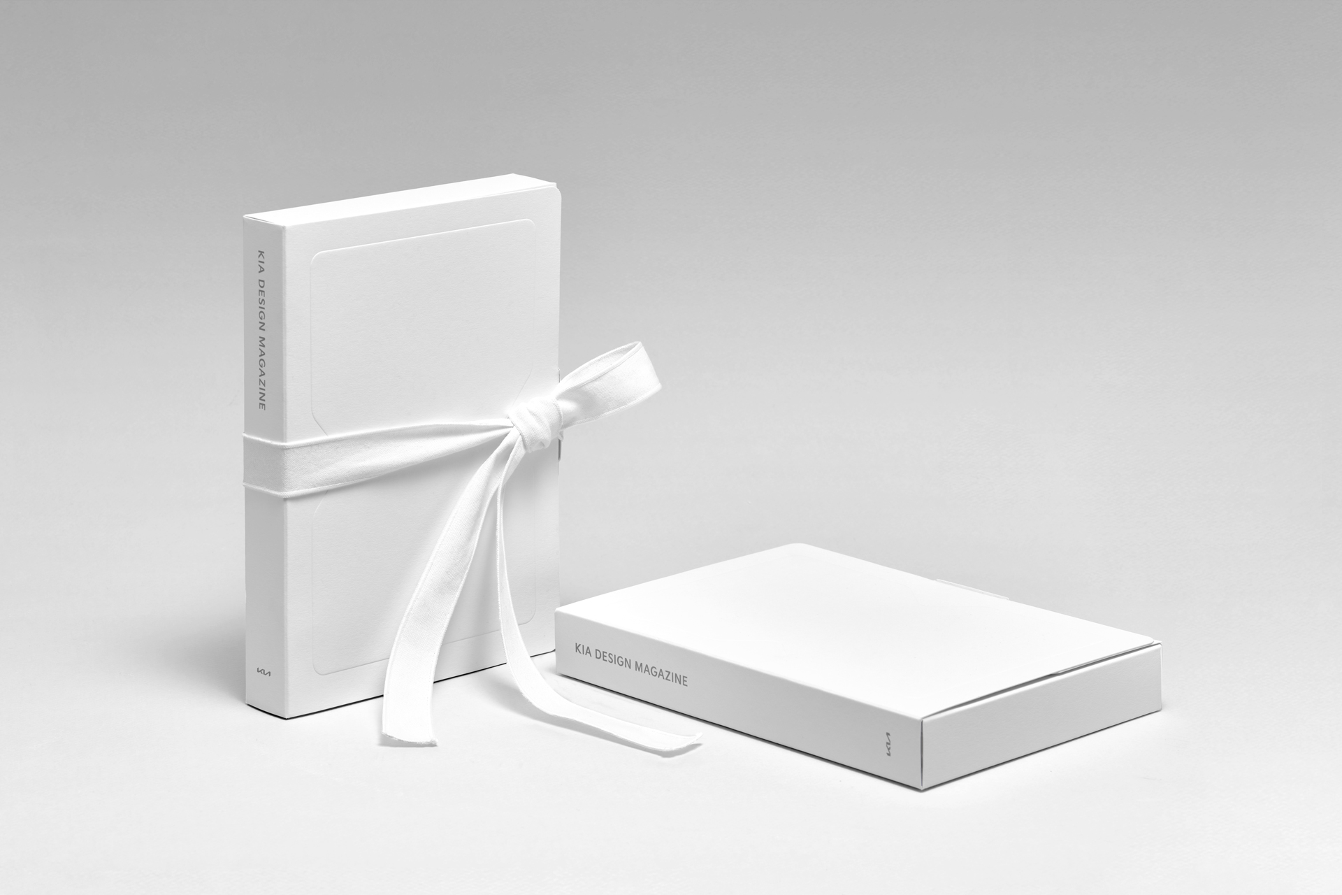
Kia Design Magazine is the longest-serving operating agency of DoubleD. After many twists and turns, the most memorable thing was participating in the exhibition "Opposites United" at Milan Design Week in 2023. We planned the earbook that we had been producing every year with the Kia Design Center to be more Korean-like to make it more suitable for the Milan project. The pure white package, which seems to be wrapped in a jeogori, conjures up a static Korean traditional aesthetic and pursues Kia's ESG move and Koreanness at the same time by utilizing minimal printing and mold pressure. In contrast to the sensuous magazine cover, the packaging visualizes Kia's design philosophy, 'Opposites United'. We have planned a total of four books, one for each volume, so that you can digest the content without any burden. The inner pages of the book reduced eye fatigue with easy-to-read typography, and we took care not to break the flow of text and images in the process of combining state-owned texts. Quotes placed in place of image appendices in the middle of each book are designed to help you understand the content immediately.
Q. How do you feel about finishing the project?
I don't think it's an easy opportunity as a consulting agency to get the opportunity to reveal branding through continuous content operation. This is because if we mainly plan the brand and hand it over to the client company, the client company often takes charge of the operation. The experience of becoming a media of the Kia Design Center with a special philosophy and researching the Kia Design Center's Dahum and Kia Design Philosophy and operating the media with contents was inevitable to learn and love so much. The project is not finished. As long as the Kia design philosophy has an impact, we expect it to continue in some form.
Interviewee |
Minjae Huh |
Client |
Kia Global Design Center |
Output |
Brand System Guidelines, Brand Application, Typeface, Pictogram, Icons |
Year |
2020 |
Double D |
Minjae Huh, Sue Park, Juhee Park, Sojung Kim, Seongje Kim, Minsu Ha, Daewook Kim, Dawon Lee, Sanha Park, Jaeyeon Jung, Chanhee Jung, Kyungmi Jun, Daye Jeong, Sunggee Min, Gyeongeun Lee |
Collaborator |
Wonwoo Lim(Yearbook Design), Heejae Yang(Logo Design), Wonsun Yu(Web Develop) |