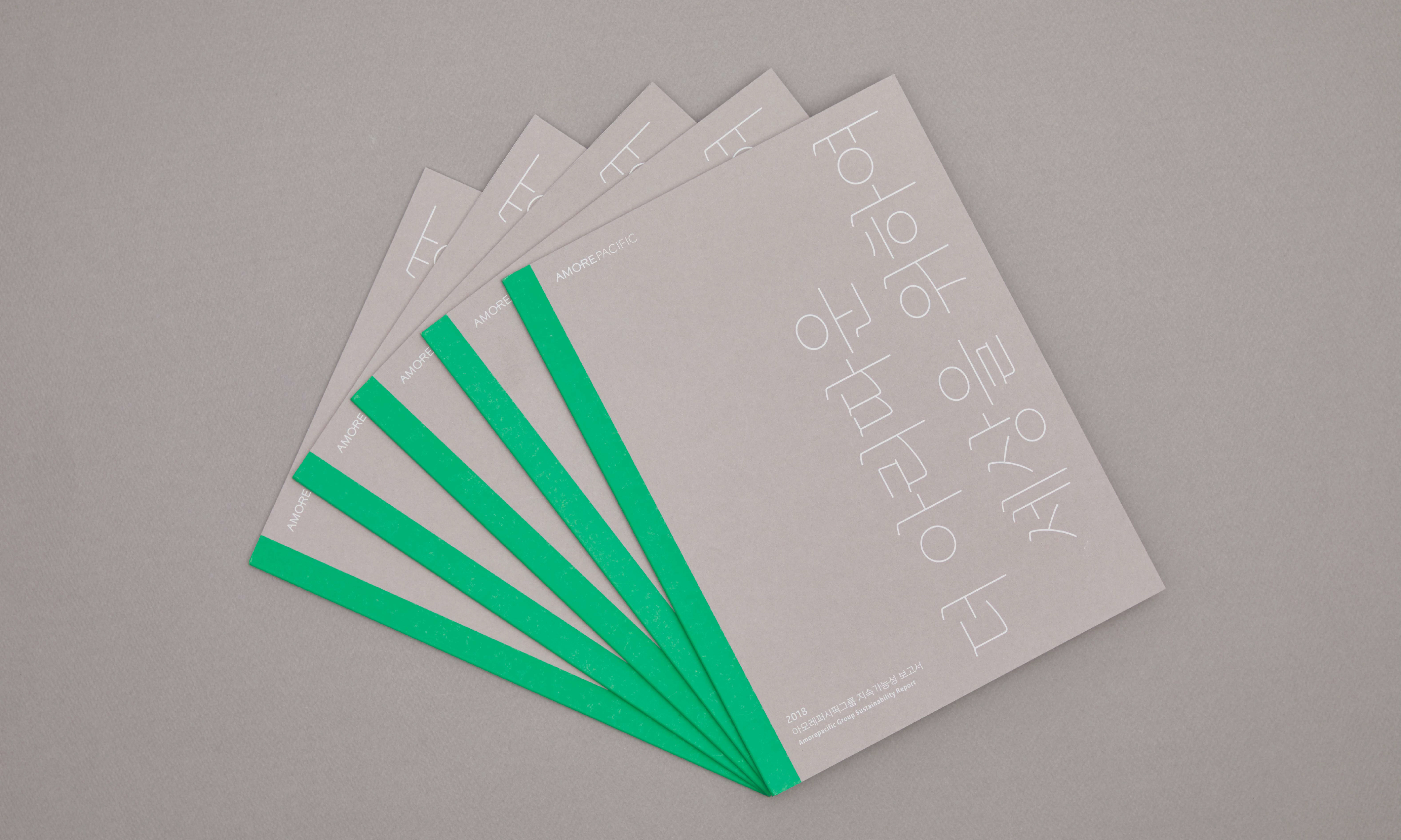
Sustainability report design for Amorepacific Group, a Korean cosmetic corporation that dreams of 'A More Beautiful World'
- editorial
- web
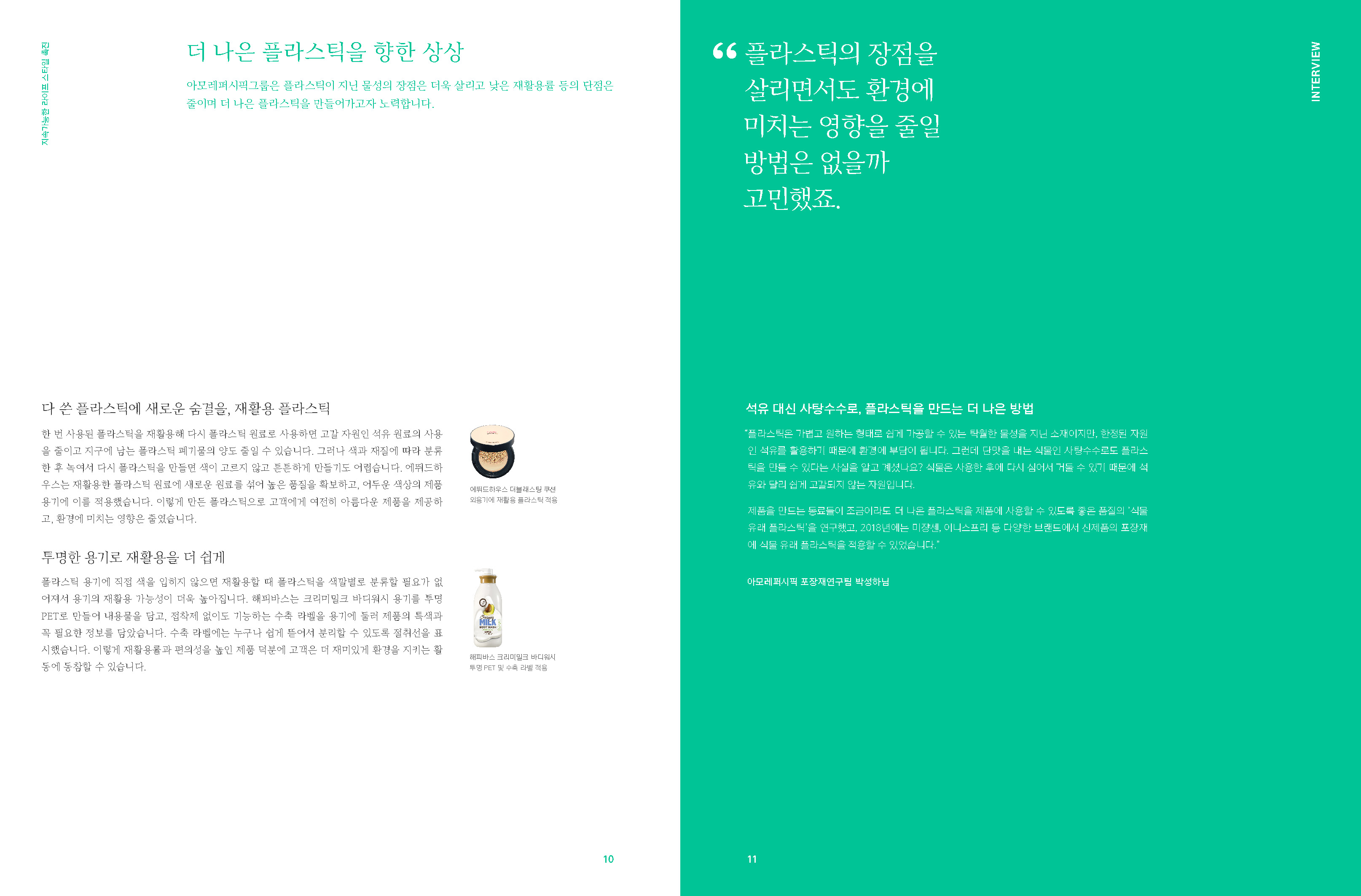

We tried to emphasize the brand by including AmorePacific's storytelling in the existing report, which lacked user access and brand experience.

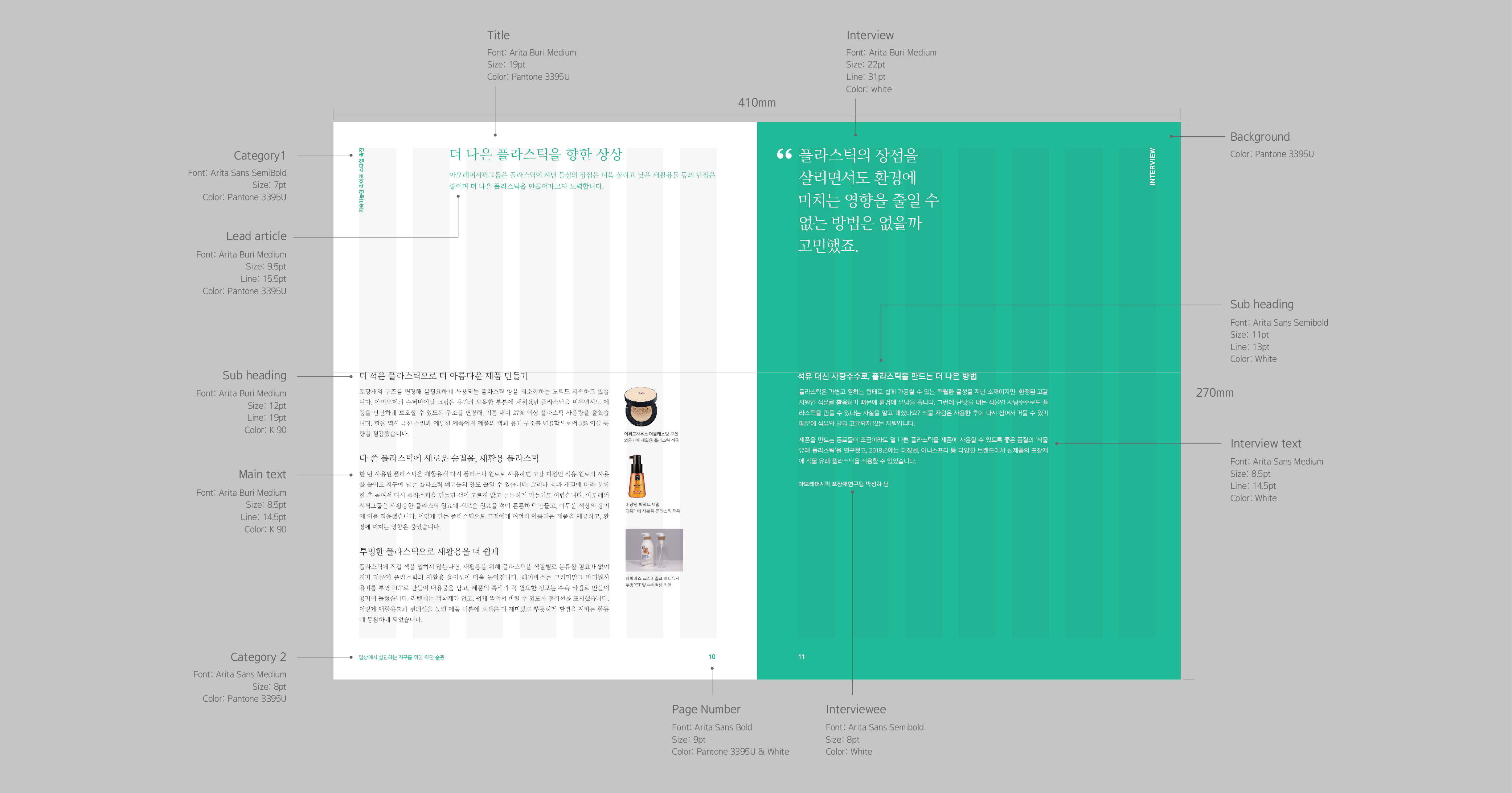
Typography system based on Amore’s brand typeface 'Arita'
We tried to maintain brand consistency by actively utilizing AmorePacific's exclusive fonts, Arita Buri and Arita Dotum.
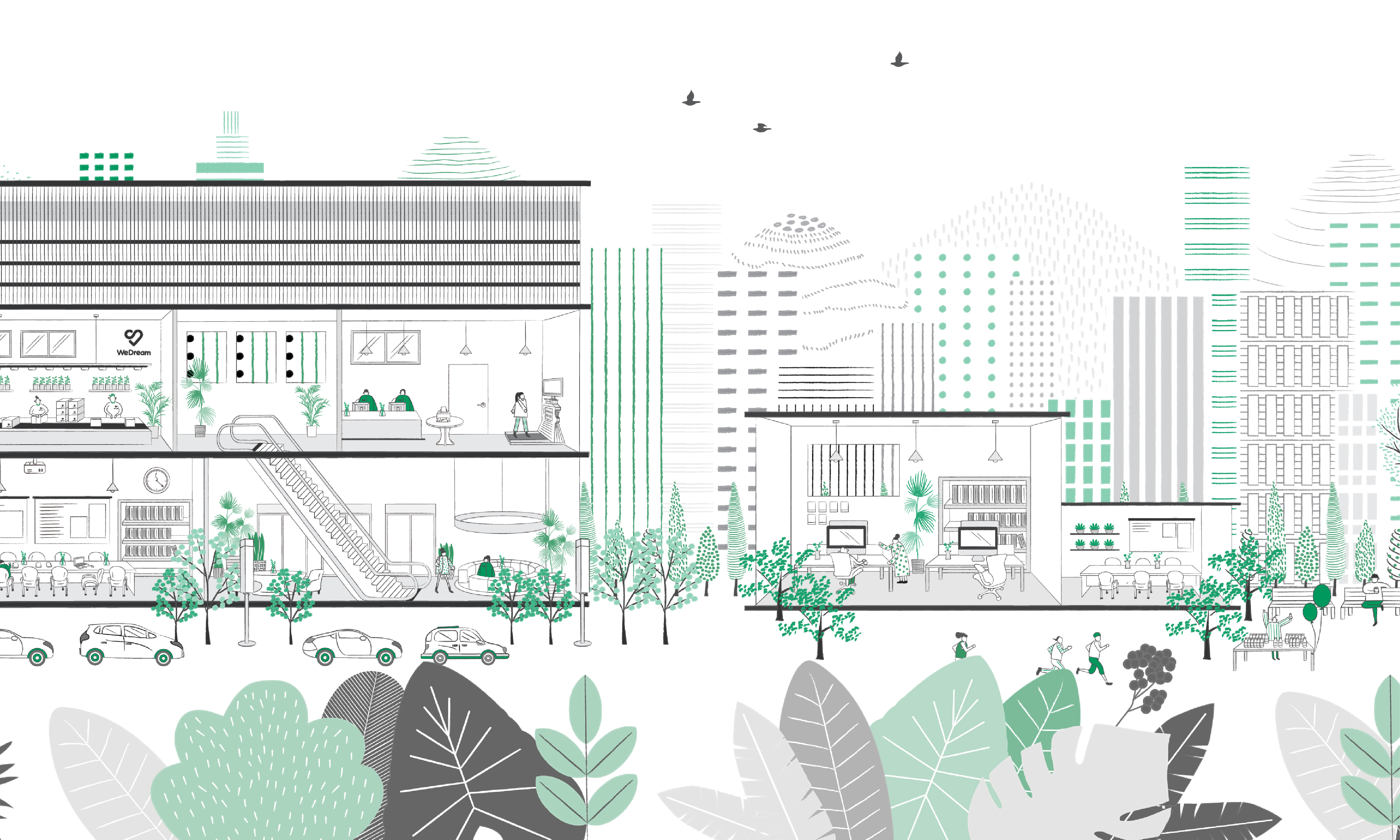
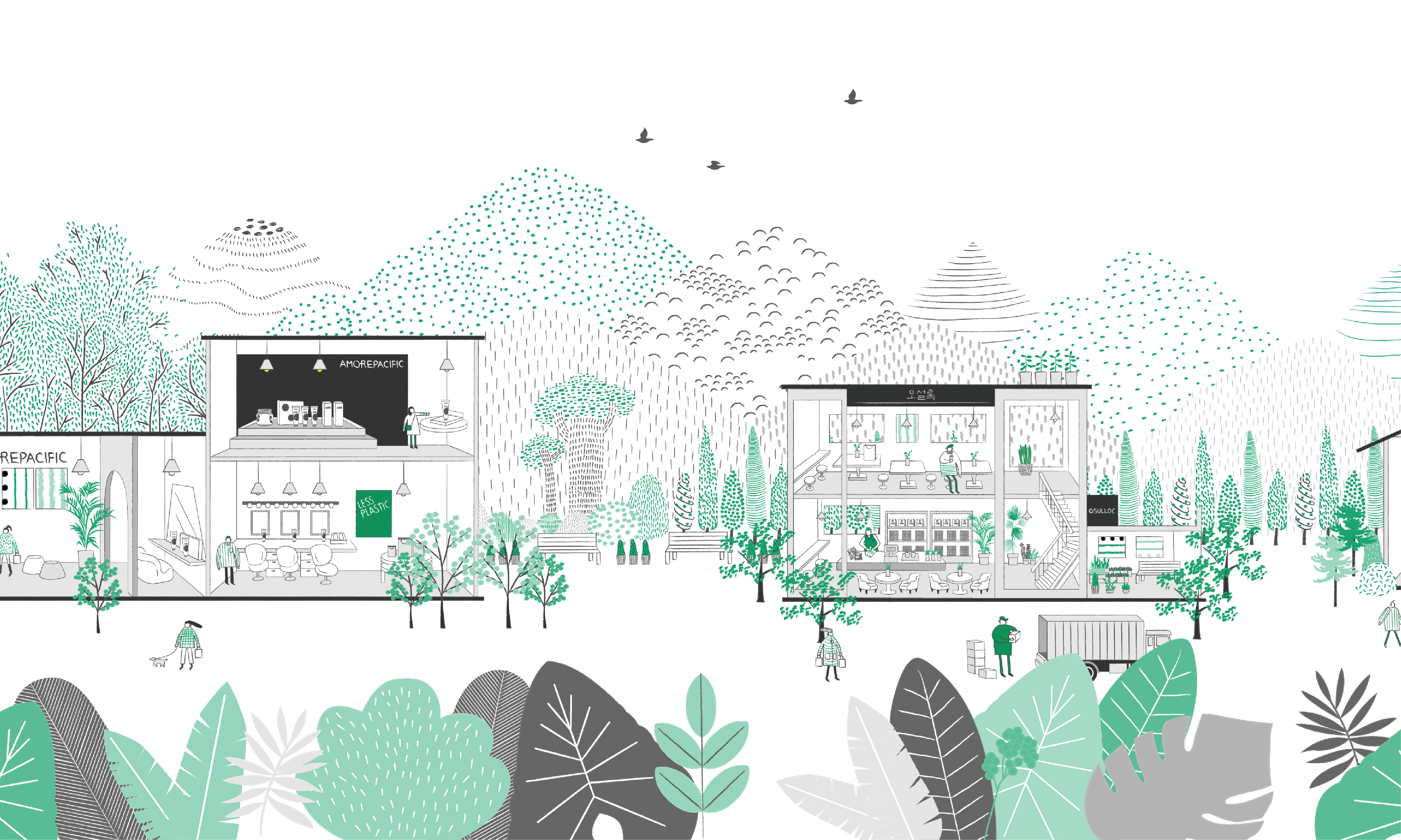
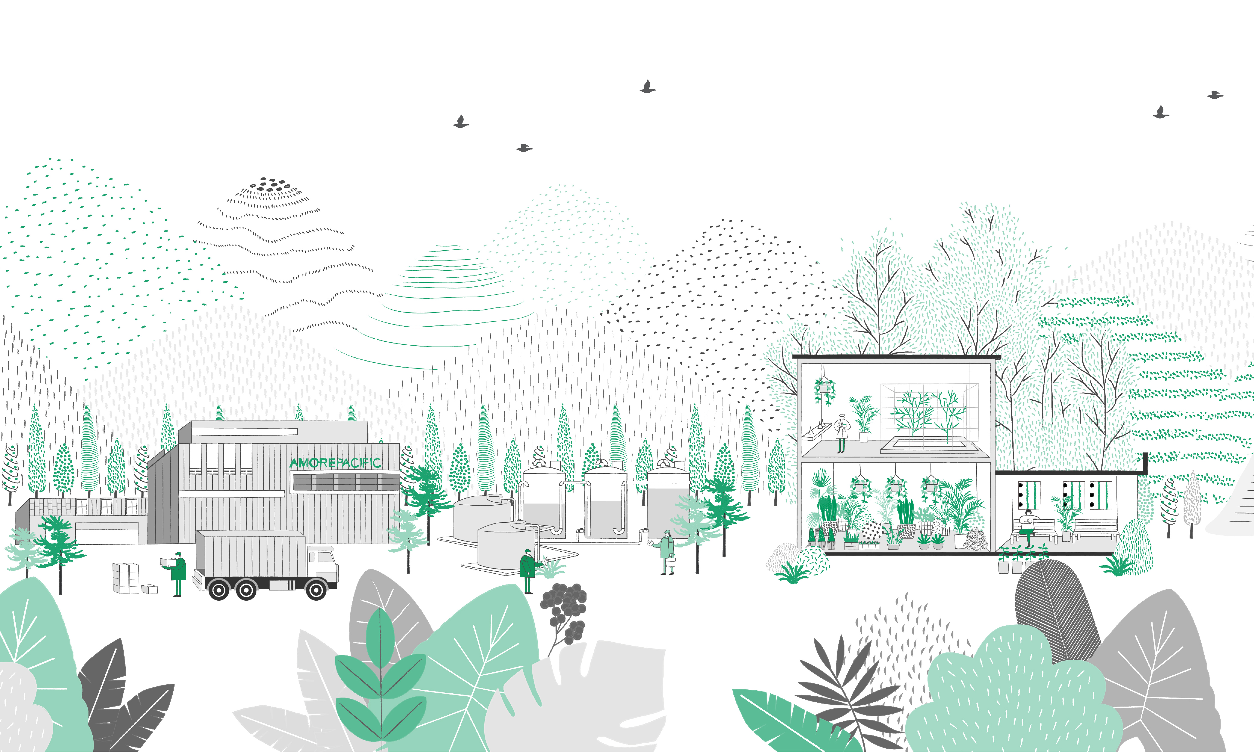
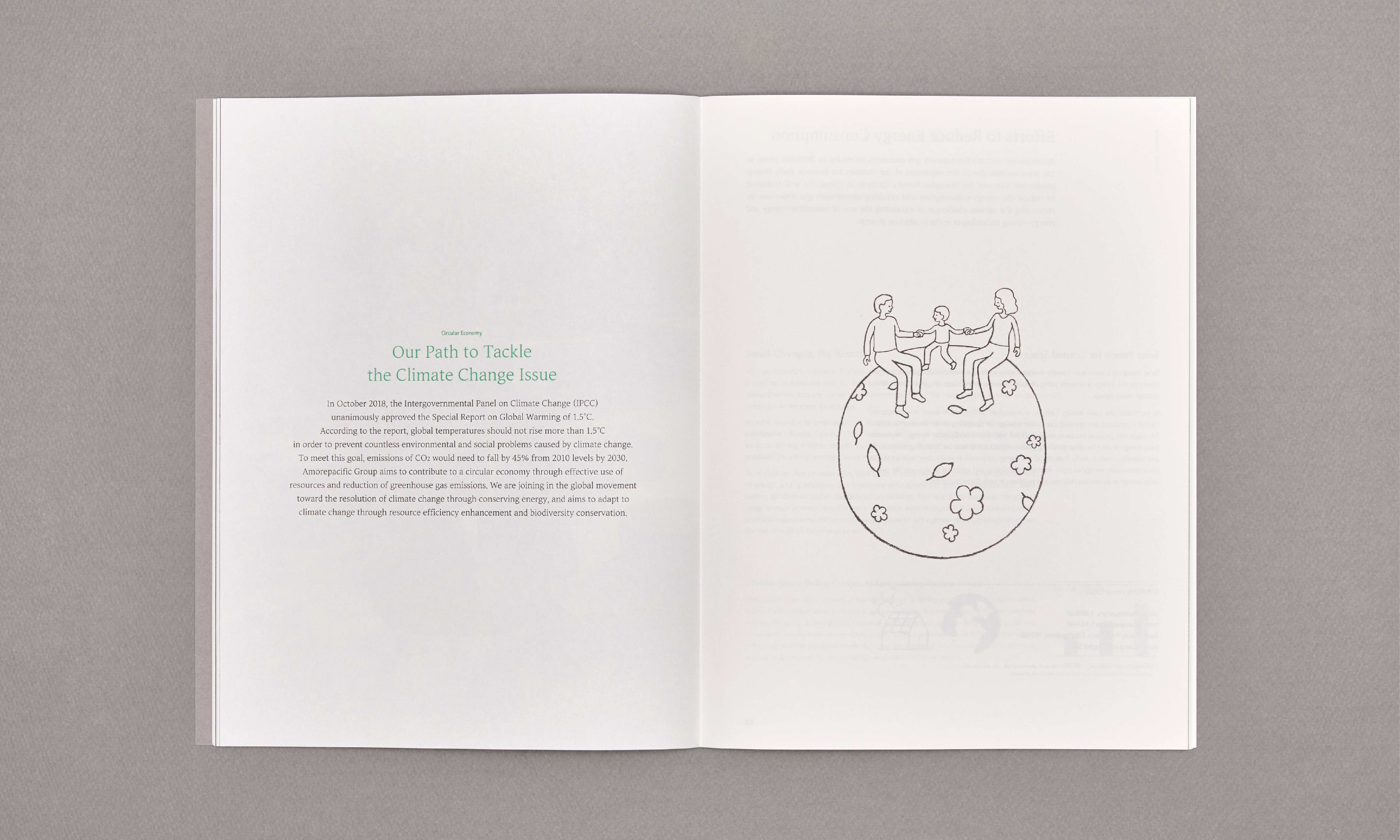
Warm illustrations that expand brand experience
To demonstrate AmorePacific's sustainable management attempts anywhere, we drew illustrations for three areas: the company's stores, workplaces, and factories.
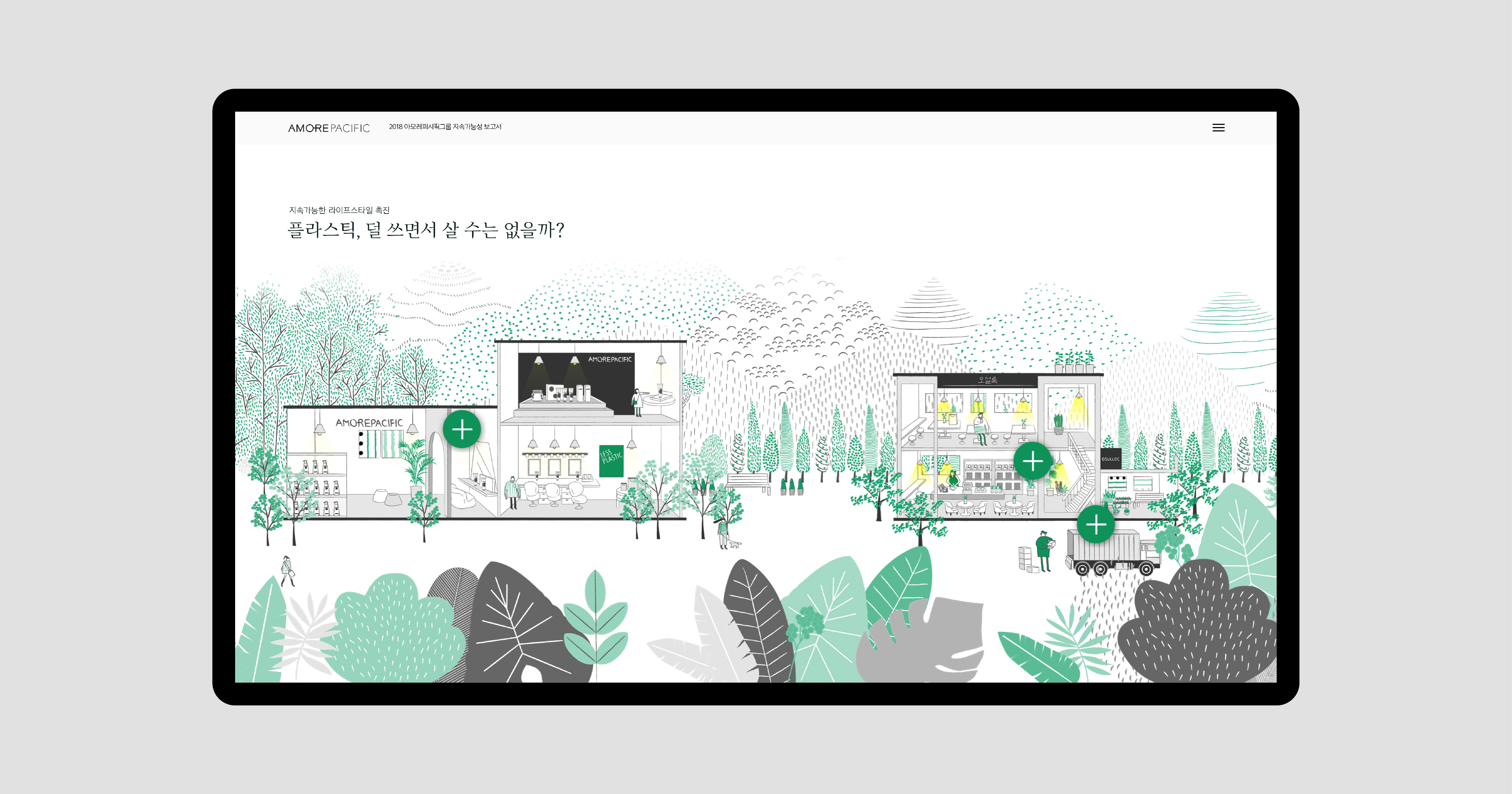
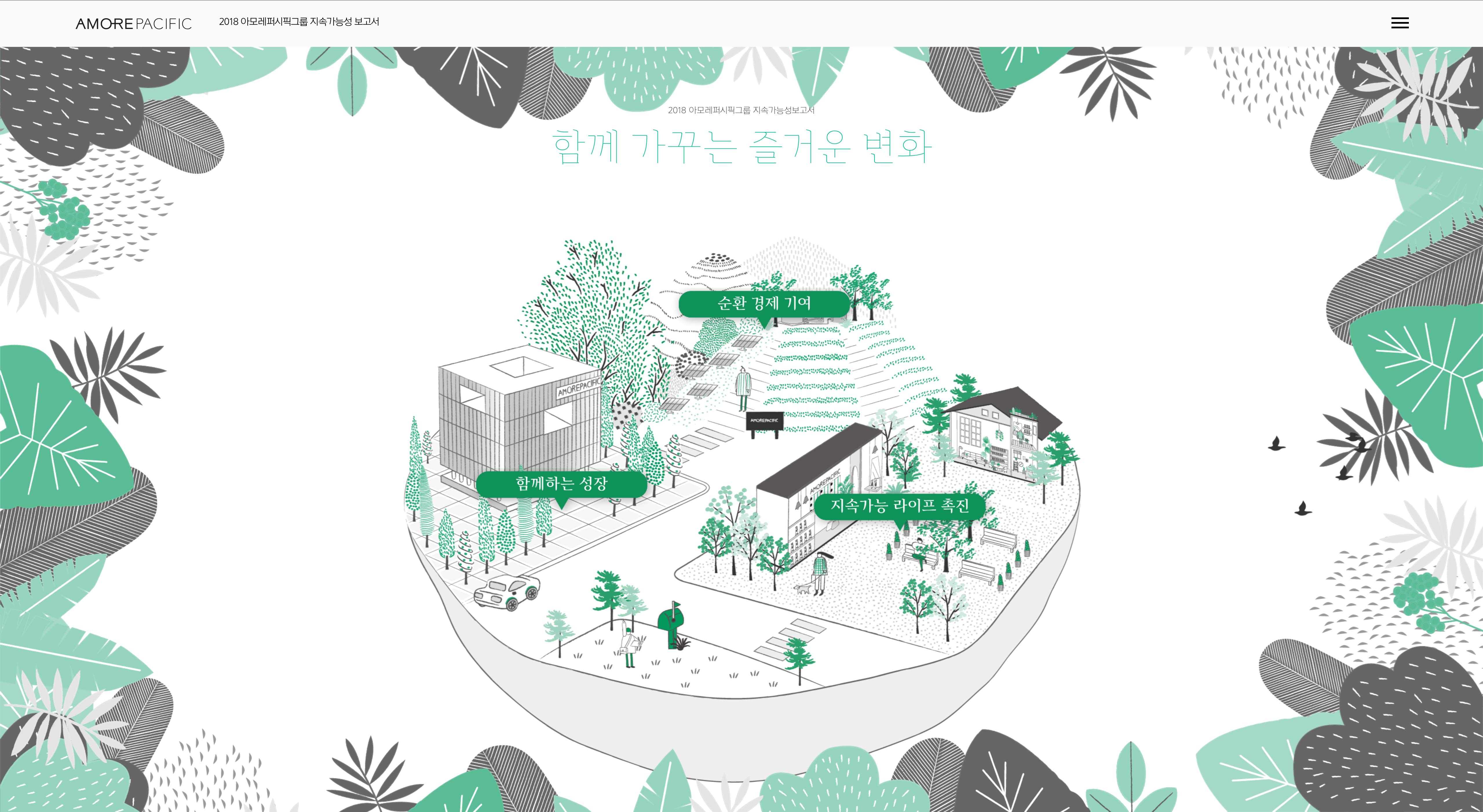
Brand experience that continues in digital environments
Sustainability report had also been created as a separate microsite to allow users to experience dynamic and three-dimensional experiences that cannot be felt in paper media.
Client |
Amorepacific |
Output |
Editorial, Web |
Year |
2019 |
Double D |
Minjae Huh, Sue Park, Chaehee Park, Mirinae Kim |