From Product-Centric to a Brand-Centric Identity Rooted in Science and Creativity
- packaging
- CI & BI
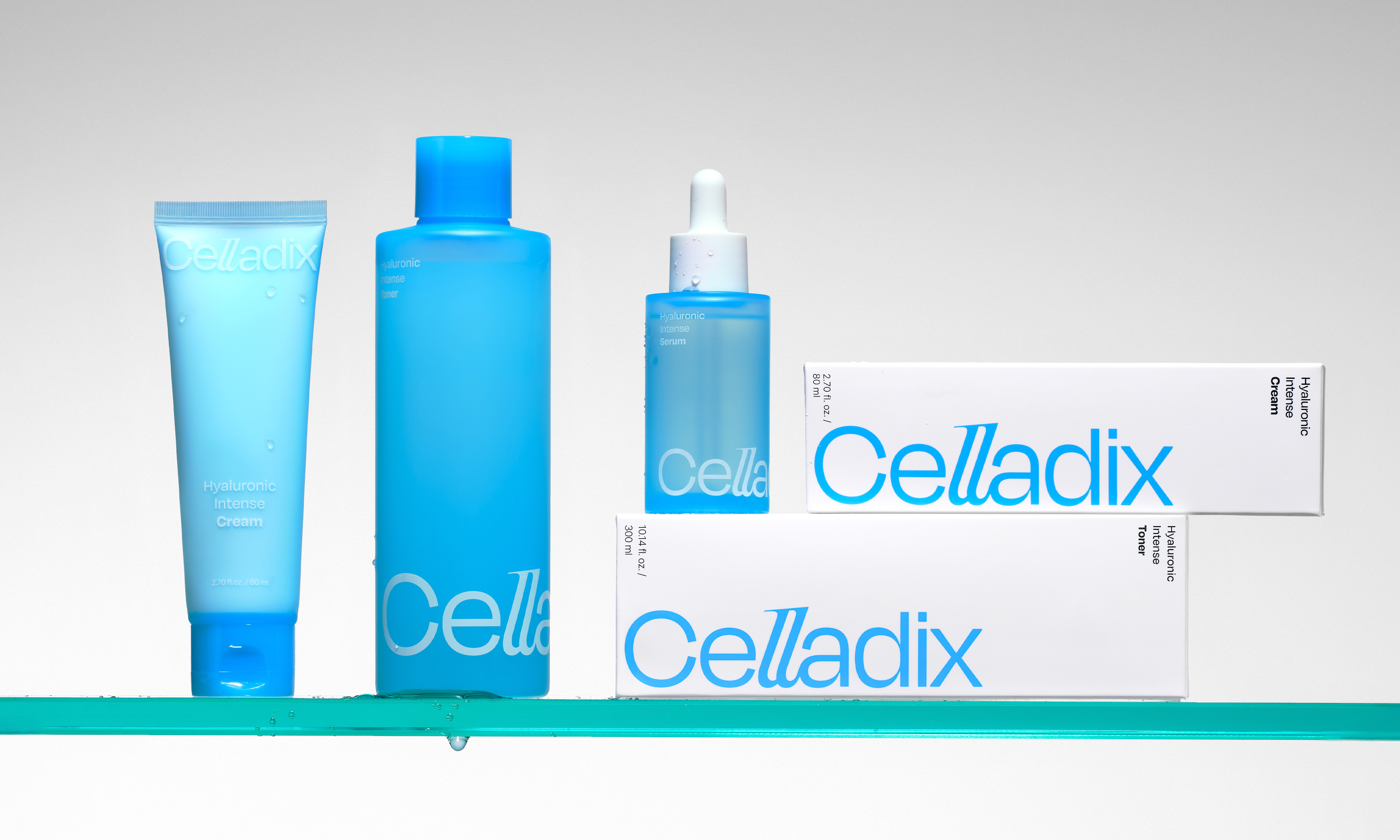
Celladix is a derma cosmetics brand that has grown through strong customer feedback and scientifically proven product performance. Despite the excellent quality, the brand struggled to convey a distinct identity in the market, with one popular item unintentionally standing in for the brand as a whole. Double D redefined the brand identity of Celladix by emphasizing its unique approach to product development through scientific research — ‘science-based creative solution’, and repositioned the brand as a true ‘Derma Creator’.
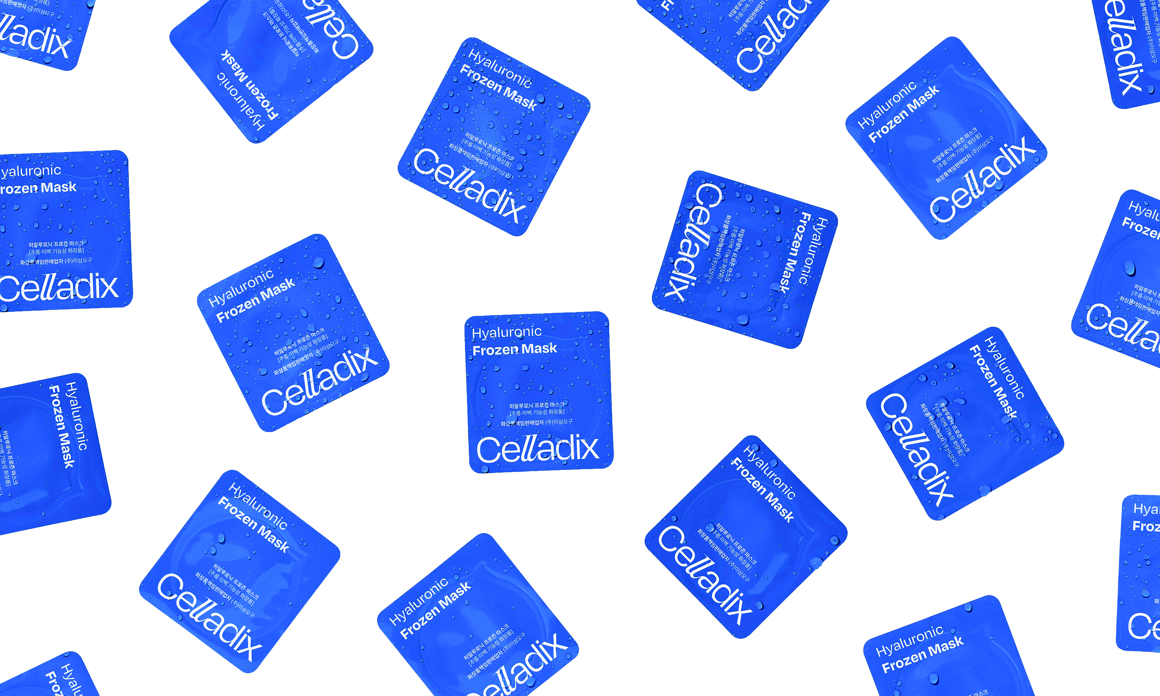
The wordmark begins with a circular and extended ‘C’, followed by the remaining letters in a smooth and refined curve, symbolizing the brand's creative and precise product development process. The typography system is reinforcing the brand's expertise in scientific research. A graphic motif, derived from the logo, visually expresses the brand's philosophy — ‘fundamental solutions from the cell level’. Inspired by cell division and expansion, the graphic pattern reflects the brand’s originality and problem-solving mindset, and is designed for flexible use across a wide range of applications.
A Flexible Graphic System Inspired by the Form of a Cell
The graphic motif derived from the logotype visually expresses Celladix's philosophy of providing a ‘fundamental derma solution from the cell level’. The pattern, which resembles cellular division and expansion, communicates the brand's originality and problem-solving approach.

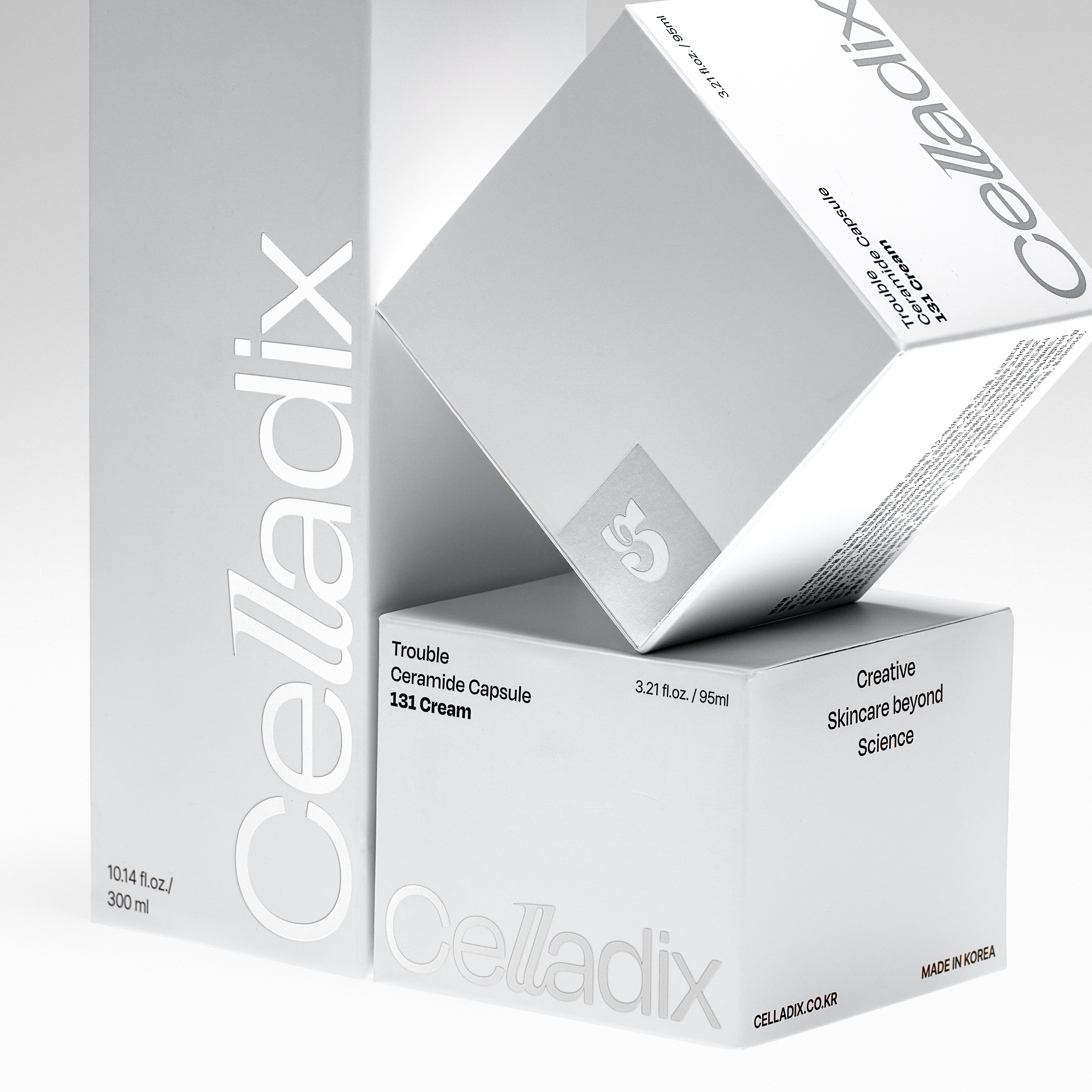
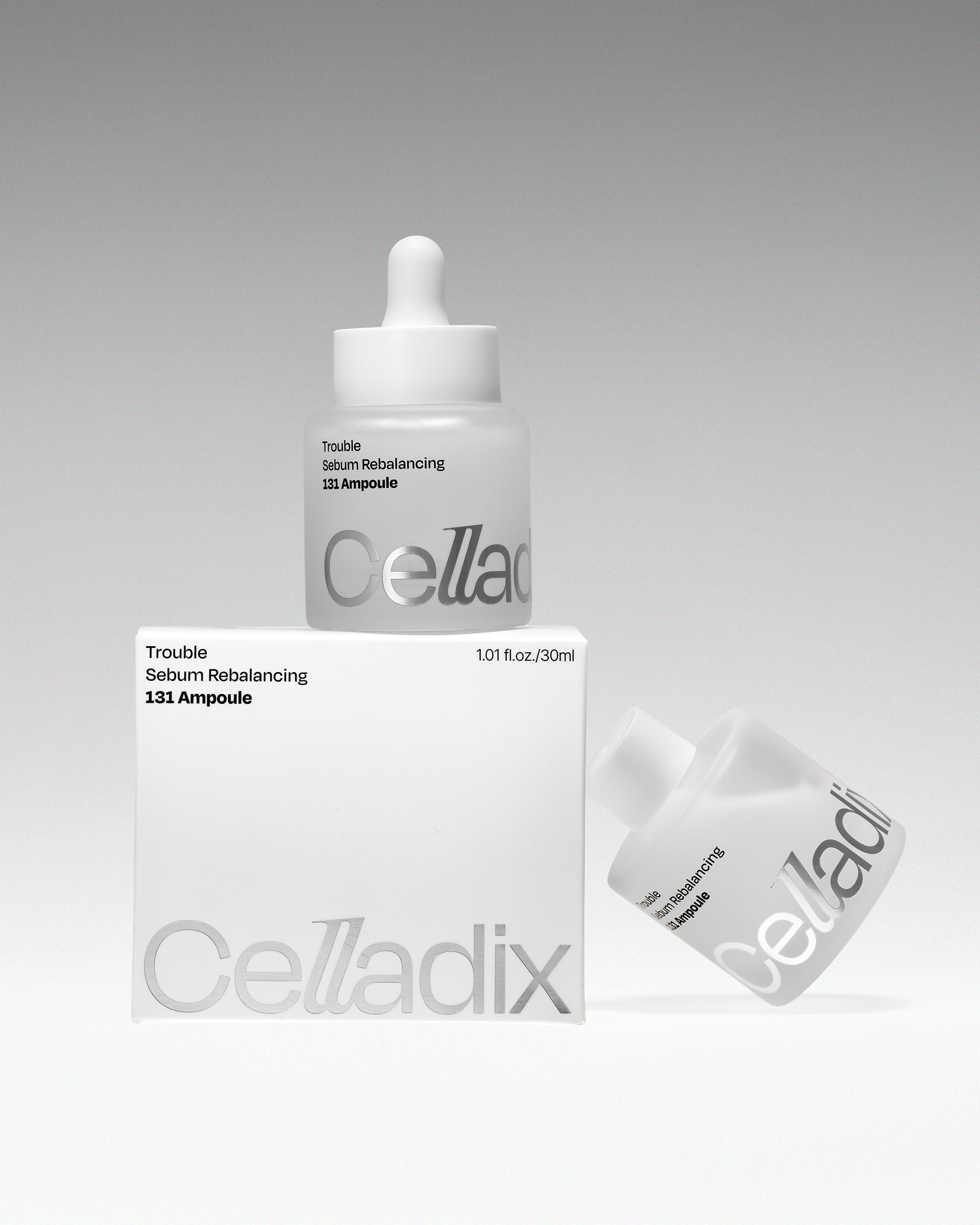
Double D developed a flexible yet consistent layout system that places the logotype and product information on the same plane in both vertical and horizontal layouts. In vertical layouts, the logo is positioned vertically along the right edge, while in horizontal layouts, it is placed at the bottom. This ensures visual consistency across a wide variety of formats.
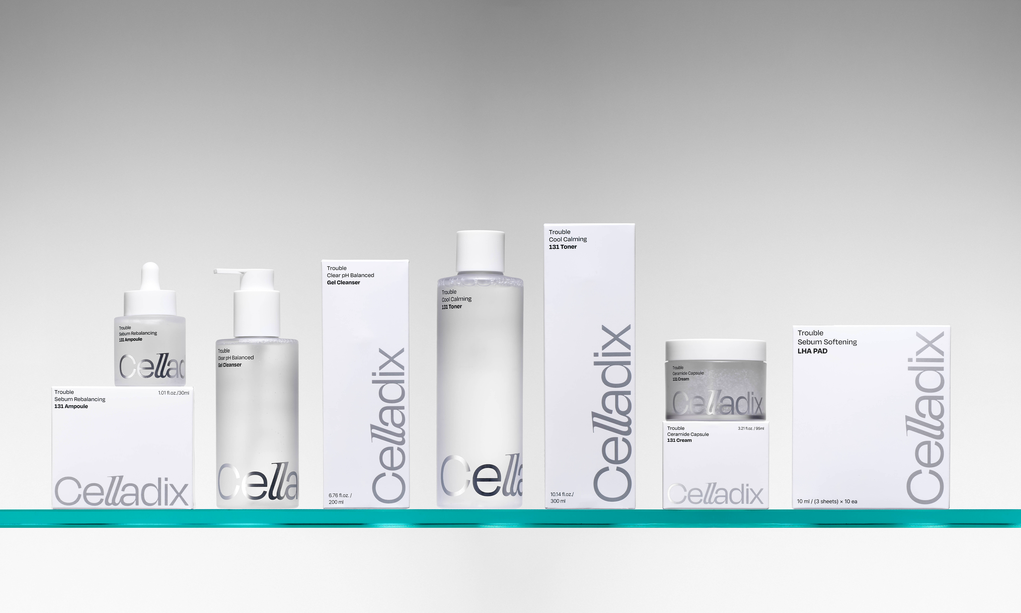

Category-Based Color & Material Guidelines
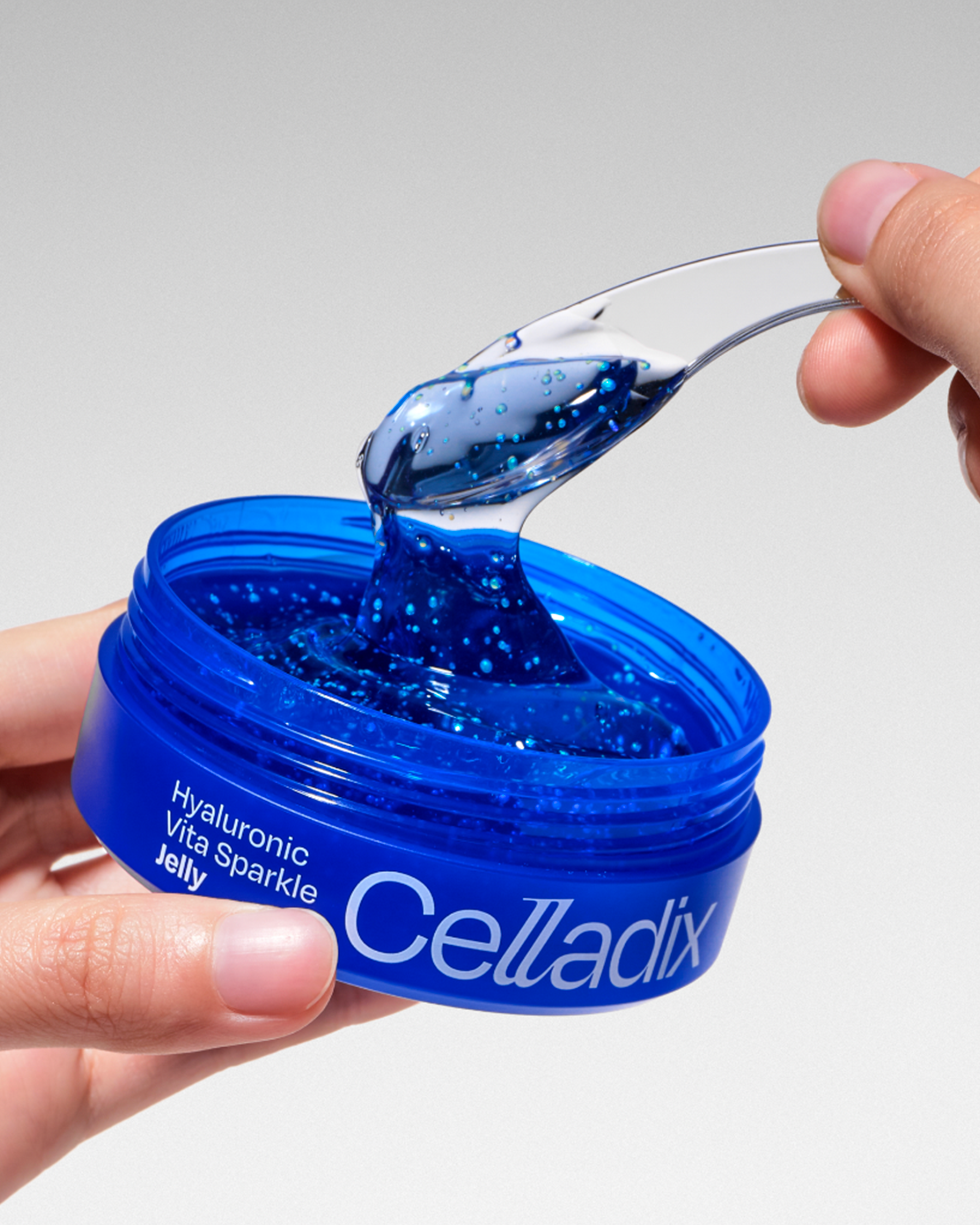
The color system covers three main product categories: Medical Derma, Daily Derma, and Anti-aging. Medical Derma products are represented by neutral blues to emphasize trust and expertise, while Daily Derma uses bright, vivid colors to convey a clean and refreshing image. Purple and glossy materials are used for Anti-aging products to create a functional and sophisticated impression. The color system clearly distinguishes each category, while a consistent layout applied across all packaging reinforces a unified and cohesive brand image.

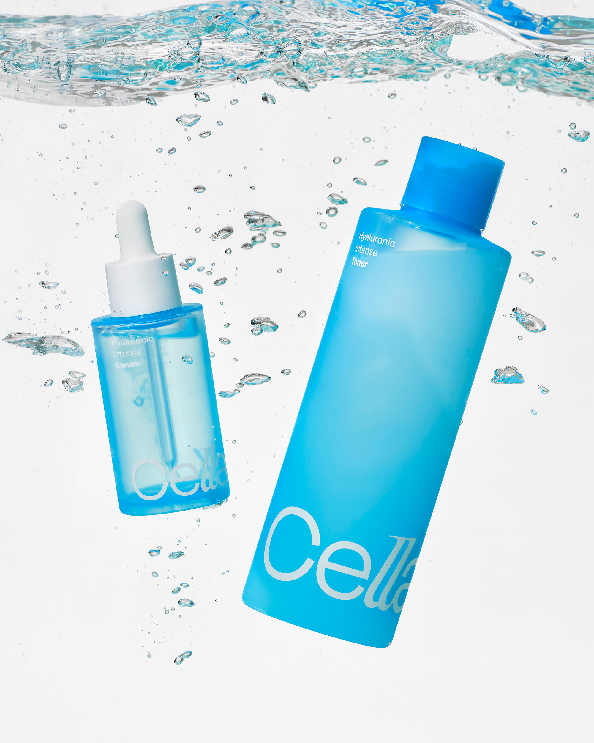
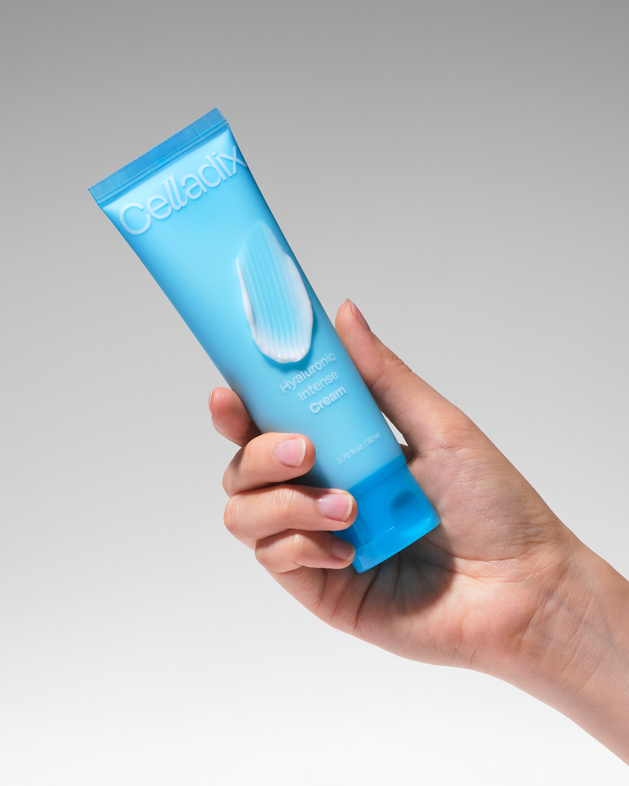
Through this project, Double D aimed to position Celladix as more than a brand with effective products — rather, as a brand with a unique presence in the derma cosmetics industry, grounded in scientific credibility. The new brand identity establishes a distinct presence that communicates both confidence and innovation, setting a new standard for what a derma cosmetics brand can represent.

Client |
Celladix |
Output |
Brand Identity, Brand Guideline, Packaging |
Year |
2024 |
Double D |
Minjae Huh, Eunyoo Moon, Soohyeon Lee, Oneseok Kang |