Designed key visuals and album packaging for ENHYPHEN's mini 2nd album BOARDER : CARNIVAL
- packaging
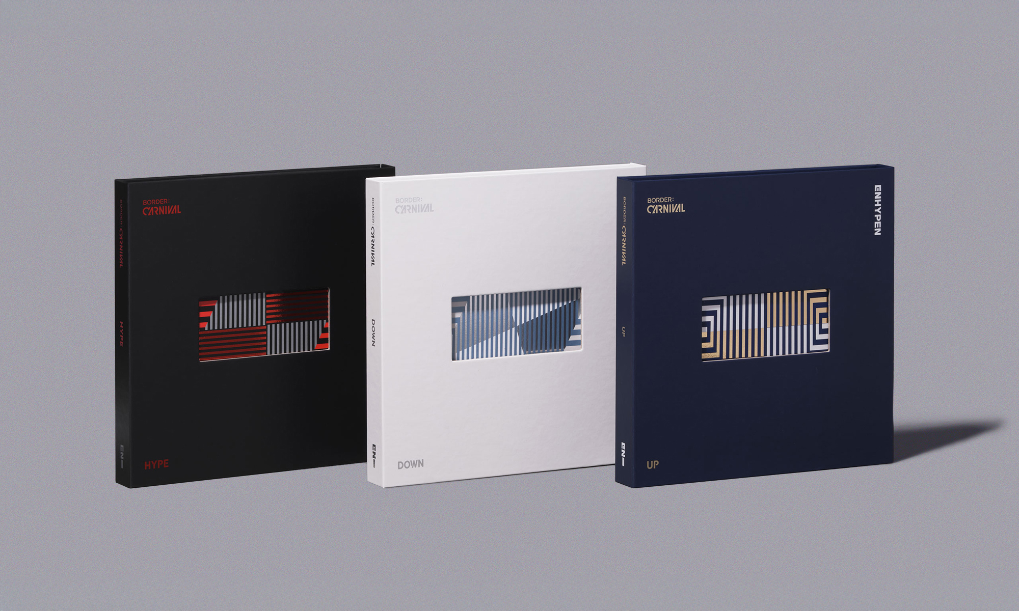
An album designed to be experienced as an epic structure
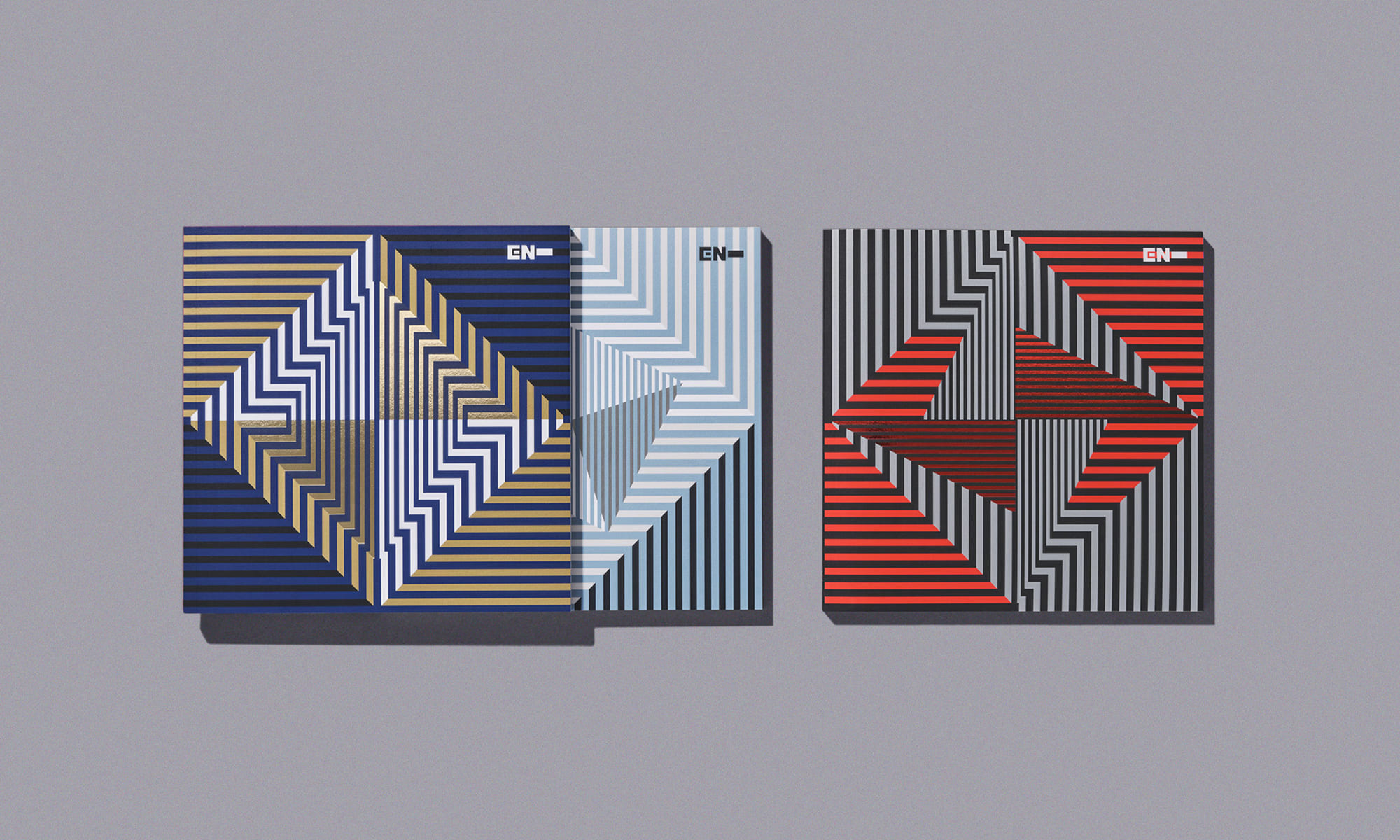
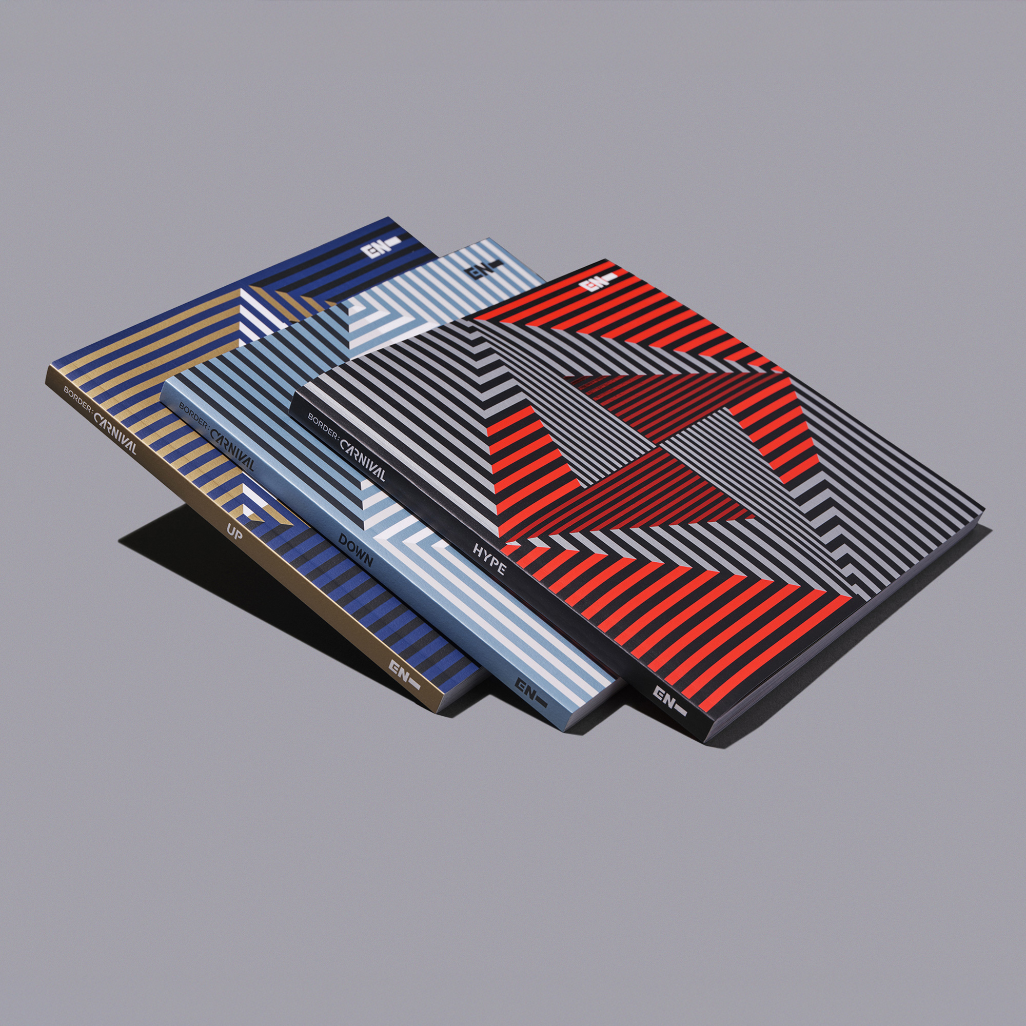
We designed the packaging for BELIFT LAB artist ENHYPEN's mini-sophomore album 'BORDER : CARNIVAL'. The album consists of three versions, UP, HYPE, and DOWN, each with three different visual looks. The emotions of 'UP–HYPE–DOWN' that ENHYPEN's boys go through at the carnival have a narrative structure of 'rising and falling' or 'entering and leaving'. Each narrative is organically connected, and the package structure is designed to let the user experience the emotional changes of the boys directly through the depth of the package.
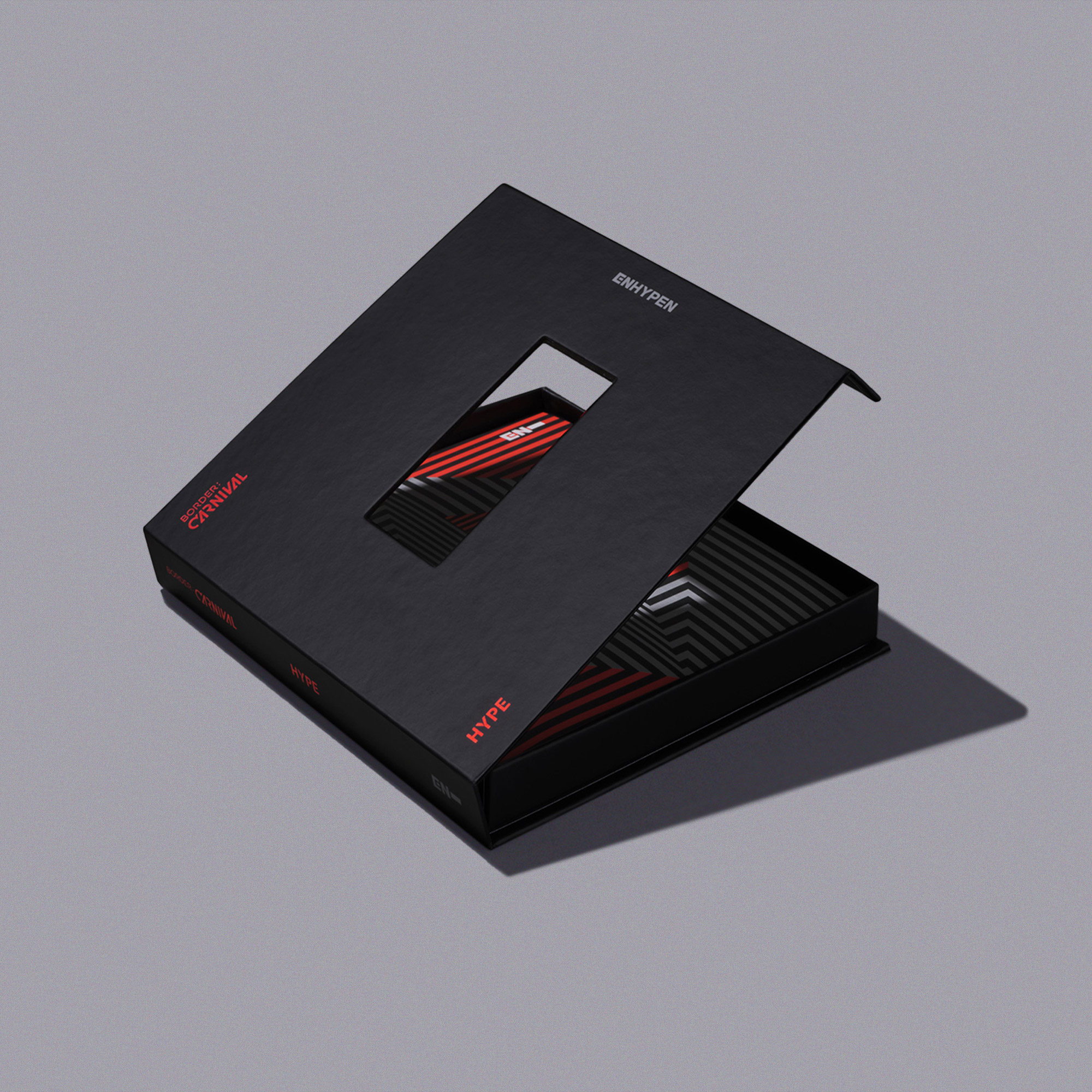
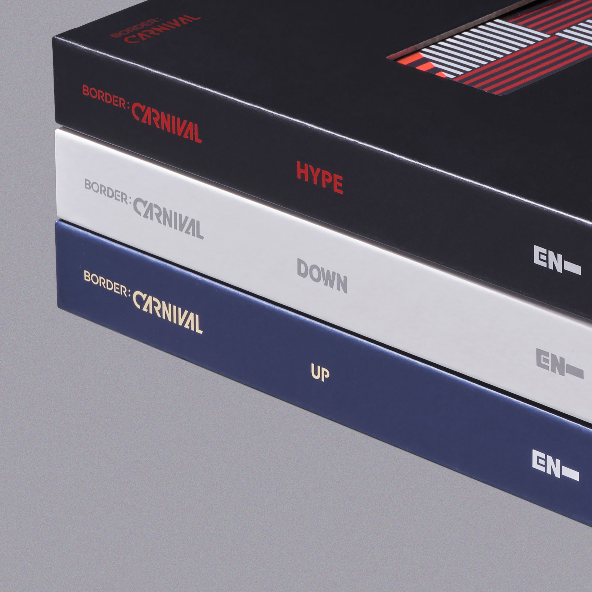
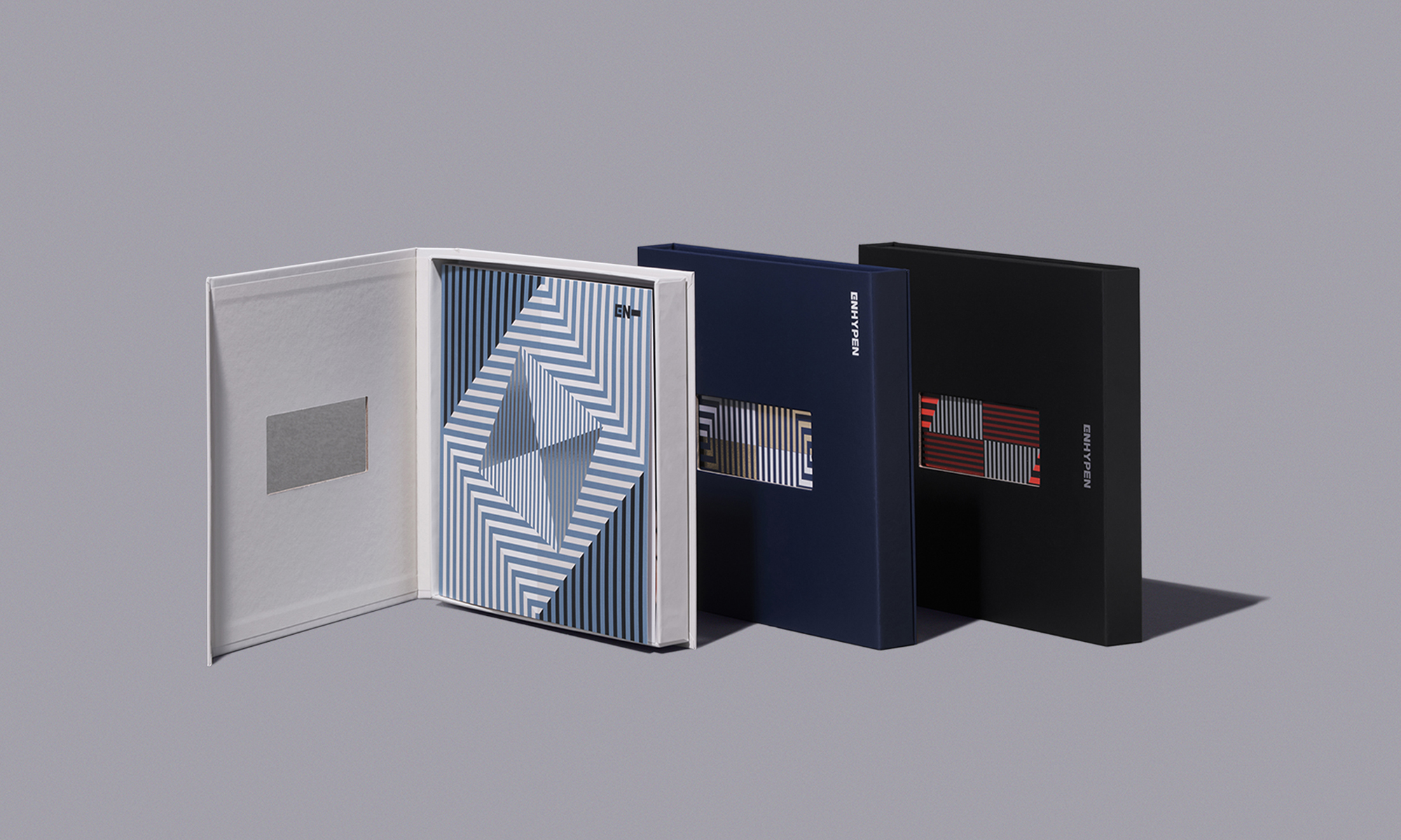
Packaging structure for immersion
We designed the structure and physicality of the album to immerse you in the stages of the carnival that each concept represents and the unique emotions that come with them. The graphics on the front and back of the package hint at and tie together the internal structure of entering each stage of the carnival. In addition, the album cover is pierced with ENHYPEN's symbol, revealing only a small portion of the graphic on the inside to encourage fans' curiosity.

A mutating striped graphic motif
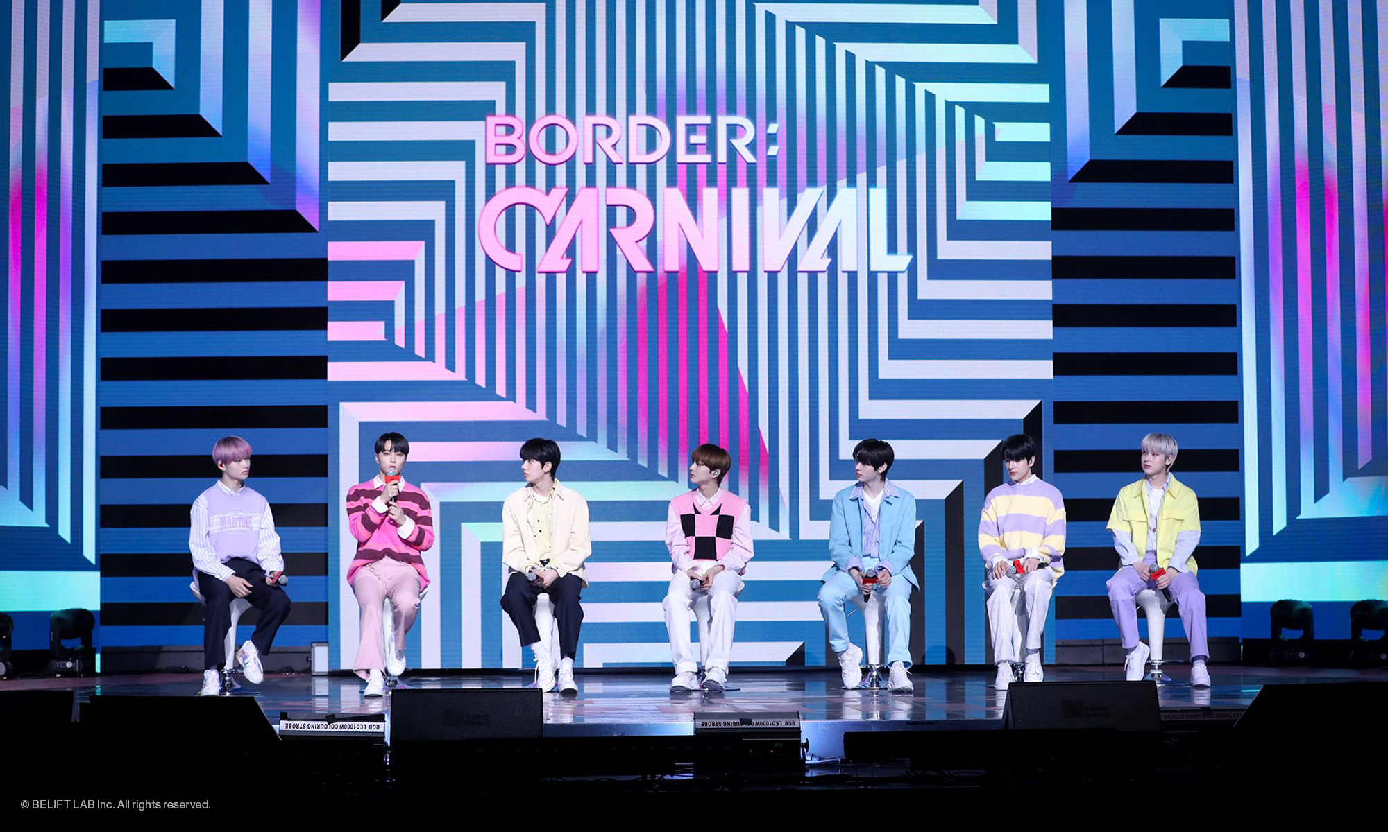
The stripe pattern on the photobook cover symbolizes a maze of confusion and functions as a graphic motif that mutates into different shapes and colors in each version. This graphic motif was applied consistently across the various components of the album, including the photobook, lyric book, and photocards.
UP: Boys in a new world
The boys' gaze toward themselves and the confidence they feel as they enter a new world after leaving a world of intense competition. The bewilderment and surprise of taking the first step across the boundary is captured in the muted colors of the front cover, which opens to reveal a portal beyond the boundary and a curved graphic of a spacious driveway.
HYPE: A day in the life of a boy in a perfect, colorful world
The HYPE version captures a day in the life of a group of boys who have just stepped over the line and into a perfect, colorful world where all the rules are gone, where everything is upside down, and where ecstasy and seemingly never-ending festivities unfold. The confidence and ecstasy of being the protagonists is captured in the forward-thinking graphics, with a strong red and dark gray two-tone contrast.
DOWN: Bewilderment at an unbelievable, seemingly never-ending reality
In the DOWN version, we switched gears to express the bewilderment of an unbelievable, seemingly never-ending reality. Chaos, subversion, and disintegration are the main keywords of DOWN, and we visualized the boys' confused emotions through the repetition and superimposition of square frames with warped perspective. The world where time seems to have stopped and rules have become blurred is finished off with a blue-toned gray variation and attractive silver foil.
Client |
BELIFT LAB |
Output |
Editorial, Key Visual, Packaging |
Year |
2021 |
Double D |
Minjae Huh, Kyungmi Jun, Kay Kwon, Yena Ahn, Daebong Jeong, Suhyun Han, Jaeyeon Jung |