New brand identity system and CI manual design for Hyundai Mobis to transform into a future mobility company
- CI & BI
- brand system
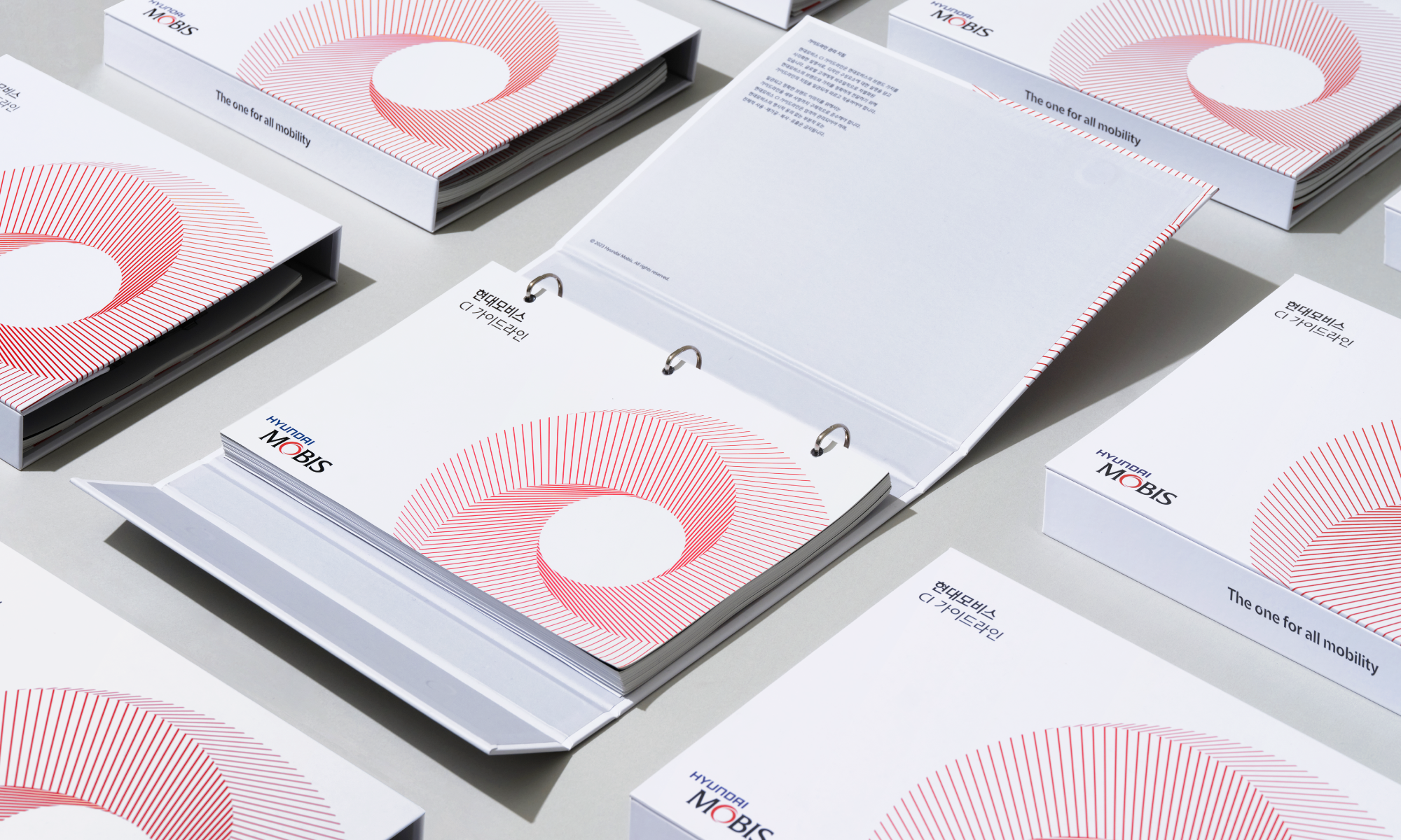
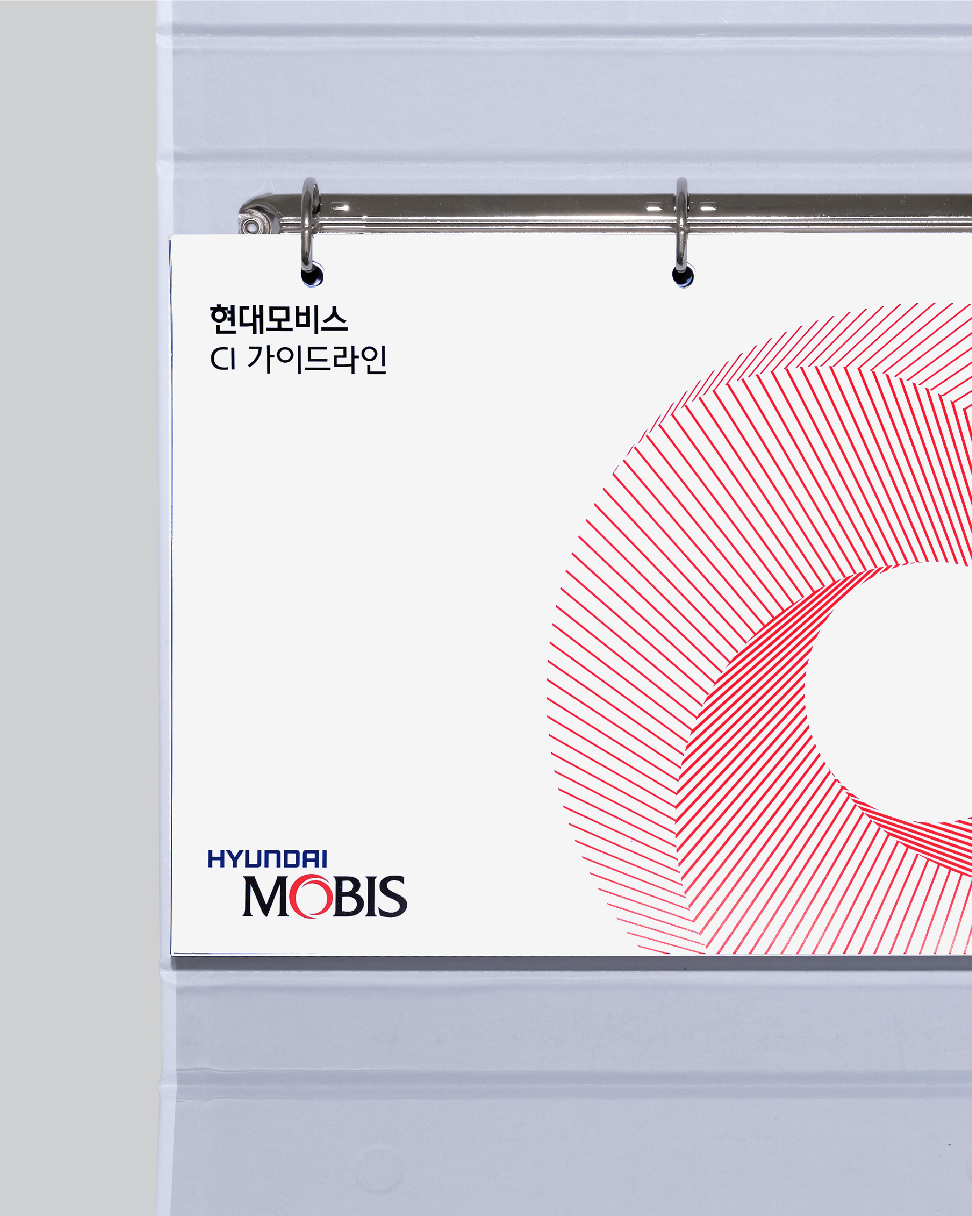
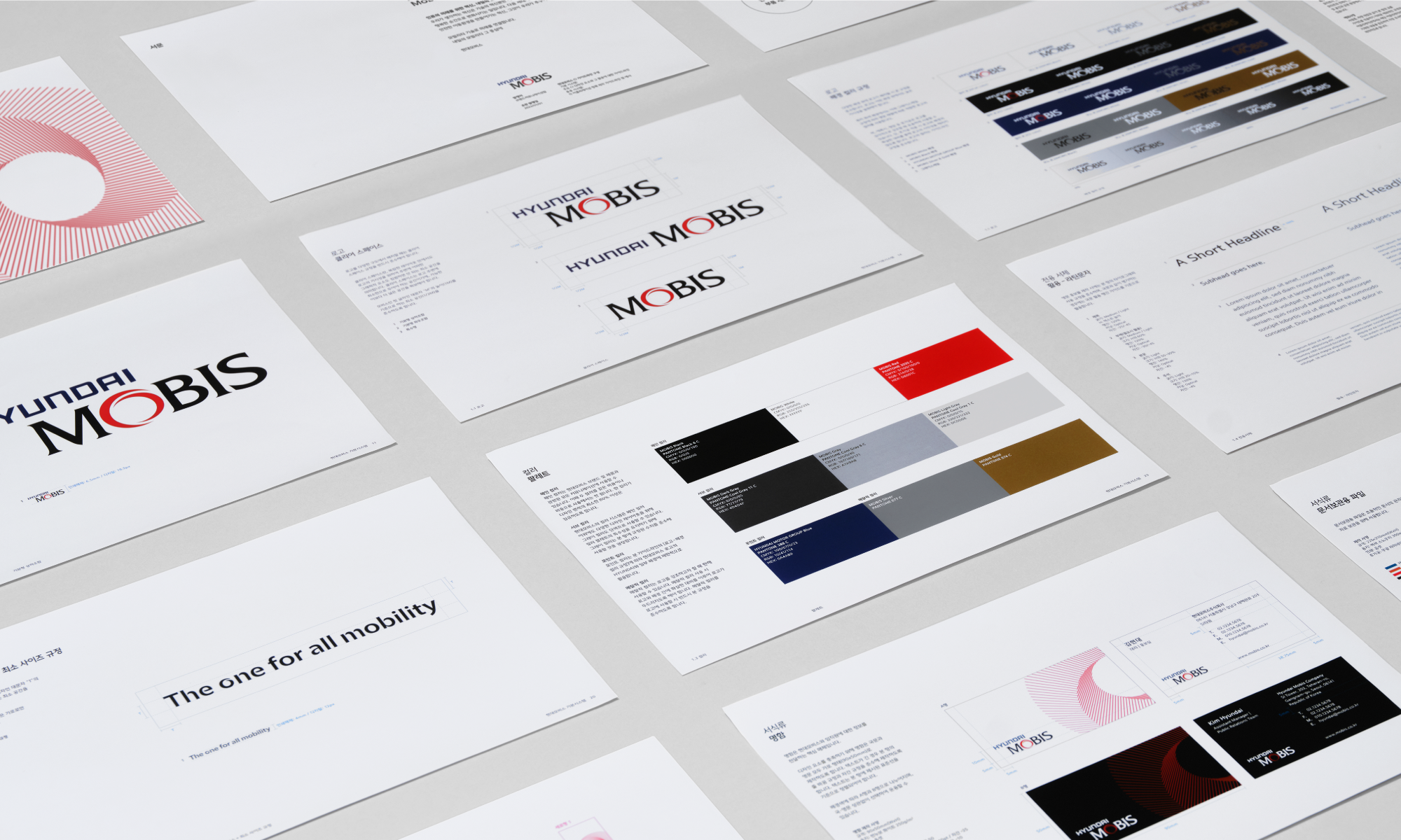
The motif of Hyundai Mobis represents the Integrated Excellence of Hyundai Mobis, symbolizing its core technological capabilities, including software and hardware, with intersecting lines rotating together in a cohesive form.
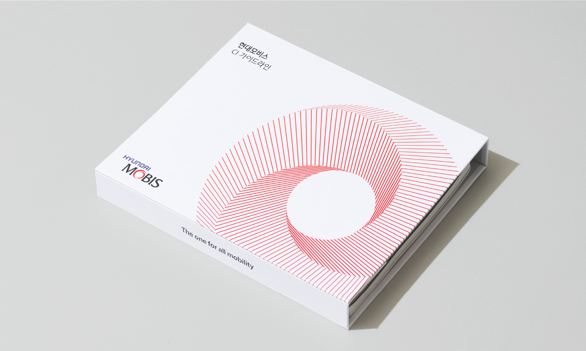

The slogan, "The one for all mobility," which encapsulates Hyundai Mobis's vision, was crafted based on the visual characteristics of the letter 'O' in the Hyundai Mobis logo, symbolizing propulsion.
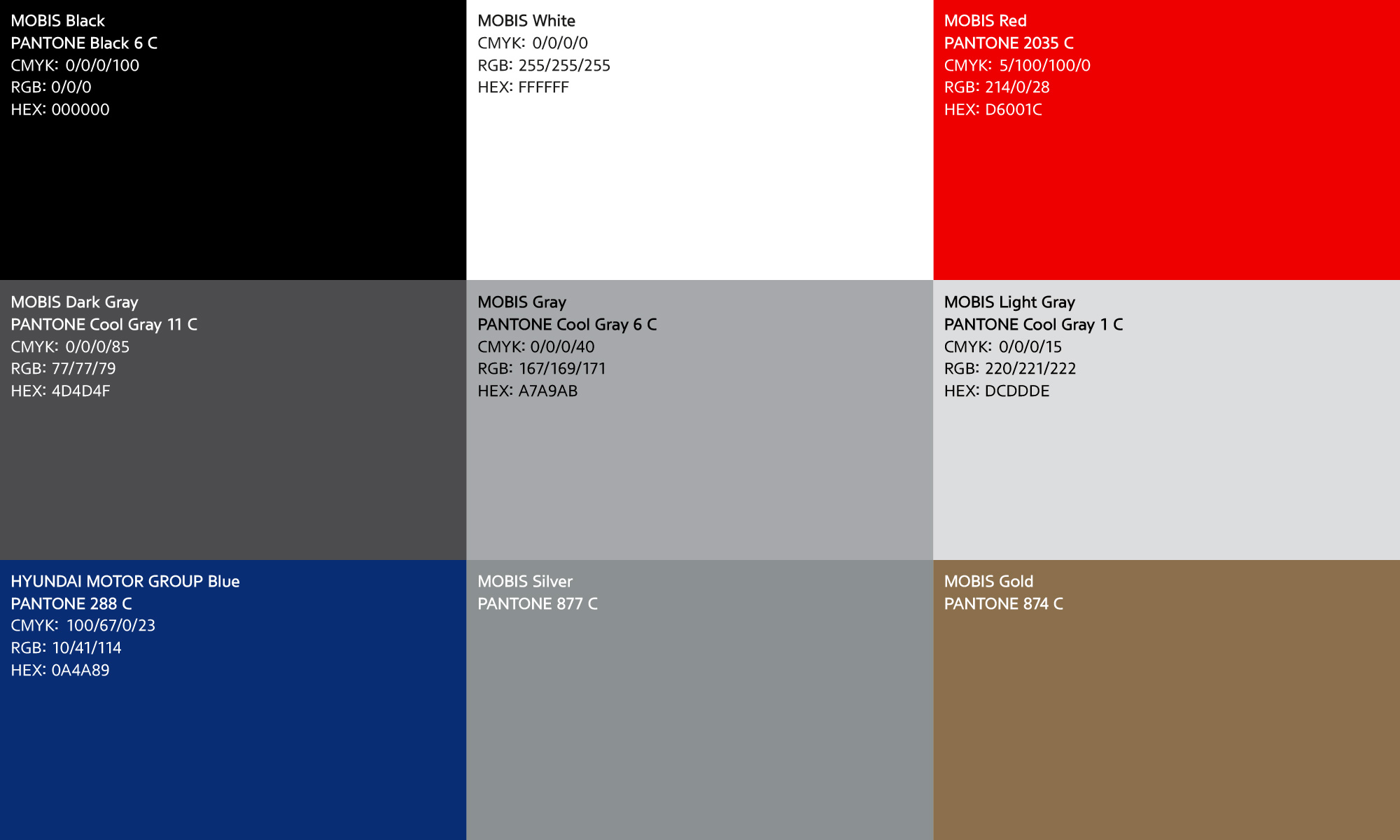

Hyundai Mobis' color system comprises Black, White, and Red. Black symbolizes Hyundai Mobis' innovation and cutting-edge hardware technology, while White represents its relentless software-driven challenges and experimental spirit. The previous Red, characterized by a dark saturation, has been replaced with a new Mobis Red, which embodies natural clarity and gentle humanity, reflecting Hyundai Mobis' challenges and innovation.

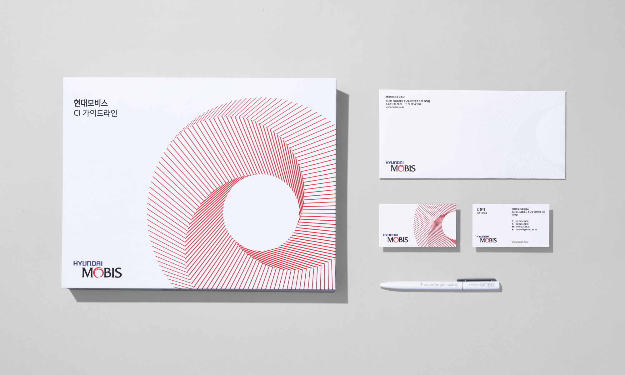
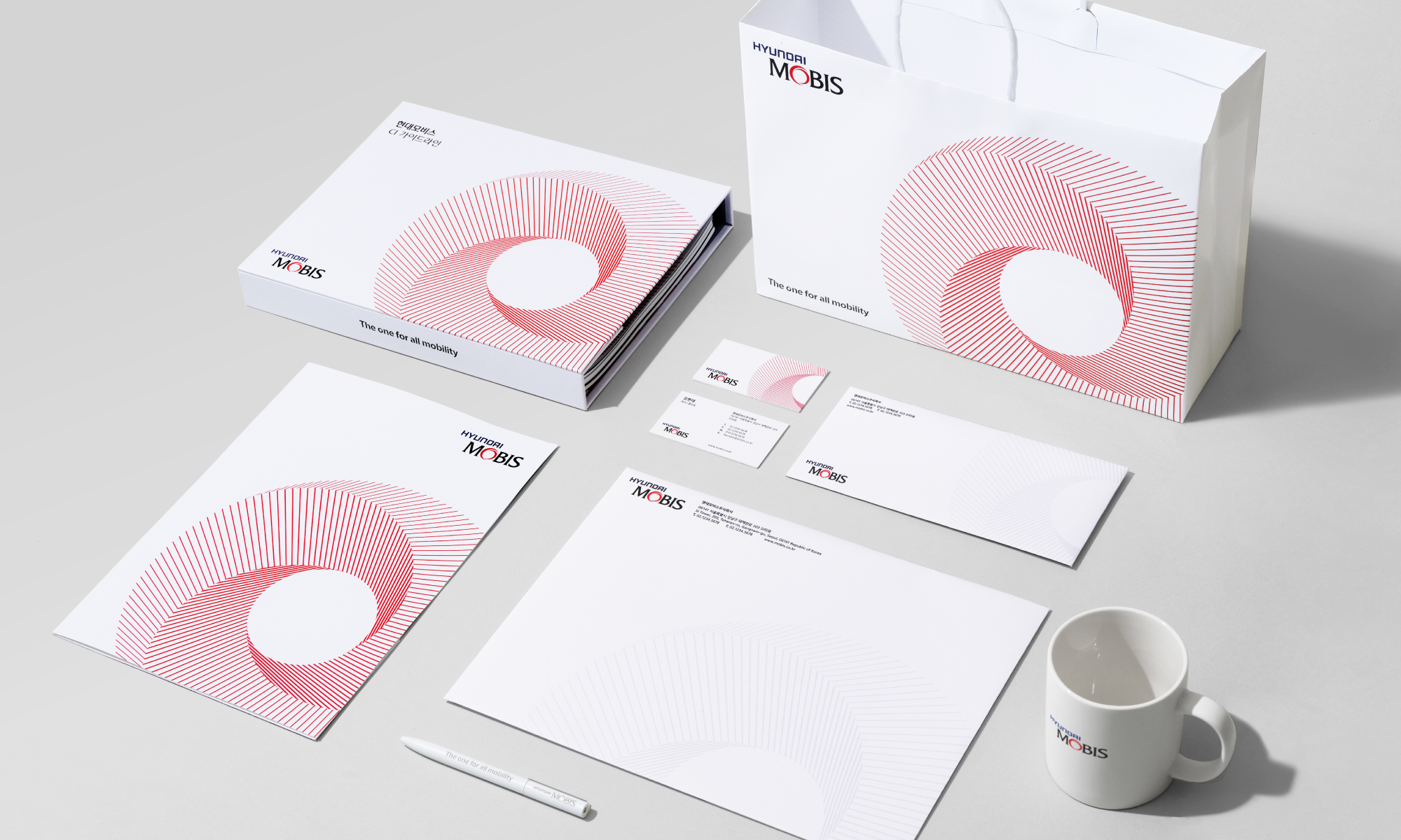
From stationery to vehicle decals, we specified the application of graphic motifs, brand colors, and other brand elements across different visual communication channels, enabling consistent brand representation both internally and externally.
Client |
Hyundai Mobis |
Output |
Brand System Guidelines, Brand Application, Brand Film |
Year |
2022 |
Double D |
Minjae Huh, Junbeom Woo, Jumyoung Lee, Juyeon Park |
Collaborator |
Kay Kwon(Design Participation), Bon Min(Typeface) |