An iconic brand in gum health care, Insadol’s logo and packaging
- packaging
- CI & BI

Keeping up with the trend, while respecting the brand heritage
Insadol, launched by Dongkook Pharmaceutical in 1978, is Korea’s leading gum treatment brand. Since its debut, it has consistently been the top-of-mind name in the category. In 2014, Insadol Plus was introduced with enhanced herbal ingredients, expanding consumer choice and solidifying support among older generations.
As cultural tastes evolved, the brand needed to connect with a younger-minded middle-aged audience. In response, Double D led a comprehensive identity refresh for Insadol and Insadol Plus, redesigning the logo and packaging for both domestic and global markets.
Traditional elements, reworked for clarity
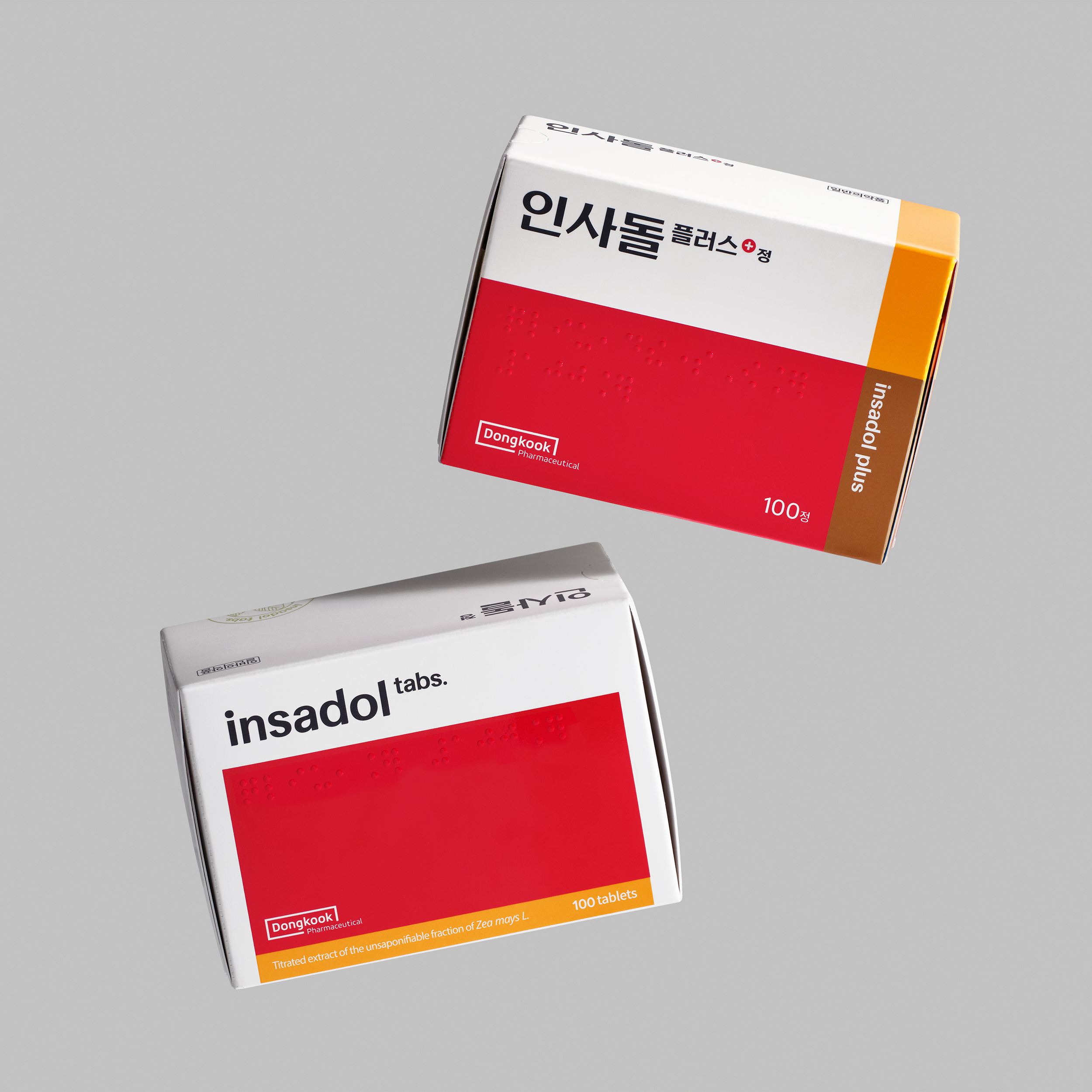
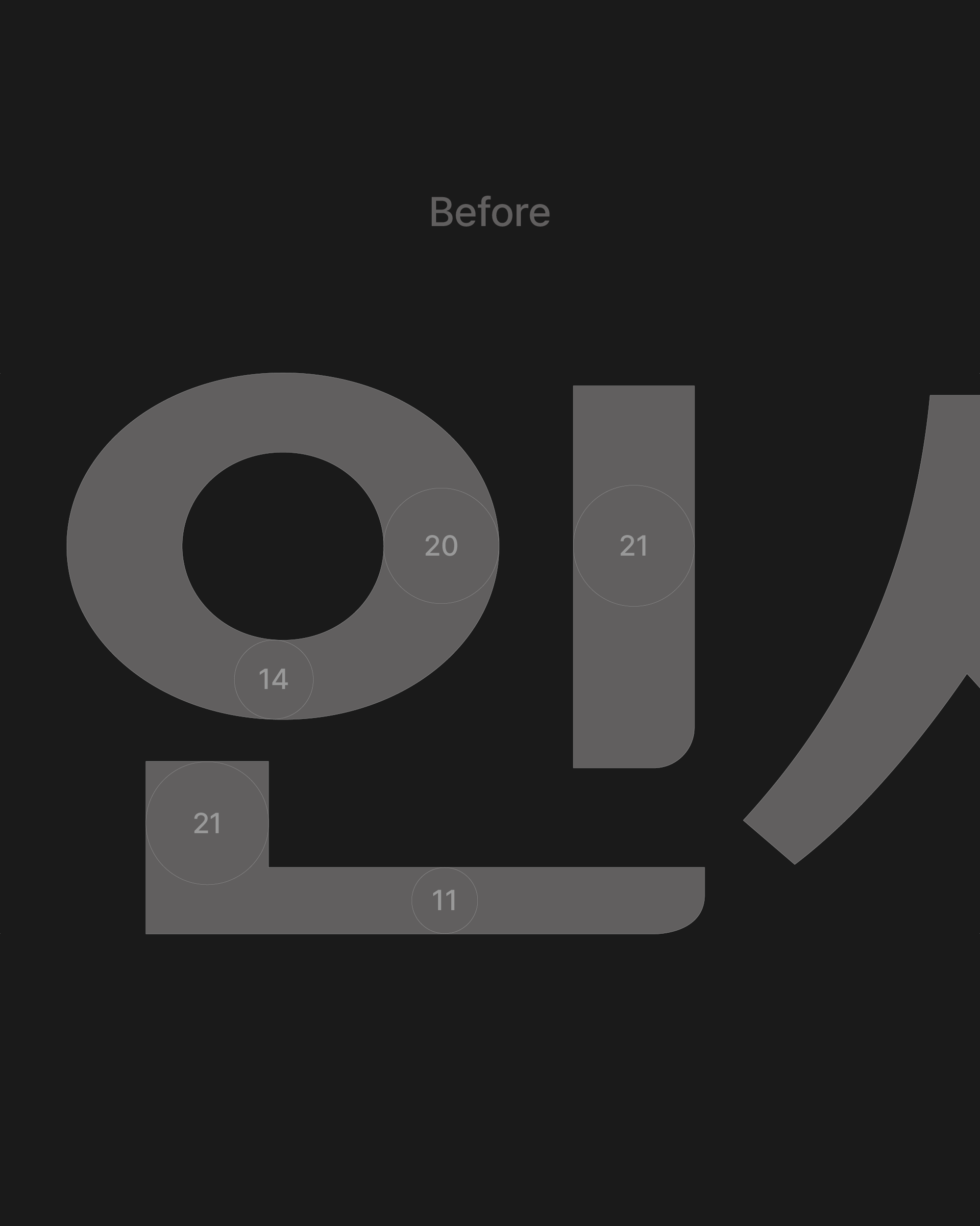
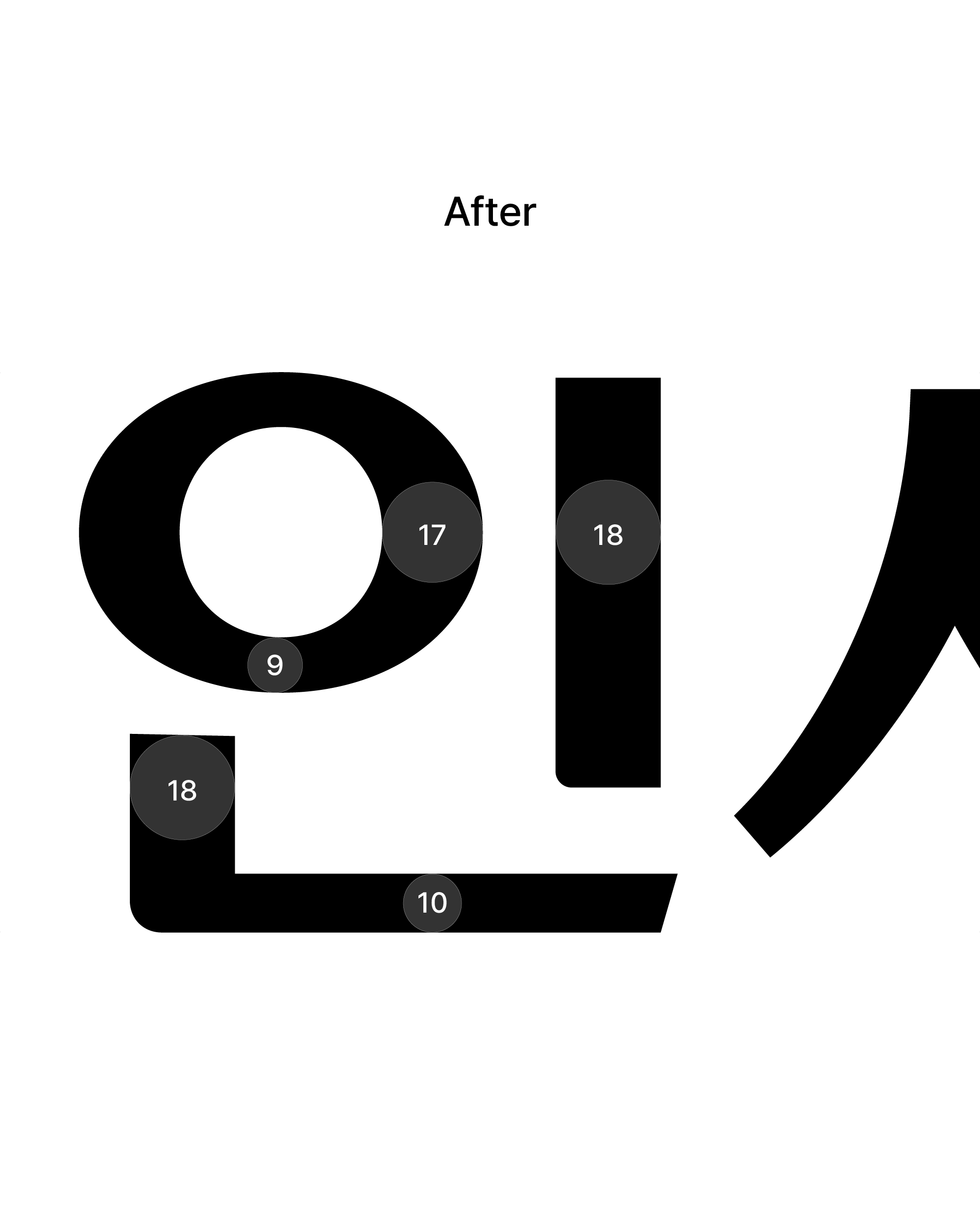
The new logo preserves Insadol’s iconic “pen nib” stroke, honoring its heritage while adding clarity and a more youthful tone through refined Korean and English wordmarks.
A new interpretation of the original divided layout
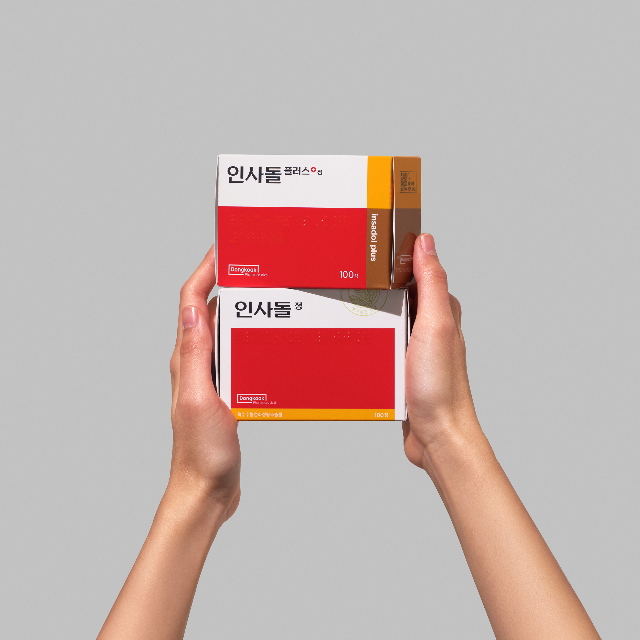
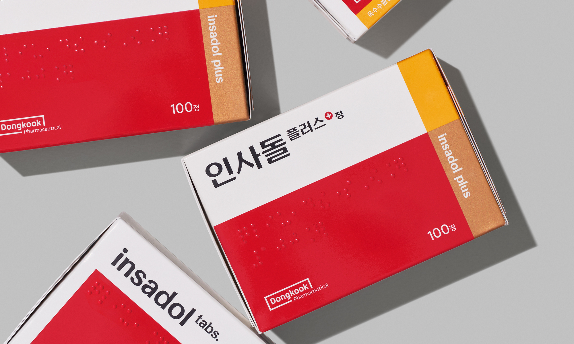
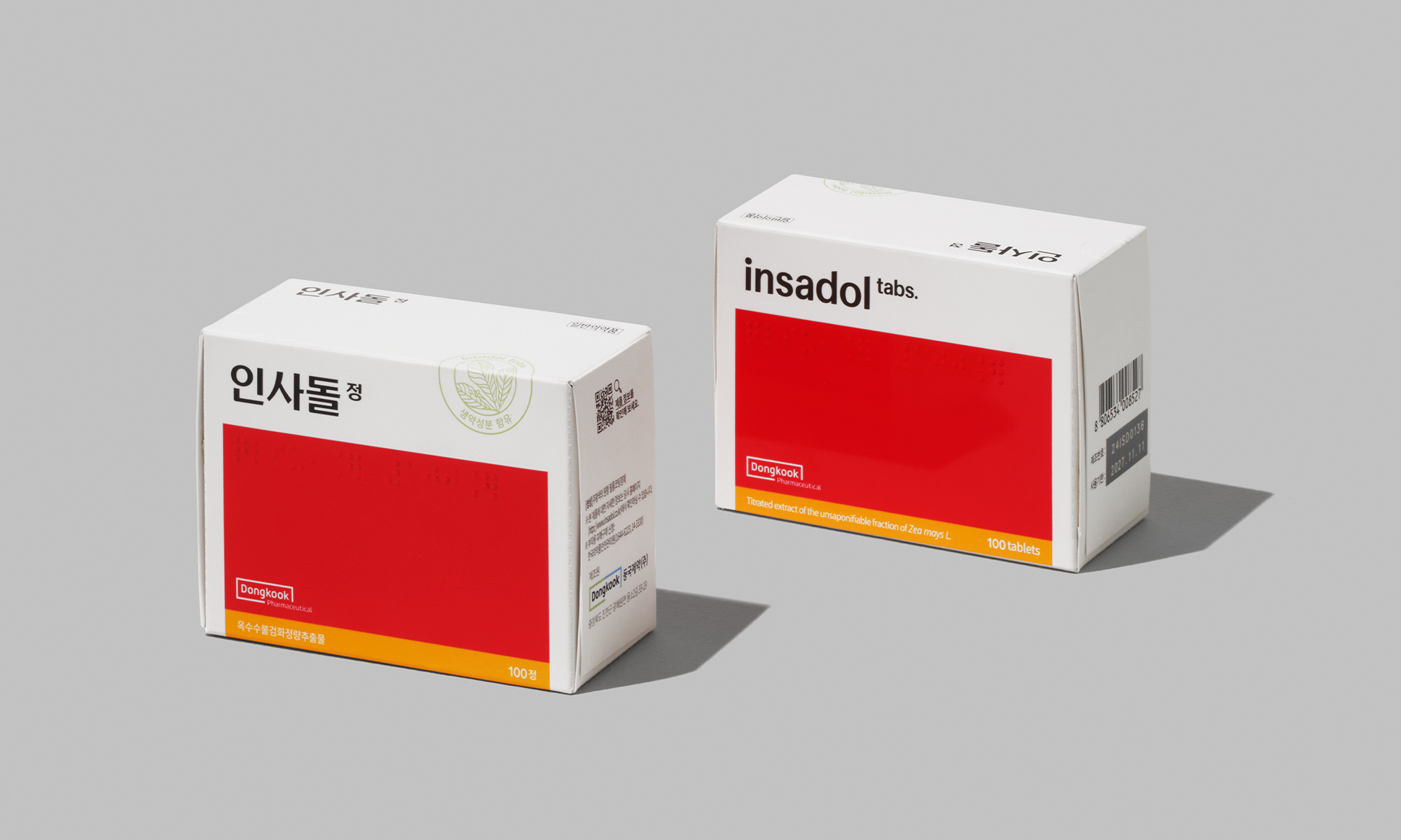
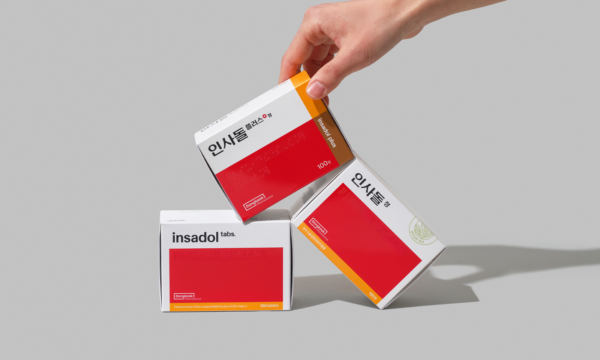
The packaging builds on key brand assets—its signature red and structured panel layout—while adjusting proportions and details to enhance visual balance and modern appeal.
User experience, elevated with thoughtful details
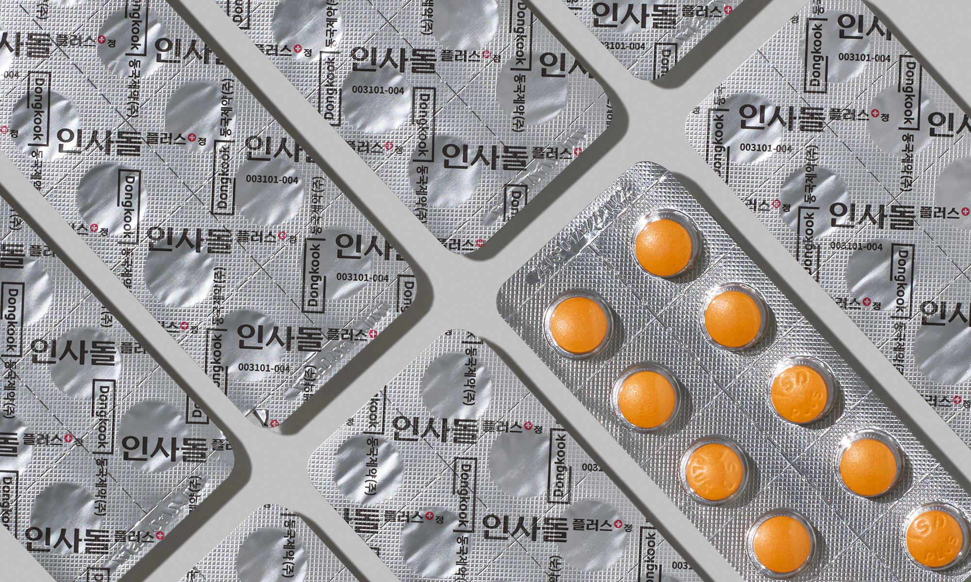
A new sub-color palette signals the brand’s evolution, while updates in information design reflect deeper care: gloss and matte finishes add tactile refinement, and newly added braille for ingredient labeling ensures broader accessibility and a more thoughtful packaging experience.
Client |
Dongkook Pharmaceutical |
Output |
Brand Identity, Packaging |
Year |
2024 |
Double D |
Minjae Huh, Ihnwung Glenn Jeon, Hyemin Ahn, Juhee Park |
Collaborator |
Yang-Jang Type(Typeface), Jaeyeon Jung, Juhee Hong(Design Participation) |