Sidewall Identity Design for Kumho Tire’s Premium Brand Transition
- CI & BI
- brand system
A New Brand Motif That Captures the Essence of Kumho
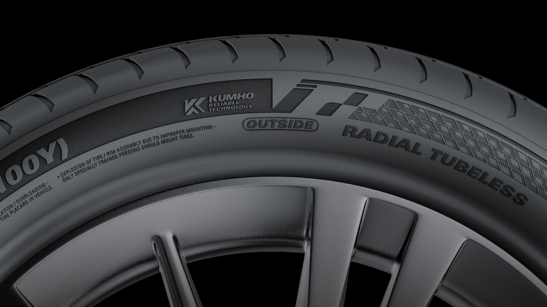
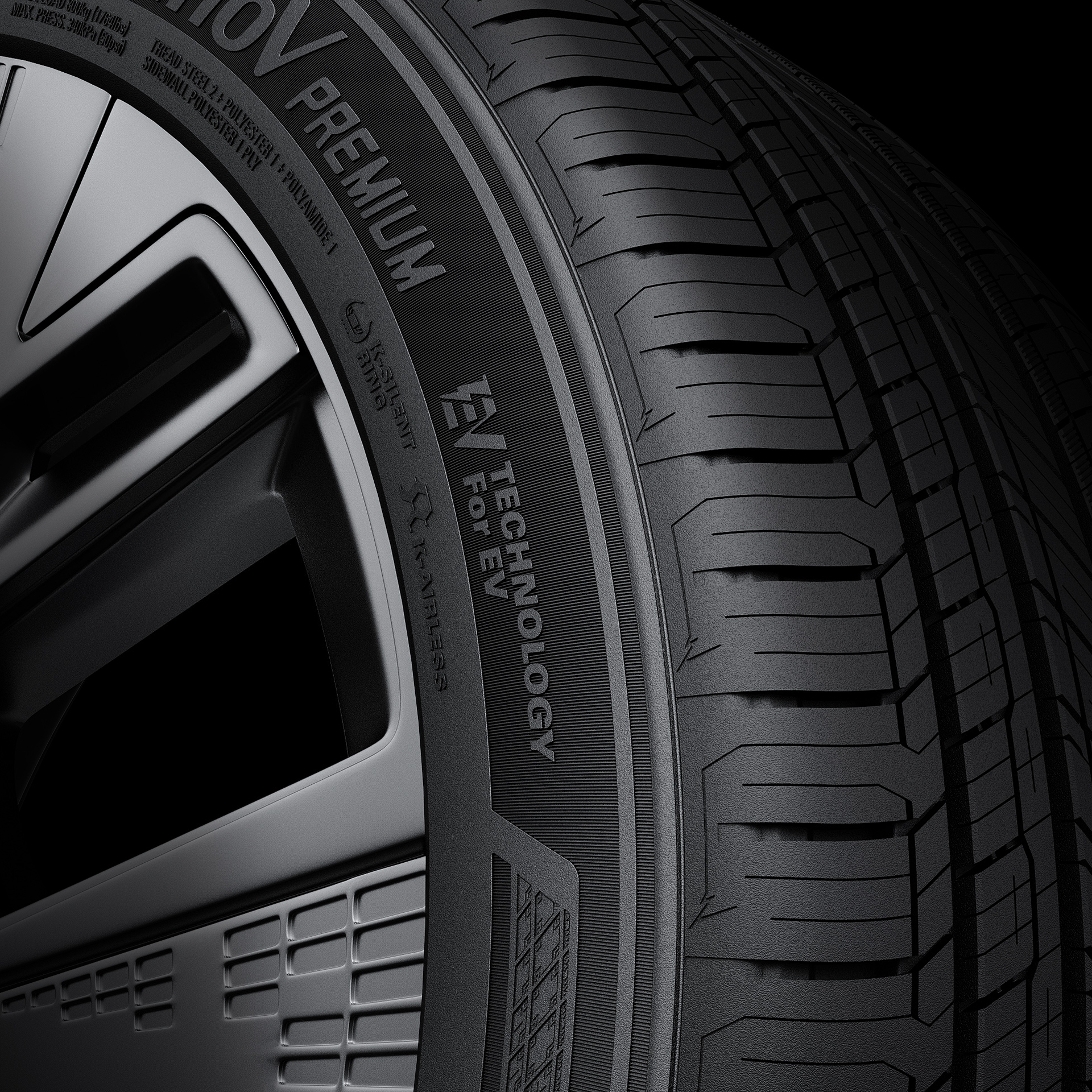
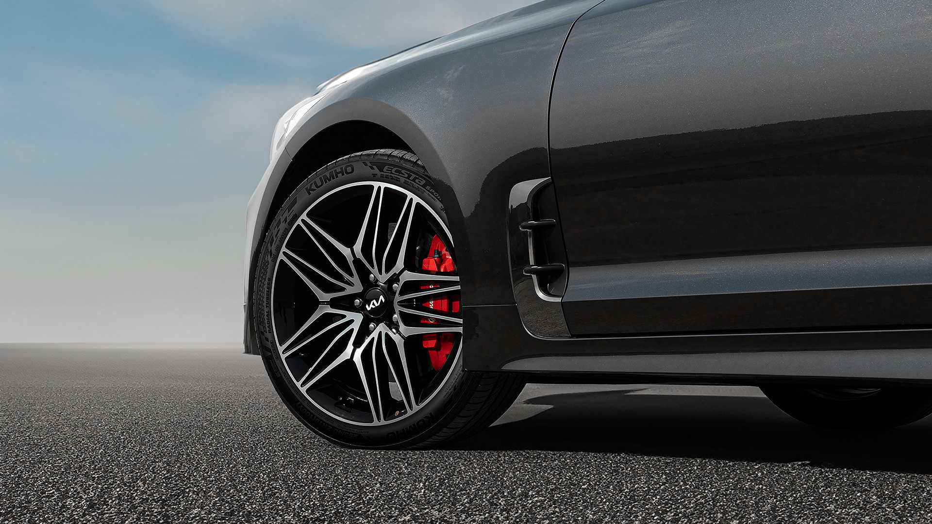
As the EV market accelerates and the tire industry continues to evolve, Kumho Tire recognized the need for a more consistent and forward-looking brand identity. Double D partnered with Kumho to define its brand essence through interviews, surveys, and market analysis, ultimately translating it into a new visual motif: KUMHO LEAP. Inspired by the rising form of the letter “K,” the motif represents Kumho’s spirit of innovation and momentum toward the future.
KUMHO LEAP was designed for flexible application across a wide range of tire segments, serving as the foundation for a unified sidewall identity. It also extends into icons and pictograms, supporting a cohesive and scalable brand experience across all touchpoints.
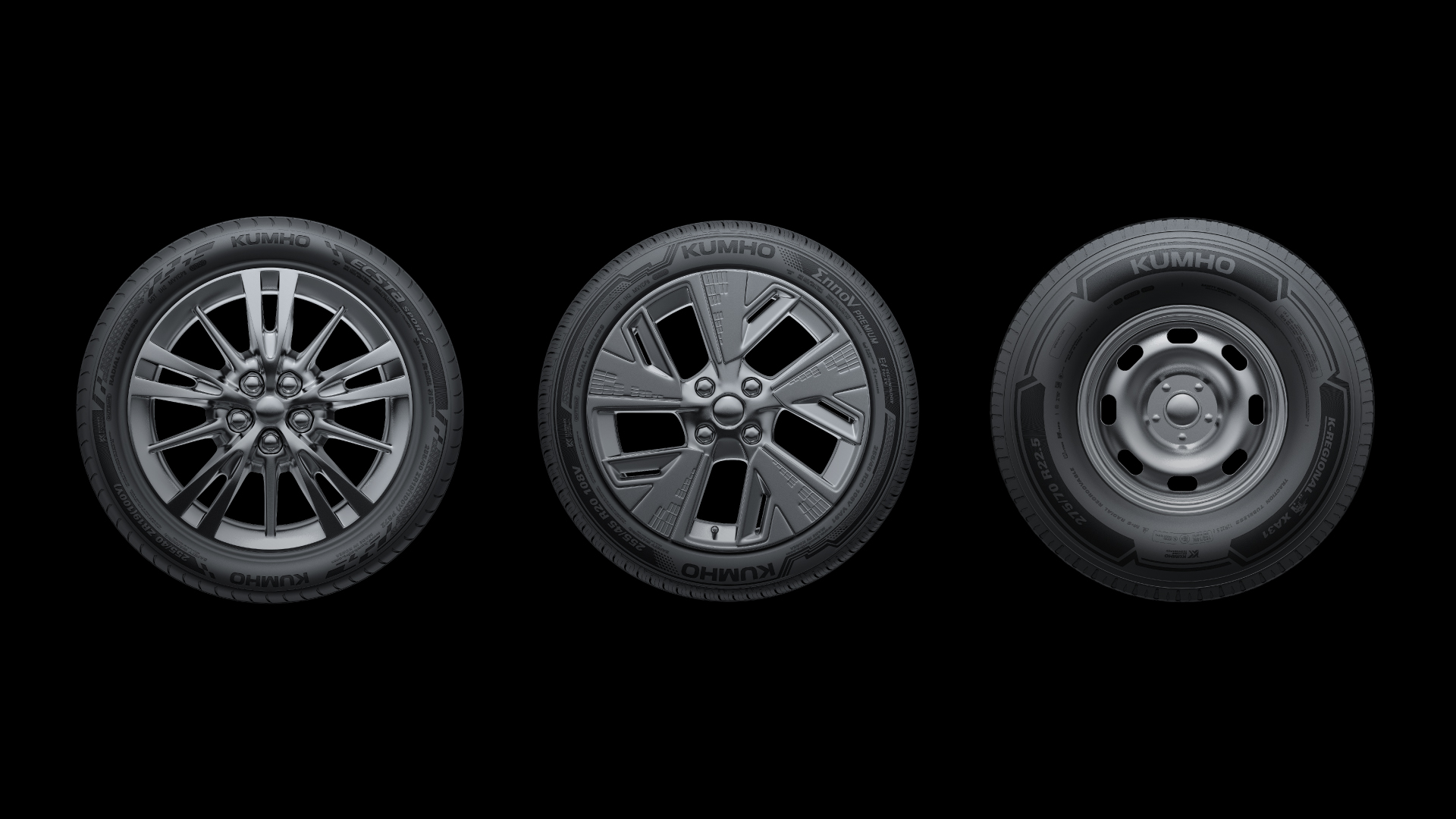
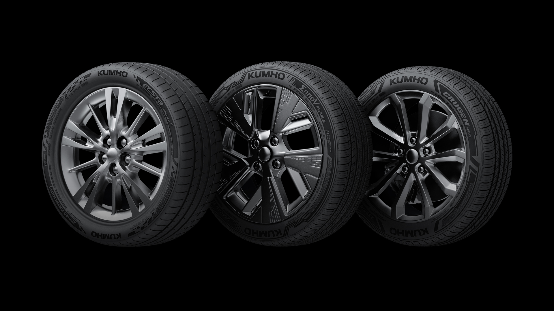
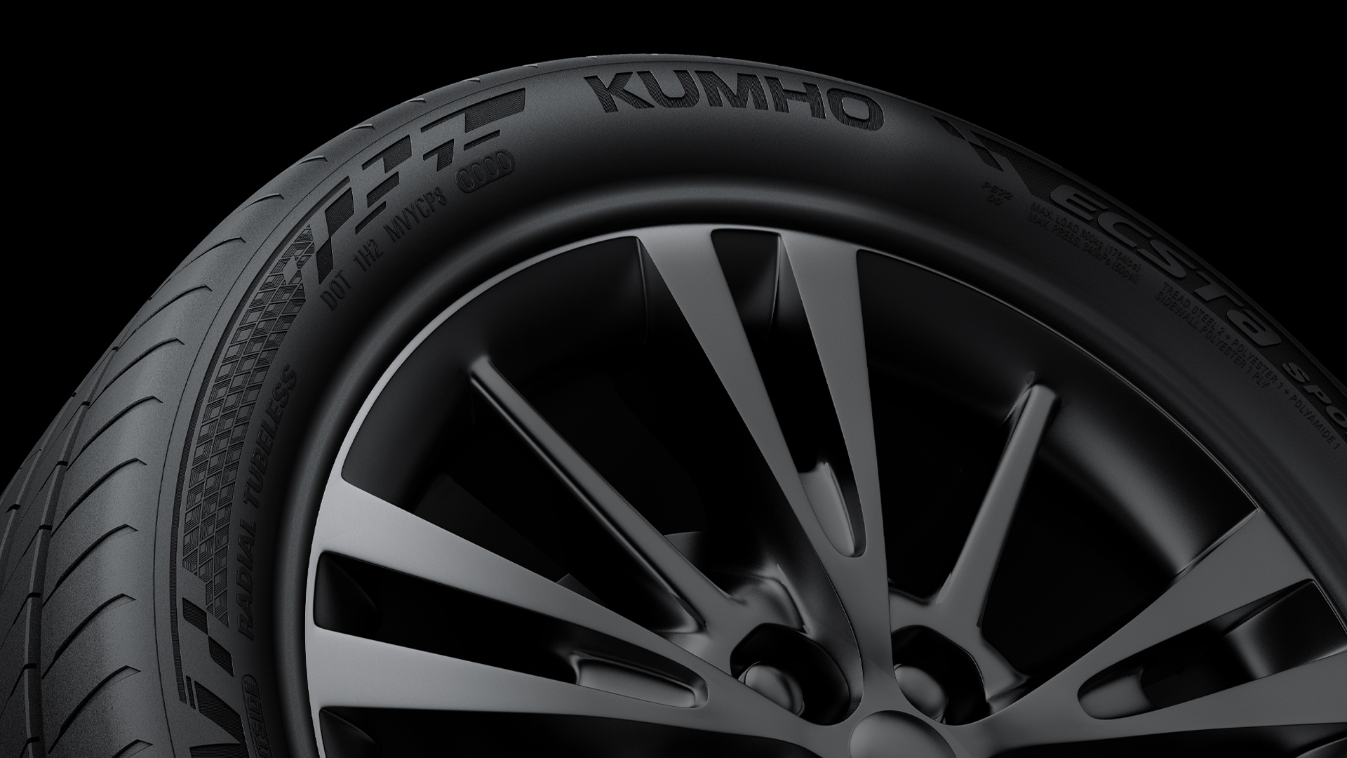
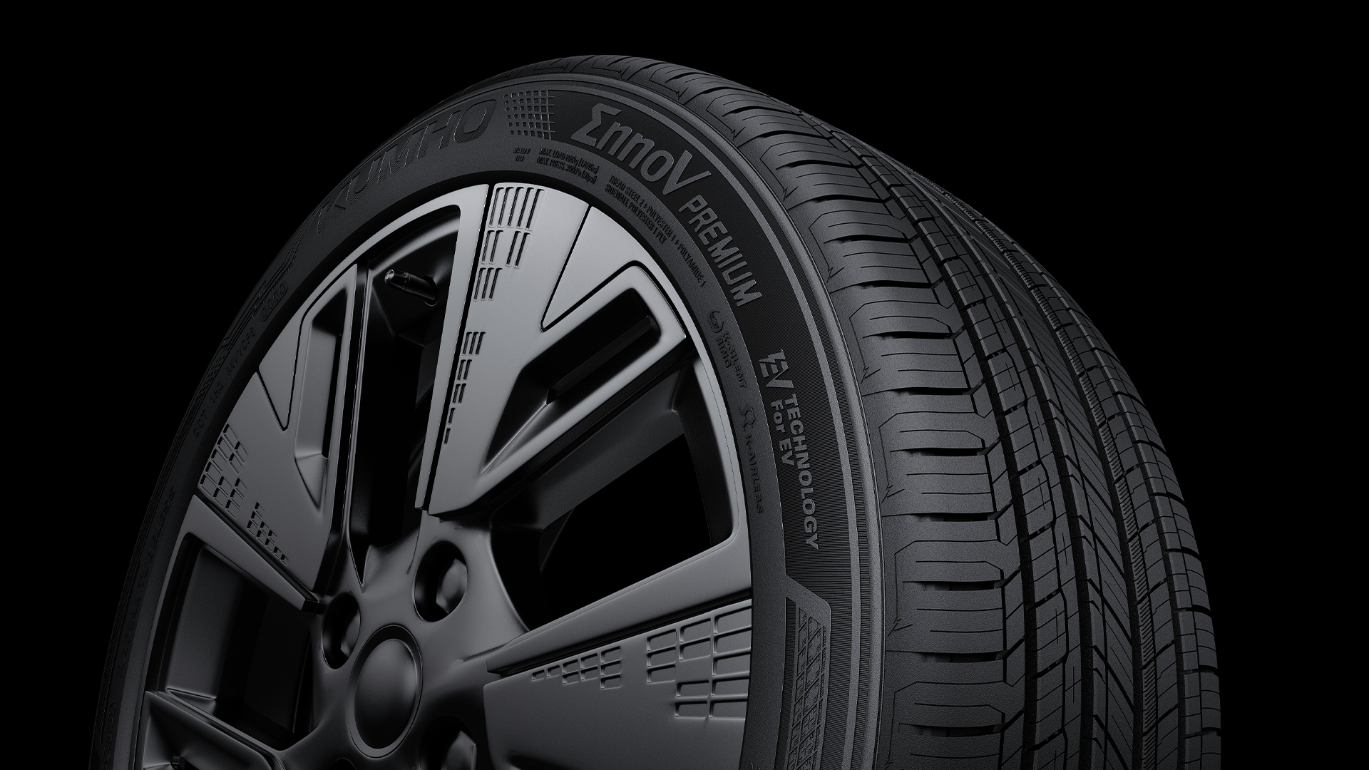
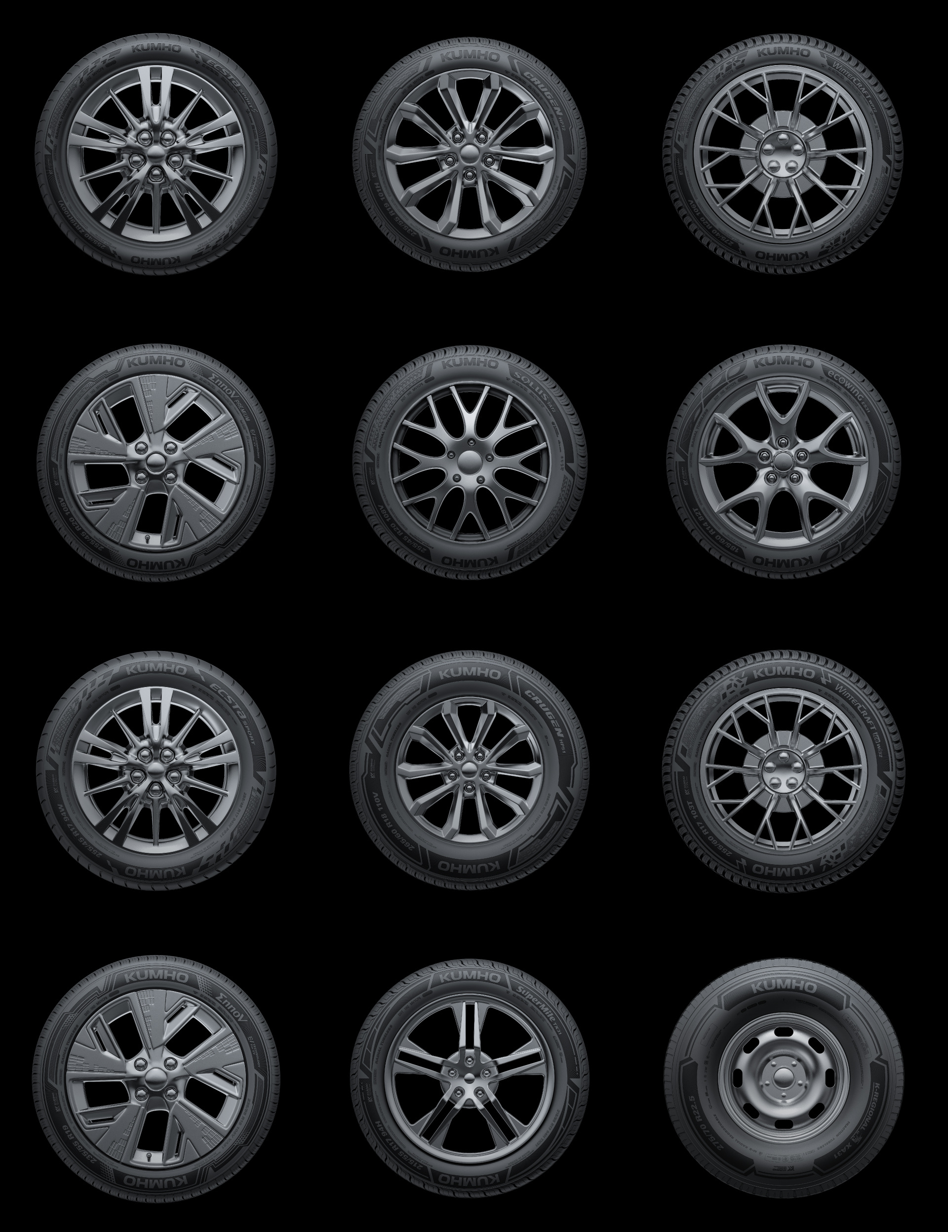
Sidewall Layouts Reflecting Product Segments
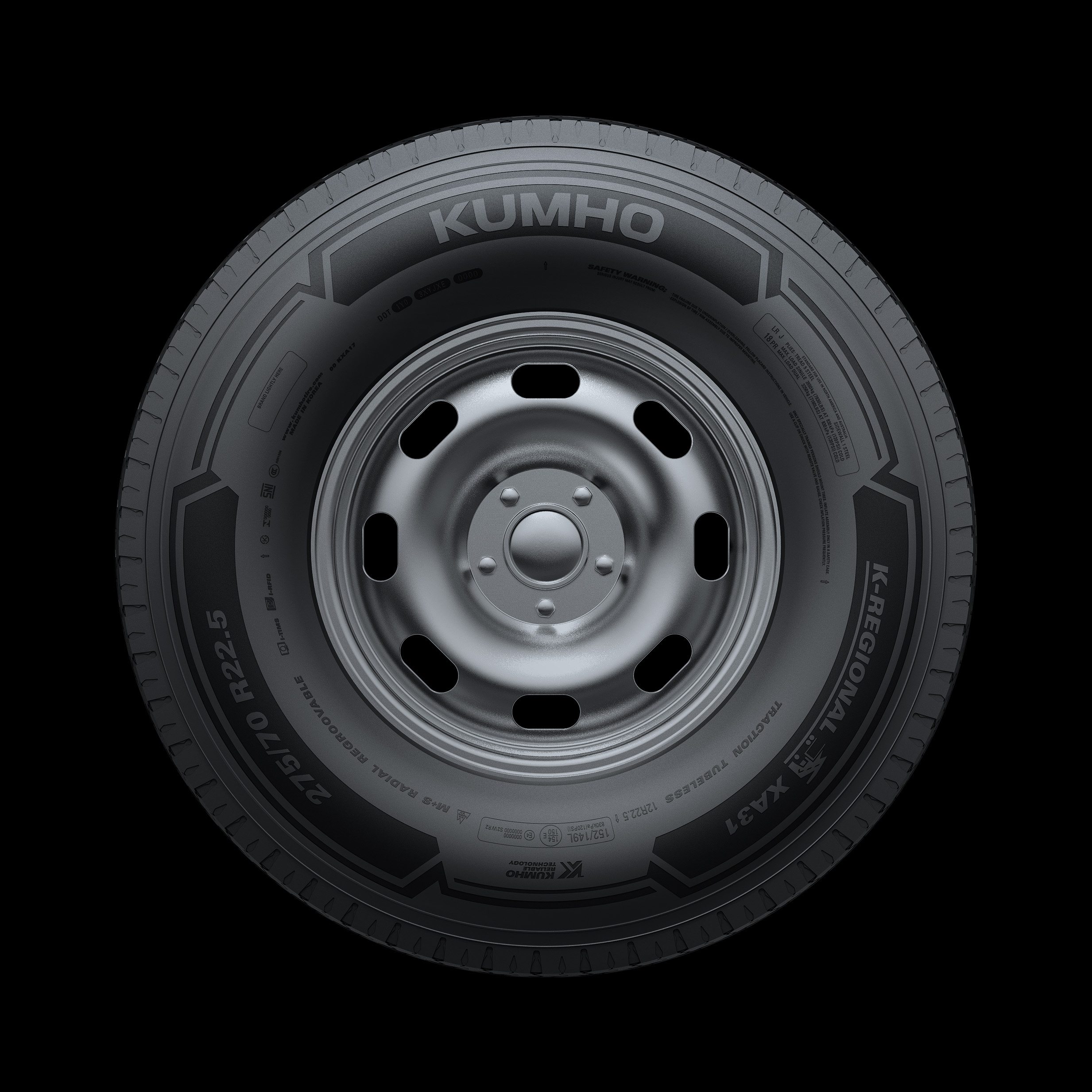
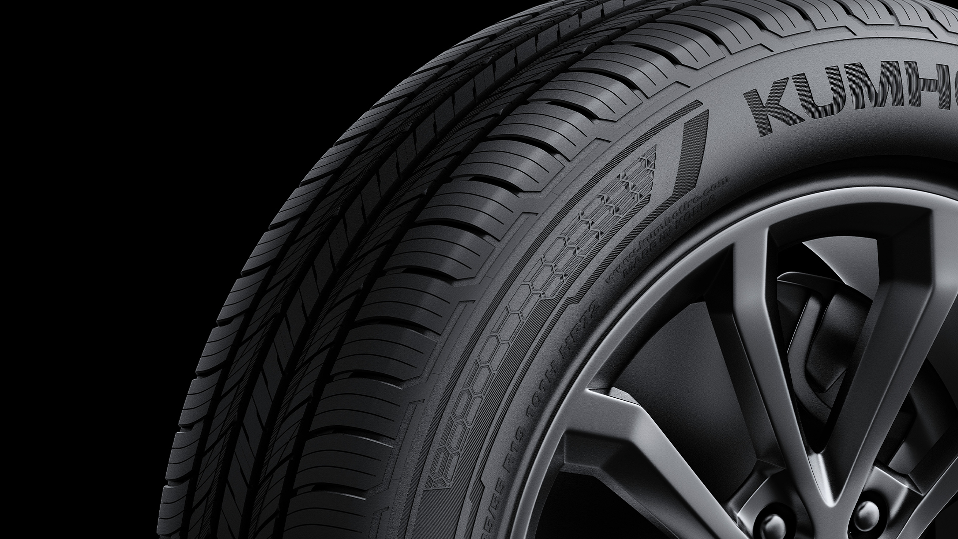
Kumho Tire organizes its product lines into PCR, EV, and TBR segments, each featuring a sidewall layout tailored to its performance and usage needs. These layouts present key information with clarity, while flexibly adapting the brand motif to maintain visual consistency across segments. This strategy reinforces the unique identity of each product group while building a cohesive and recognizable Kumho brand experience.
To build an integrated sidewall design system unique to Kumho Tire, we updated the design of the technology icons, which represent the technology applied to the tires, and the TBR pictograms, which are imprinted on tires for heavy trucks and buses and which intuitively represent the purpose of the tires even in rugged environments. We reviewed the existing technology system to build a naming system that is easy to expand, then developed it into a graphic system that is linked to the brand motif and sidewall designs, all with the aim to build a consistent brand experience unique to Kumho Tire.
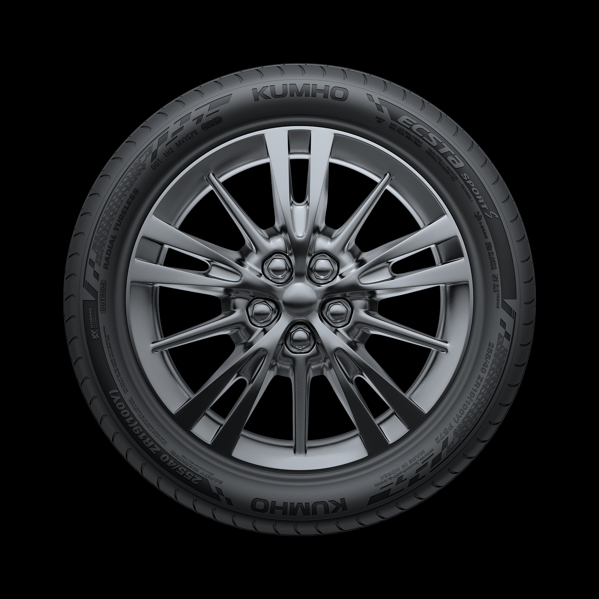
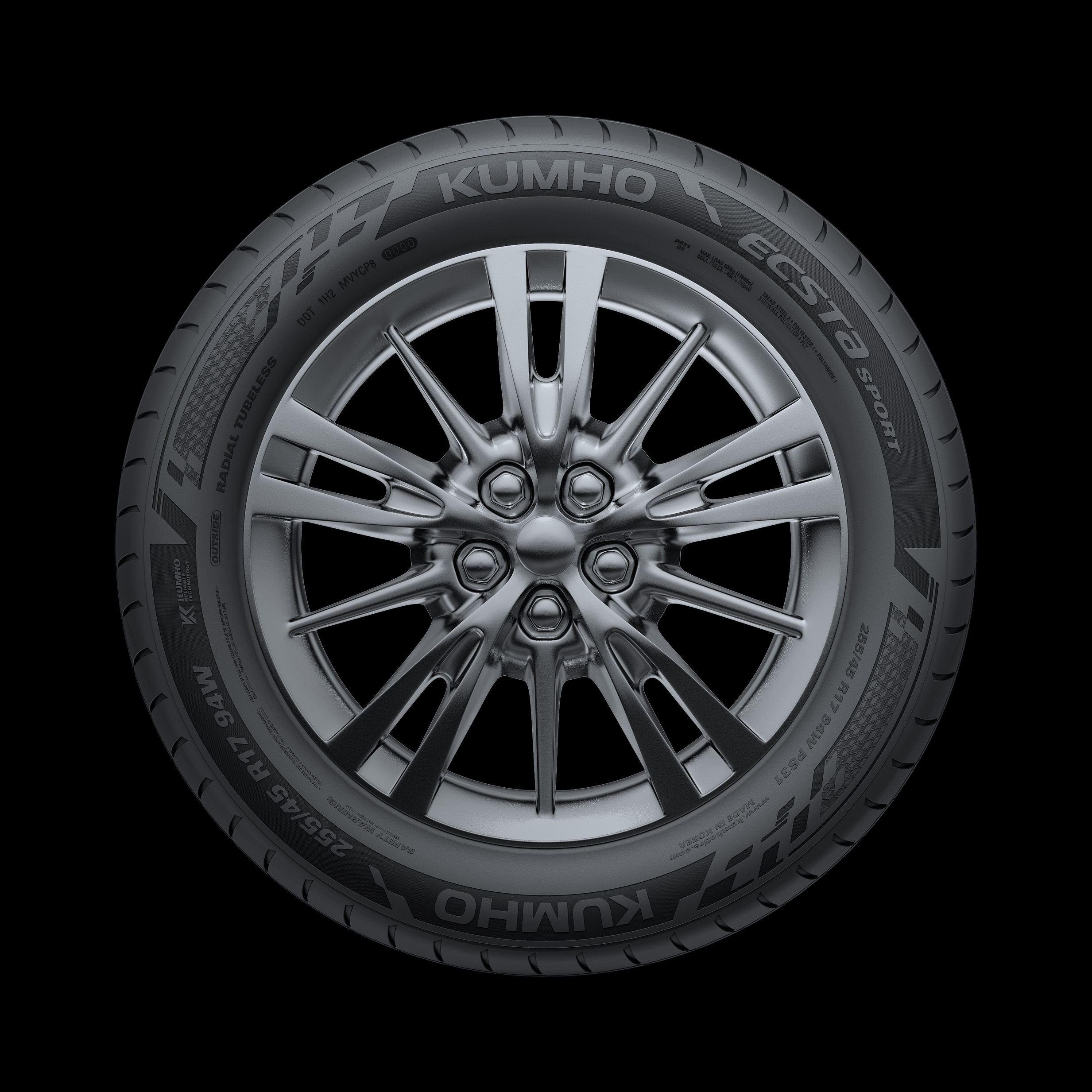
In order to indicate design differences by product grade, we developed pattern graphics that add the impression of the product brand for premium products and added tactile details through knurling post-processing engraved on the sidewall surface.
Icon system started from motifs
In order to build Kumho Tire's unique integrated sidewall design system, an icon that visually expressed the technology applied to the tire was needed. Accordingly, to maximize brand consistency, we developed an icon system that utilizes the formative characteristics of the brand motif. In addition, we established a naming system that takes into account the scalability of icons and created a consistent brand experience unique to Kumho Tire.
It was inevitable to update the design of the TBR pictogram, which is imprinted on truck and bus tires and represents the tire's purpose through an intuitive picture even in rugged environments. To this end, we reexamined the existing truck and bus tire system to establish an easily expandable naming system, linked it to the brand motif and sidewall design, and reorganized the graphic system and new BI for truck and bus tires.
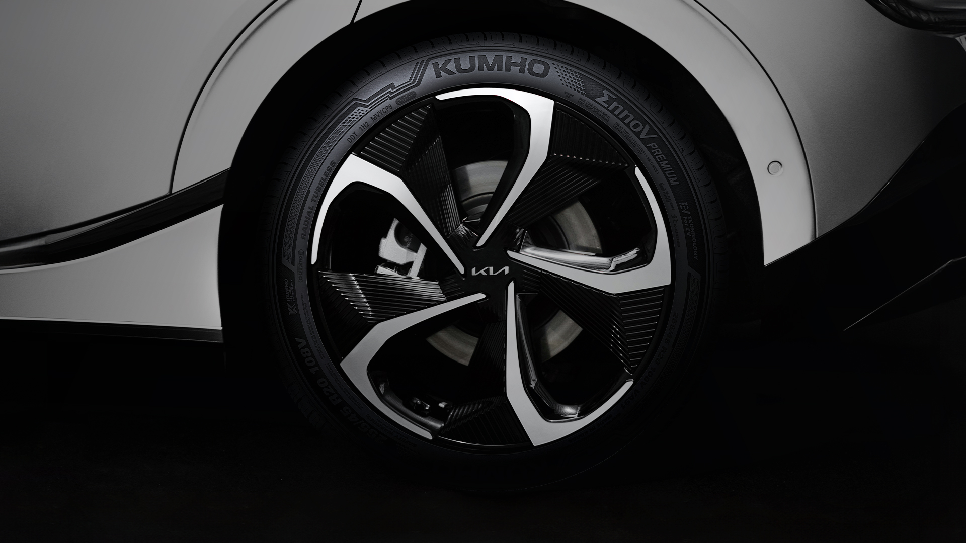
Kumho Tire’s new pattern knurling
Previously, Kumho Tire's tire design used a layout that reflected the brand's characteristics. However, in order to become a premium brand and differentiate itself from other brands, we went through the process of developing pattern knurling that could more effectively convey the brand's identity in tire design.
Block error: "Undefined variable $srcValue" in block type: "image"
Client |
KUMHO TIRE |
Output |
Brand Identity, Brand Application, Brand System Guidelines, Icons, Pictograms |
Year |
2023 |
Double D |
Minjae Huh, Junbeom Woo, Will Lee, Jaehwi Han, Juhee Park, Jumyoung Lee |
Collaborator |
LIFT-OFF(Icons, Pictograms), Depth Studio(3D Design) |