From Fila Holdings to Misto Holdings: A Corporate Identity Project for Brand Expansion
- CI & BI
Strategic Rebranding from Fila Holdings to Misto Holdings
Starting with a single brand, Fila Holdings expanded its business and grew into a globally recognized multi-brand house. However, having ‘FILA’ in the corporate name made it difficult to establish an identity that wasn’t tied to the Fila brand alone. To resolve this, the company initiated a strategic rebrand in 2025, introducing a new name, ‘Misto’, to better define its role as a global multi-brand organization.


Misto's Philosophy of Moving Beyond Industry Boundaries
Double D worked on the strategy as well as the development of a new verbal and visual identity system for Misto. Through focused research and employee interviews, we identified the brand’s new slogan, ‘redefining boundaries’, which reflects Misto’s ambition to move beyond conventional industry norms. This idea sat at the centre of the entire rebranding process, and the visual identity system thoroughly incorporates this philosophy.
Misto's logotype expresses a sense of flexibility and forward movement within its work culture. Its extended horizontal form suggests momentum that pushes past boundaries, while the combination of uppercase and lowercase letters reflects the diversity and adaptability expected of a multi-brand group.

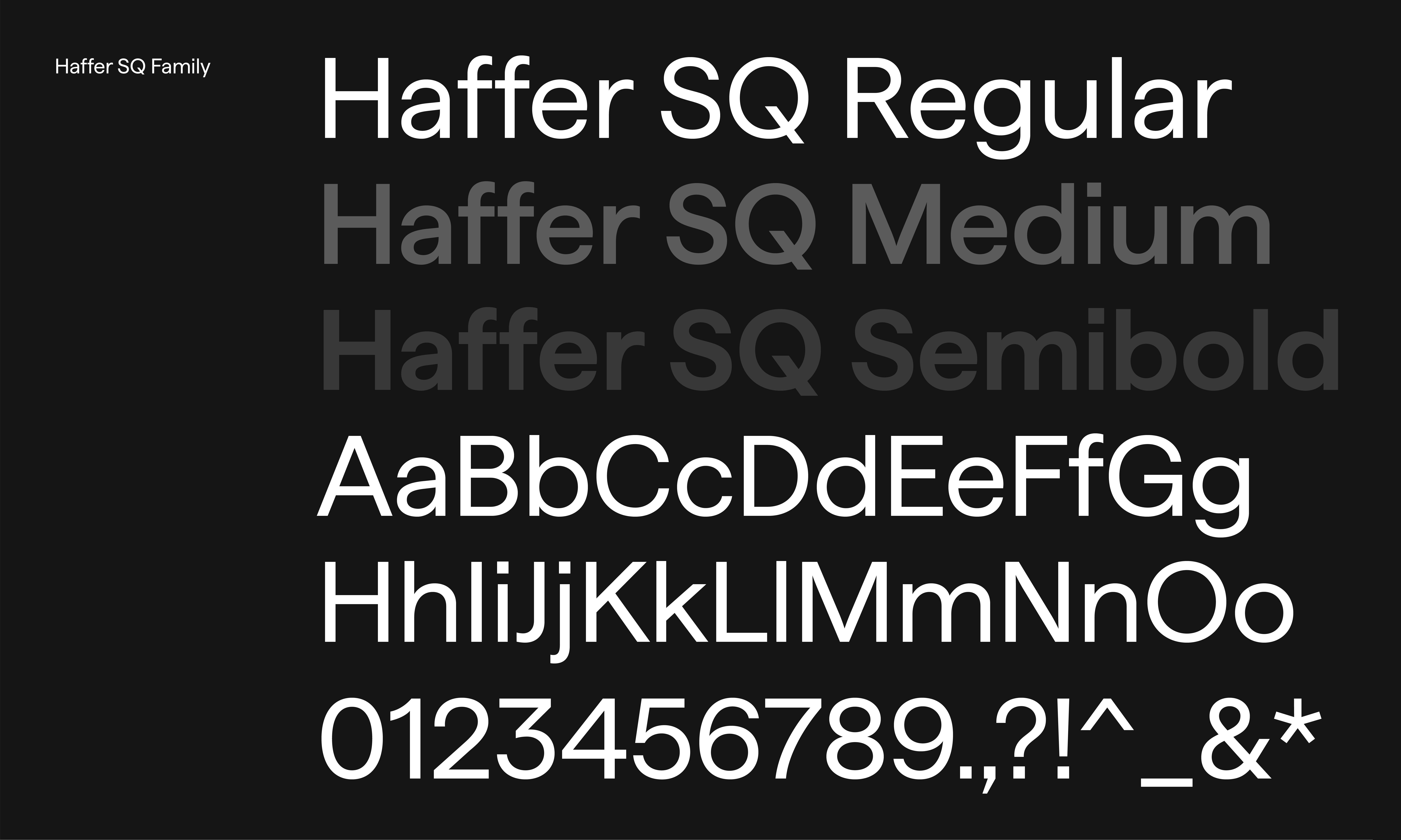

Visual Motif and Colour System Expressing Misto's Philosophy
The new visual motif system was developed to carry the idea of ‘redefining boundaries’ throughout the brand. The visual qualities of the logotype were also incorporated into the motif, creating a cohesive identity. The outward-sharpening line graphics represent flexible thinking evolving into clear strategic judgement. Designed in both line-based and container formats, the system adapts cleanly across a wide range of applications.
The colour system further reinforces Misto’s character. Misto Red and its gradient convey energy and dynamic growth, while the neutral palette introduces a sense of stability and trust.


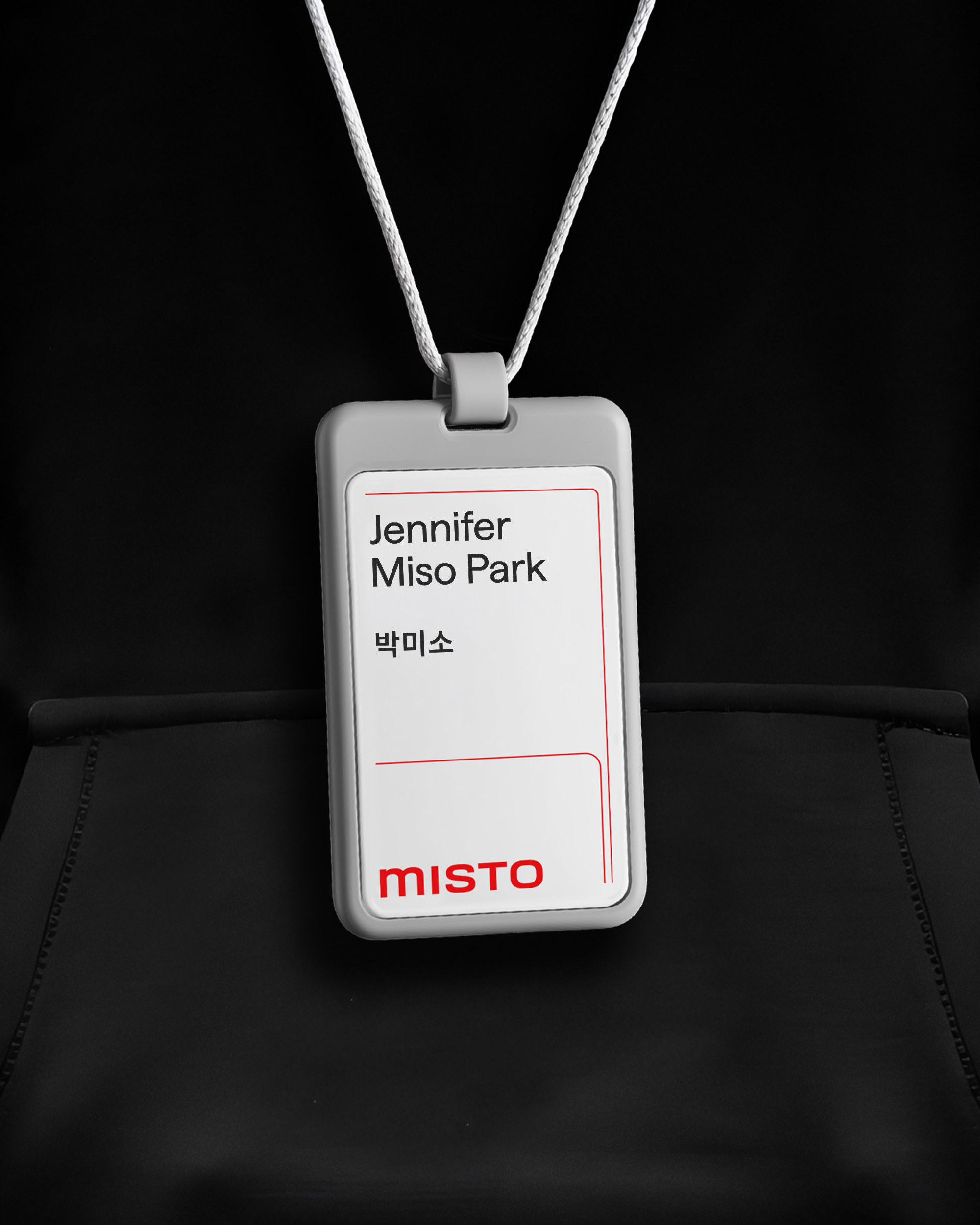
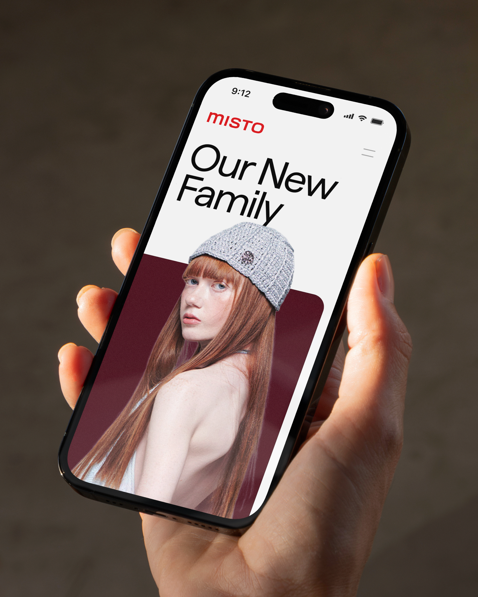
A System Designed for Diverse Brand Touchpoints
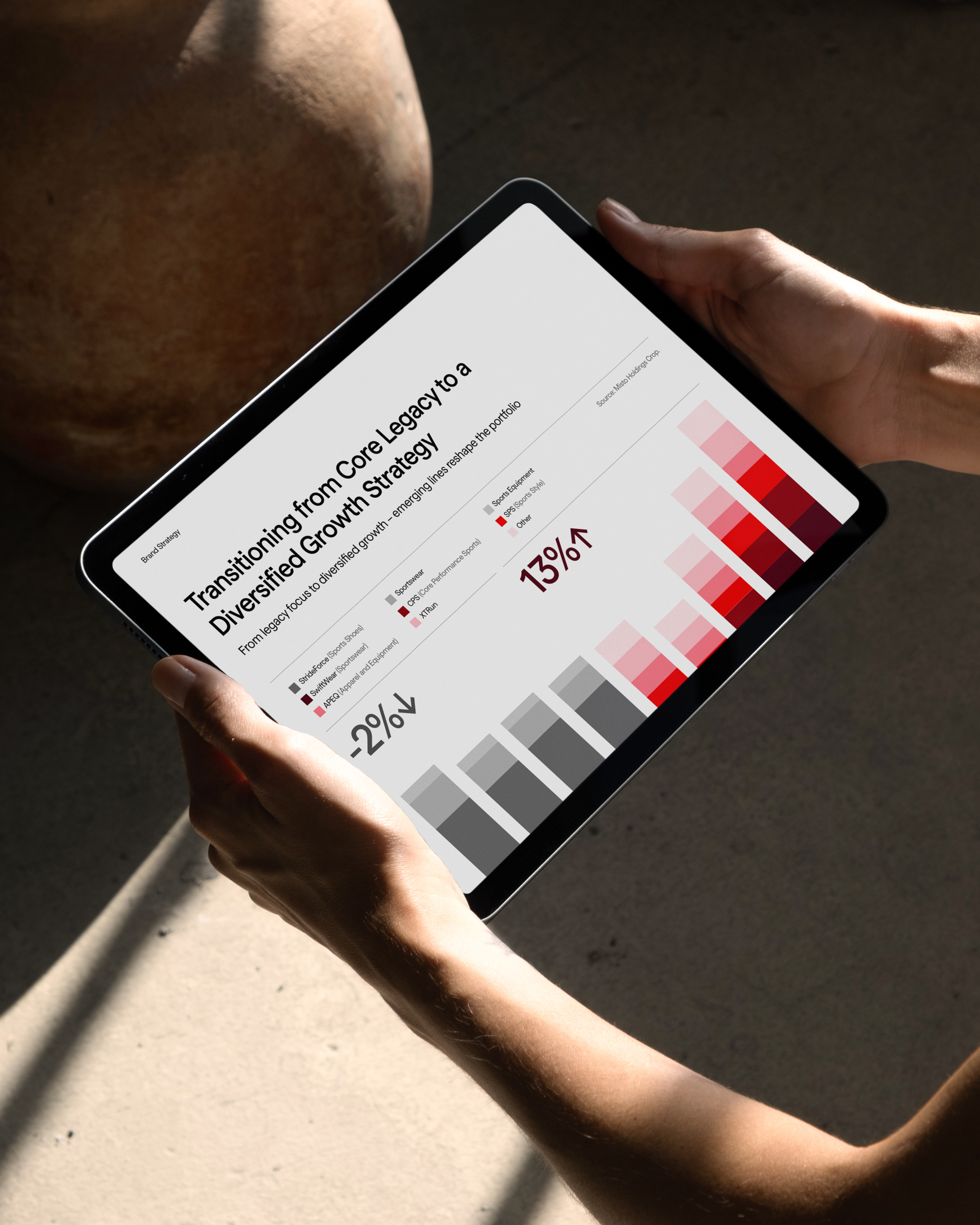
The motif system, structured in both line and container formats, was designed to be applied flexibly across a variety of communication touchpoints. From ID badges and business cards to internal documents and corporate signage, the system focuses on items used frequently in day-to-day operations, ensuring that Misto’s corporate identity integrates naturally into real working environments.
It also accounts for the need to represent Misto Holdings' various sub-brands within a unified system. The application system covers everyday essentials like ID badges, business cards, internal documents, presentation templates, and signage. We built a clear CI guideline to ensure consistent brand use across all communications, spanning over a dozen global entities.
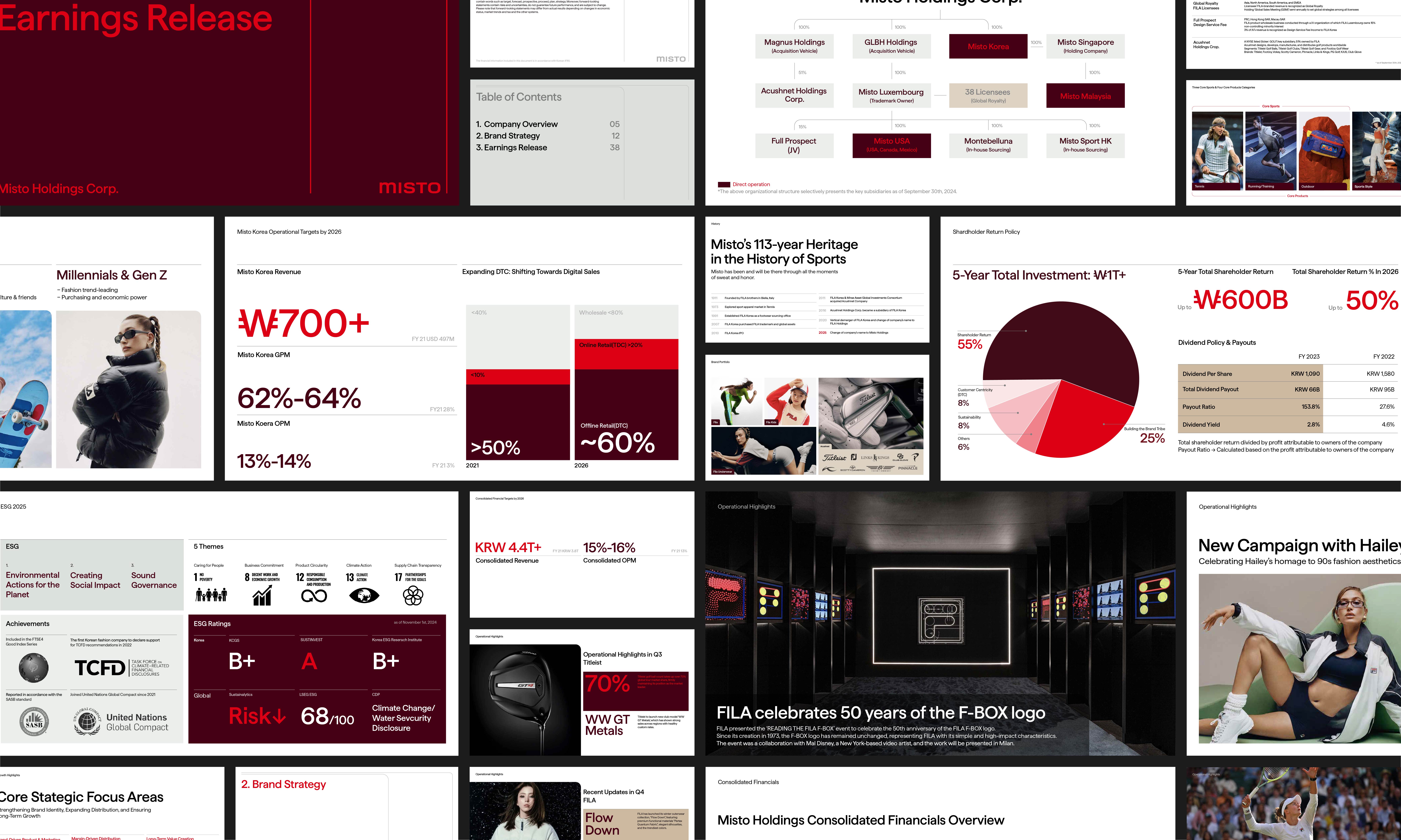
Unified CI Guideline for Global use
We also designed a complete CI guideline for all branches across the world. The guideline defines the rules and standards for logo usage, the application of the visual motif, the colour system, typography, layout principles, and reference examples to ensure consistent execution across regions.
Client |
Misto Holdings |
Output |
Brand Identity, Brand Strategy, Brand Application, Brand System Guidelines |
Year |
2025 |
Double D |
Minjae Huh, Junbeom Woo, Sanha Park, Oneseok Kang, Soohyeon Lee |
Collaborator |
Heesun Eum(Brand Strategy) |