Brand renewal of H&B Store Olive Young, a place where external and internal beauty is cued.
- CI & BI
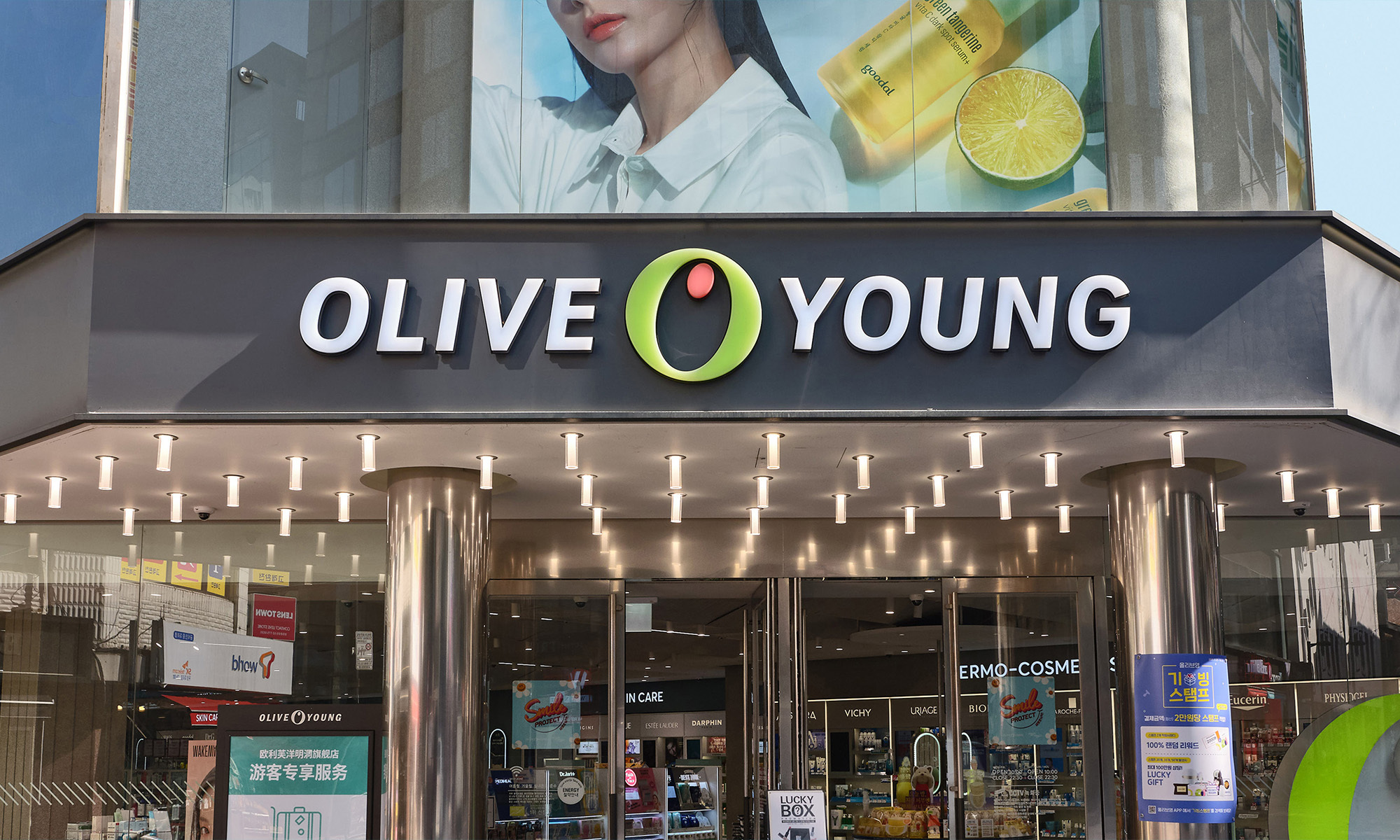
Olive Young, Korea's most famous H&B store, has celebrated its 20th anniversary with a brand renewal. Taking its identity of 'healthy beauty' and its existing brand essence, we have redefined the business from 'a playground for trend-savvy shoppers' to a place where 'healthy external and internal beauty' is curated. By reinterpreting the newly defined mission and values, we have established a Design Principle that visualizes the Olive Young spirit across all media, spaces, environments, and forms handled by Olive Young.
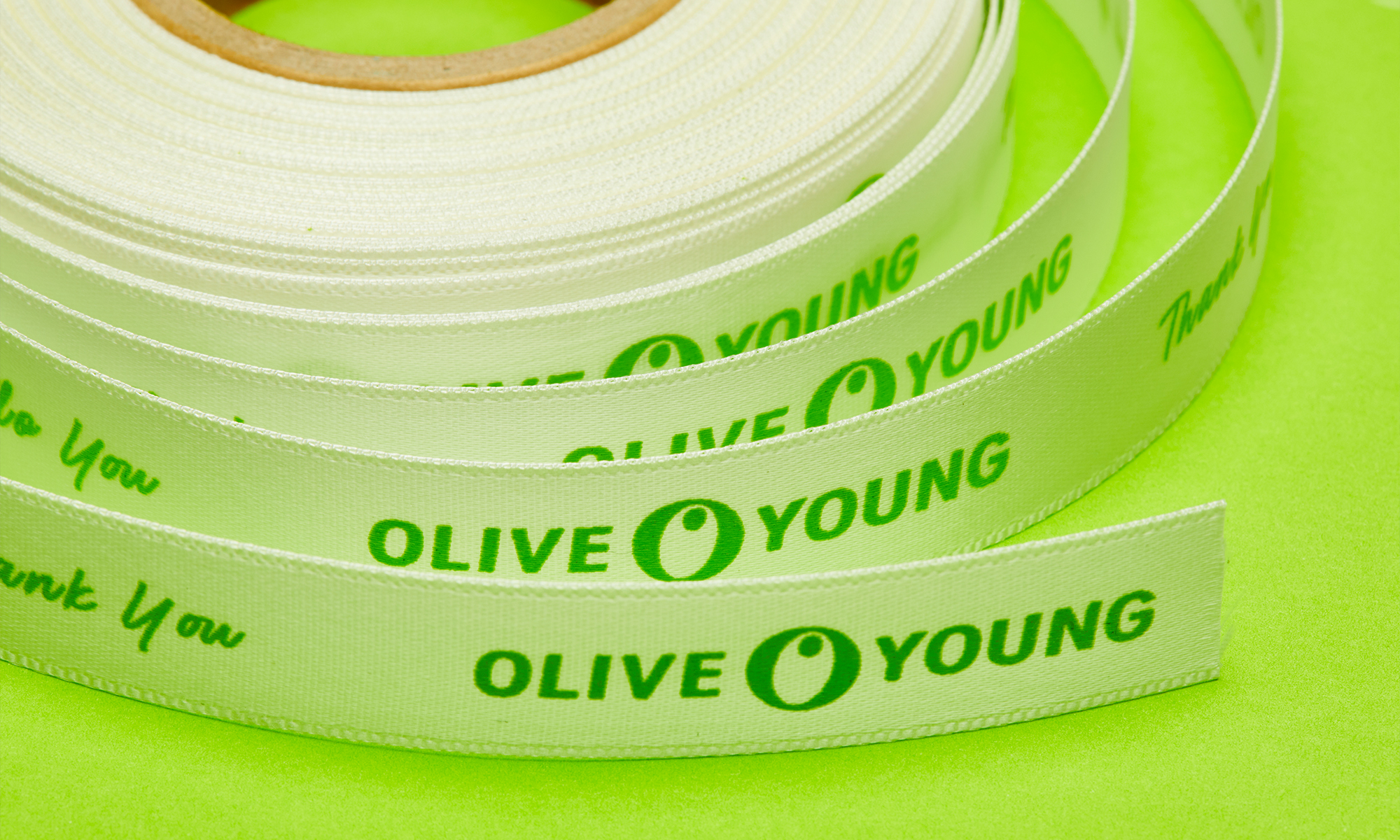
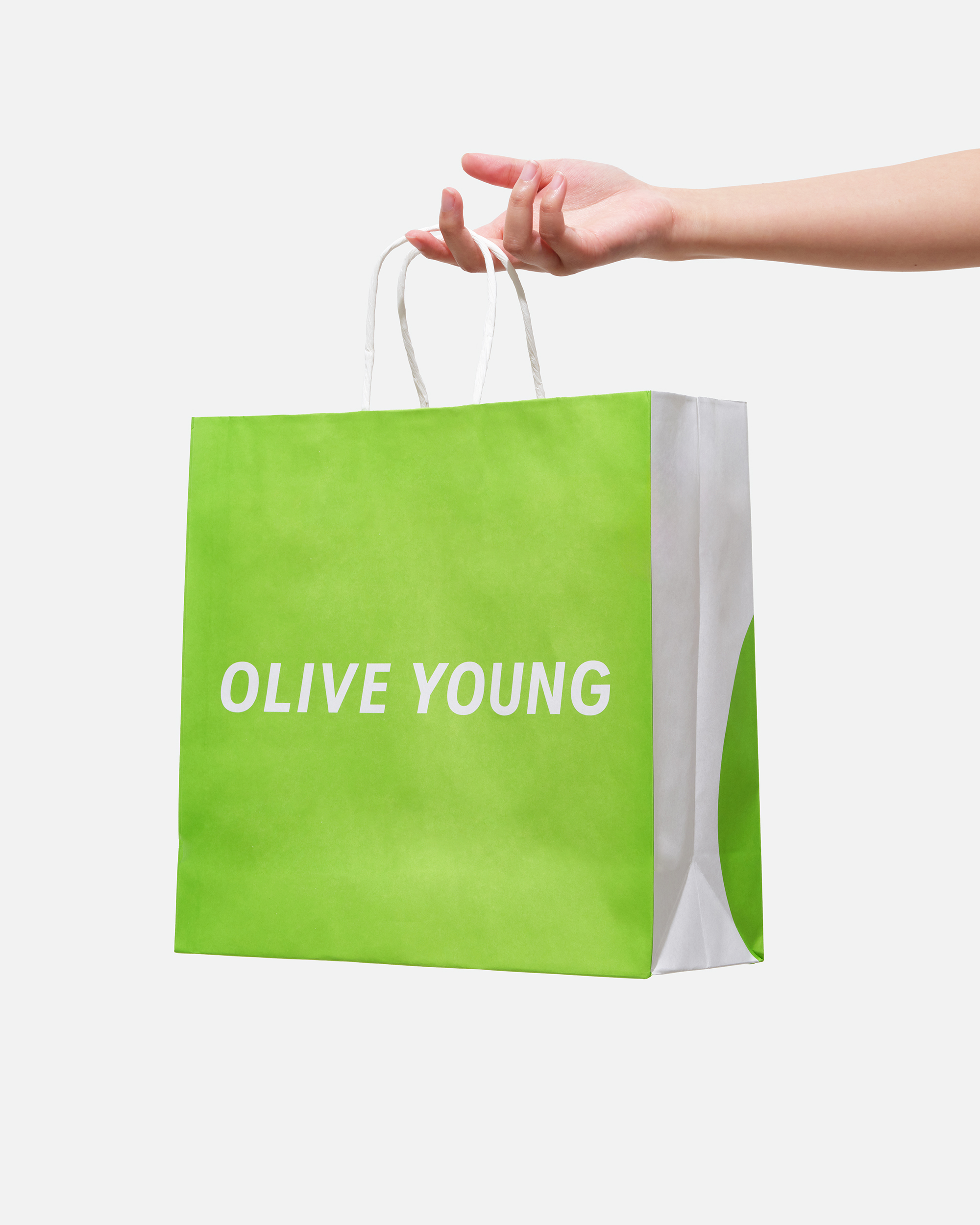
For the logo (BI), the focus was on refining the asset rather than making bold changes. The symbol was kept intact, but the typography was refined with more sophisticated height and spacing to enhance usability and readability in digital environments. Notably, the symbol's color was changed for the first time in 20 years. New Olive Green and Coral Orange colors were applied to express healthy beauty more vividly.
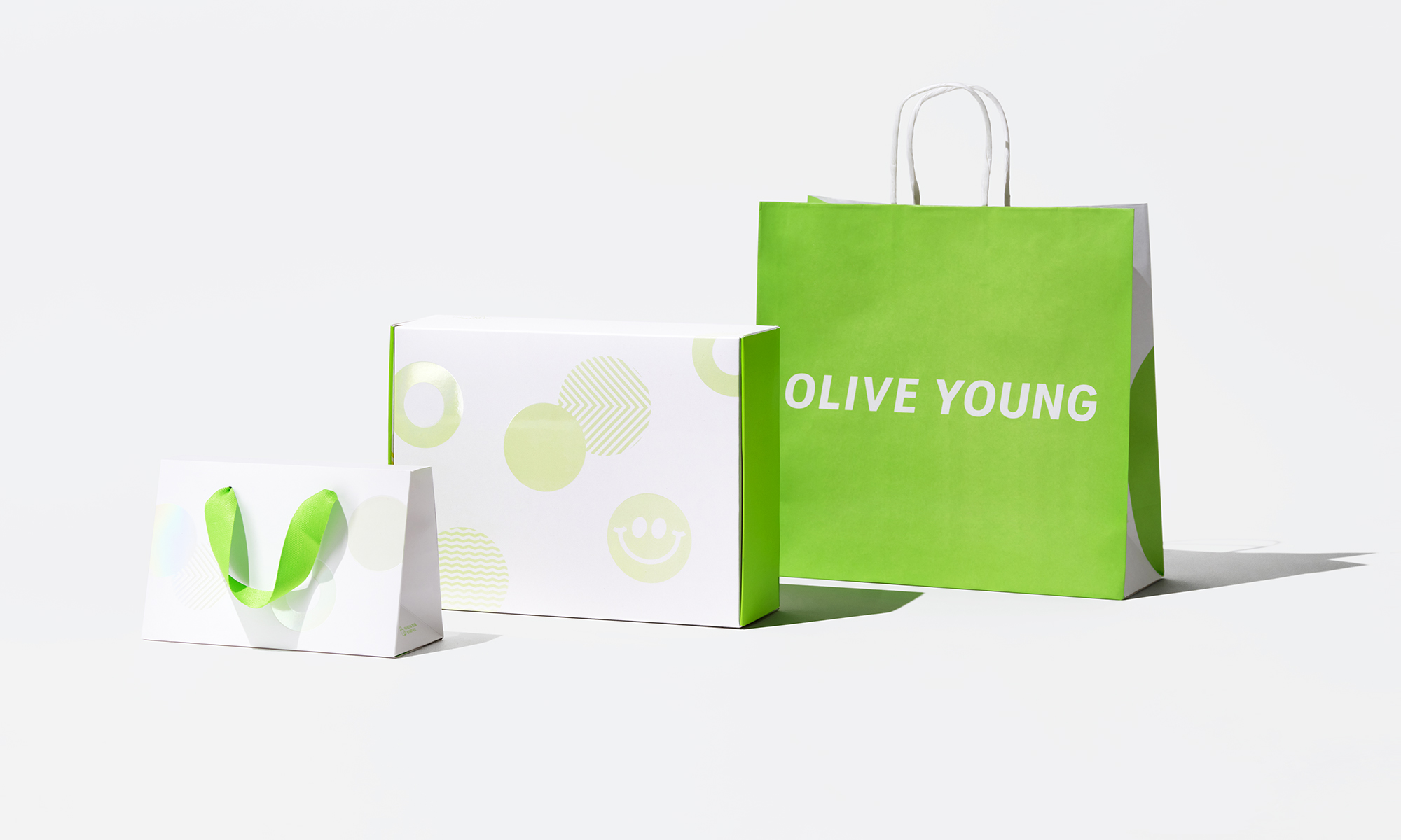
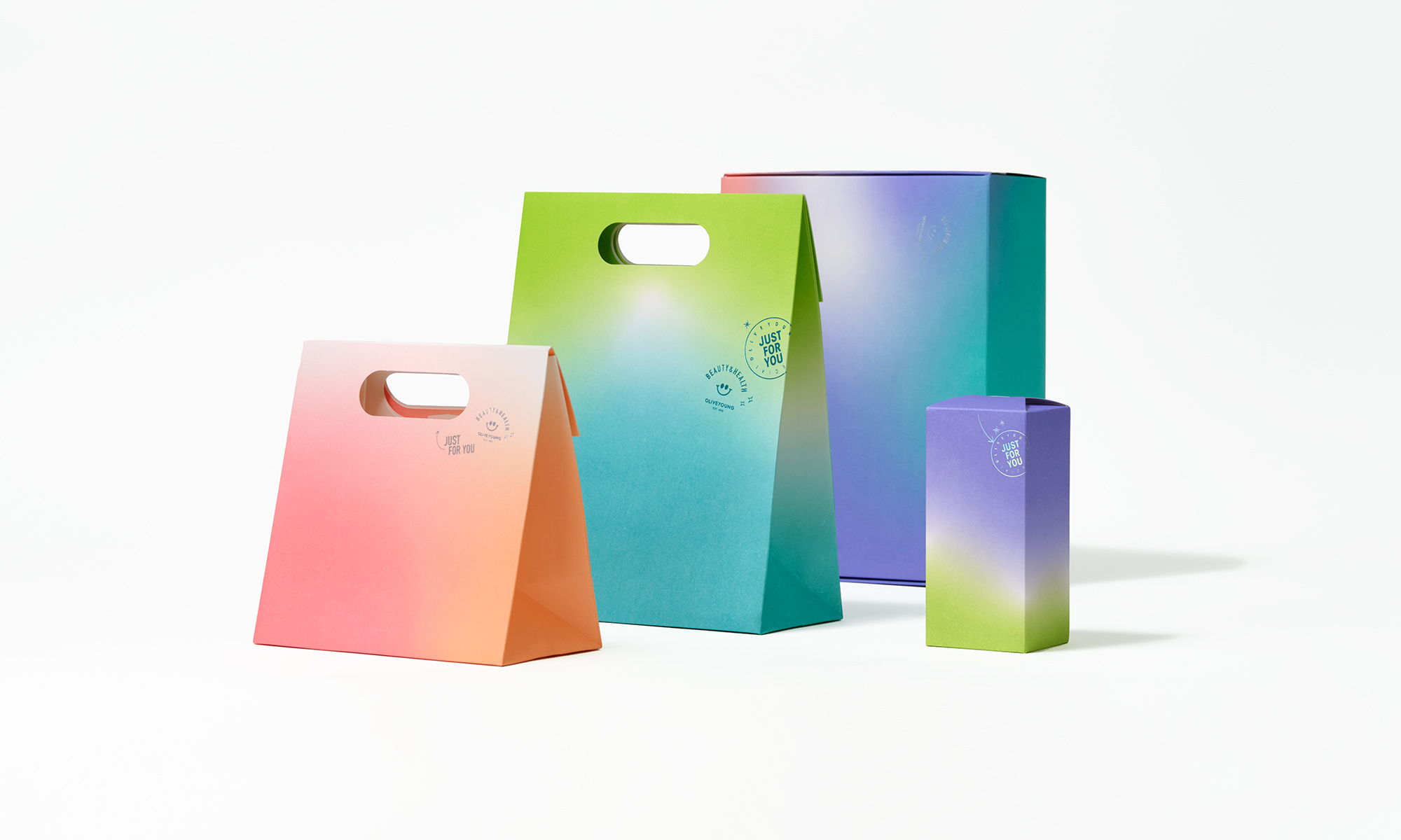
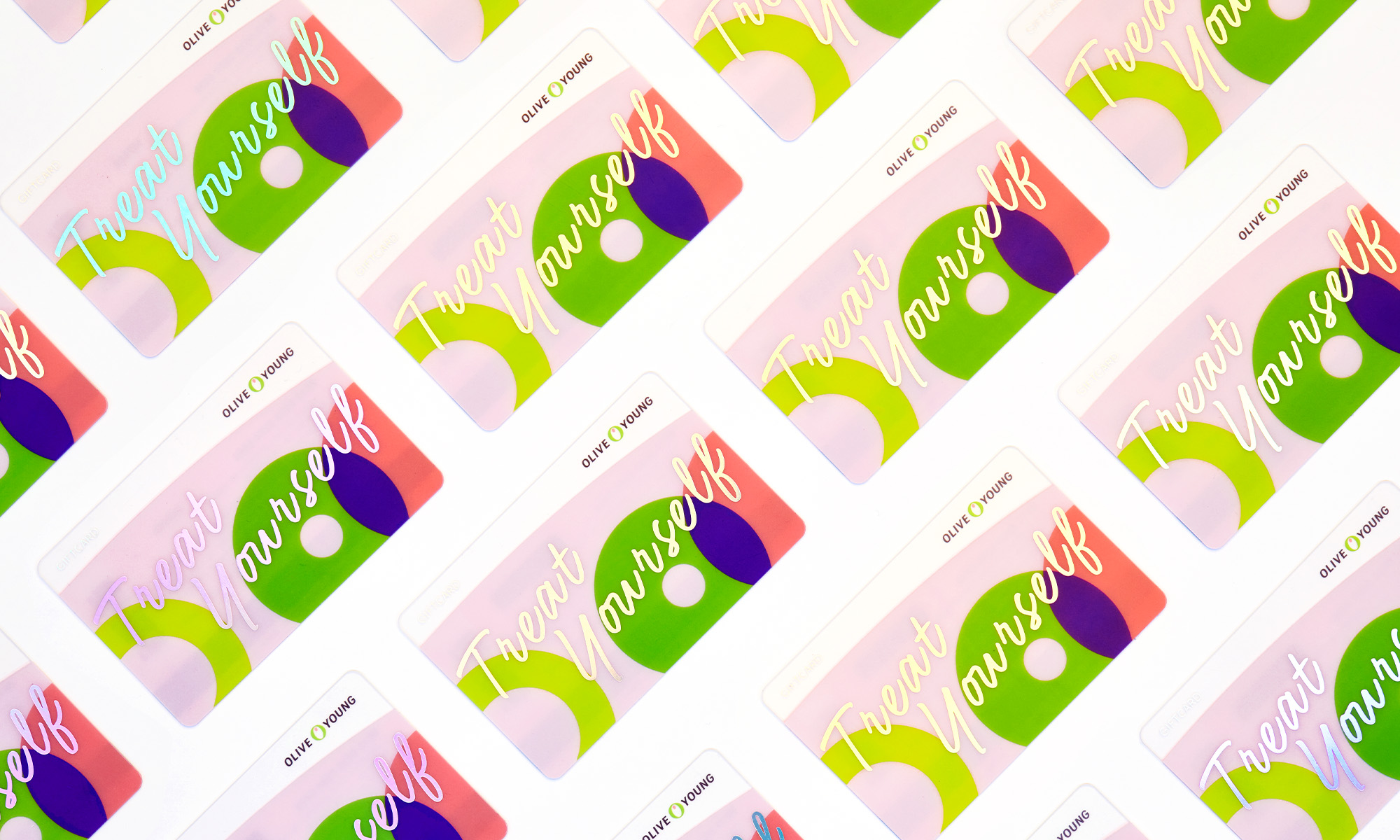
Using the brand logo colors Olive Green and Coral Orange as primary colors, we created a color system that allows for a diverse and vibrant color combination. In particular, Lime Green, which complements the liveliness of Olive Green, and Violet, which completes the balance of the graphics, were selected as secondary colors.
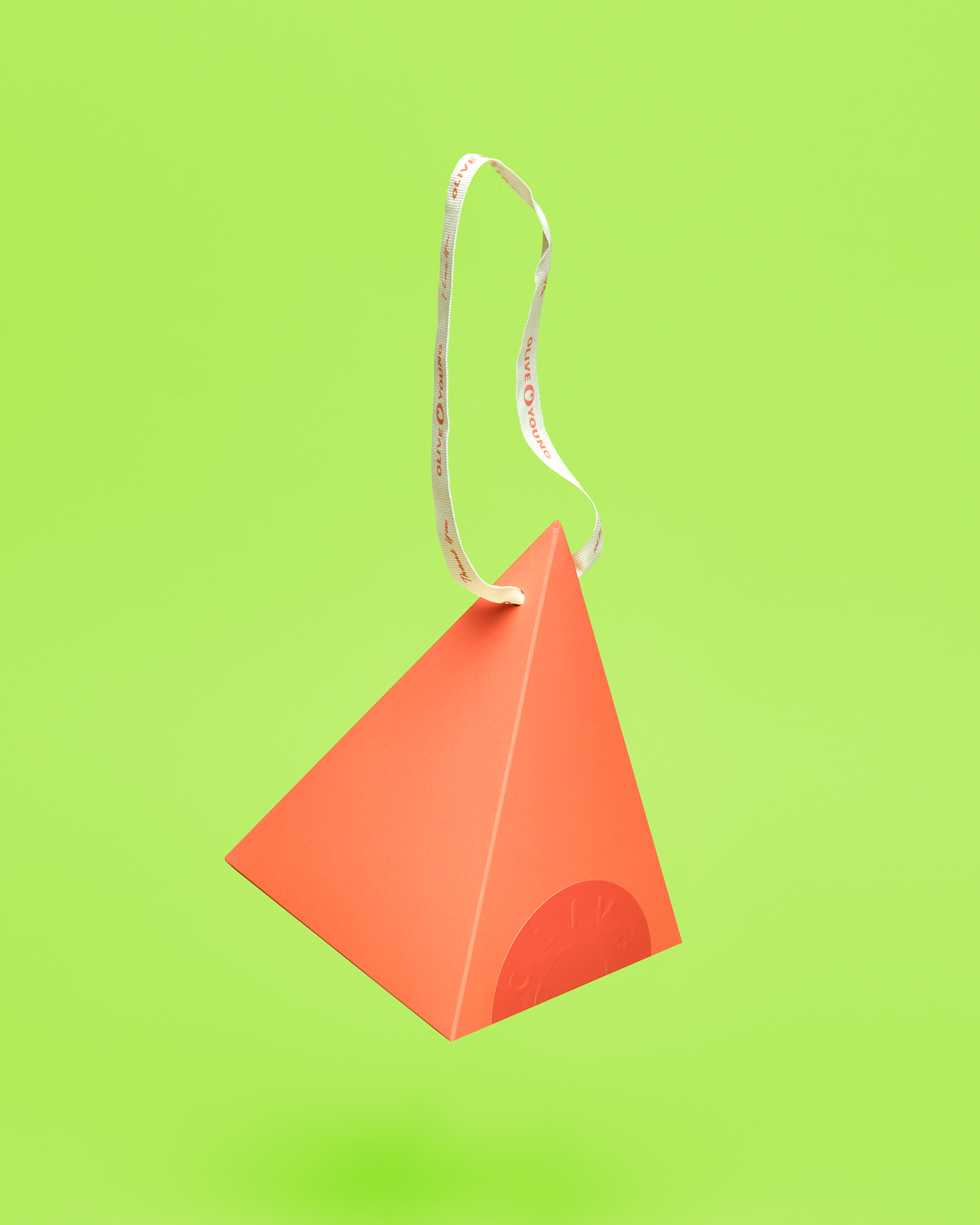
For the new BI, we developed graphic units that embody Olive Young's BPS (Vibrant, Discerning, Unceasingly Adventurous, Witty). These units were designed to be flexible and witty in their application across all mediums when used together.
As the largest H&B store in the country, Olive Young's logo often appears alongside other brand logos. To assist in brand management, we created a Co-Branding system and guidelines. This system differentiates between single and multiple brand pairings, ensuring that the Olive Young logo always maintains visual priority while allowing for easy layout application.

Client |
Olive Young |
Ouput |
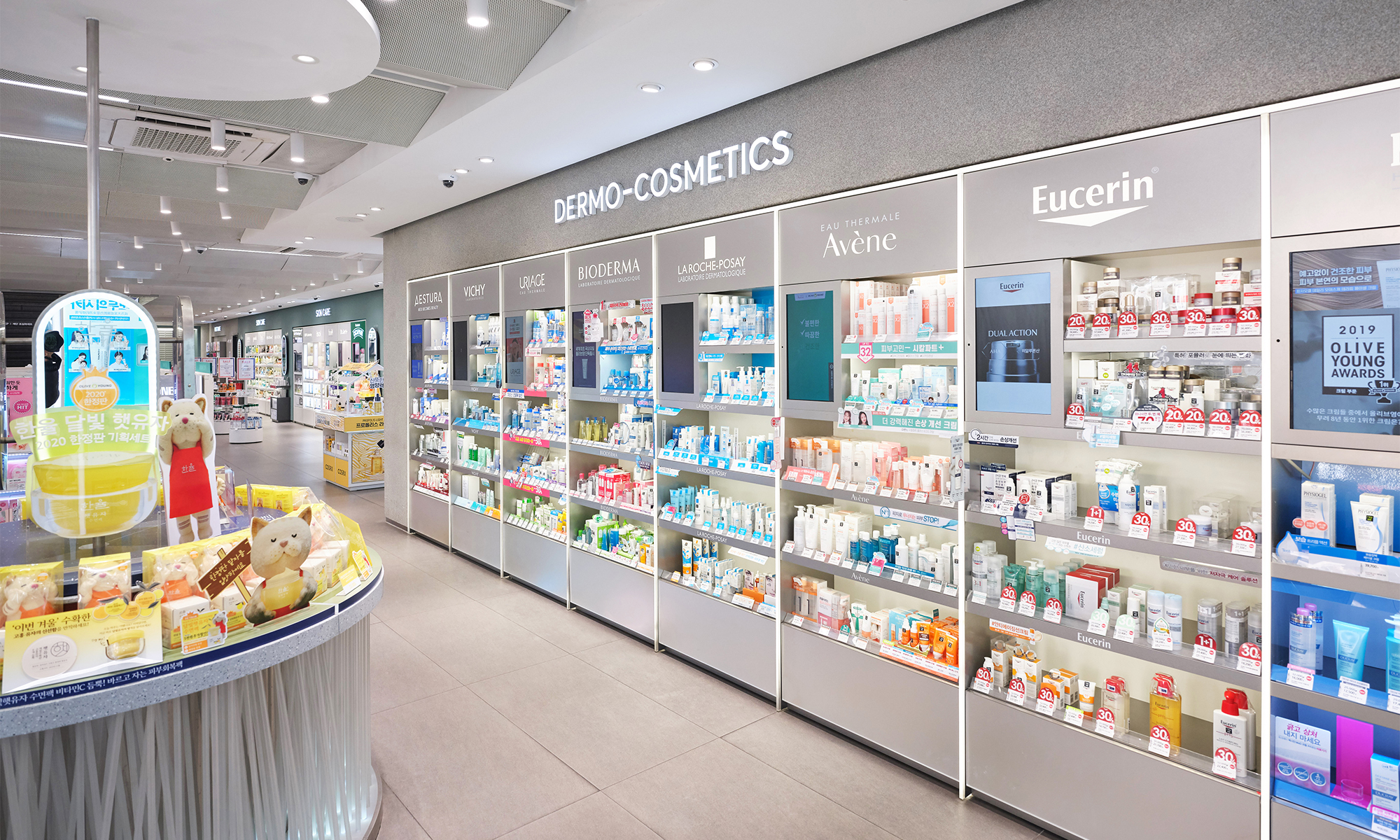
Brand Identity, Packaging, Signage & Environmental Graphics |
Year |
2019 |
Double D |
Minjae Huh, Sue Park, James Chae, Helen Chang, Sol Kim, Chaehee Park, Mirinae Kim |