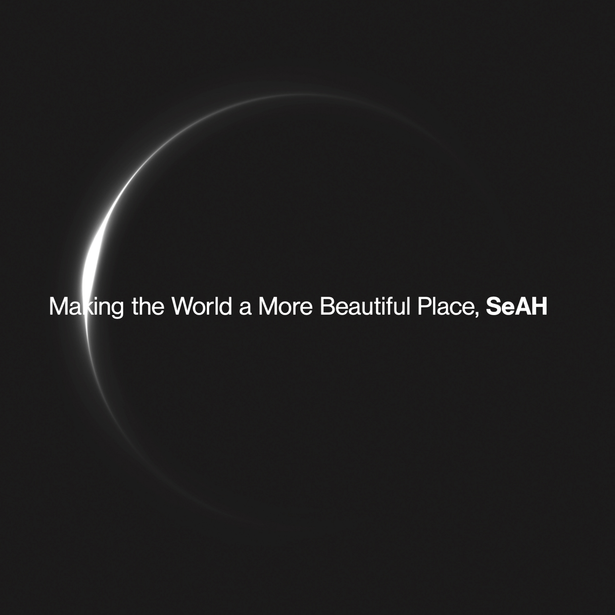
Designing a national brochure for SeAH Group, a company that aims to make the world beautiful.
- editorial
The past, present, and future of SeAH Group
DoubleD designed a national brochure for SeAH Group, a company that aims to “make the world beautiful”. Based on its core competency in steel manufacturing, SeAH Group continues to convey its values and envisions a beautiful future.
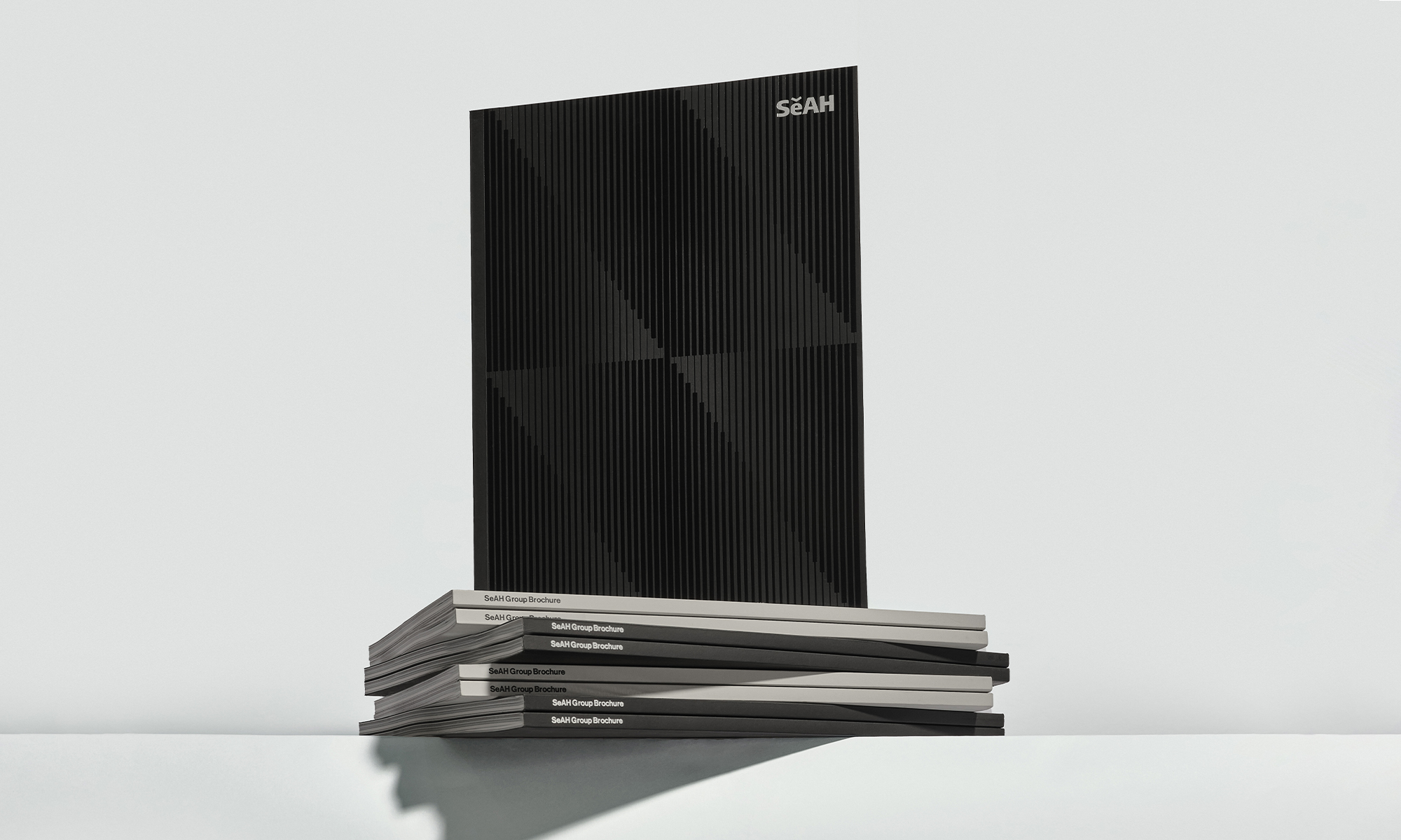
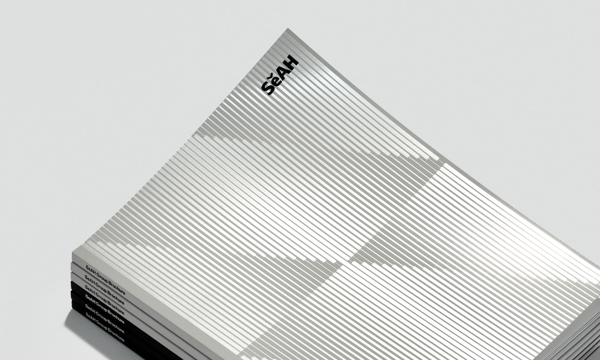
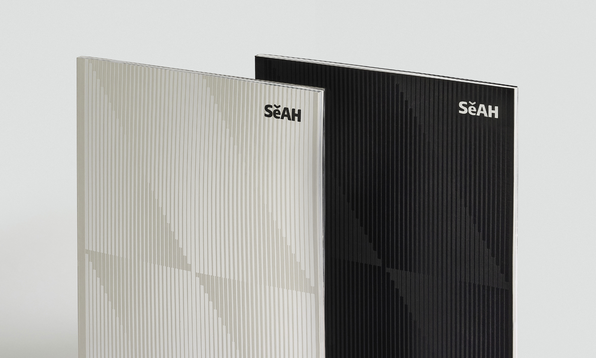
DoubleD wanted to convey SeAH's connected and enduring values with a cover design that utilizes a strong yet soft line graphic.
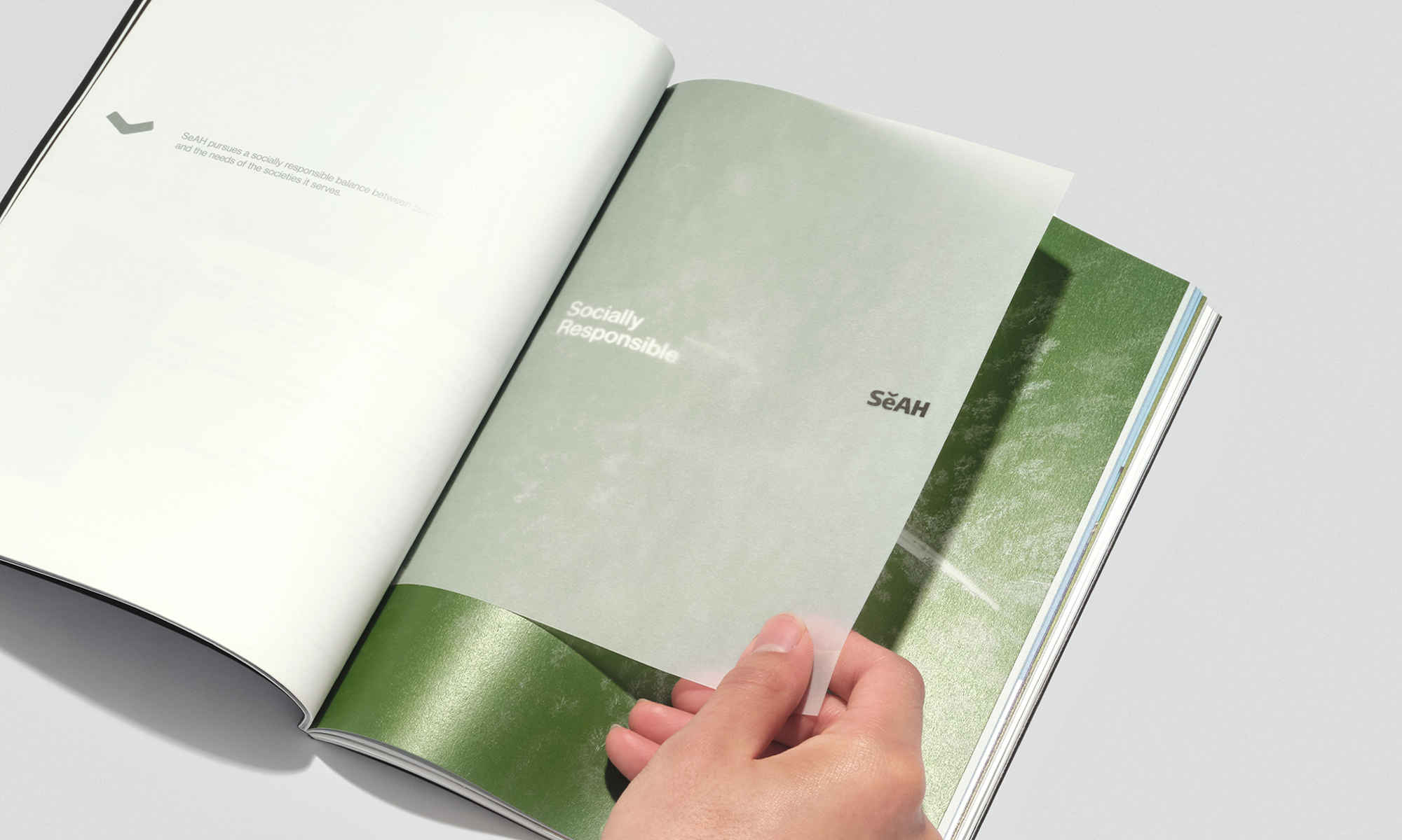
A color system that symbolizes SeAH
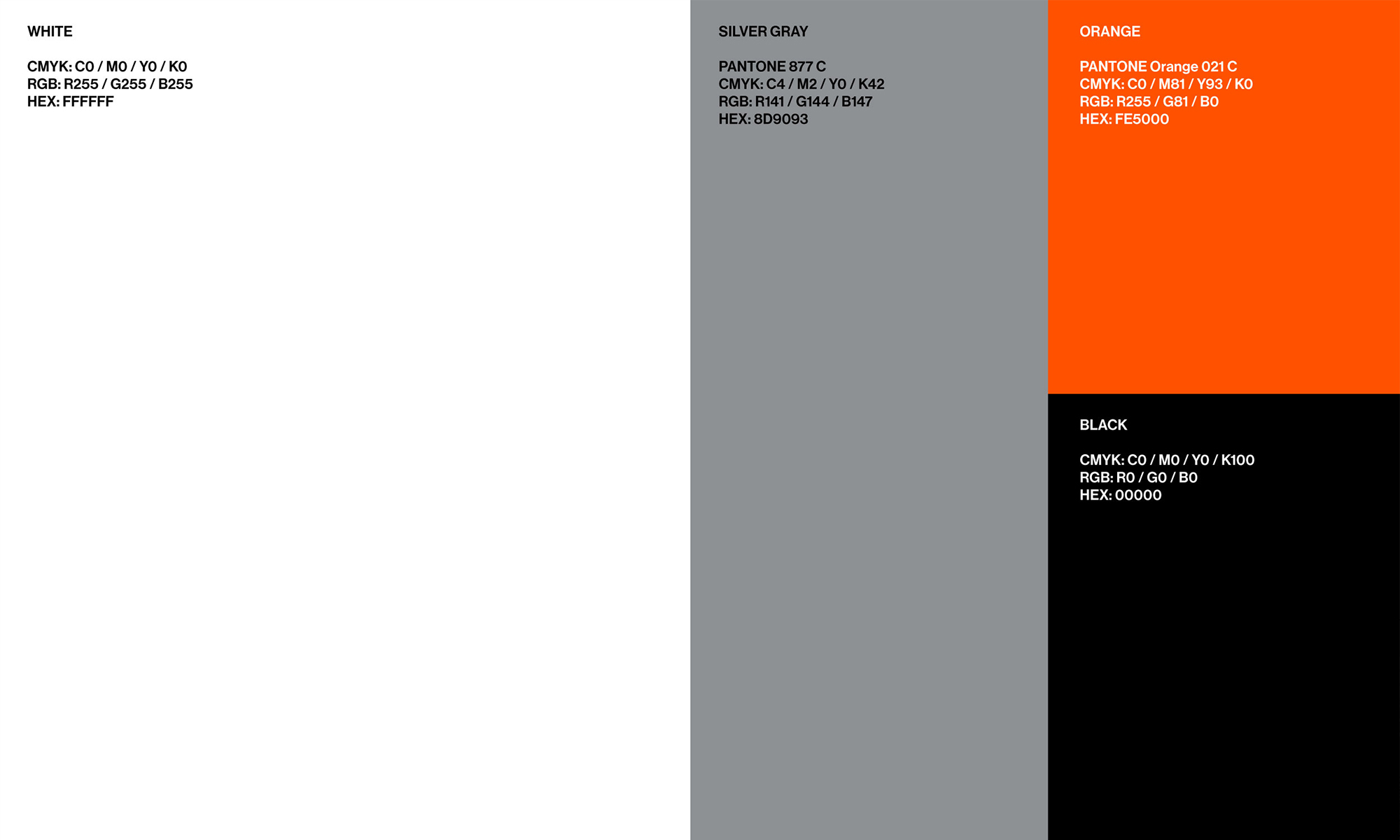
The gray color, which symbolizes the trust built up in the steel business, and the orange color, which symbolizes the unstoppable passion and warm corporate values, were highlighted with spot color printing throughout the brochure.
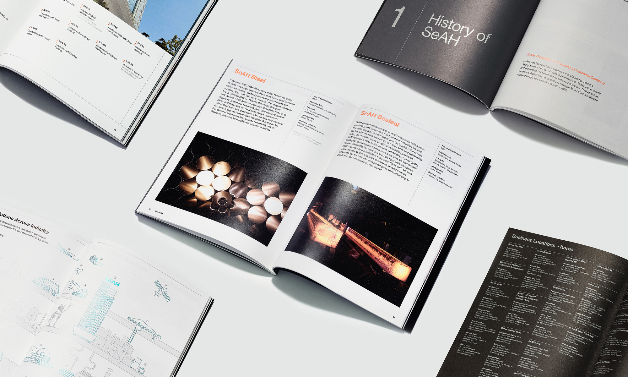
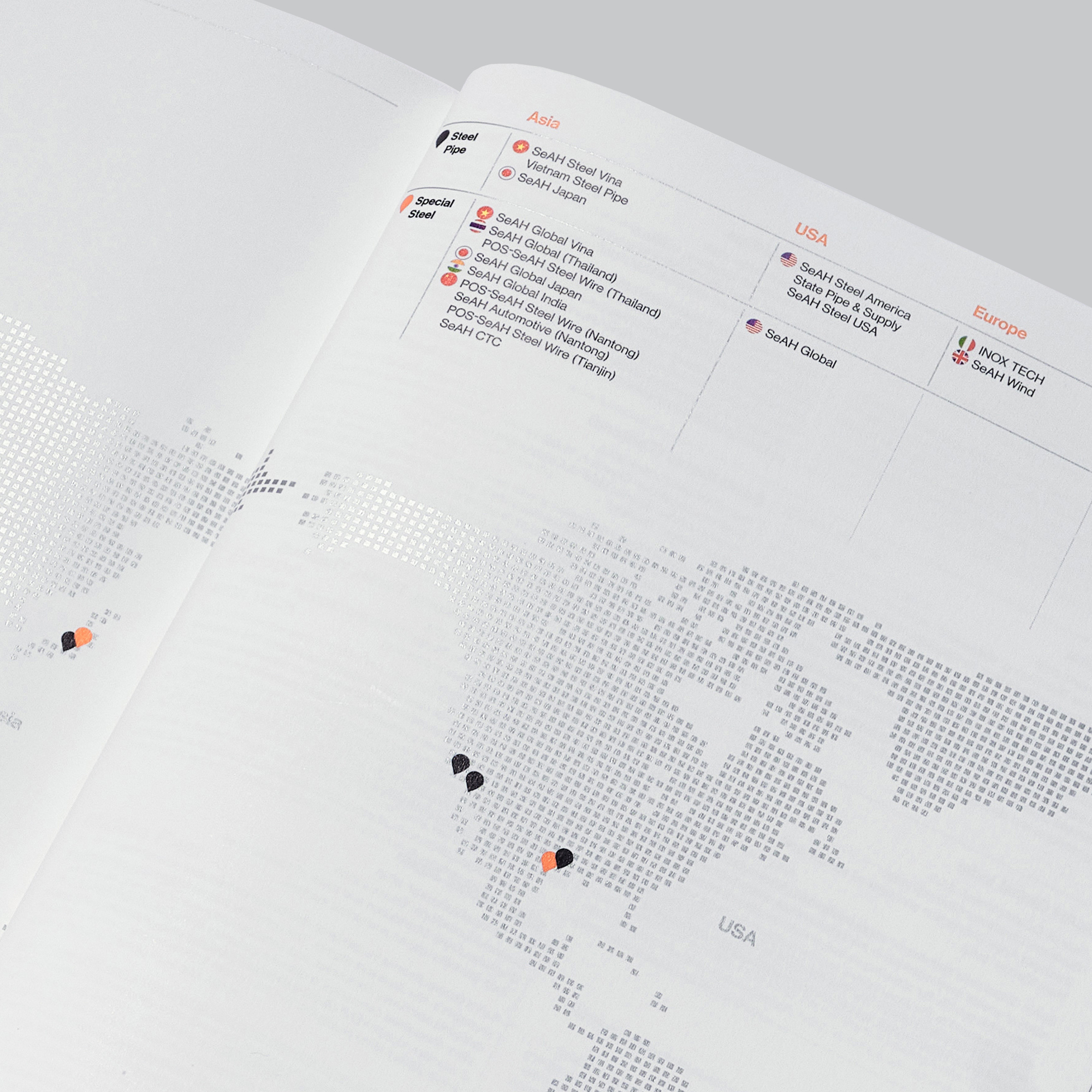
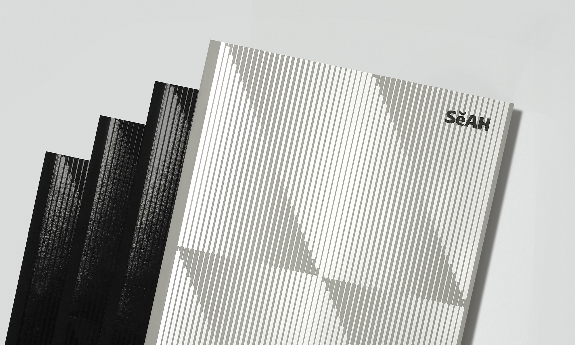
The inner pages have been updated to clearly express Seah Group's core values.
The content of the brochure was organized with the purpose of introducing and informing outsiders about SeAH, defining the direction of the company, and effectively conveying the corporate image. The design was simple and concise, yet sophisticated and deep, not overly flashy or fashionable. SeAH's values with a simple, concise, sophisticated, and deep design.
Client |
SeAH |
Output |
Editorial |
Year |
2022 |
Double D |
Minjae Huh, Kyungmi Jun, Taeyeon Kim, Daewook Kim, Jihoon Park |
Collaborator |
LIFT-OFF(Design Participation) |