A new identity for Korea’s leading organic brand, shaping the country’s lemon juice market
- CI & BI
- brand system
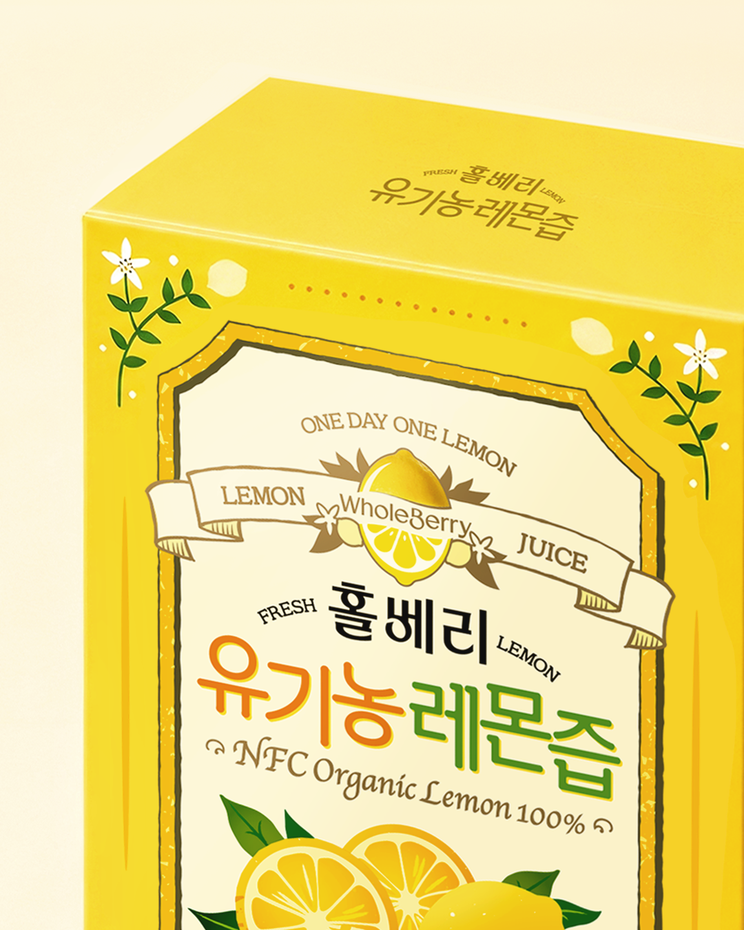
Reframing Wholeberry as a Specialist Lemon Brand
Wholeberry was created under Wholefood Korea’s vision of delivering authentic products through food of genuine value. The brand has introduced organic ingredients from around the world and developed a diverse range of health products centered on the integrity of their natural sources. With approximately KRW 170 billion in sales, lemon juice has become Wholeberry’s signature product—establishing the brand as a leading name in Korea’s rapidly growing lemon juice market.
Double D approached the project with the goal of expanding Wholeberry’s portfolio around its flagship lemon juice. Building on the product’s key strengths—premium Spanish-grown lemons and a low-temperature extraction process that presses the whole fruit, including the peel—we set out to strengthen Wholeberry’s position as a specialist lemon brand.
To move beyond product-led recognition and communicate a clearer, more distinctive identity, we redefined the brand story and renewed the Brand Identity System (BIS) in its entirety.
A Logo Inspired by Fruit and the Flow of Nature
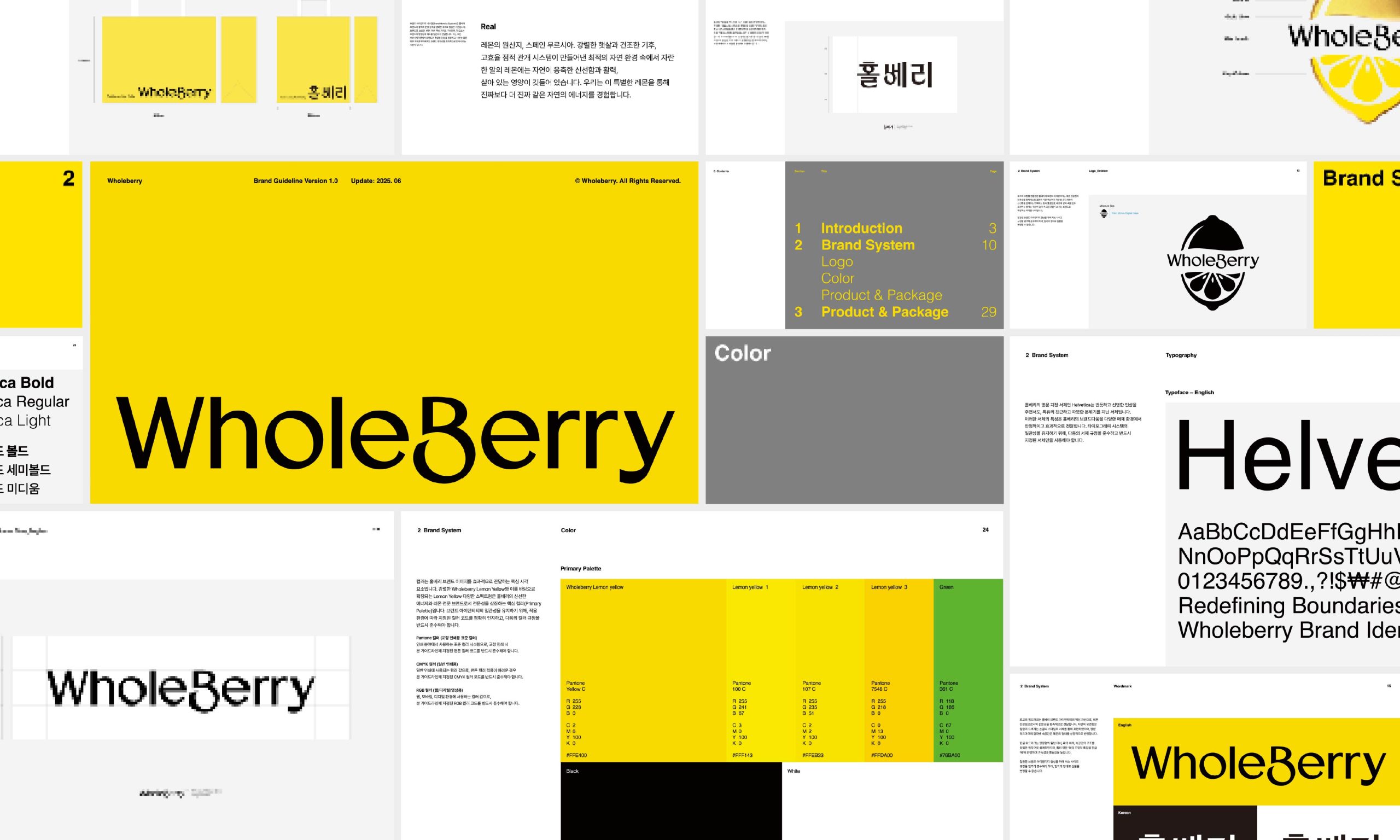
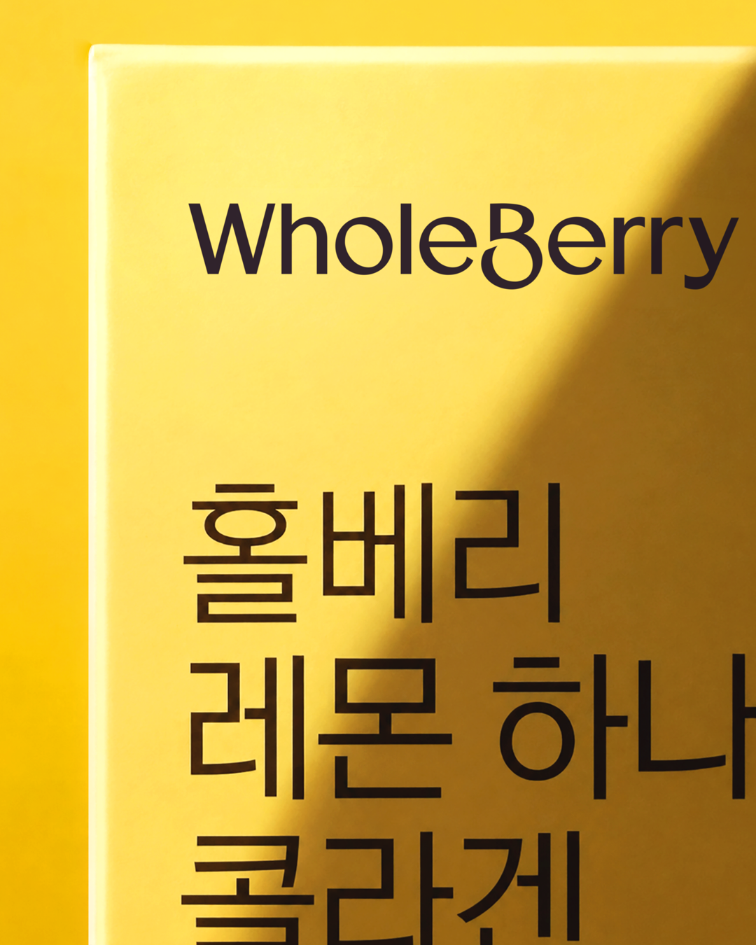
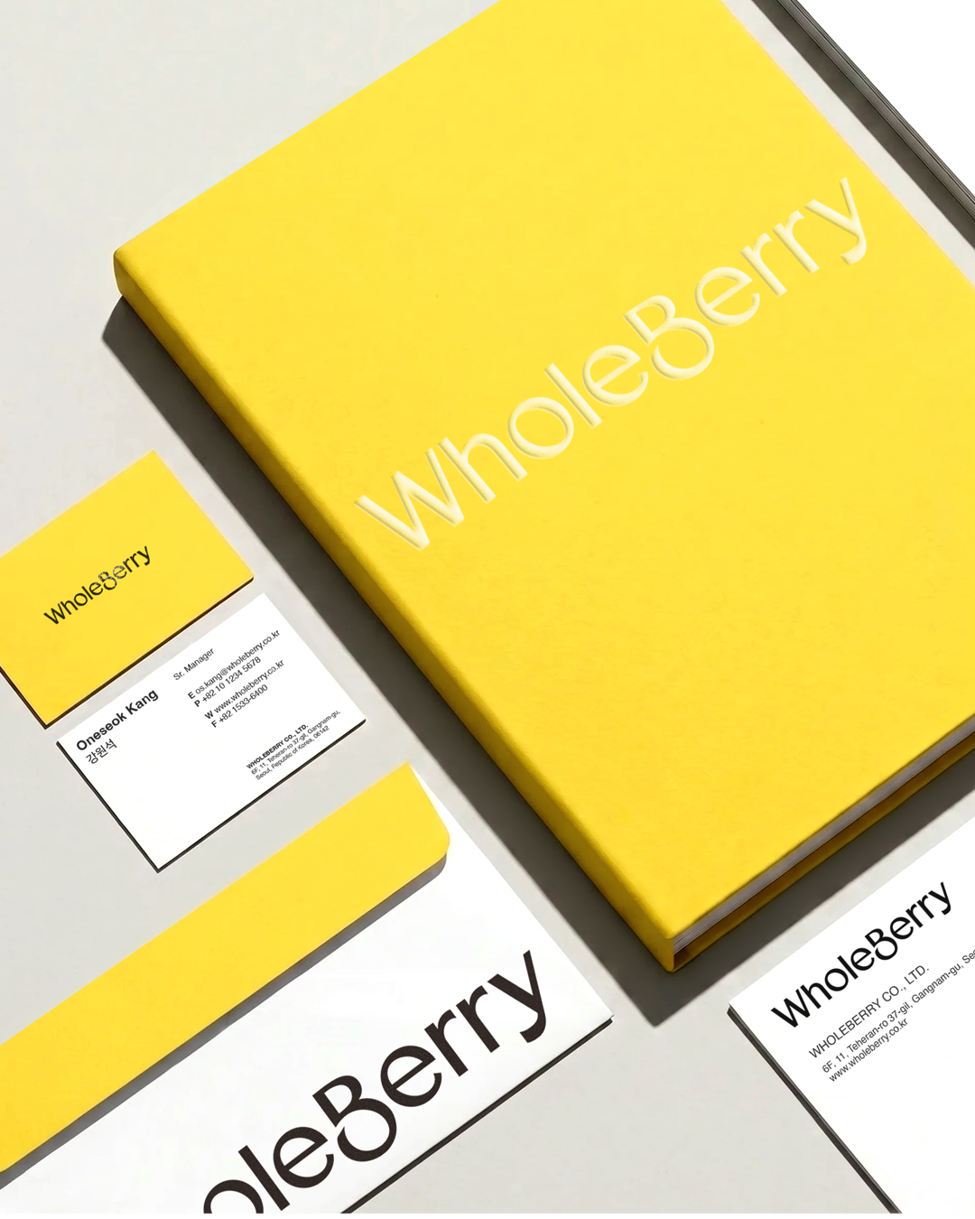
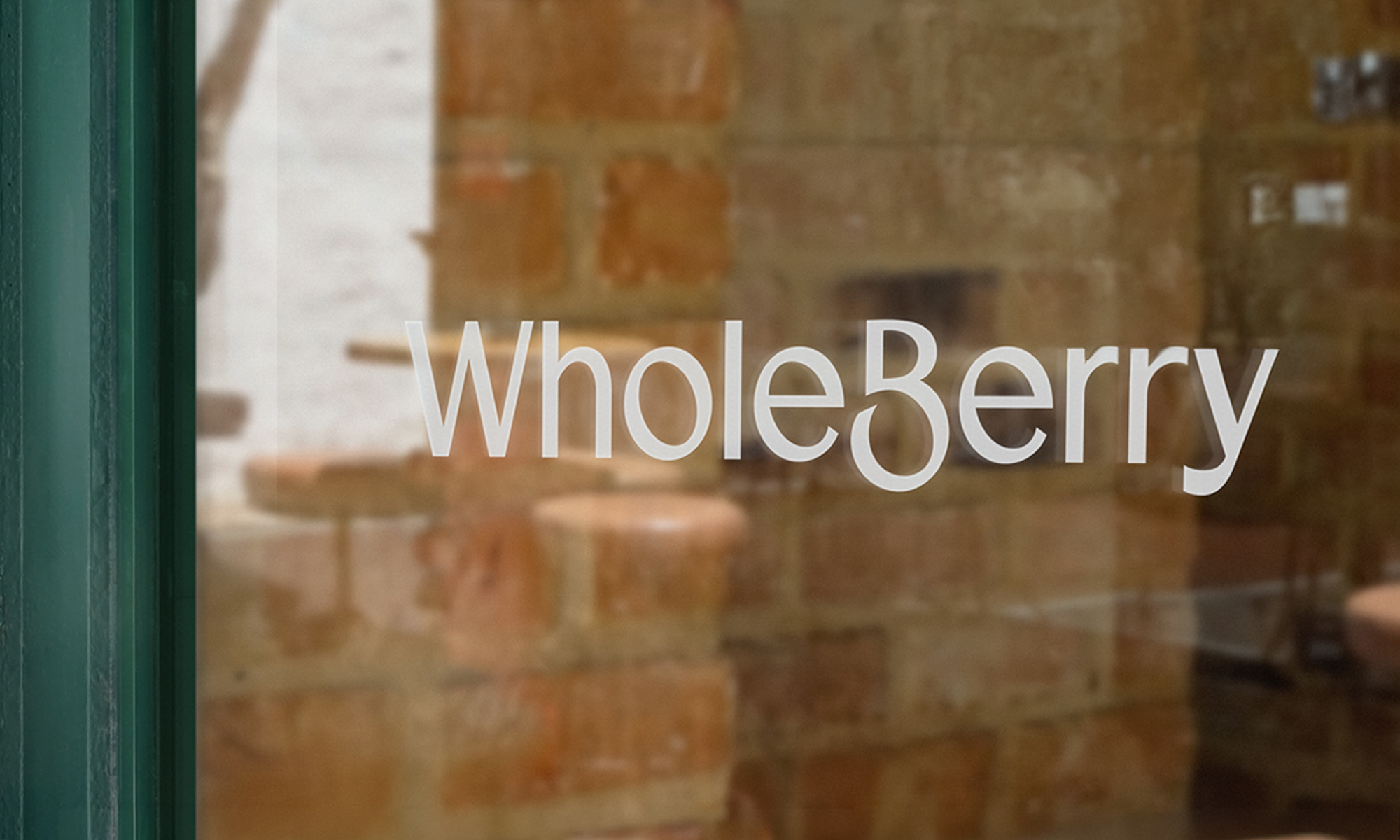
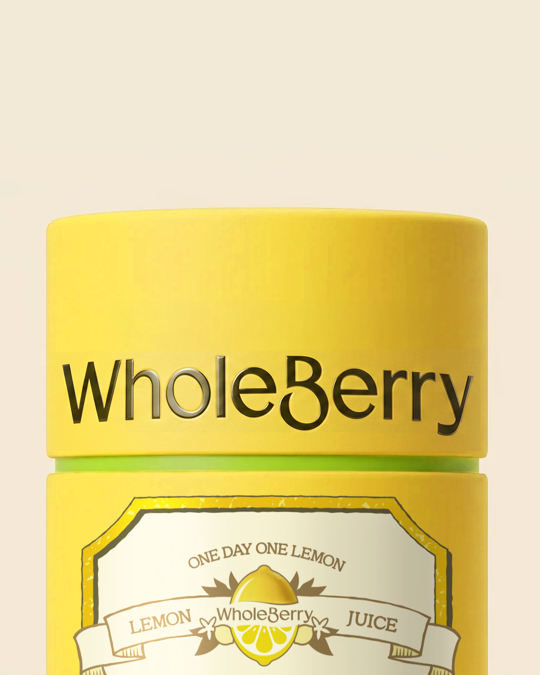
The new wordmark captures Wholeberry’s identity as a specialist lemon brand through forms inspired by the fruit itself and the freshness of its natural ingredients. Soft, rhythmic curves evoke the gentle movement of a breeze, giving the logo a light and organic character.
The Korean wordmark takes a distinctive cue from the English letter ‘B,’ which shares its pronunciation with the Korean syllable ‘베.’ By carrying the defining shape of the ‘B’ into its Korean counterpart, the two wordmarks retain a consistent visual character across languages, reinforcing the brand’s overall coherence.
A Color System Rooted in Lemon and Nature
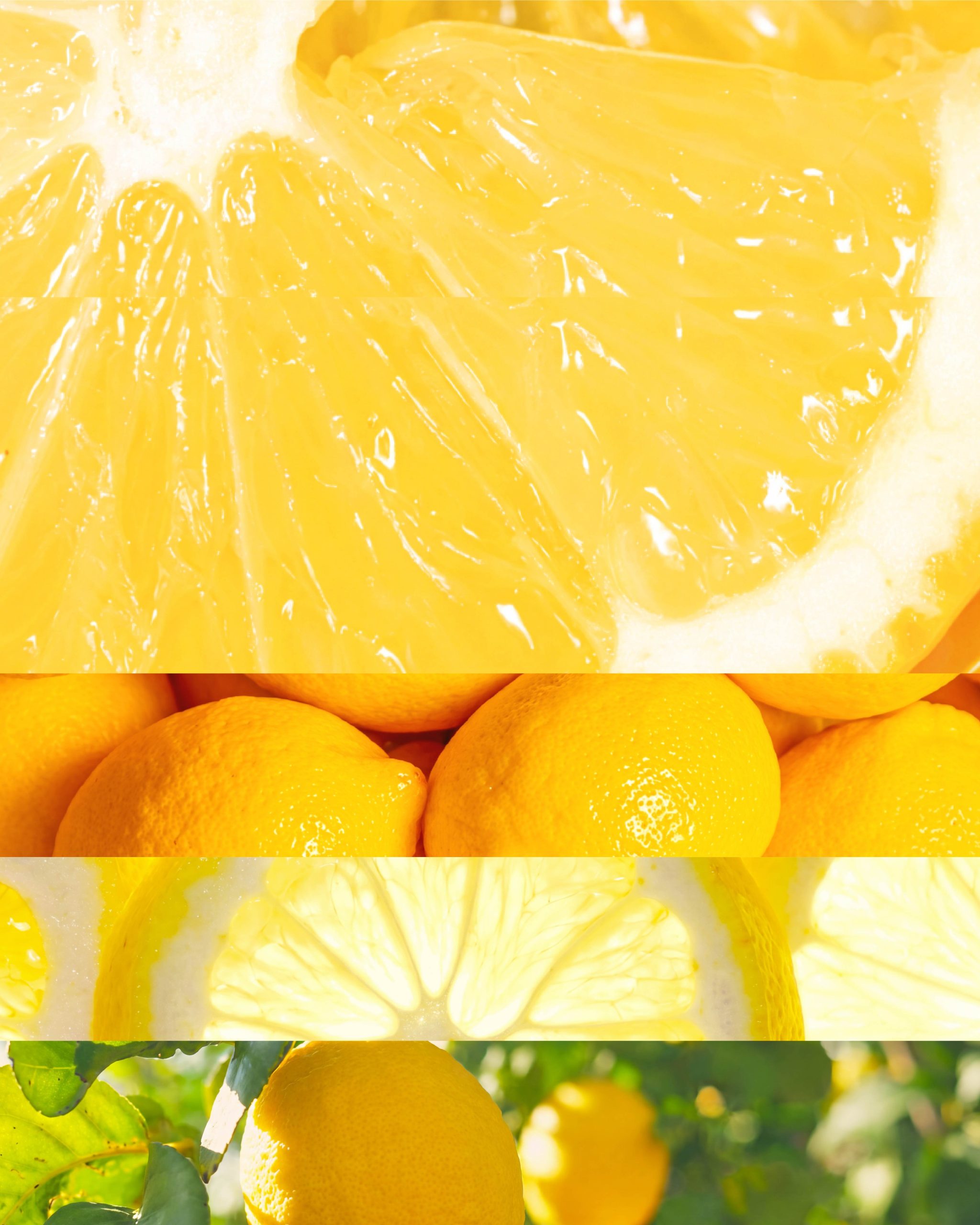
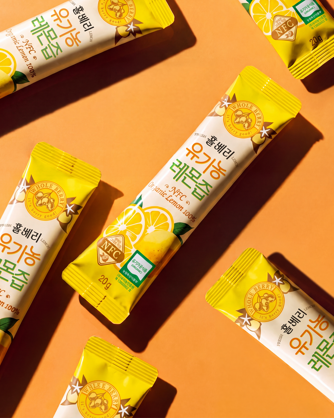
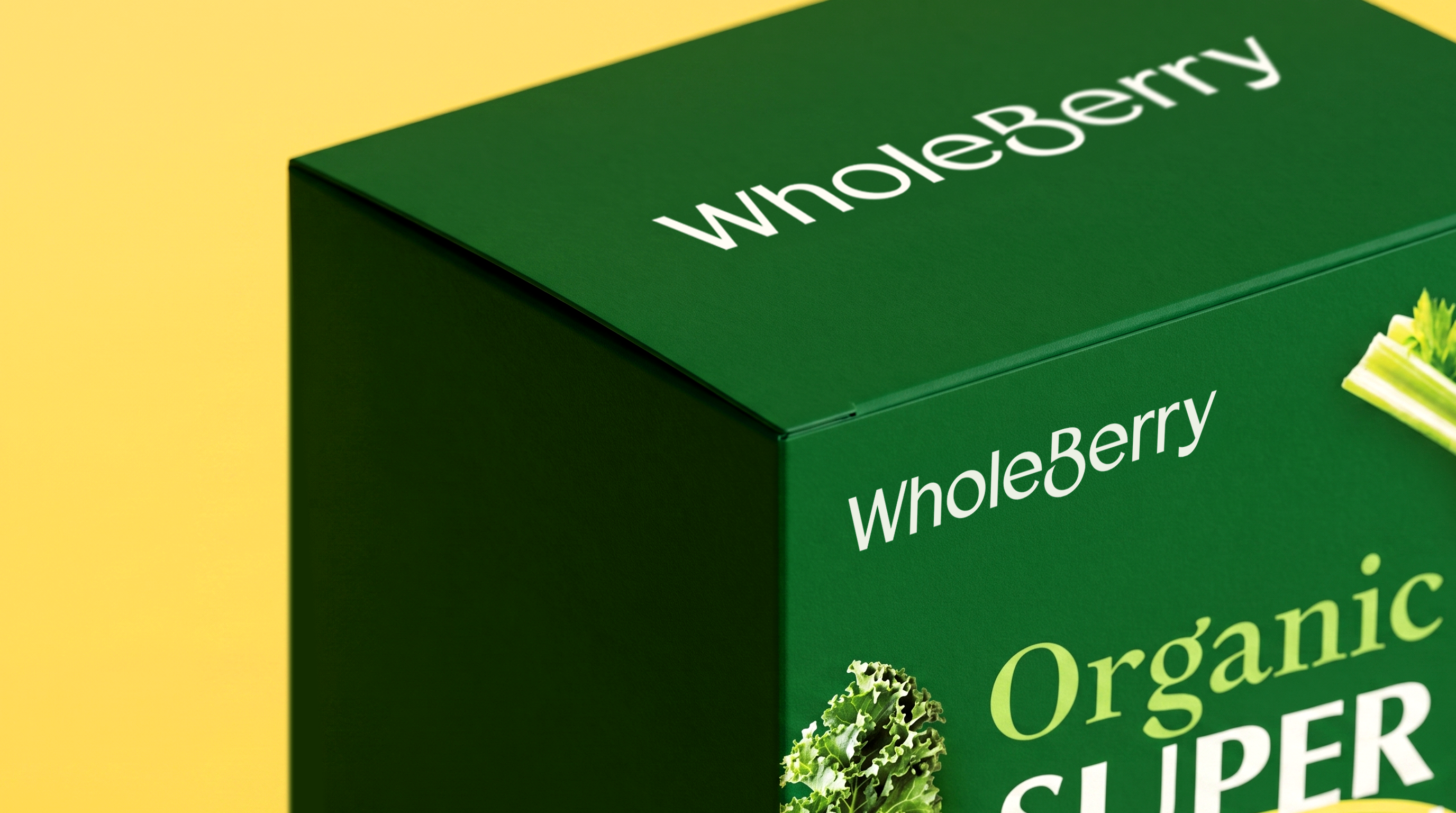
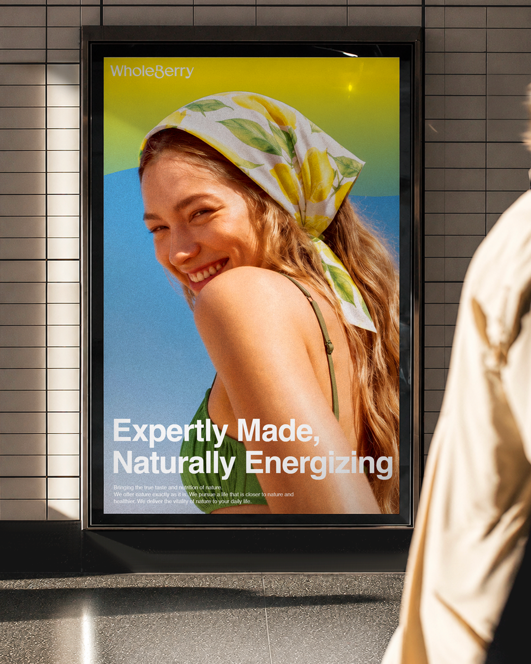
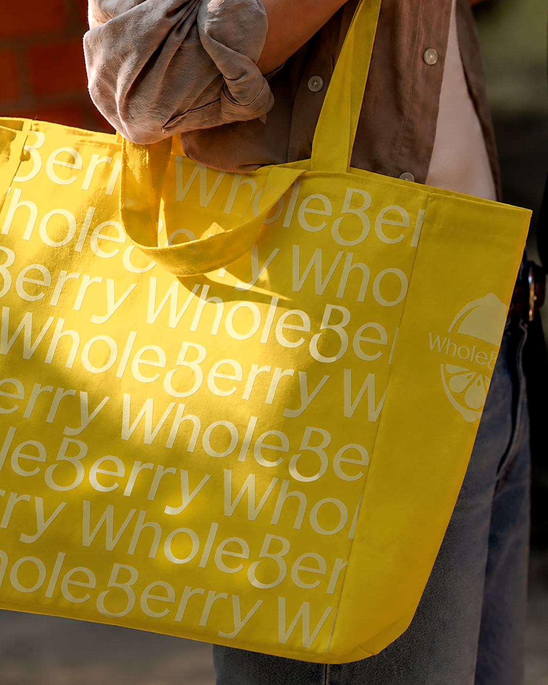
Inspired by the lemon at the heart of Wholeberry’s flagship product, the color system was designed to express freshness, vitality, and a close connection to nature. Yellow represents the bright, uplifting energy and tangy freshness of the fruit, while green conveys the natural integrity and reassurance associated with organic ingredients. Used together, the two colors create a fresh, balanced, and distinctly Wholeberry mood.
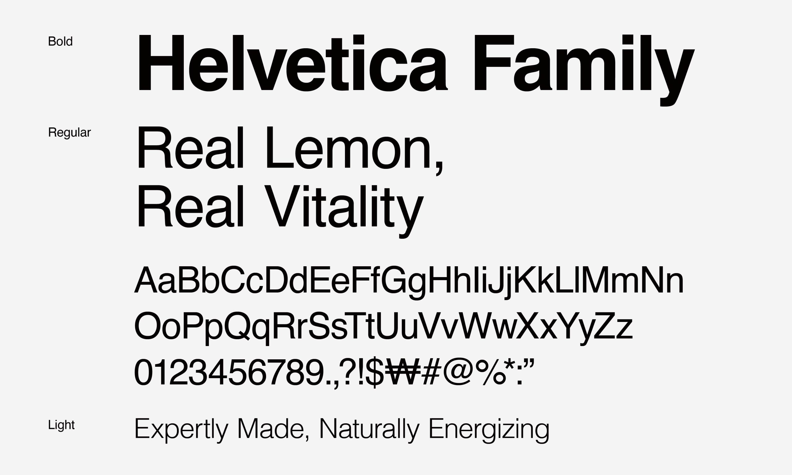
To support clear communication and convey the brand’s sincerity, we paired a highly legible sans-serif typeface for English with Pretendard for Korean. Together, they establish a consistent and trustworthy voice across every consumer touchpoint.
A Brand Story That Brings Natural Vitality into Everyday Life
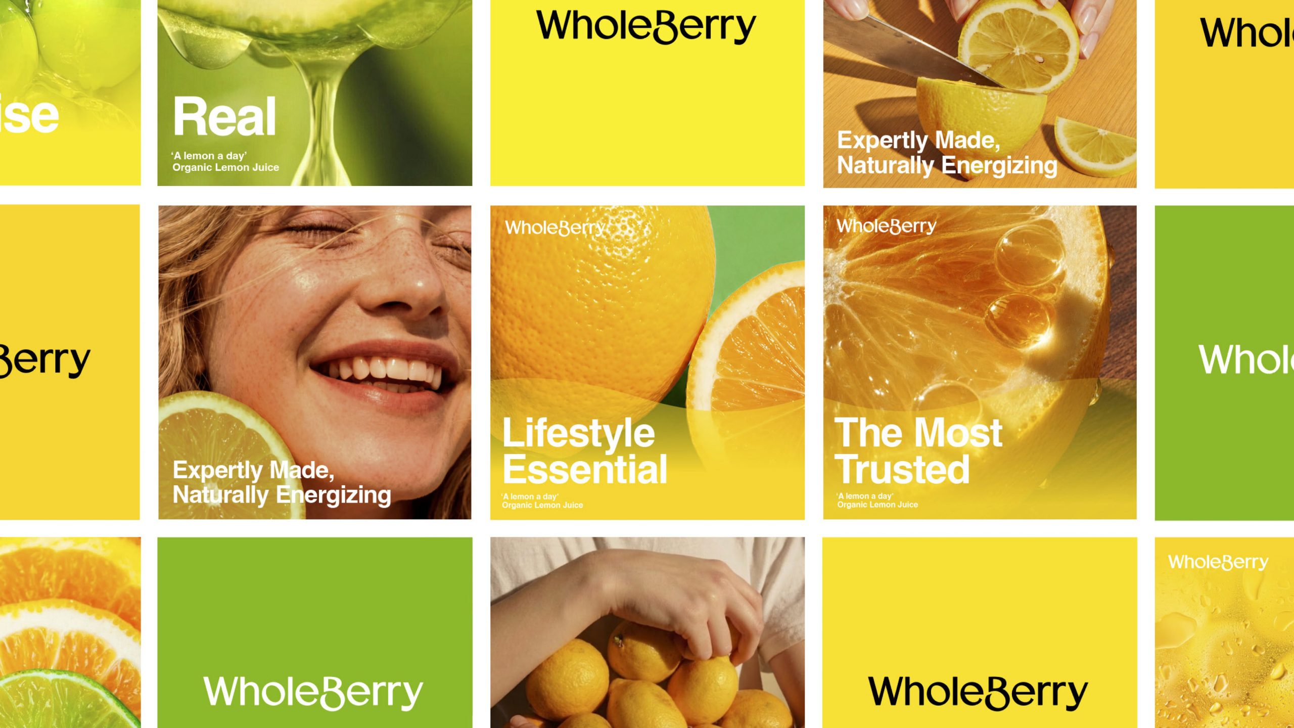
Through interviews with internal stakeholders, competitor research, and market analysis, Double D established a clear strategic direction for the brand. The resulting identity and core message, “Real Lemon, Real Vitality,” capture both the inherent energy of fresh ingredients and Wholeberry’s commitment to expertise, trust, and natural authenticity.
Drawing on its technical expertise as a specialist lemon brand, Wholeberry places the fruit in its purest form at the heart of its identity. By positioning the brand around energetic, rhythmic routines for healthier living, we defined a distinctive direction, set of values, and story that belong uniquely to Wholeberry.
일관된 브랜드 경험을 위한 새로운 로고 시스템
더블디는 새롭게 개발된 로고와 비주얼 시스템이 제품 패키지를 포함한 모든 브랜드 접점에서 일관되게 활용될 수 있도록 홀베리의 가이드라인을 함께 구축했습니다. 가이드라인에는 새로운 BIS, 로고 사용 규정, 컬러 및 비주얼 모티프 적용 방식, 타이포그래피 시스템, 레이아웃 구조 등에 대한 통합적인 가이드라인을 포함하고 있으며, 이를 통해 동일한 기준 아래 홀베리가 레몬 제품을 넘어 브랜드 경험 전반에서 신뢰와 일관성을 유지할 수 있는 기반을 마련했습니다.
Client |
Wholefoods Korea |
Output |
Brand Identity, Brand System Guidelines |
Year |
2025 |
Project |
Minjae Huh, Eunyoo Moon, Haeun Chung, Oneseok Kang |
Collaborator |
Taeryong Kim(Typeface), Heesun Eum(Brand Strategy) |
Portfolio |
Minjae Huh, Eunyoo Moon, Yurim Hong, Oneseok Kang(Motion Partner) |