From a car manufacturing company to a mobility company that inspires people through movement
- case studies
Q. I'd like to ask about the project first. What kind of work was Double D in charge of?
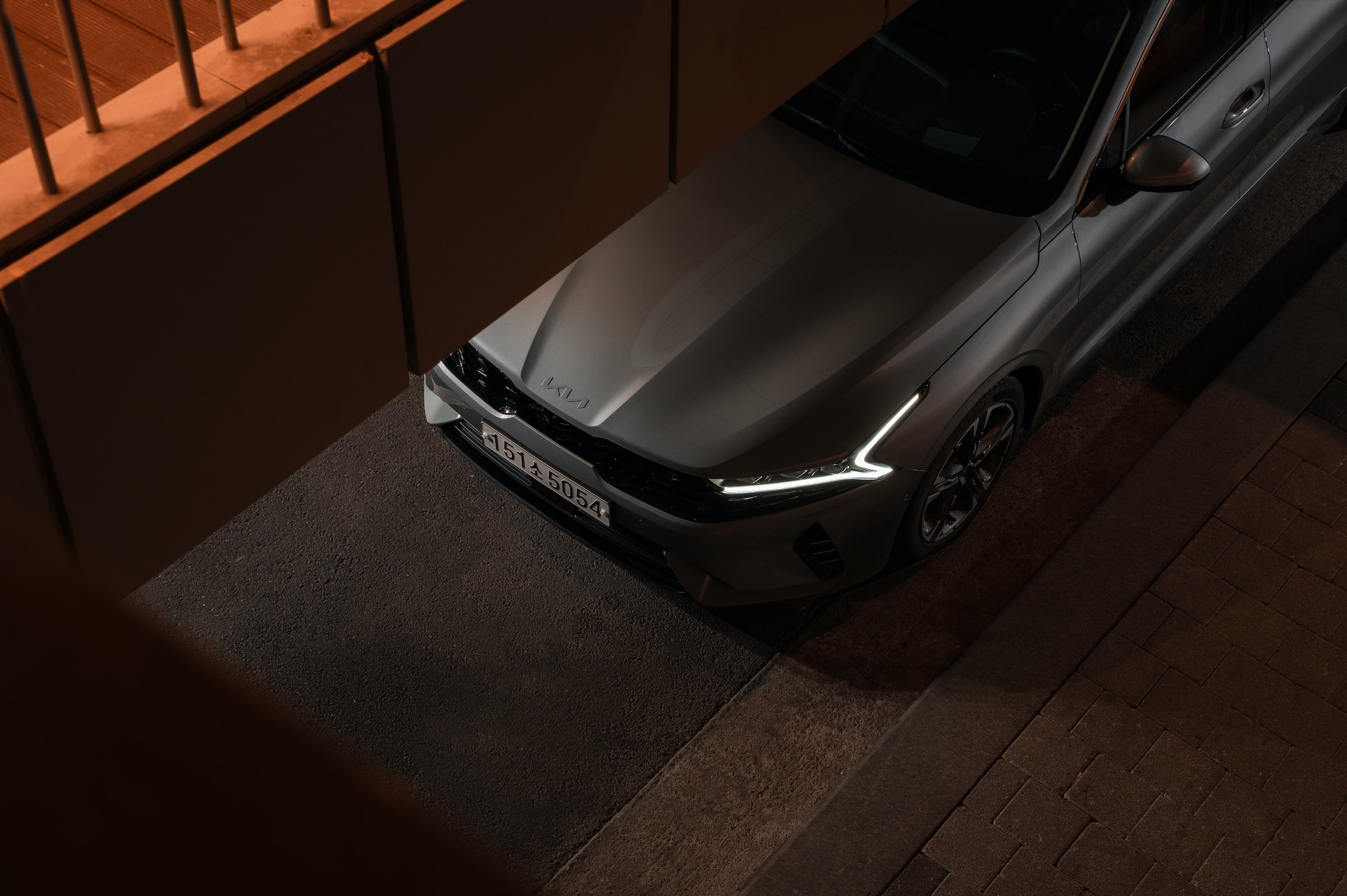
In line with the changing mobility paradigm, Kia Motors has changed its name to Kia for the first time in 30 years, changing its logo and slogan accordingly, and introducing a new brand strategy. DoubleD has proposed brand design strategies and renewed its basic and application systems to help deliver Kia's new brand message more effectively and consistently.
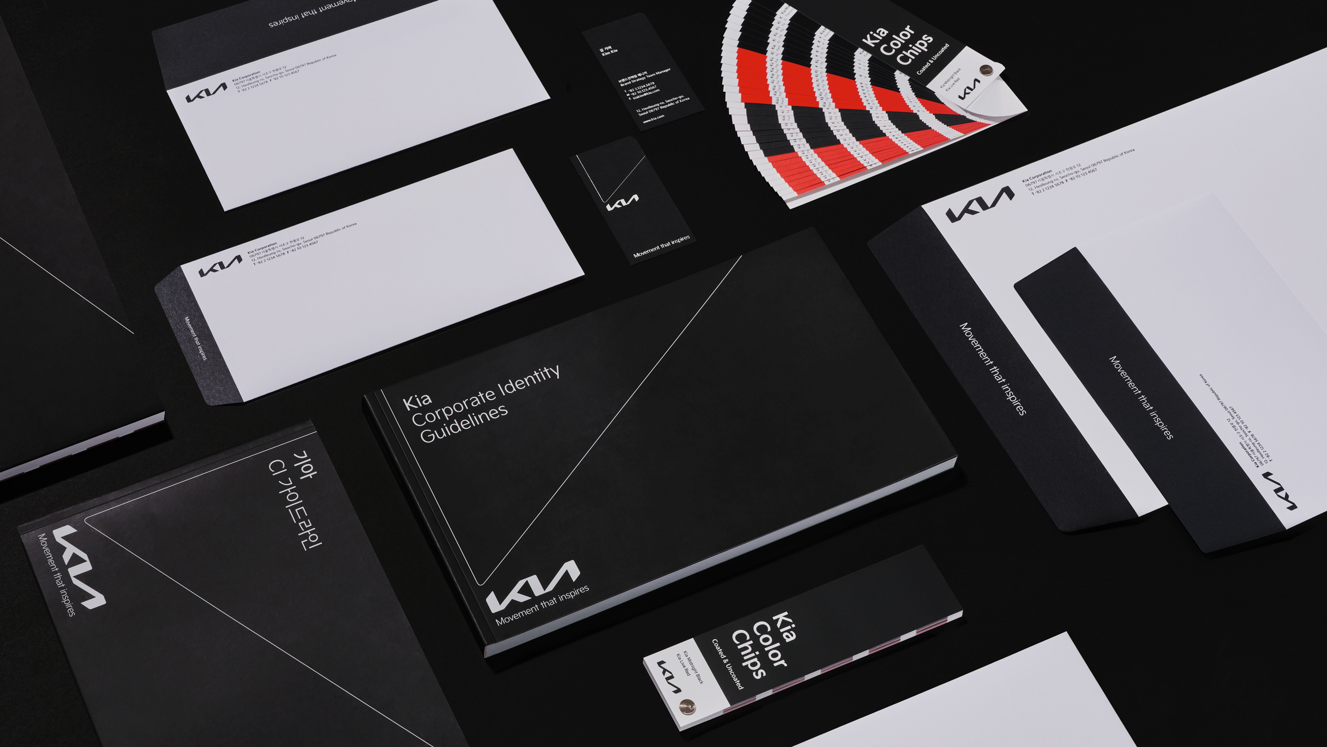
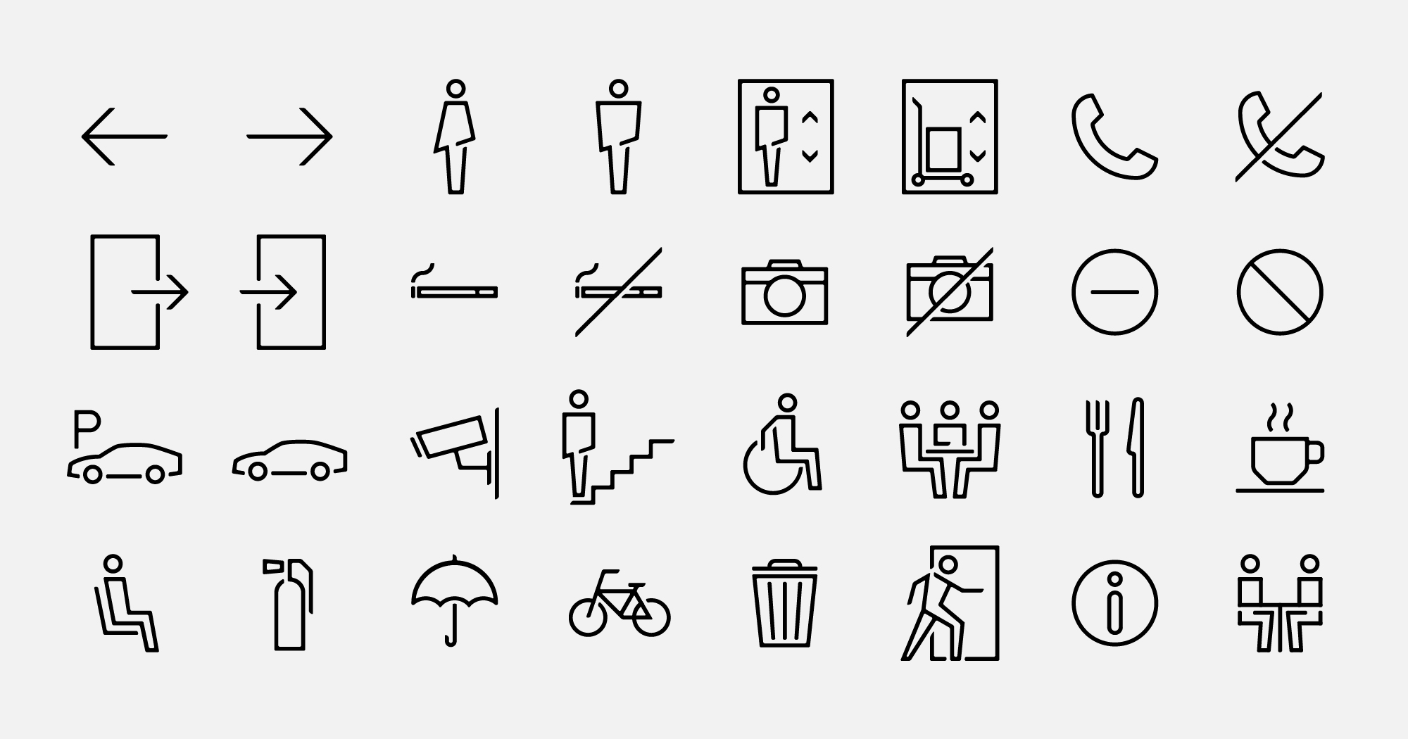
Based on the new slogan "Movement that Inspires," we have established a basic and application system to effectively visualize logos containing Kia's philosophy on mobility and the graphic motifs derived from them. We proposed a strategy for a dedicated typeface, and for the final design, we developed it with sandstones to ensure that hunger as a whole feels consistent across the entire media. We have developed basic visual elements derived from pictograms, icons, etc., and basic systems.
Q. How did you get to participate in the project?
In 2019, DoubleD was selected through proposals to upgrade creative strategies and application design and systems, excluding the Kia logo hosted by Innovation. In the case of Kia logo design, it was already developed and completed in a design studio in Germany, and in the case of image directions, other creative agencies in Korea eventually took over, and all the work was a big project under Innovation's project management.
Q. The line element that divides the screen stands out in the application, where did you come up with this idea?
Kia's new logo is called 'Kia Signature.' It also means that it originated from a hand-drawn sign. The new logo looks very straight, but it also looks like a human being wrote with a flat brush.
We have created systems and guidelines for maintaining Kia's brand image by consistently utilizing logos that demonstrate brand value. In addition to regulations for basic logos, we have established an overall brand system considering their use in various situations, including logo extension combinations and slogan combination regulations required to utilize and combine logos.
Motifs using part of the logo were also made and utilized to be used in various situations.
Q. The red color that Kia has used for the logo for 30 years has been missing, what could be the background?
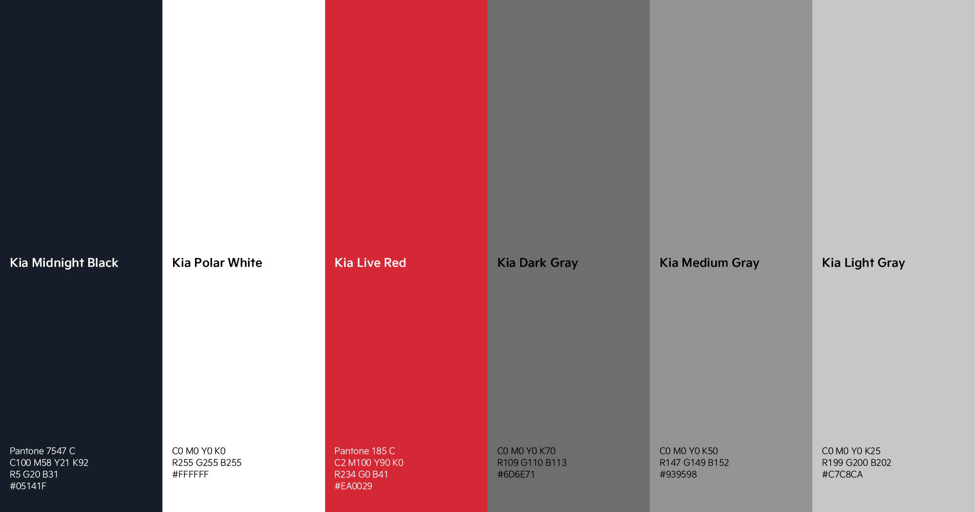
The color strategy was to remove Red from the logo, which represented Kia for 30 years. To this end, while researching the recently updated color strategies of brands to organize insights, I suggested that black and white colors, which can be in harmony with yin and yang, should be the main color, based on Kia's design philosophy, "Opposites United." The black and white that complete the color scheme symbolizes unlimited expression, and furthermore contains Kia's vision to explore and expand the mobility service sector beyond mobility.
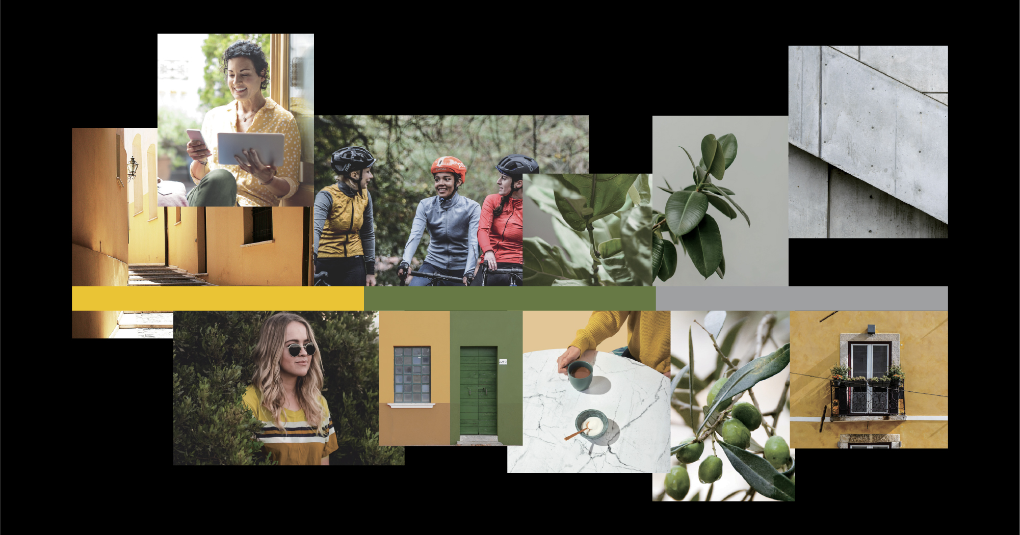
Using the opposite colors, black and white, as the basic colors, we tried to express it in line with Kia's new brand value of 'Opposites United' by creating a strong contrast but stable harmony at the same time. The sub-color proposal also wanted to reveal the human-centered lifestyle that Kia wants to move forward. In addition to the main and point colors, it also defined auxiliary colors that can be used for moods and hues when expressing the casual and delicate lifestyle pursued by Kia in images.
"In order to reflect Kia's new slogan "Movement that Inspires," we have moved away from existing brand colors (Red) and proposed a new color (Black & White) based on Kia's design philosophy."

Q. How was Kia's new brand typeface born?
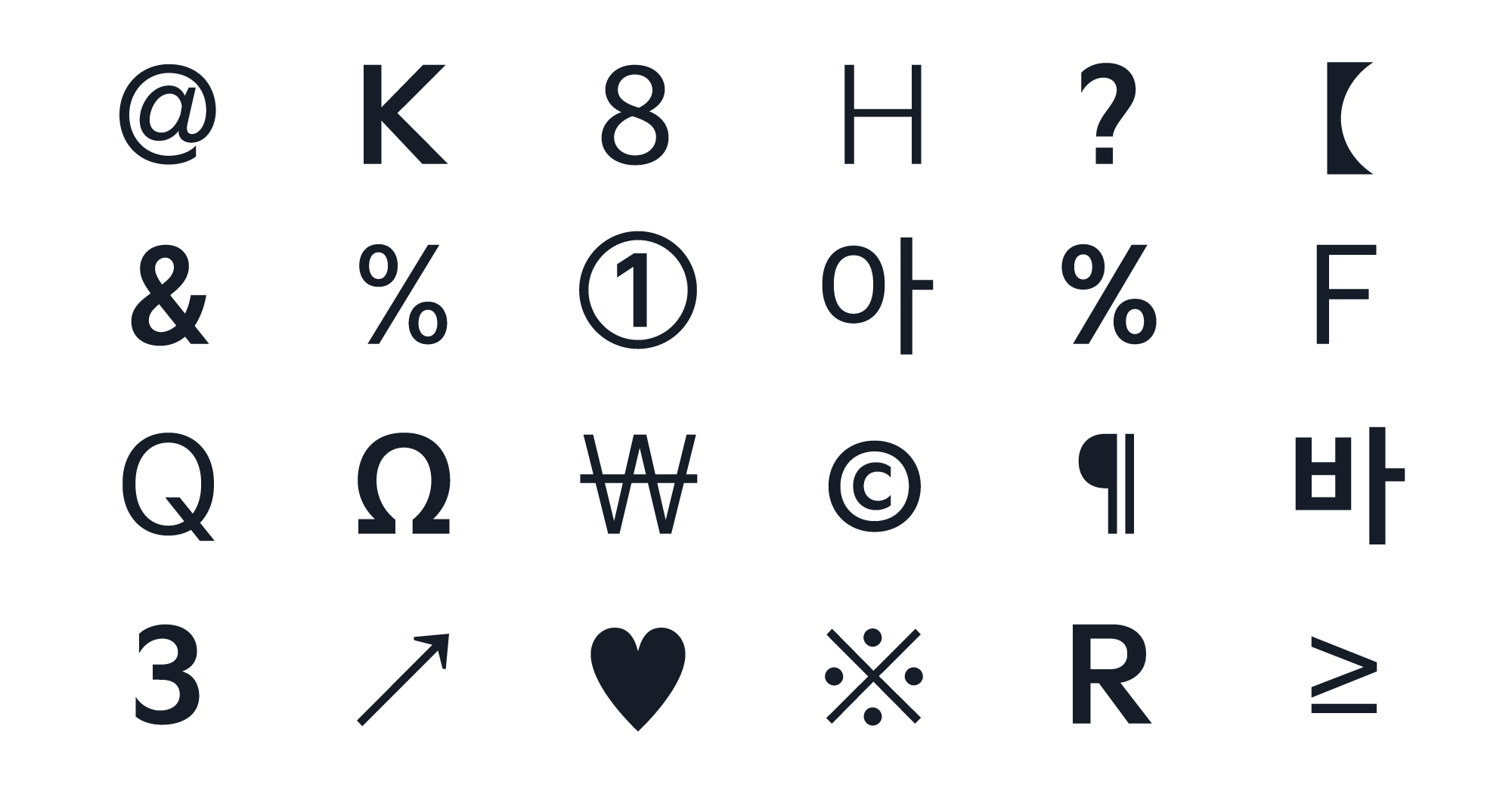
The development of Latin and Korean typefaces of the dedicated typeface "Kia Signature," which conveys a new direction for Kia, began with selecting a font developer and planning directions together. We had to proceed with the development and hinting of state-owned typeface, so we selected Sandol as a stable partner to develop the typeface. And before the actual development, we shared font creative strategy directions with Kia through several communications with Kia. We were geometric that inherited the mechanical impression of the automobile company, but also humanistic that could contain the human-centered philosophy of hunger. Sharp edges and bold typeface were combined to express the strong feeling of Kia and cars, and the flow of strokes was gently expressed to add a human impression to the hard typeface. The guidelines for using typography, which are the criteria for actual use and application of the typeface, were presented together to maintain visual unity and readability even in different editions. The development principle of this font was also utilized in pictograms and icons in the future.
"I thought that the typeface, which is a mechanical smooth form based on mobility, should contain humanity together."
Q. What was the most important thing you thought of while working on the project?
We focused on creating a consistent guideline system, prioritizing making guidelines as easy as possible. To this end, we wanted to analyze the recently updated Brand Guide as a whole to find a system that is easy, flexible, but consistent. Kia's guidelines, which worked with several members of Double D and partner Lyftoff, later won the Red Dot Award.
Q. How do you feel about finishing the project?
Kia distributed its new logo in late 2020 and began applying it across the company. It has changed to a new starvation at all points of contact, such as cars and stores. As a participating designer, I feel proud when I commute to and from work every day and see the logo of Kia Motors on the road and recall the project.
Interviewee |
Minjae Huh |
Client |
Kia |
Output |
Brand System Guidelines, Brand Application, Typeface, Pictogram, Icons |
Year |
2020 |
Double D |
Minjae Huh, Sue Park, Kay Kwon, Sol Kim, James Chae, Choonggeun Yoon, Minjong Kim, Sohyeon Lee, Allison Yoon, Taeyeon Kim |
Collaborator |
Lift Off(Design), Sandoll(Typeface), Jaejun Han(Typeface Advisory), Byunghak Ahn(Typeface Advisory), Bon Min(Typeface Advisory) |