From a car manufacturing company to a mobility company that inspires people through movement
- CI & BI
- brand system
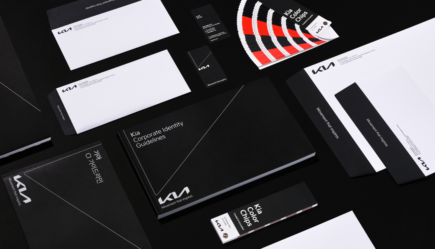
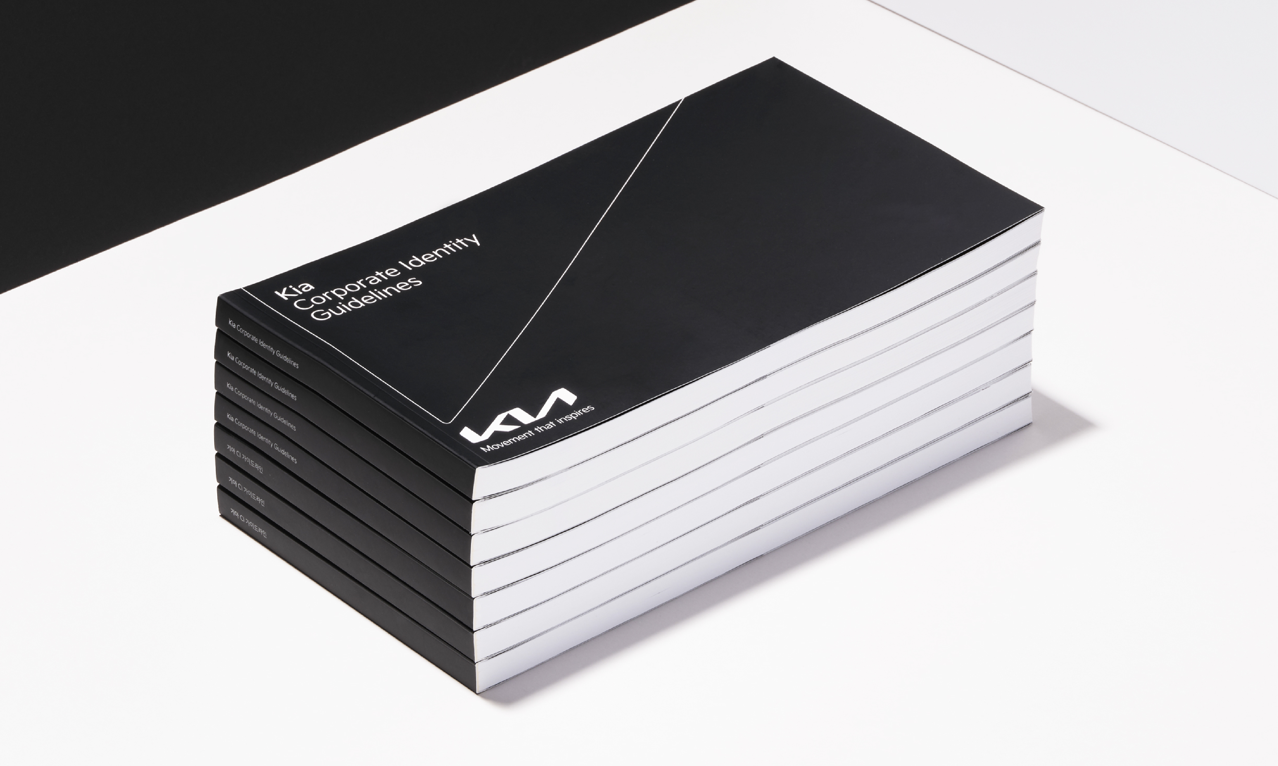
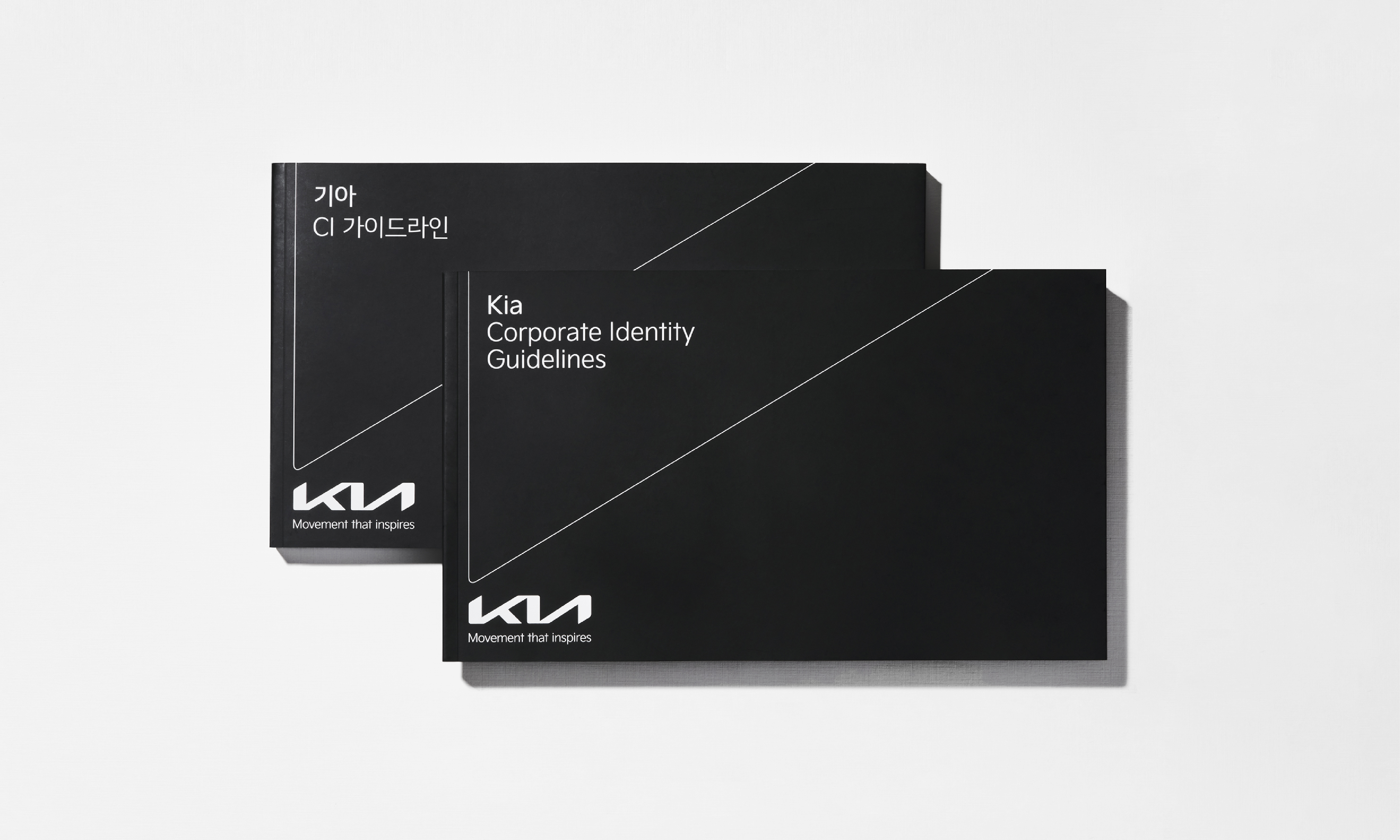
Established a brand system that considers not only regulations for the primary logo but also usage in various situations, including guidelines for logo expansion combinations and slogan combinations when utilizing and combining the logo.

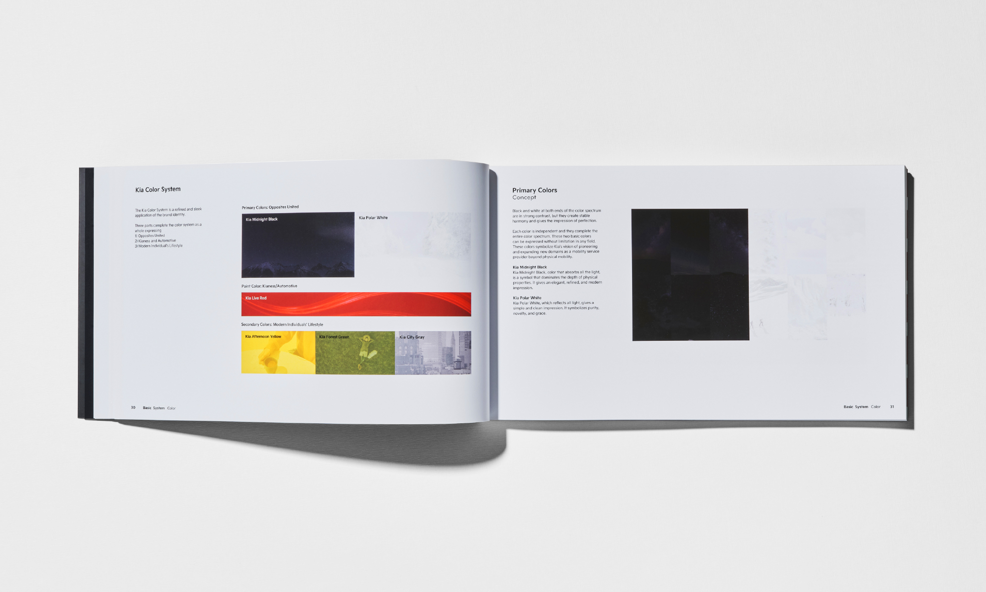
The new brand colors reflecting Kia's design philosophy, 'Opposites United.
Black and white that complete the color palette symbolize unrestricted expression, encapsulating Kia's vision to pioneer and expand into the field of mobility services beyond mobility. The stark contrast yet harmonious new main color aligns seamlessly with Kia's new brand value, 'Opposites United.'

The auxiliary colors, namely 'Afternoon Yellow,' 'Forest Green,' and 'City Gray,' which express the casual and delicate lifestyle pursued by Kia, represent the values of 'sustainability,' 'eco-friendliness,' and 'smart mobility.' Each color is chosen to convey these three principles, contributing to the transmission of the brand message and experience.
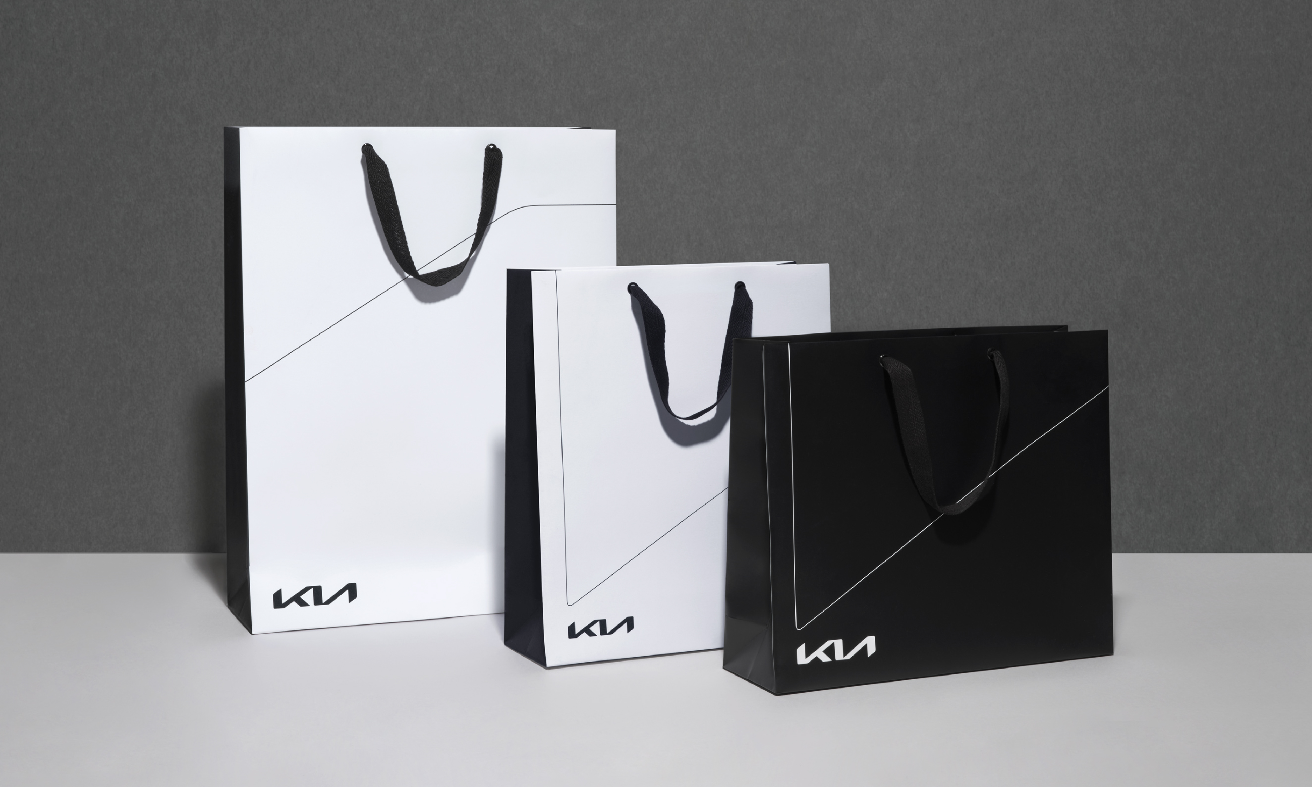
A graphic motif expressing Kia's energy driving change.
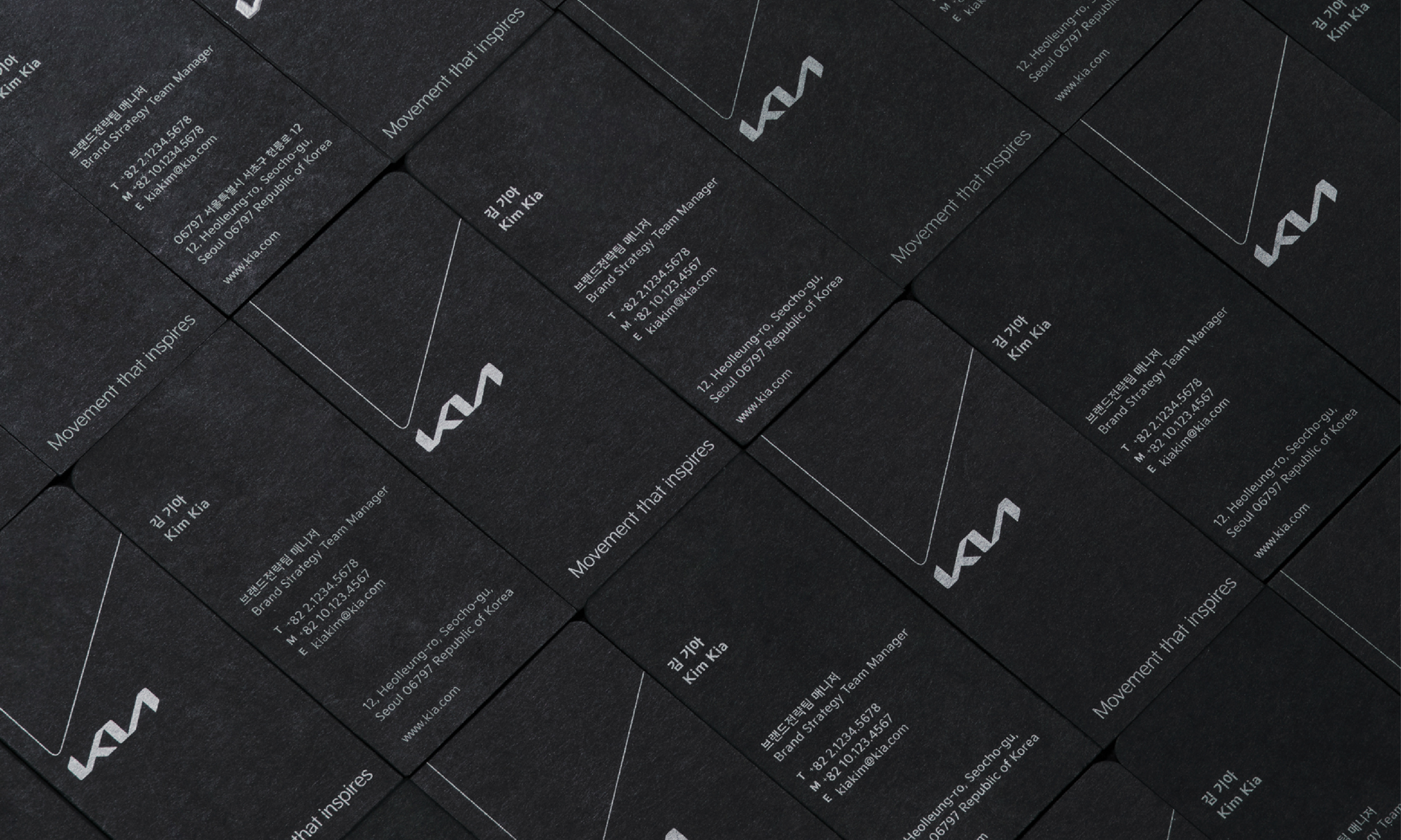
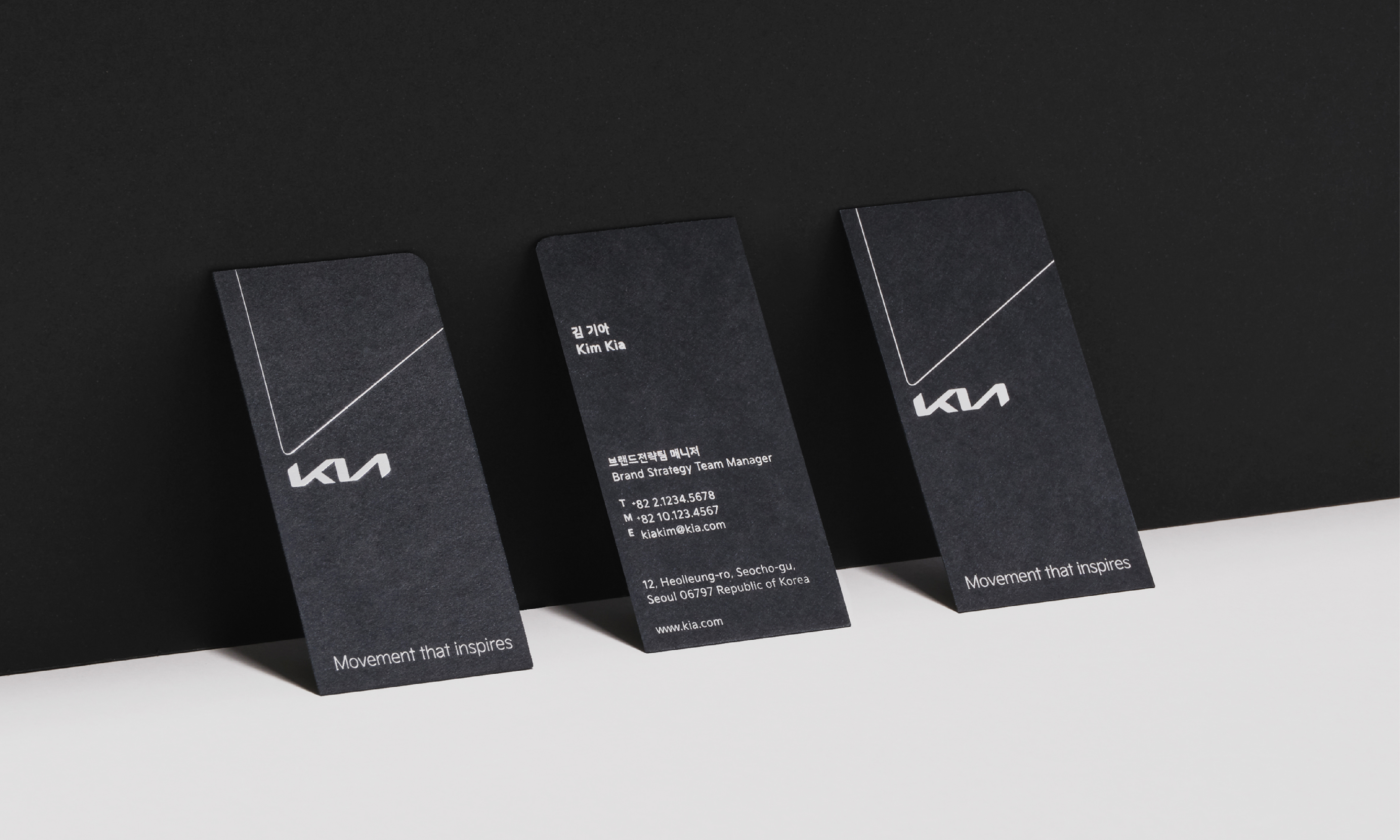
The graphic motif, utilizing the rising lines of the Kia logo, visualizes the brand's personality and future-oriented direction. Derived into three types, the graphic motif is systematically employed according to system regulations to fit the size and form of various media.

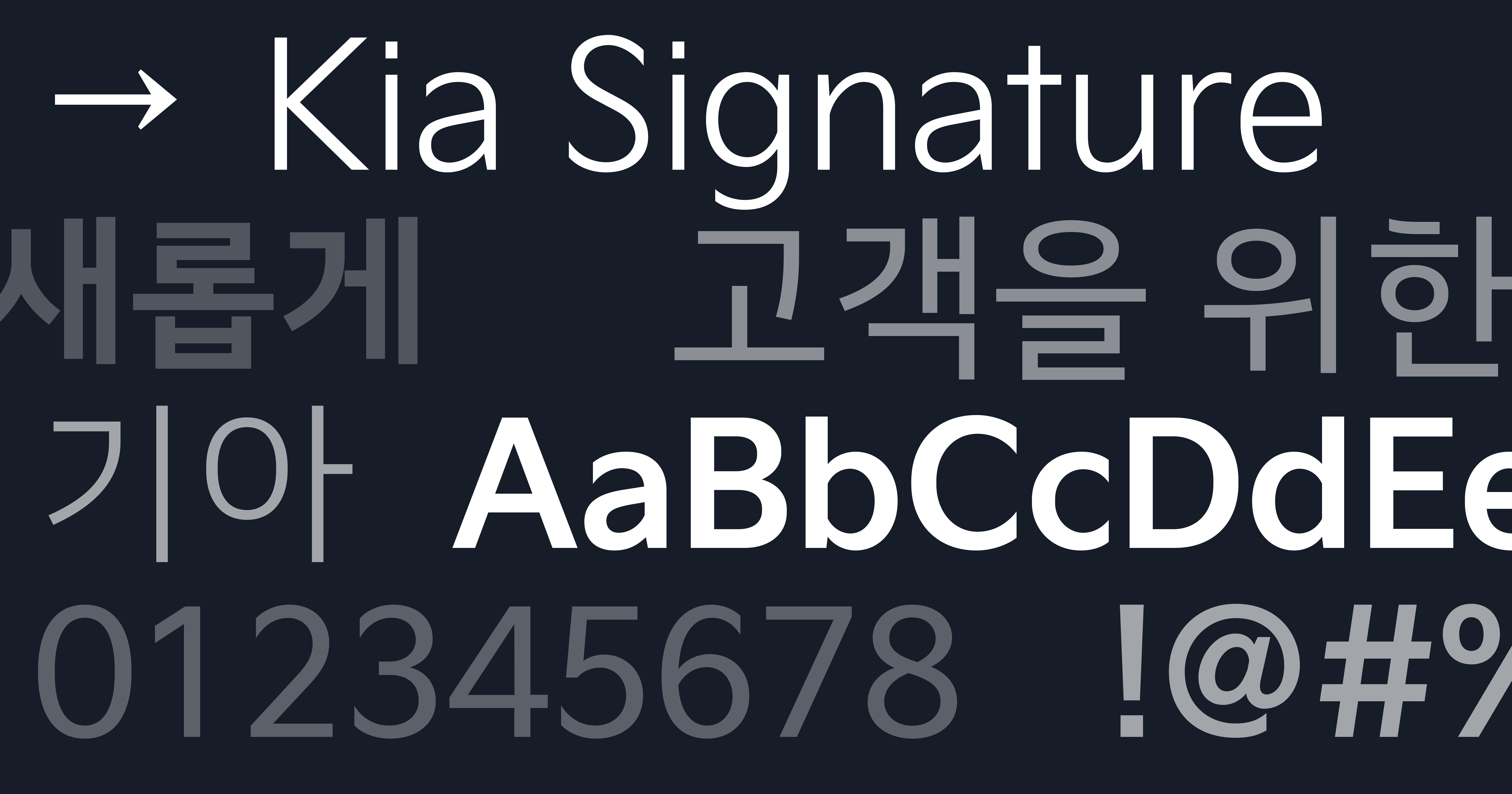
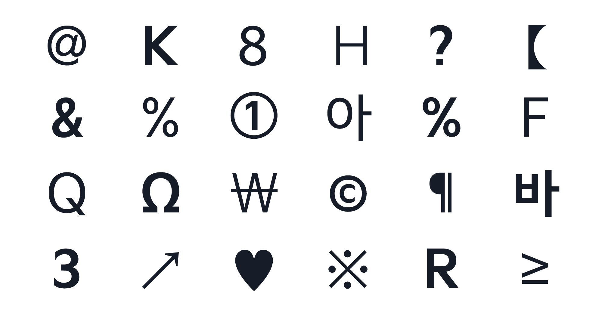
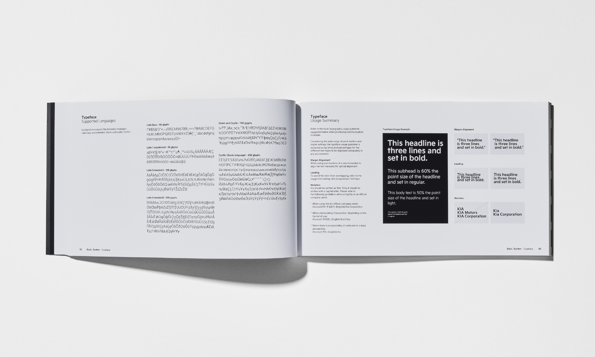
Kia's new brand typeface, 'Kia Signature,' expresses the robust mechanical feel of automobiles with sharp edges and bold lettering. At the same time, the smooth strokes add a human touch to the sturdy typeface.

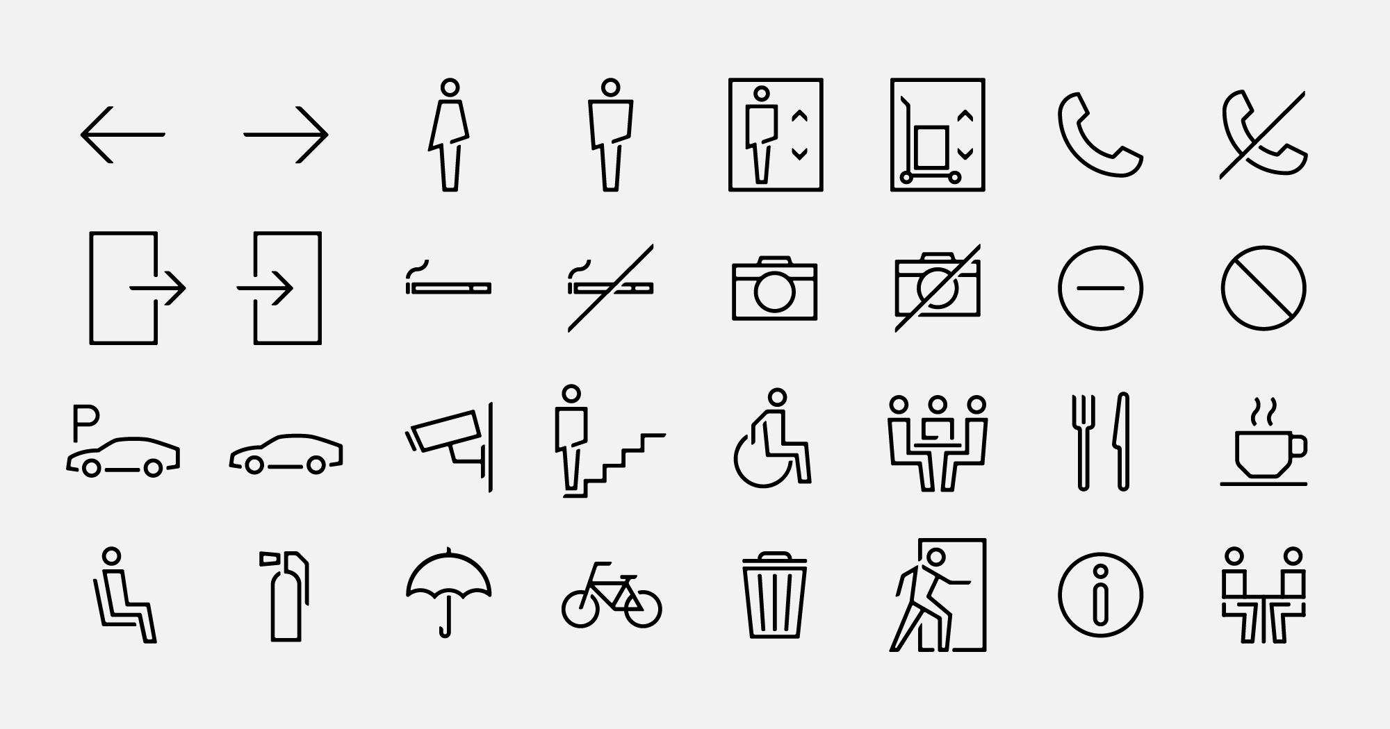
The design of the pictograms incorporates the sleek lines and intricate curves inspired by the logo, aiming to convey a consistent brand message and image.
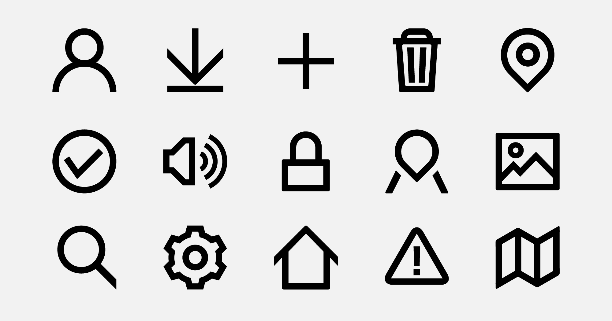
Considering the combination with the Kia exclusive typeface, the icons are designed to maximize visual harmony by reflecting the key characteristics of the Kia Signature typeface when used together.


Client |
Kia |
Output |
Brand System Guidelines, Brand Application, Typeface, Icons, Pictogram |
Year |
2020 |
Double D |
Minjae Huh, Sue Park, Daye Jeong, Kay Kwon, Sol Kim, Dawon Lee, James Chae, Choonggeun Yoon, Minjong Kim, Sohyeon Lee, Allison Yoon, Taeyeon Kim |
Collaborator |
LIFT-OFF(Icons, Pictogram), Sandoll(Typeface), Jaejun Han, Byunghak Ahn, Bon Min(Advisory) |