Brand identity and packaging system renewal for Torriden, a dermatological skincare brand that redefines clean beauty market
- case studies

Q. If you're not familiar with beauty, some of you may not have heard of the brand 'Torriden.' Could you please introduce the brand and give a brief overview of the responsibilities Double D assumes in relation to the brand?
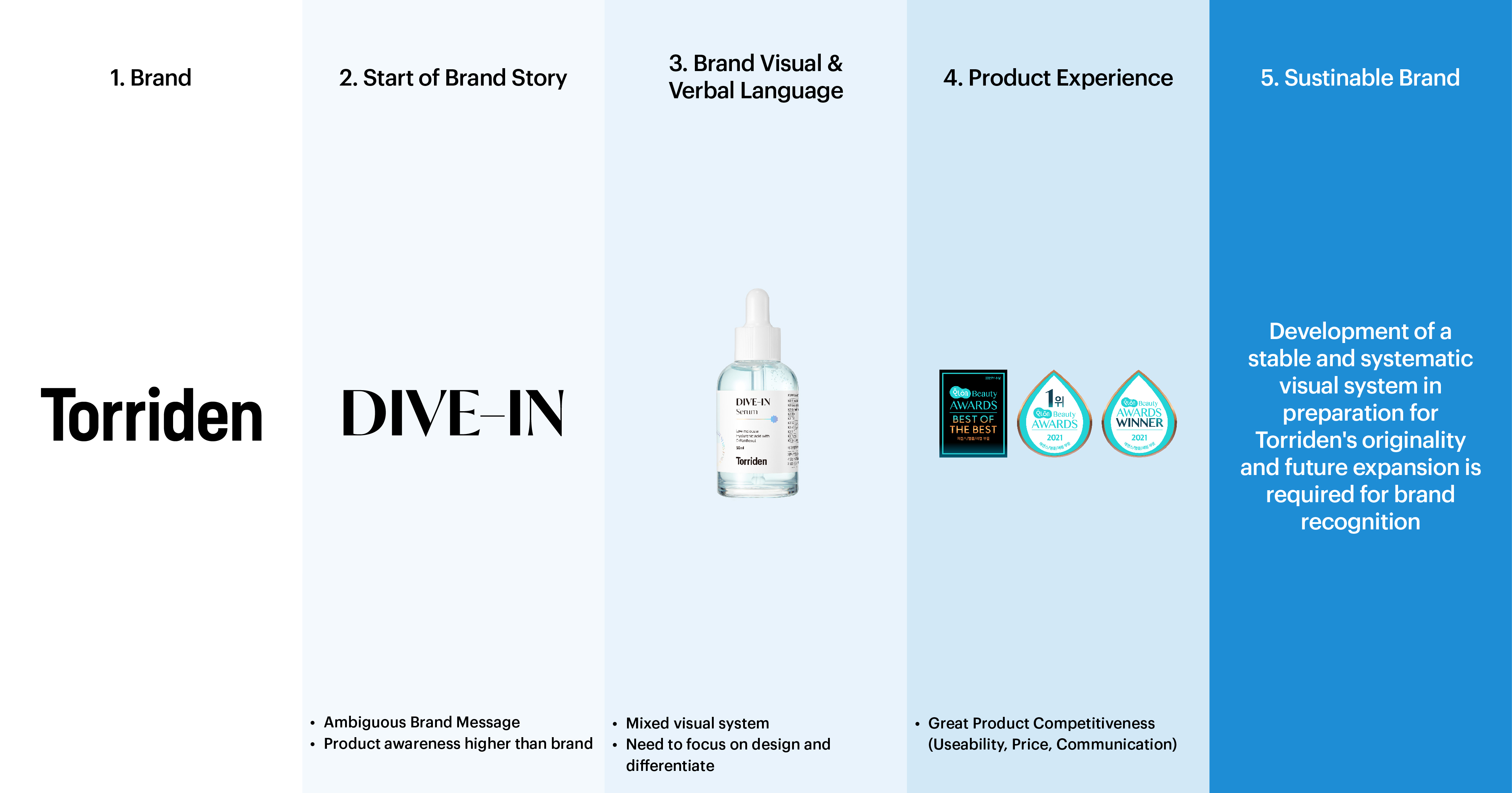
In 2021, Torriden gained significant traction on the domestic beauty scene through the 'Hwahae' app, the largest cosmetics information sharing platform in South Korea. Seeking to elevate itself into a larger brand, Torriden entered Olive Young, expanding its distribution network. Among Torriden's existing products, the "Dive-in" product line stood out for its clean and simple design. However, there was an issue with the package not deeply connecting with the values and persona of the Torriden brand. Additionally, the product line name, "Dive In," overshadowed the brand name. To address these concerns, Double D collaborated with the client to revamp brand strategy, business intelligence, package systems, and image guidelines.
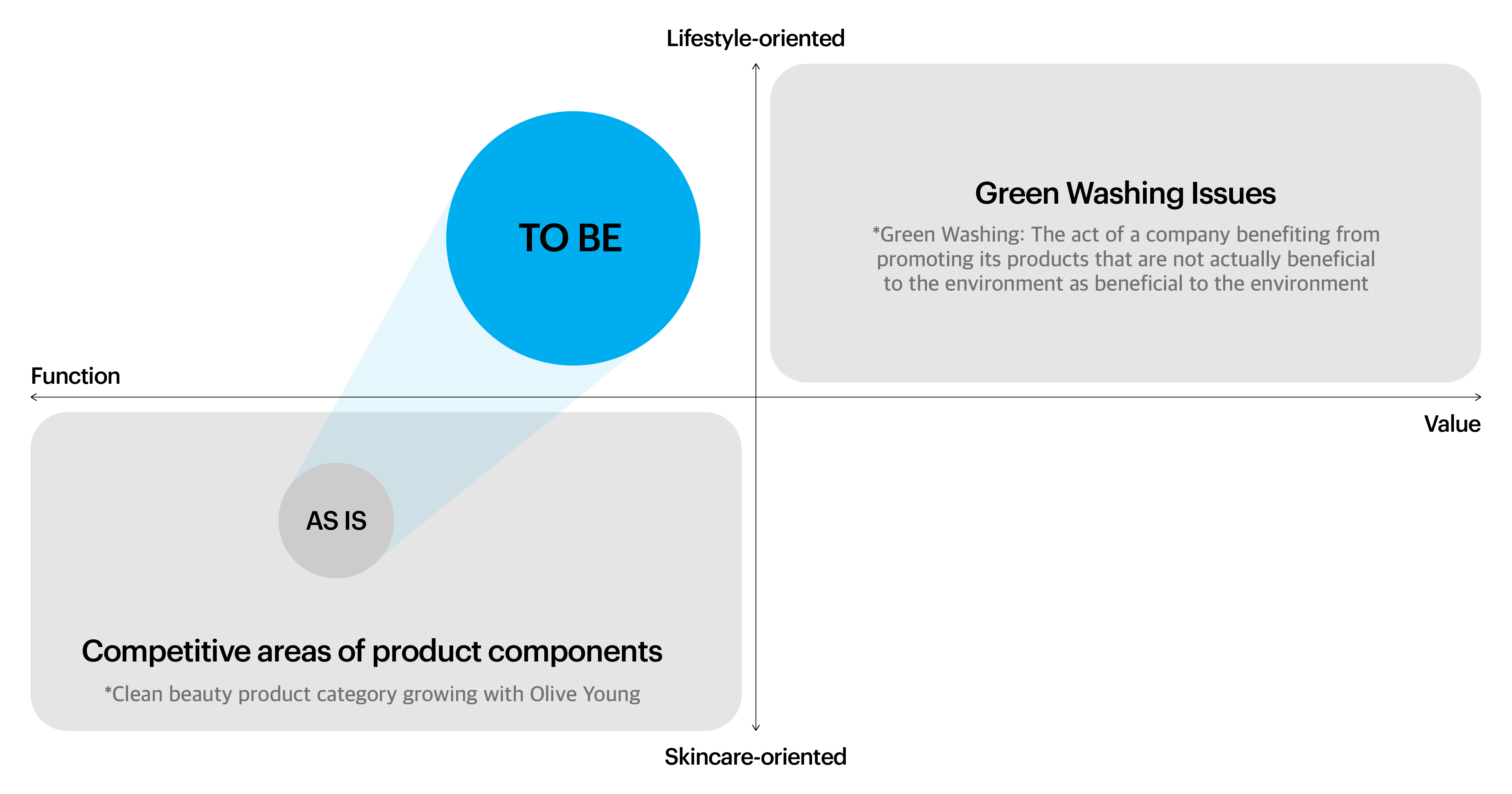
Given the highly competitive landscape of the clean beauty market, where Torriden positioned itself, design distinctiveness and prominence were crucial. Collaborating with strategic partners, Double D designed visuals that visualized the essence of Torriden's origin, the Torriden Land, to evoke a clear association with the skin and the environment. The slogan "YOUR SKIN IS OUR PLANET" was crafted to complement this visual representation. A thoughtful verbal communication strategy was also developed. In anticipation of future brand expansion, Double D established a stable and systematic brand operation system, including image direction for website design and other platforms.
The Torriden project came about when the client, impressed by our successful rebranding of COSRX in 2018, approached us for assistance. Following the initial meeting with the client, we developed a strong desire to collaborate with Torriden. The evident passion of the in-house brand team for their brand left a lasting impression on us. Additionally, the transparent communication with C-level executives further convinced us that Torriden is an excellent and promising brand to work with.
The perception of Torriden's products among customers was positive in terms of usability. However, there was a lack of awareness and a clear brand image for Torriden as a whole. Additionally, the existing brand story, while well-intentioned, was perceived as ambiguous and challenging to empathize with, making it difficult to establish a focal point for branding activities. In the saturated clean beauty market, there was a need for design distinctiveness and differentiation.
Internally, there wasn't a unified voice on the direction Torriden should take. To address this, we conducted an internal branding workshop in collaboration with our brand strategy partner to define the brand's orientation. For brand awareness, Torriden needed its own uniqueness.
At the time, the market was witnessing the rise of value-driven, authenticity-seeking Millennials and Zoomers leading a new consumer market focused on clean beauty, emphasizing safe ingredients. "How thoughtfully one acts" became a valued brand attribute. Torriden aimed to evolve into a brand that loves and respects relationships with people, nature, and diverse forms of life, starting from self-love.
Inspired by the sustainability and biodiversity of the Torridon region in Scotland, Torriden crafted its philosophy and attitude as a beauty brand pursuing a healthy life. The brand story revolved around Torriden being a brand that loves and respects all relationships, creating its own narrative. The brand's guiding principles and commitment, aligned with Torriden's philosophy, were distilled into 'Simple, Together, Positive.'
"The name Torriden is inspired by the Torridon region in Scotland, where various flora and fauna coexist harmoniously. This concept led to the creation of the new slogan 'YOUR SKIN IS OUR PLANET.'"

"The existing logo features a bold and attention-grabbing typeface reminiscent of headlines often used in posters. Due to its narrow letter width and thick form, it conveys a functional rather than an emotional impression, making it challenging to encapsulate Torriden's new value, 'YOUR SKIN IS OUR PLANET.' Therefore, we aimed to move away from the existing functional and technical appearance, opting for a brand logo that reflects Torriden's values. The new logo showcases strokes with a tactile feel, along with a natural letter width, steering away from a rigid impression. This approach intends to convey a logo that embodies Torriden's values in a more organic manner."
We introduced the concept of 'stratum' to reinforce the existing clean beauty identity, focusing on the strength of the texture. This idea originated from the new slogan 'YOUR SKIN IS OUR PLANET,' establishing a connection between Torriden's inspiration from the Torridon region in Scotland and the stratum representing the skin that Torriden aims to preserve. The simple grid system used in the package, stacking characters and square boxes, also visualizes the concept of stratum. The graphic system is a simple grid system that stacks box modules like layers. The main graphic box modules are utilized for brand colors, patterns, photos, and more.
The identity of Torriden is represented by the clean and natural colors seen in the Torridon region, a sans-serif typeface with no frills, and adorable icons—all inspired by the pristine and blue natural colors of the Torridon region, creating a graphic system that embodies Torriden's essence.
"We brought the concept of 'layer' to further strengthen the texture of the formulation, which was the existing clean beauty identity and strength. The environment in Scotland's Torridon region and the skin that Torridon seeks to protect are connected at a point called strata."
In the case of the first package, the mold was selected and utilized among off-the-shelf products without digging new ones. We tried to capture the brand identity and clean beauty by revealing the color of the product in a transparent bottle. We also tried to clarify the value of Torriden against separable emission labeling and animal testing in the package. For the second package, the paper texture feels natural and allows customers to touch Torriden sensibly through effects such as mold pressure.

Through image direction, we created basic image usage rules for consistent brand impressions, including Torriden's values of "Simple, Together, Positive." It was intended to convey a positive image with a simple composition focused on the subject and an honest and unadorned production while containing naturalness. In addition to image directions, we delivered website design strategy directions and sketches, and we proposed to implement a website that is more user-friendly and customer-friendly than today.
Torriden has continued to grow since the rebranding, along with the growth of the clean market. Even in Olive Young, which was aimed at, success continues to be exposed as the main. I also support your future growth.

Interviewee |
Minjae Huh |
Client |
Torriden |
Output |
Brand Identity, Packaging |
Year |
2022 |
Double D |
Minjae Huh, Yena Ahn, Ihnwung Glenn Jeon, Kyungmi Jun, Yejin Won, Seongje Kim, Daewook Kim |
Collaborator |
Kay Kwon, Heeseung Lee(Design Participation), Salt Studio(Photography), nabb(Strategy) |