Brand identity and packaging system renewal for Torriden, a dermatological skincare brand that redefines clean beauty market
- packaging
- CI & BI
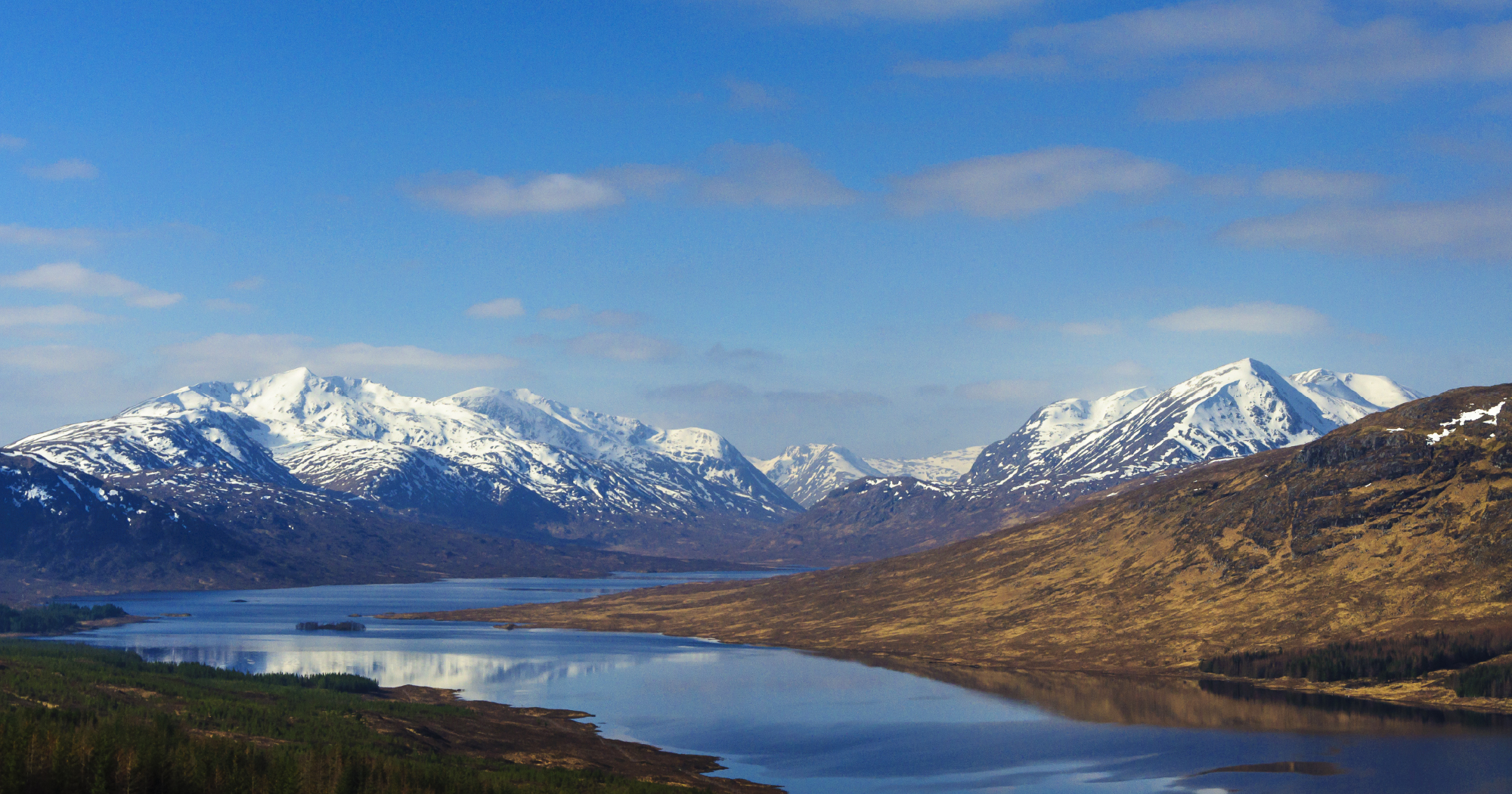
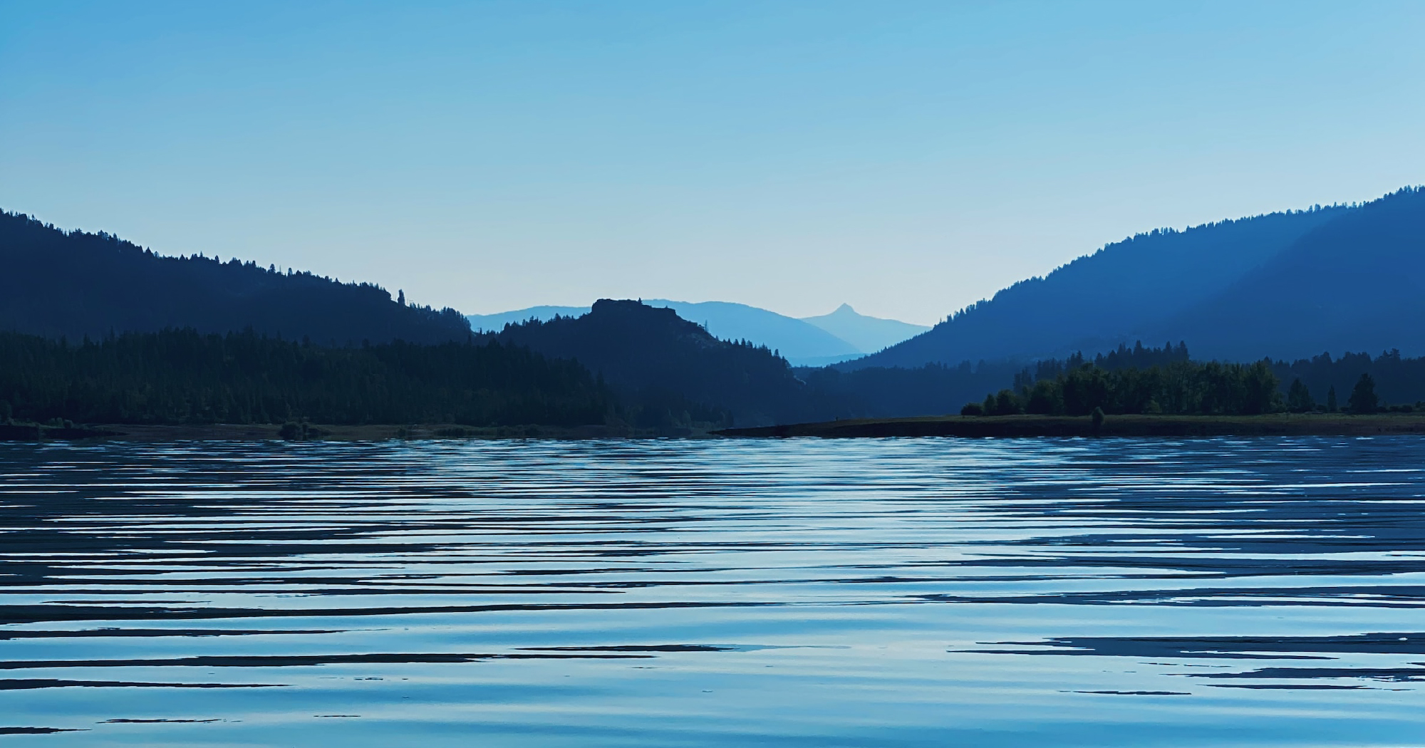
Land of hope, Torridon
Torridon, a land of natural beauty spanning billions of years, is nestled in Scotland. Inspired by this remarkable place, the Torriden brand aims to convey a philosophy and attitude of a beauty brand that pursues a healthy life based on sustainability, harmlessness, and diversity.
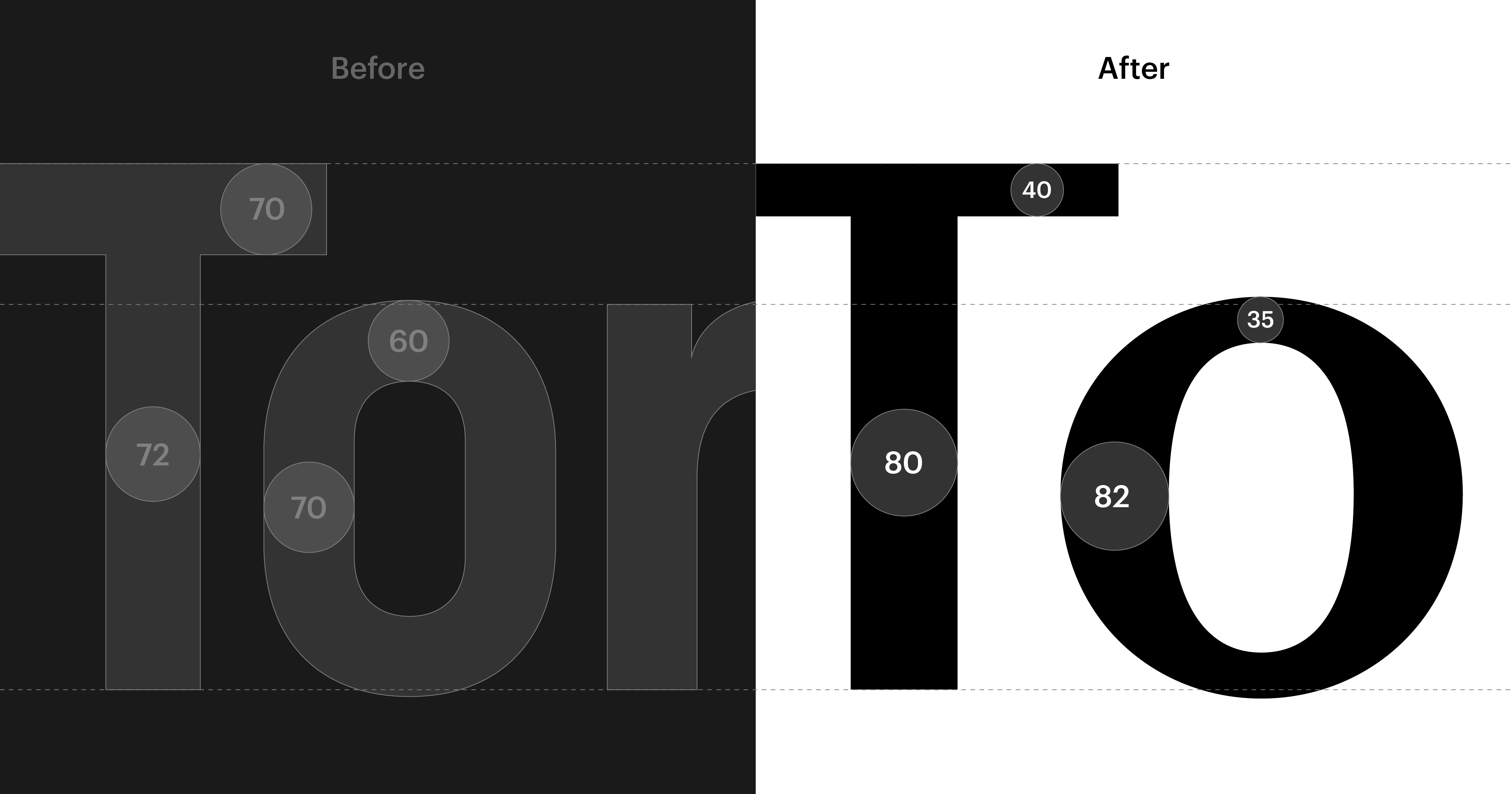
Natural stroke contrast inspired by hand pressure
The new logo aimed to move away from the technical and rigid impression of the existing logo, expressing the brand values that Torridon seeks. It incorporates the natural pressure of the hand, creating a contrast in strokes to evoke a more organic feel.
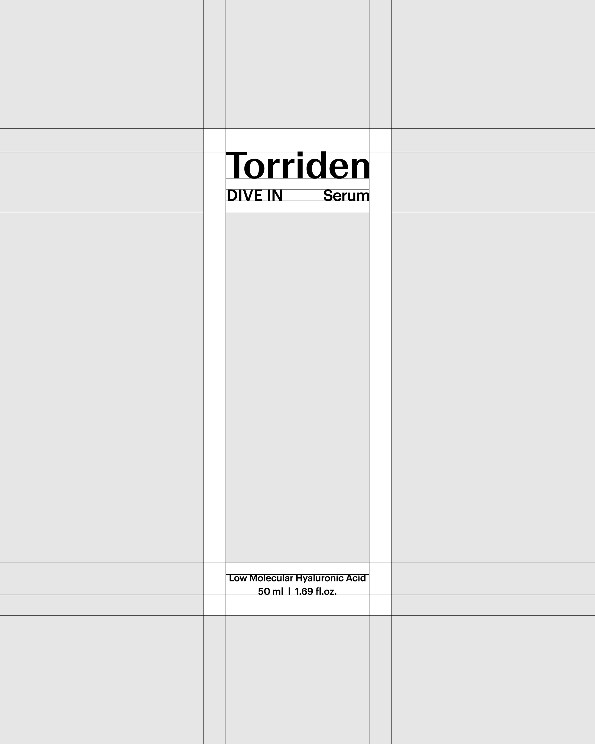
Graphic motifs inspired by the structure of terrain and skin layers
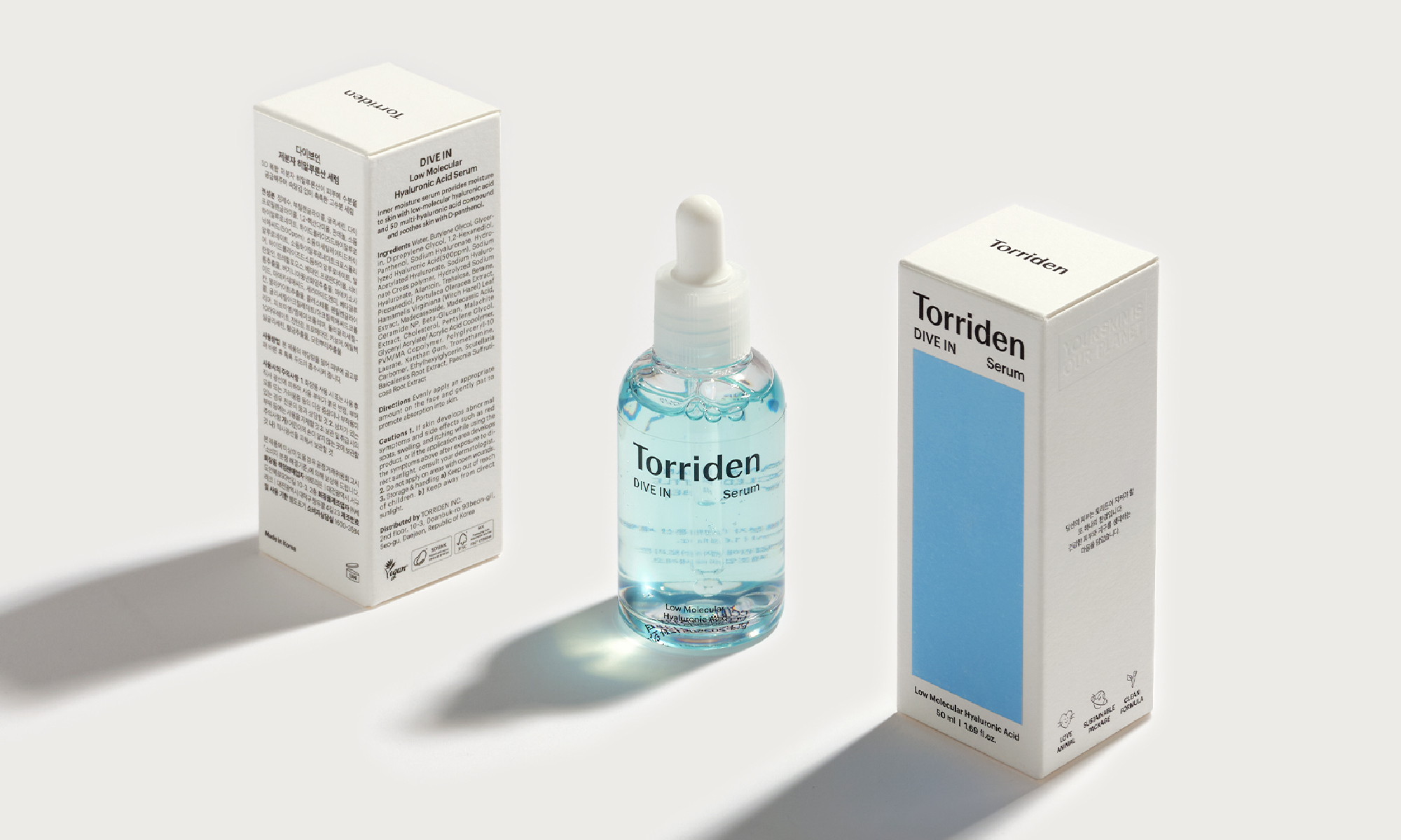
Starting from Torriden's new slogan 'YOUR SKIN IS OUR PLANET', the stratum idea connects the environment of the Torridon region of Scotland, where Torriden is inspired, to the skin that Torriden seeks to protect at a point called stratum. This stratum idea is embodied in a simple grid system that stacks letters and square boxes.
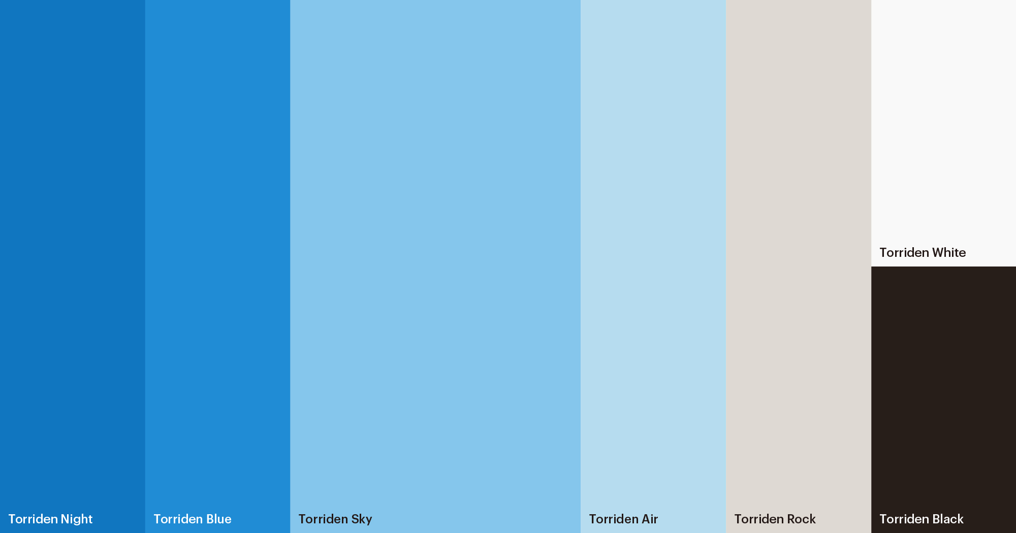
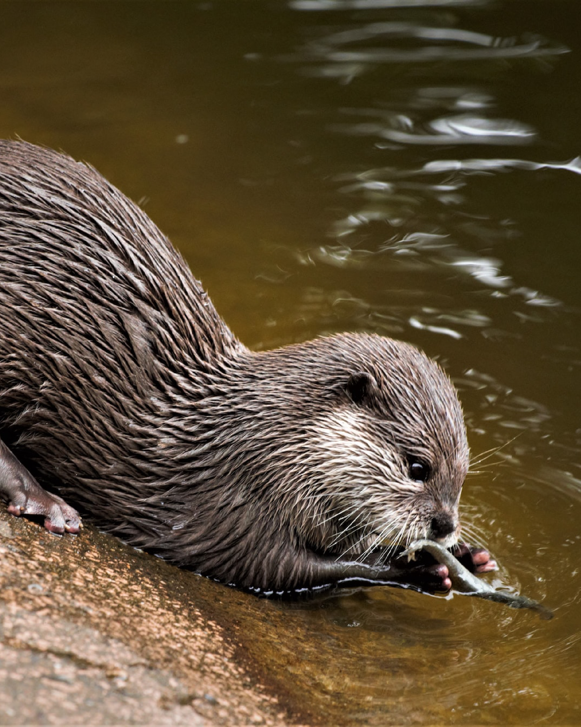
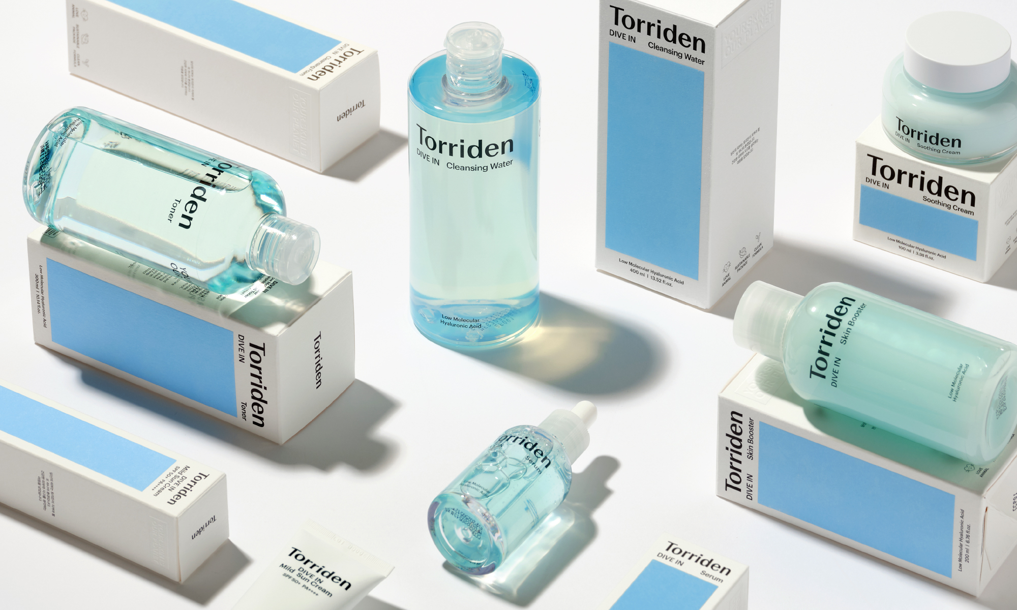
The color palette of Torriden was inspired by the natural colors found in the Torridon area.
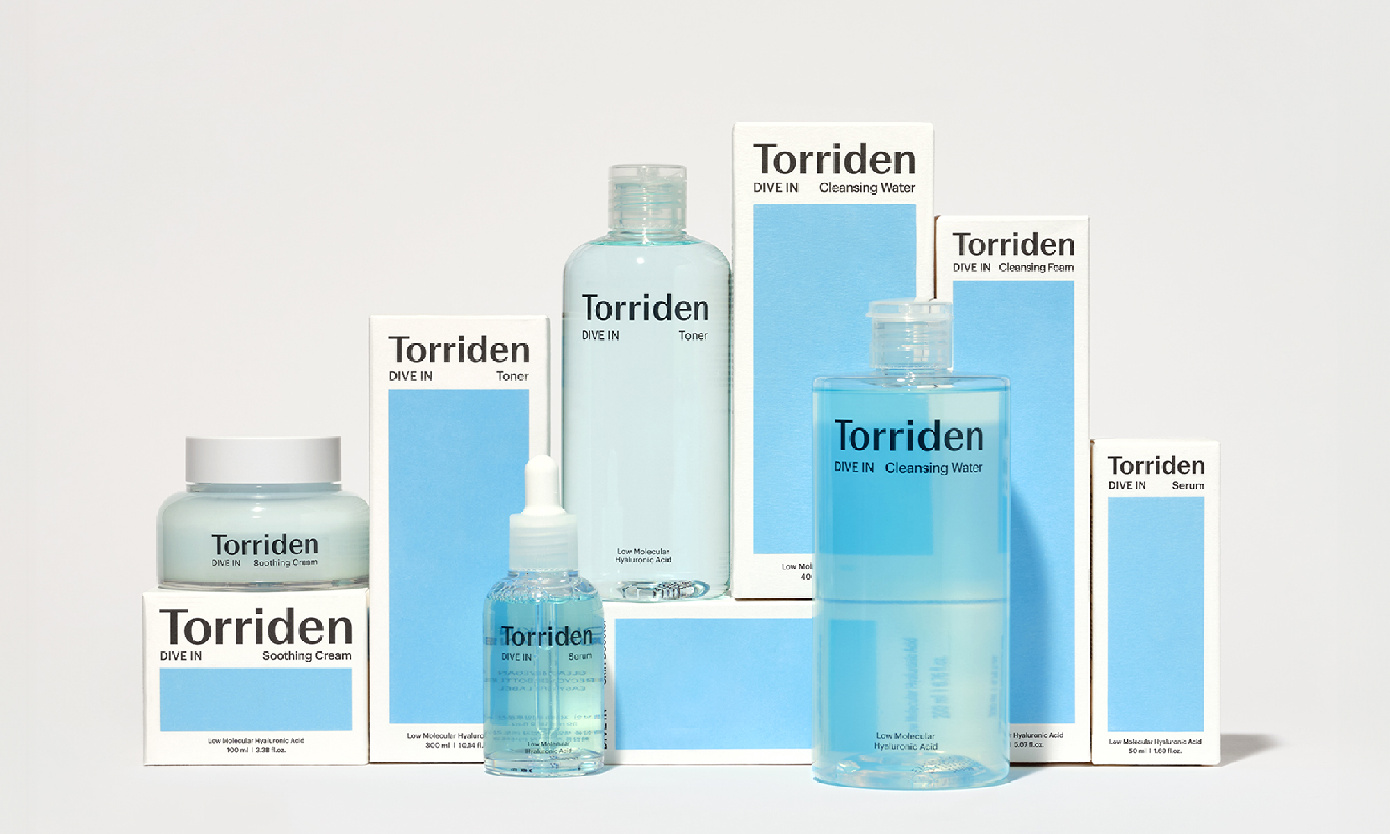
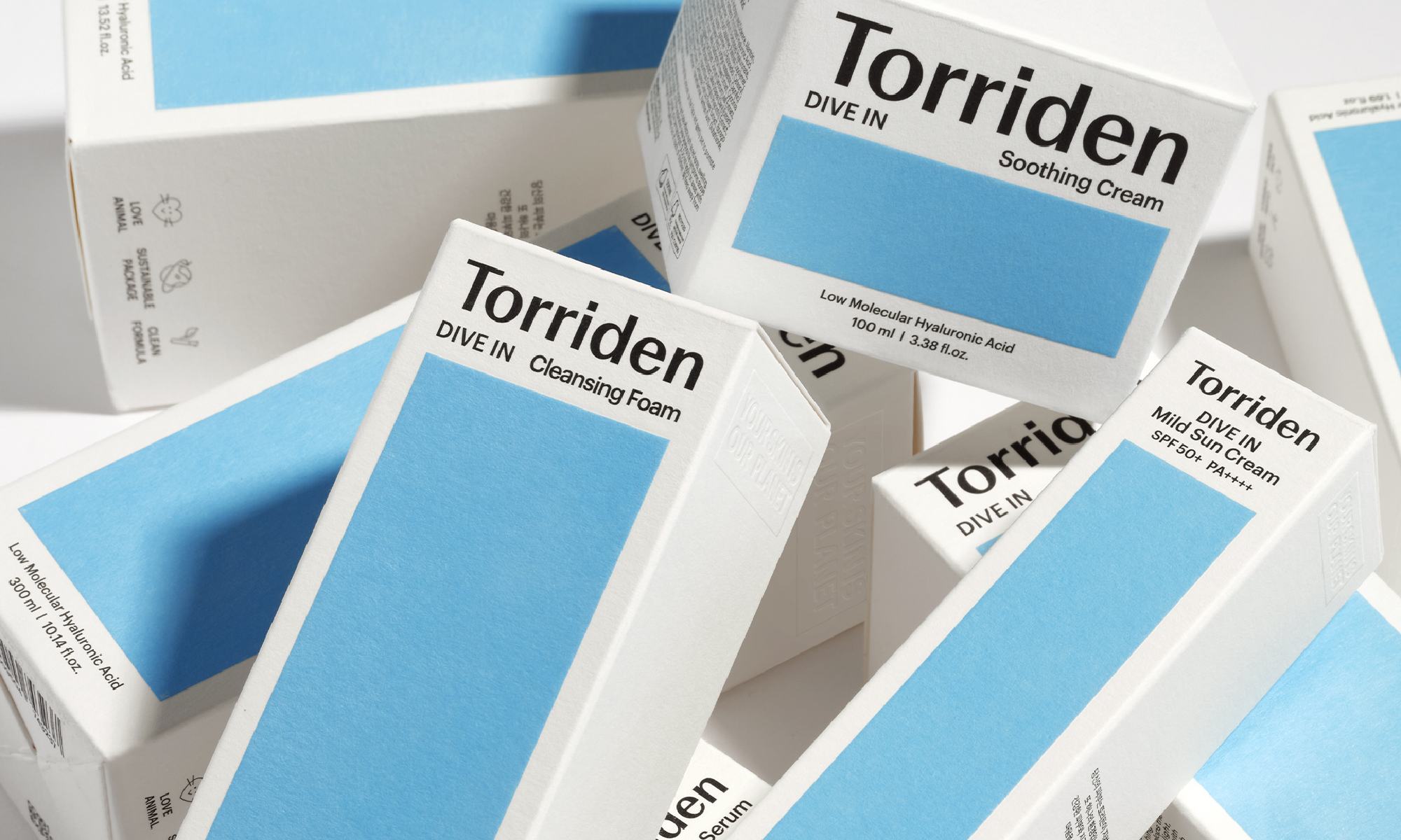
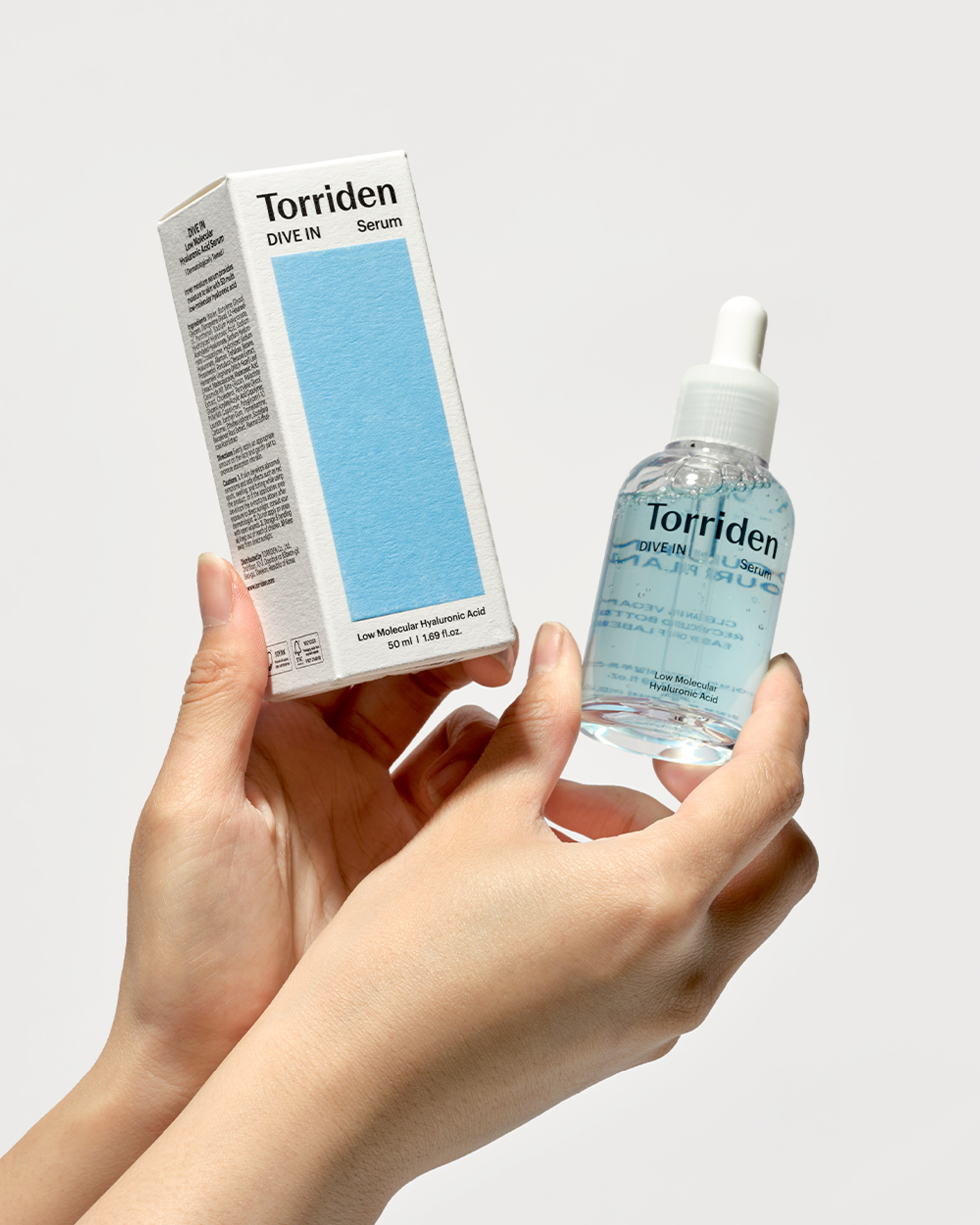
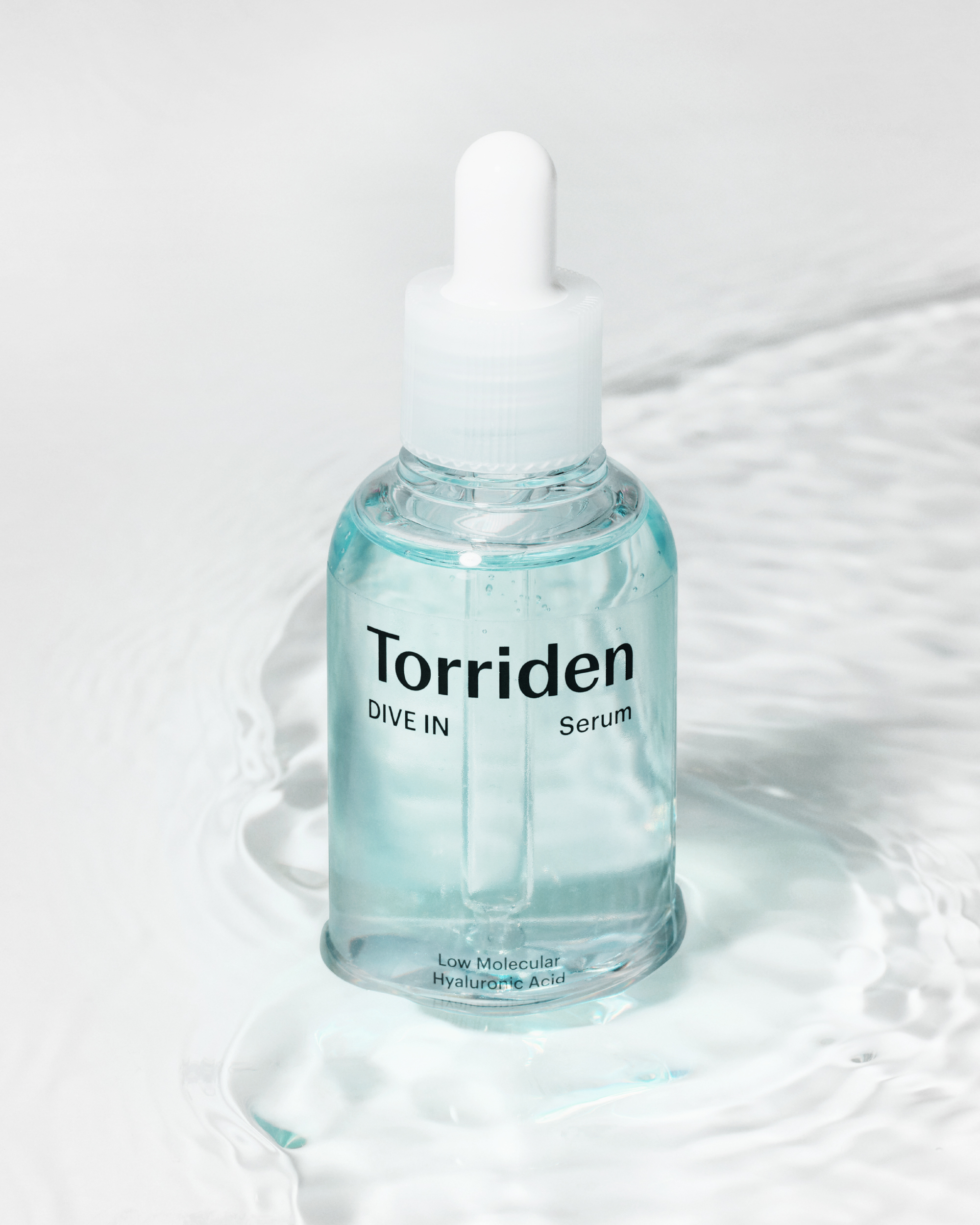
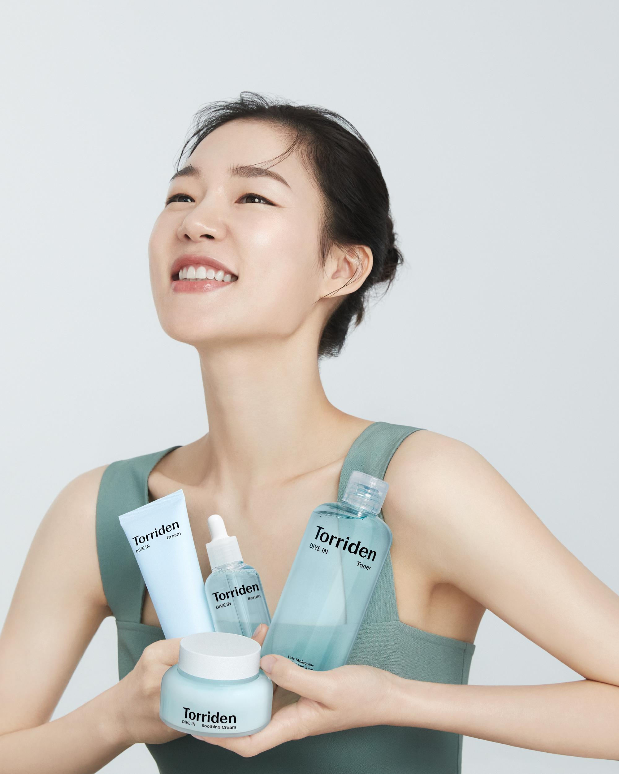
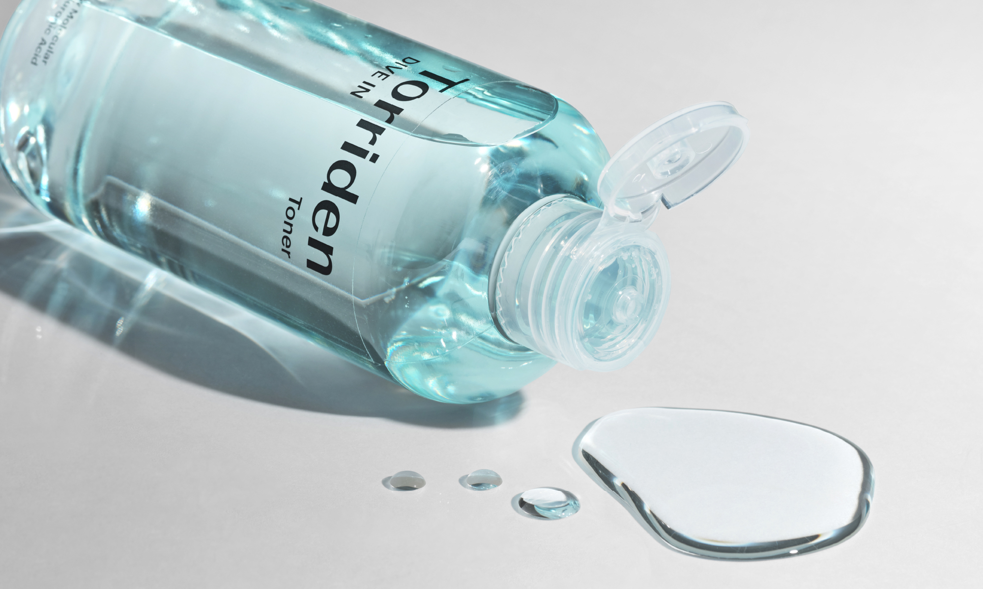
Basic packages designed according to the graphics system provide a tactile experience and show flexibility. The pressure-packed package provides a tactile experience and shows a flexible graphics system by size.
Client |
Torriden |
Output |
Brand Identity, Packaging |
Year |
2023 |
Double D |
Minjae Huh, Yena Ahn, Ihnwung Glenn Jeon, Kyungmi Jun, Yejin Won, Seongje Kim, Daewook Kim |
Collaborator |
Kay Kwon, Heeseung Lee(Design Participation), Salt Studio(Photography), NABB(Brand Strategy) |