Packaging design inspired by the aesthetics of Korean tradition, and editorial and key visual design for Kia Design Magazine No. 4-7
- editorial
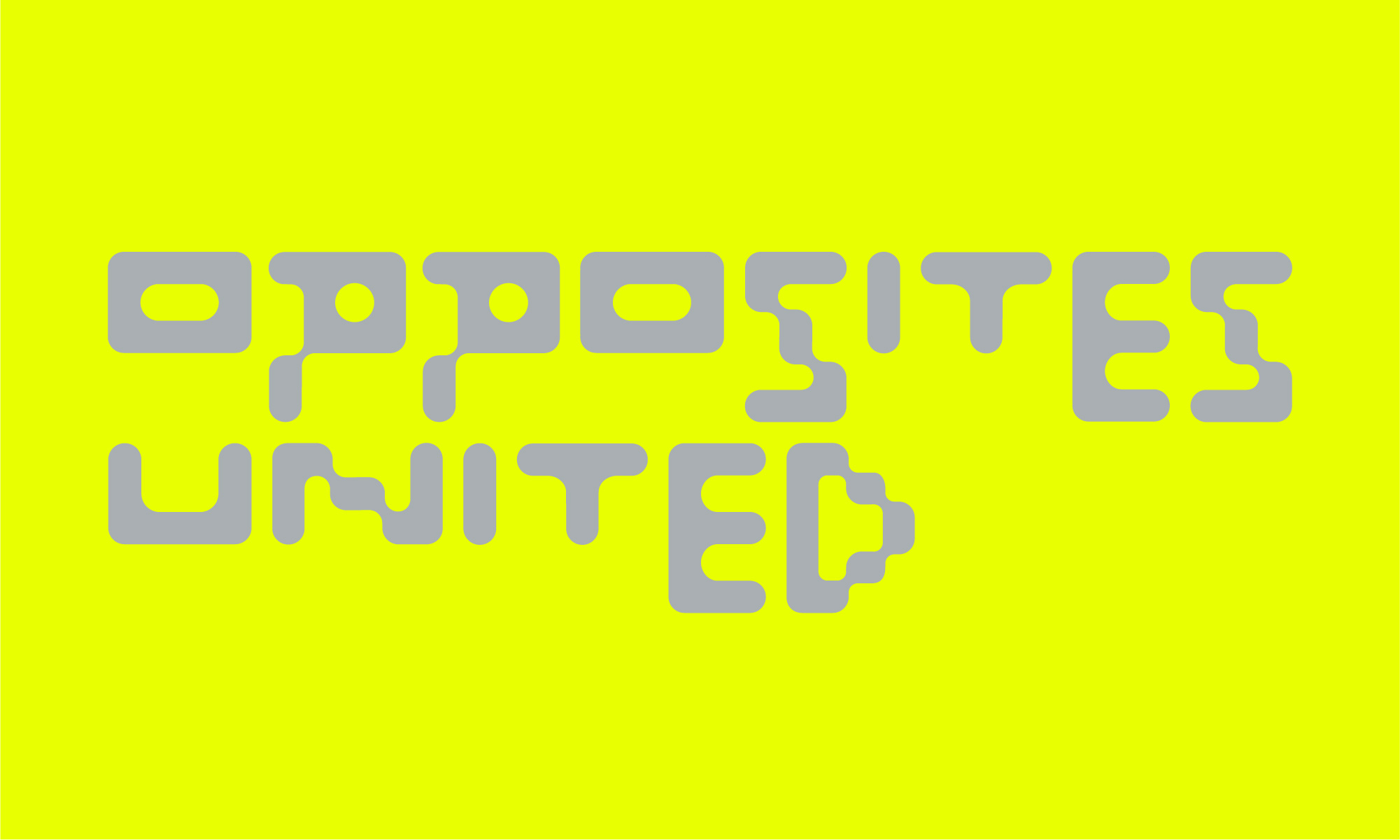
In 2023, Kia Design Magazine embraced the keyword "Expansion" to embody Kia's design philosophy of "Opposites United" as a cultural and everyday experience. As part of this effort, we produced a yearbook and participated in Kia's exclusive exhibition at the 2023 Milan Design Week, where our work was selected as one of the top contenders for the prestigious "Fuorisalone Award." We were the only mobility company nominated, contributing significantly to this achievement.
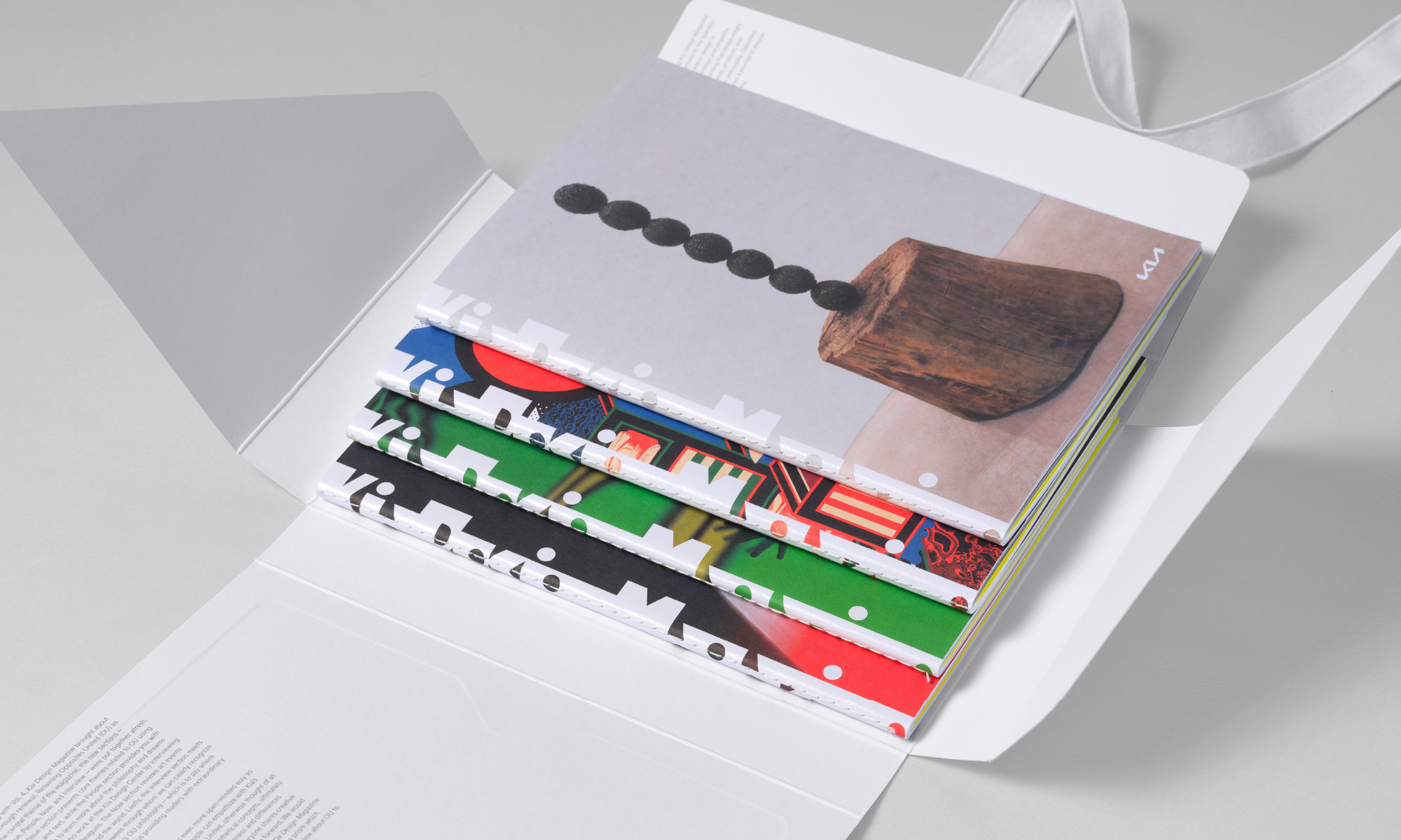
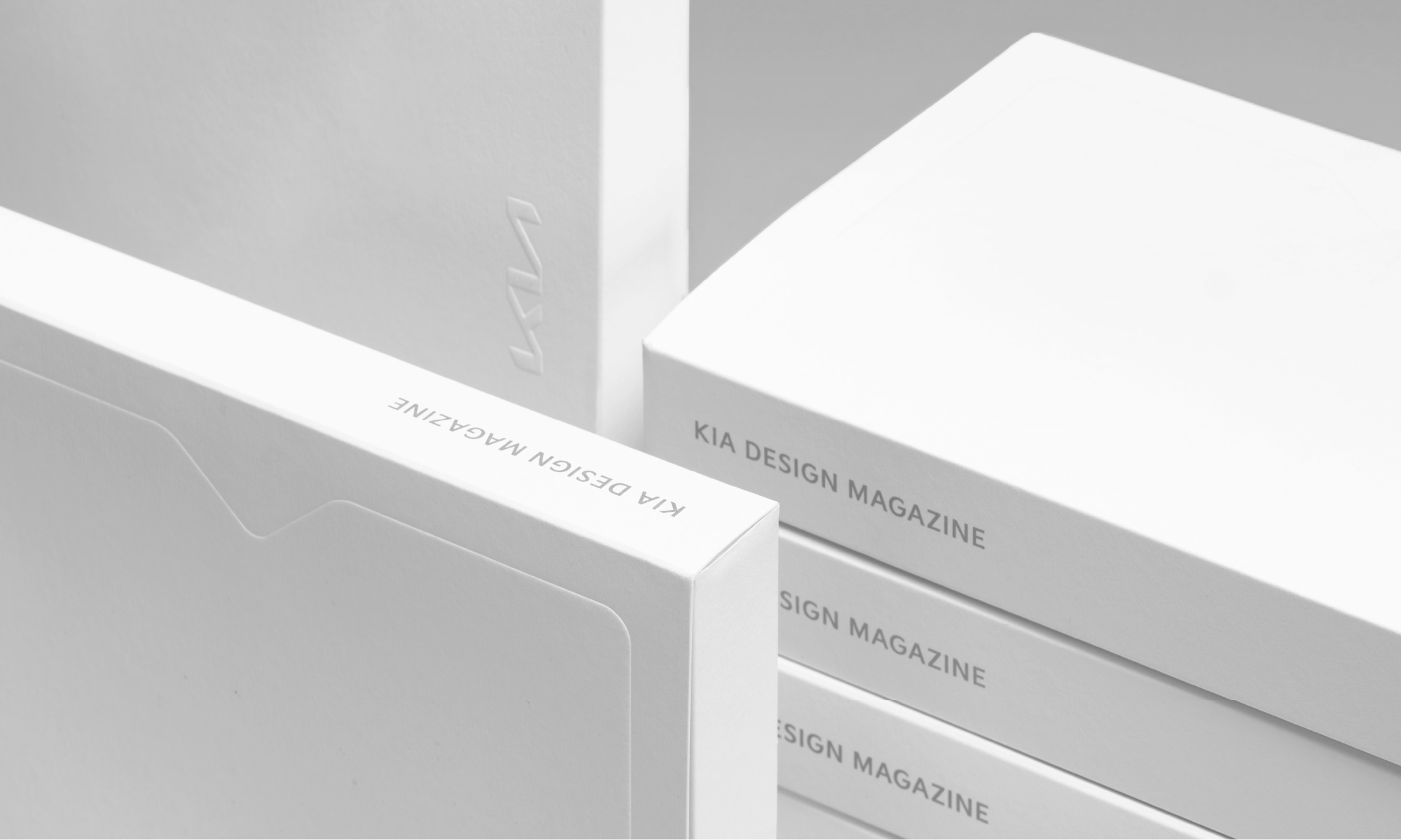
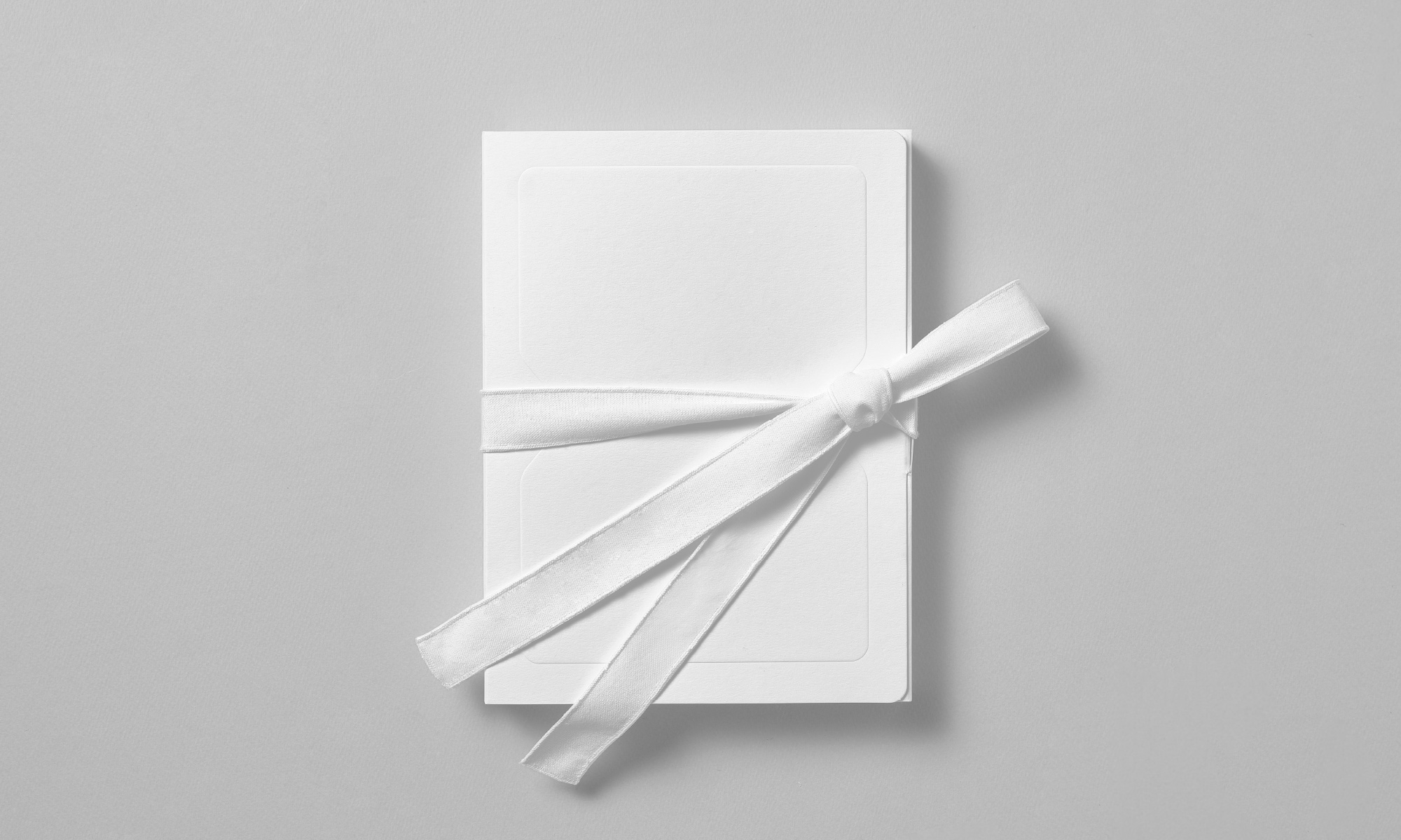
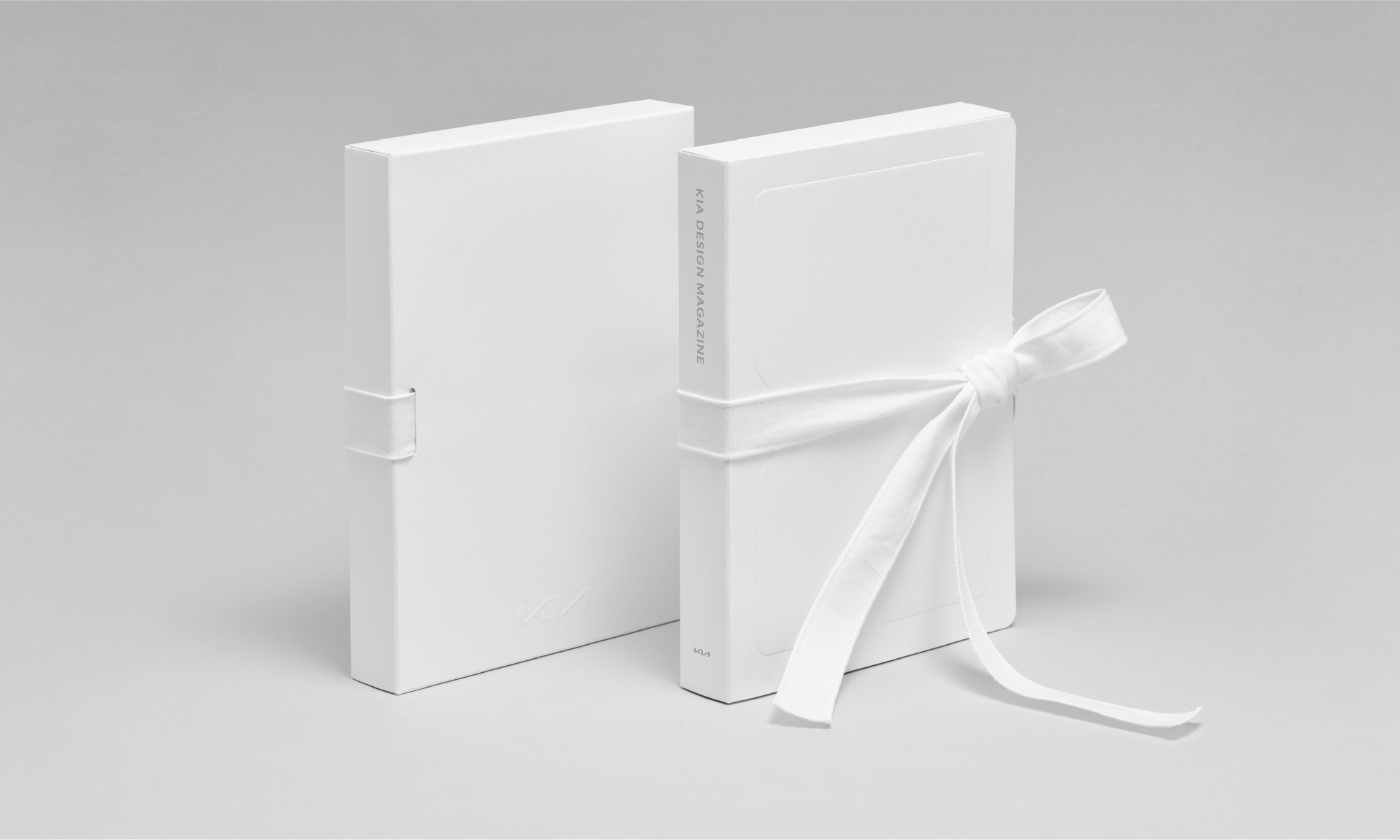
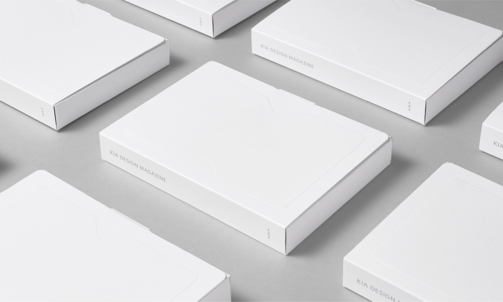
Inspired by the way the jeogori, a traditional Korean garment, is wrapped, we designed a packaging structure imbued with Korean sensibility, where the straps untie and unfold in all directions. Additionally, we utilized minimal printing and embossing techniques to align with Kia's ESG initiatives.
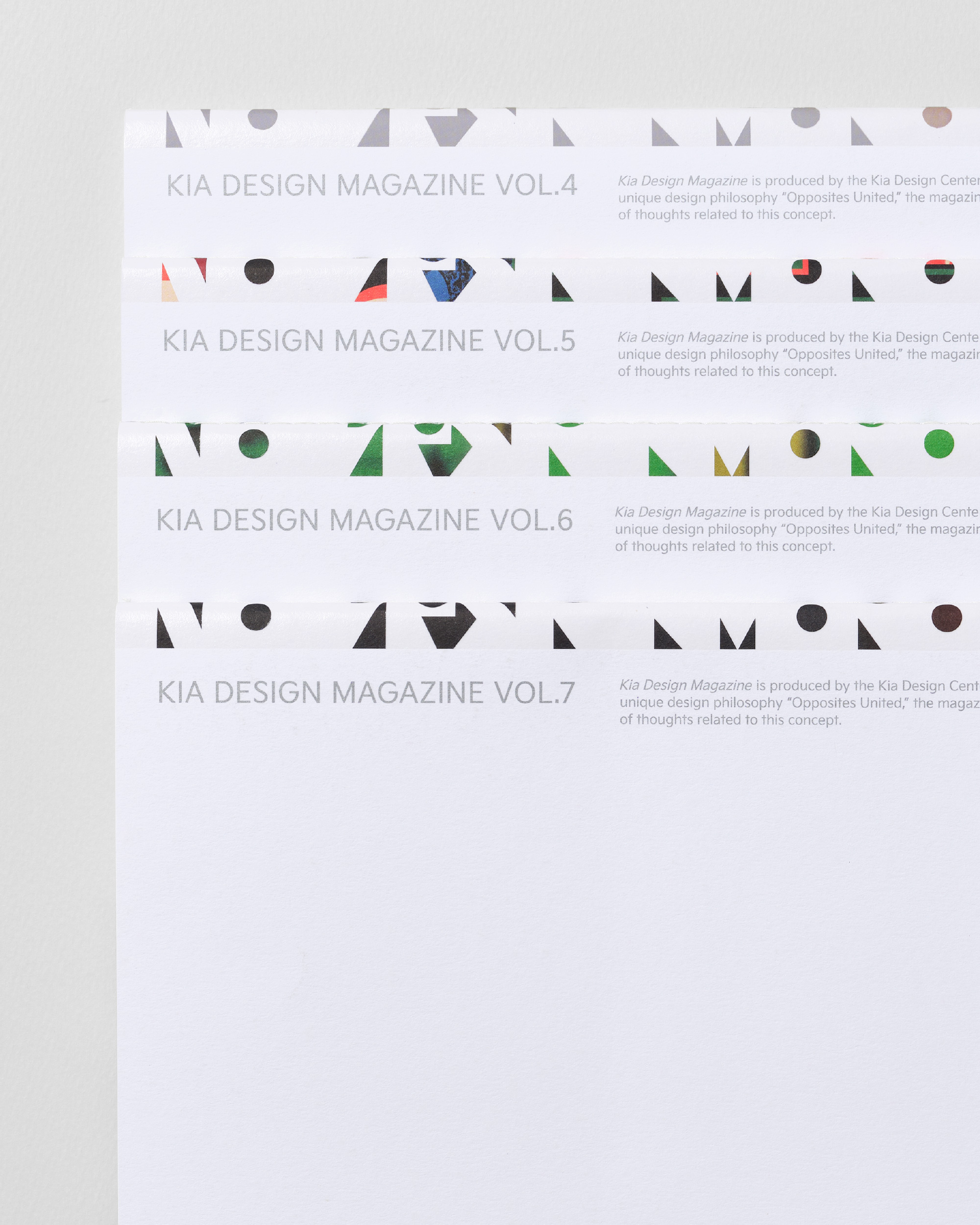
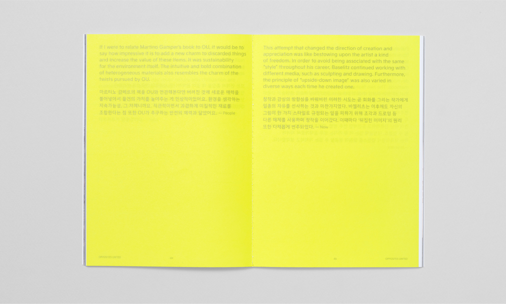
The contrast between the front and back sides of the magazines indirectly conveys Kia's design philosophy(The Opposites United). The Kia Design Magazine logo inserted around the spine of each volume, adds a visual interest.
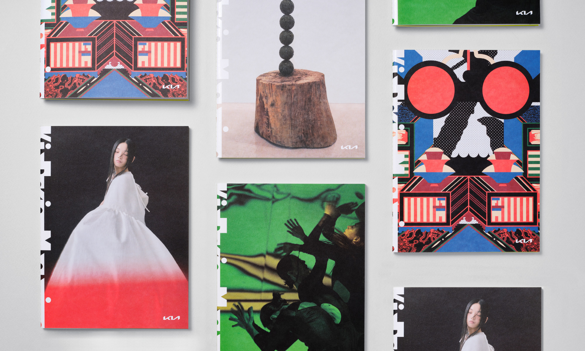
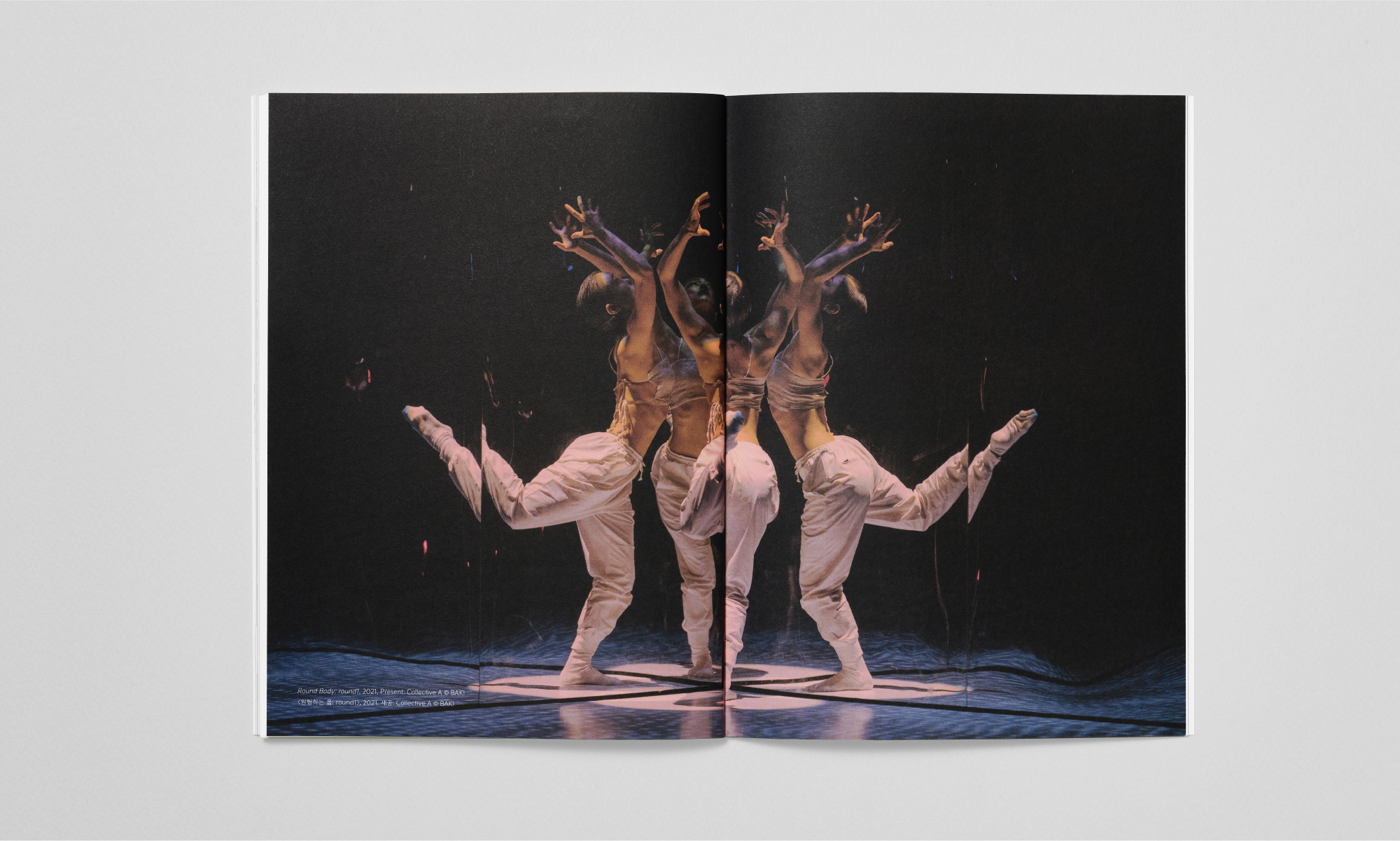
Based on the nature of Kia Design Magazine's webzine, the Rounded Frame of the web window serves as a graphic motif, applied to the section titles' visuals and the corners of inserted images throughout the magazine. This was done to infuse visual elements of fun throughout the yearbook.
Especially in the "People" section, where interviews with Kia employees from both domestic and international offices were conducted, content was arranged within the Rounded Frame across the spread. This visually emphasizes the voices within Kia and allows readers to focus on the content more effectively.
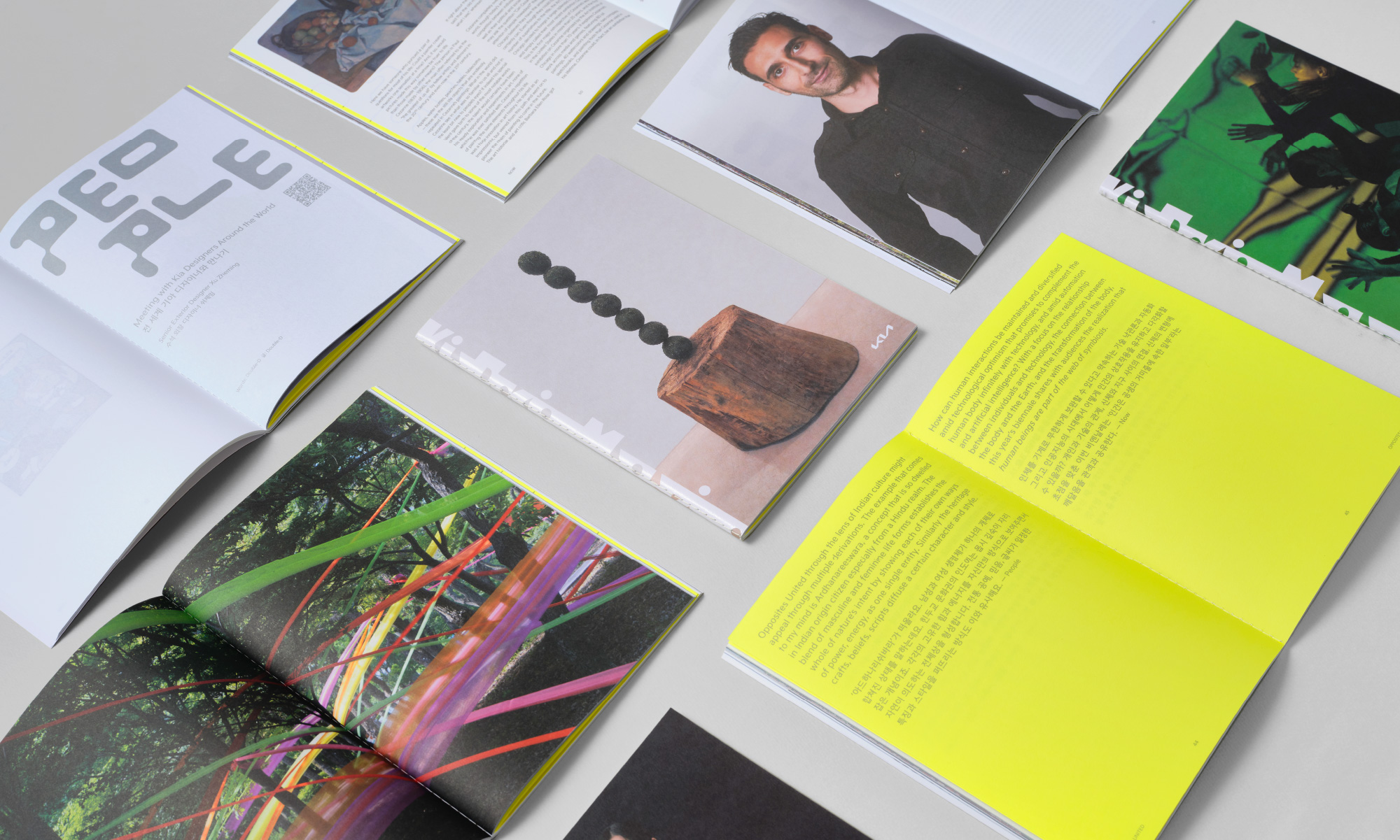
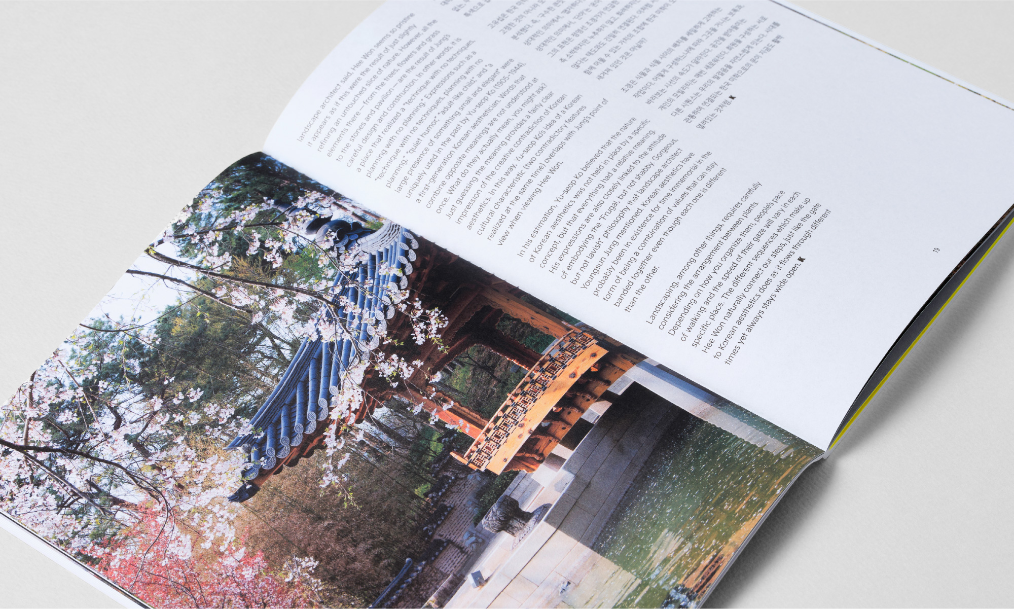
By transitioning the webzine into print format, we focused on reducing reader fatigue and making it easier to read within the predefined content flow. Variations in the arrangement of images and text, along with the appropriate use of graphic elements, effectively separate information by section and facilitate easy acquisition of image-centric information.
Client |
Kia Design Center |
Output |
Editorial, Packaging |
Year |
2023 |
Double D |
Minjae Huh, Ihnwung Glenn Jeon, Harry Jun |
Collaborator |
Wonwoo Lim (Design Participation) |